The document provides information about the covers and contents of four different music magazines from different genres and time periods:
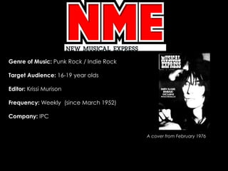
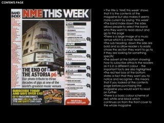
1) NME (punk rock/indie rock magazine from 1976) uses a limited color scheme and large images on the cover to attract readers. The contents page neatly lists articles and bands. Features use photos and distinct text formatting.
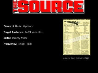
2) The Source (hip hop magazine from 1988) also prioritizes large cover images and uses minimal yet distinctive text. The contents are clearly laid out. Features contrast photos with brand advertisements.
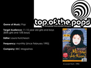
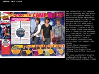
3) Top of the Pops (pop magazine from 1995) employs varied colors and fonts on the cover to appeal to its young audience. It focuses more on photos