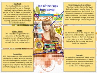
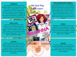
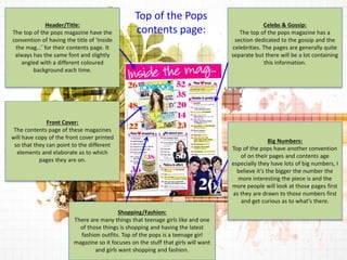
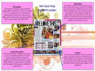
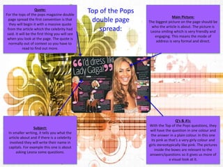
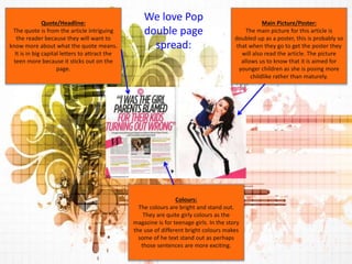
Magazine Analysis 
There are two main 
examples of pop 
magazines. Top of the 
Pops and We love Pop. 
The front covers of 
these magazines are 
always very busy and 
friendly. The pictures 
are engaging with the 
audience and there 
are always lots of 
different stories and 
colours. 
Top of the Pops We love Pop
Masthead: 
The masthead fits the codes and 
conventions of the top of the pops 
masthead. It always has the same font 
and the ‘of the’ is always in the middle of 
the circle. Generally the masthead fits 
across the whole of the top of the page 
but sometimes it will be slightly angular 
reaching 2/3 across with stars lined on 
top and on the bottom. 
Cover Image/mode of address: 
The picture on the front is of a Taylor 
Swift who is a very popular singer. The 
picture is medium shot and central. Its of 
direct address as she is looking straight 
forward, so formal. The cover is also child 
like as it is aimed for younger years and 
teens, with the bright colours and gossip. 
Barcode: 
The barcode is pretty much always on the 
front which is conventional. Its pretty 
much always on the bottom half of the 
cover it tells you the issue information 
and the price of the magazine. 
Competition: 
With these magazines they are aimed for 
teenage fan girls who would do anything 
do win something to do with their celeb 
crush. So in order for more buys from the 
magazine they will place the competition 
on the front page to draw the attention. 
Quote: 
On the front cover of this magazine it’s a 
convention for there to be a quote from 
perhaps the star on the front. Its to give 
you a taste as to what they will be 
talking/what the interview was about 
inside the magazine. 
What’s Inside: 
This area of the magazine has the 
convention of the top of the pops 
magazine where it tells you what you're 
going to find in the magazine. It’s 
normally the most exciting stories. 
Top of the Pops 
front cover:
Masthead: 
The masthead for the ‘We Love Pop’ 
magazine follows the conventions of most 
of its covers. It generally has a heart 
instead of love as that normally how 
teens write when they’re texting also its 
in a speech bubble which is suggesting 
that many kids should be saying this out 
loud because teens and kids love pop. 
Cover Image/mode of address: 
The image on the front is of the famous 
pop/RnB singer Rihanna. So immediately this 
brings the attention because they will want 
to know what its got to say about her. She is 
looking straight at you so this Is known as a 
direct mode of address almost as if she is 
trying to communicate with you. This is 
known as a formal cover. The cover is very 
bright attracting the attention of teens and 
children. 
Barcode: 
The same with the other cover the 
barcode is generally on the bottom half 
of the cover and it includes the 
information about the issue and the price 
of the magazine. 
Exclusive: 
There is another convention of this 
magazine which is they leave a little strip 
at the bottom which will have a short 
sentence about an exclusive which is 
saying that only they had this information 
first which will more than certainly excite 
the readers. 
Fashion: 
Teenagers love fashion and for a pop 
magazine to involve fashion and celeb 
gossip and pop music teenagers will love 
it. Most of the time the fashion is related 
to the season but sometimes it will be 
advice from a celebrity. 
What’s Inside: 
The cover will always have a short 
sentence or two which will give you a 
sneaky peak as to what’s inside the 
magazine. It will mention what the actual 
story is about or it will say what celebs 
they will be talking about. This is there 
ways of exciting the readers. 
We love Pop 
front cover:
Celebs & Gossip: 
The top of the pops magazine has a 
section dedicated to the gossip and the 
celebrities. The pages are generally quite 
separate but there will be a lot containing 
this information. 
Big Numbers: 
Top of the pops have another convention 
of on their pages and contents age 
especially they have lots of big numbers, I 
believe it’s the bigger the number the 
more interesting the piece is and the 
more people will look at those pages first 
as they are drawn to those numbers first 
and get curious as to what’s there. 
Shopping/Fashion: 
There are many things that teenage girls like and one 
of those things is shopping and having the latest 
fashion outfits. Top of the pops is a teenage girl 
magazine so it focuses on the stuff that girls will want 
and girls want shopping and fashion. 
Header/Title: 
The top of the pops magazine have the 
convention of having the title of ‘Inside 
the mag…’ for their contents page. It 
always has the same font and slightly 
angled with a different coloured 
background each time. 
Top of the Pops 
contents page: 
Front Cover: 
The contents page of these magazines 
will have copy of the front cover printed 
so that they can point to the different 
elements and elaborate as to which 
pages they are on.
Main piece: 
Just under the title of the contents page 
there is normally a big picture of a certain 
pop star/ group and then a bit of writing. 
For example in this issue its about the 
Saturdays. The convention is that the 
article is finished off with a hand written 
name, conventionally a girl and there will 
belike a kiss at the end of it. 
Posters: 
The strip at the bottom of the contents 
page is saved to show you which posters 
are included in the magazine. This allows 
you to know which ones you want to stick 
up before even reaching that page in the 
magazine. 
The header: 
The header is always in big and bold 
capital letters with the ‘o’ from love filled 
in. It is a convention for it to have the 
masthead from the front cover on the 
right corner of the title. Also the contents 
title is also always ‘WE LOVE THIS…’ 
Inside this month: 
The ‘We love pop’ magazine has a new 
issue out monthly and this art of the 
contents page includes what has 
happened over the last month in celeb 
world. Which is a good way of ordering 
out the page for the younger readers to 
understand. 
We love Pop 
contents page:
Main Picture: 
The biggest picture on the page should be 
who the article is about. The picture is 
Leona smiling which is very friendly and 
engaging. This means the mode of 
address is very formal and direct. 
Q’s & A’s: 
With the Top of the Pops questions, they 
will have the question in one colour and 
the answer in a plain colour. In this one 
its pink as that’s a very girly colour and 
girls stereotypically like pink. The pictures 
inside the boxes are relevant to the 
answers/questions so it gives us more of 
a visual look at it. 
Quote: 
For the tops of the pops magazine double 
page spread the first convention is that 
they will begin it with a massive quote 
from the article which the celebrity had 
said. It will be the first thing you will see 
when you look at the page. The quote is 
normally out of context so you have to 
read to find out more. 
Subject: 
In smaller writing, it tells you what the 
article about and if there is a celebrity 
involved they will write their name in 
capitals. For example this one is about 
asking Leona some questions. 
Top of the Pops 
double page 
spread:
Main Picture/Poster: 
The main picture for this article is 
doubled up as a poster, this is probably so 
that when they go to get the poster they 
will also read the article. The picture 
allows us to know that it is aimed for 
younger children as she is posing more 
childlike rather than maturely. 
Colours: 
The colours are bright and stand out. 
They are quite girly colours as the 
magazine is for teenage girls. In the story 
the use of different bright colours makes 
some of he text stand out as perhaps 
those sentences are more exciting. 
Quote/Headline: 
The quote is from the article intriguing 
the reader because they will want to 
know more about what the quote means. 
It is in big capital letters to attract the 
teen more because it sticks out on the 
page. 
We love Pop 
double page 
spread:

AS Media Magazine Analysis

  • 1.
    Magazine Analysis Thereare two main examples of pop magazines. Top of the Pops and We love Pop. The front covers of these magazines are always very busy and friendly. The pictures are engaging with the audience and there are always lots of different stories and colours. Top of the Pops We love Pop
  • 2.
    Masthead: The mastheadfits the codes and conventions of the top of the pops masthead. It always has the same font and the ‘of the’ is always in the middle of the circle. Generally the masthead fits across the whole of the top of the page but sometimes it will be slightly angular reaching 2/3 across with stars lined on top and on the bottom. Cover Image/mode of address: The picture on the front is of a Taylor Swift who is a very popular singer. The picture is medium shot and central. Its of direct address as she is looking straight forward, so formal. The cover is also child like as it is aimed for younger years and teens, with the bright colours and gossip. Barcode: The barcode is pretty much always on the front which is conventional. Its pretty much always on the bottom half of the cover it tells you the issue information and the price of the magazine. Competition: With these magazines they are aimed for teenage fan girls who would do anything do win something to do with their celeb crush. So in order for more buys from the magazine they will place the competition on the front page to draw the attention. Quote: On the front cover of this magazine it’s a convention for there to be a quote from perhaps the star on the front. Its to give you a taste as to what they will be talking/what the interview was about inside the magazine. What’s Inside: This area of the magazine has the convention of the top of the pops magazine where it tells you what you're going to find in the magazine. It’s normally the most exciting stories. Top of the Pops front cover:
  • 3.
    Masthead: The mastheadfor the ‘We Love Pop’ magazine follows the conventions of most of its covers. It generally has a heart instead of love as that normally how teens write when they’re texting also its in a speech bubble which is suggesting that many kids should be saying this out loud because teens and kids love pop. Cover Image/mode of address: The image on the front is of the famous pop/RnB singer Rihanna. So immediately this brings the attention because they will want to know what its got to say about her. She is looking straight at you so this Is known as a direct mode of address almost as if she is trying to communicate with you. This is known as a formal cover. The cover is very bright attracting the attention of teens and children. Barcode: The same with the other cover the barcode is generally on the bottom half of the cover and it includes the information about the issue and the price of the magazine. Exclusive: There is another convention of this magazine which is they leave a little strip at the bottom which will have a short sentence about an exclusive which is saying that only they had this information first which will more than certainly excite the readers. Fashion: Teenagers love fashion and for a pop magazine to involve fashion and celeb gossip and pop music teenagers will love it. Most of the time the fashion is related to the season but sometimes it will be advice from a celebrity. What’s Inside: The cover will always have a short sentence or two which will give you a sneaky peak as to what’s inside the magazine. It will mention what the actual story is about or it will say what celebs they will be talking about. This is there ways of exciting the readers. We love Pop front cover:
  • 4.
    Celebs & Gossip: The top of the pops magazine has a section dedicated to the gossip and the celebrities. The pages are generally quite separate but there will be a lot containing this information. Big Numbers: Top of the pops have another convention of on their pages and contents age especially they have lots of big numbers, I believe it’s the bigger the number the more interesting the piece is and the more people will look at those pages first as they are drawn to those numbers first and get curious as to what’s there. Shopping/Fashion: There are many things that teenage girls like and one of those things is shopping and having the latest fashion outfits. Top of the pops is a teenage girl magazine so it focuses on the stuff that girls will want and girls want shopping and fashion. Header/Title: The top of the pops magazine have the convention of having the title of ‘Inside the mag…’ for their contents page. It always has the same font and slightly angled with a different coloured background each time. Top of the Pops contents page: Front Cover: The contents page of these magazines will have copy of the front cover printed so that they can point to the different elements and elaborate as to which pages they are on.
  • 5.
    Main piece: Justunder the title of the contents page there is normally a big picture of a certain pop star/ group and then a bit of writing. For example in this issue its about the Saturdays. The convention is that the article is finished off with a hand written name, conventionally a girl and there will belike a kiss at the end of it. Posters: The strip at the bottom of the contents page is saved to show you which posters are included in the magazine. This allows you to know which ones you want to stick up before even reaching that page in the magazine. The header: The header is always in big and bold capital letters with the ‘o’ from love filled in. It is a convention for it to have the masthead from the front cover on the right corner of the title. Also the contents title is also always ‘WE LOVE THIS…’ Inside this month: The ‘We love pop’ magazine has a new issue out monthly and this art of the contents page includes what has happened over the last month in celeb world. Which is a good way of ordering out the page for the younger readers to understand. We love Pop contents page:
  • 6.
    Main Picture: Thebiggest picture on the page should be who the article is about. The picture is Leona smiling which is very friendly and engaging. This means the mode of address is very formal and direct. Q’s & A’s: With the Top of the Pops questions, they will have the question in one colour and the answer in a plain colour. In this one its pink as that’s a very girly colour and girls stereotypically like pink. The pictures inside the boxes are relevant to the answers/questions so it gives us more of a visual look at it. Quote: For the tops of the pops magazine double page spread the first convention is that they will begin it with a massive quote from the article which the celebrity had said. It will be the first thing you will see when you look at the page. The quote is normally out of context so you have to read to find out more. Subject: In smaller writing, it tells you what the article about and if there is a celebrity involved they will write their name in capitals. For example this one is about asking Leona some questions. Top of the Pops double page spread:
  • 7.
    Main Picture/Poster: Themain picture for this article is doubled up as a poster, this is probably so that when they go to get the poster they will also read the article. The picture allows us to know that it is aimed for younger children as she is posing more childlike rather than maturely. Colours: The colours are bright and stand out. They are quite girly colours as the magazine is for teenage girls. In the story the use of different bright colours makes some of he text stand out as perhaps those sentences are more exciting. Quote/Headline: The quote is from the article intriguing the reader because they will want to know more about what the quote means. It is in big capital letters to attract the teen more because it sticks out on the page. We love Pop double page spread: