Unit IV-Visual
Analytic
• Networksand Trees - Heat Map – Tree Map - Map Color and Other Channels Manipulate View – Visual
Attributes
• Network And Trees
• Heat Map & Tree Map
• Map color And Other Channels Manipulate view-
• Visual Attributes
• Networks & Trees
3.
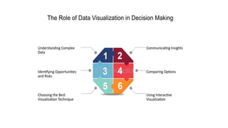
Visual analytics
• Visualanalytics is a multidisciplinary field that combines data analysis,
statistics, and data visualization to help people understand and
interpret complex datasets.
• It involves using interactive visual interfaces to allow users to explore
data and derive insights by visualizing patterns, trends, and
relationships that might otherwise be difficult to detect in raw data
alone.
4.
Key Aspects ofVisual Analytics
• Interactive Exploration:
• Visual analytics tools often provide interactive interfaces that allow users to
dynamically explore data by zooming, filtering, or drilling down into specific
data points. This enables users to engage with data more intuitively than
traditional static reports or tables.
5.
Pattern Recognition:
• Bypresenting data in visual forms, such as graphs, charts, maps, or
heatmaps, visual analytics helps users identify patterns, trends, and
anomalies. These patterns can reveal insights that are critical for
decision-making.
6.
Real-Time Analysis:
• Inmany applications, especially in fields like finance, health care, or
logistics, visual analytics supports real-time data visualization. This
allows decision-makers to quickly identify and respond to emerging
trends or issues as they happen.
7.
Data Integration
• DataIntegration: Visual analytics often involves integrating data from
various sources to provide a holistic view of the problem at hand. By
combining disparate datasets, users can gain insights that they might
miss by analyzing isolated datasets.
8.
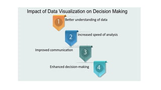
Decision Support:
• DecisionSupport:
• Visual analytics plays a significant role in decision-making. By
translating complex data into visually accessible forms, it allows
decision-makers to quickly assess situations and make informed
choices based on the insights drawn from the visualized data.
11.
Common Visual AnalyticsTools:
• Tableau: A popular tool for creating interactive visualizations.
• Power BI: Microsoft’s suite of analytics tools for interactive data
visualization and business intelligence.
• Qlik Sense: Provides associative data modeling and interactive data
exploration.
• D3.js: A JavaScript library used for creating complex, custom
interactive visualizations on the web.
12.
Benefits:
• Enhanced Decision-Making:Better understanding of data patterns
leads to more informed decisions.
• Increased Efficiency: Quickly identify issues and opportunities within
large datasets.
• Better Communication: Visualizations are often more effective than
numbers in conveying complex insights.
13.
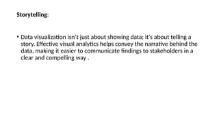
Storytelling:
• Data visualizationisn’t just about showing data; it's about telling a
story. Effective visual analytics helps convey the narrative behind the
data, making it easier to communicate findings to stakeholders in a
clear and compelling way .
15.
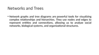
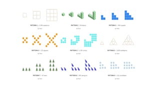
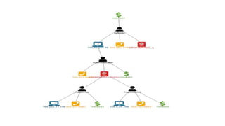
Networks and Trees
•Network graphs and tree diagrams are powerful tools for visualizing
complex relationships and hierarchies. They use nodes and edges to
represent entities and connections, allowing us to analyze social
networks, biological systems, and organizational structures.
16.
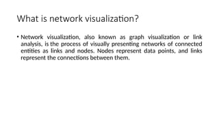
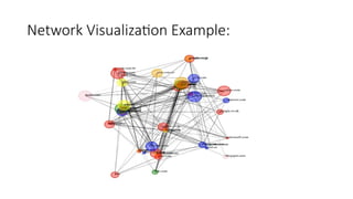
What is networkvisualization?
• Network visualization, also known as graph visualization or link
analysis, is the process of visually presenting networks of connected
entities as links and nodes. Nodes represent data points, and links
represent the connections between them.
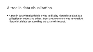
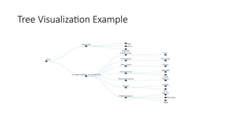
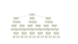
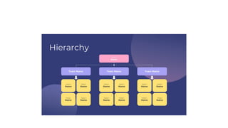
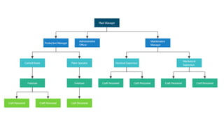
A tree indata visualization
• A tree in data visualization is a way to display hierarchical data as a
collection of nodes and edges. Trees are a common way to visualize
hierarchical data because they are easy to interpret.
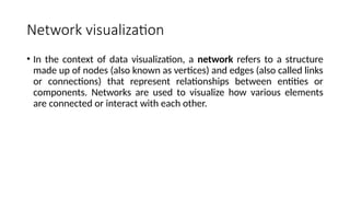
Network visualization
• Inthe context of data visualization, a network refers to a structure
made up of nodes (also known as vertices) and edges (also called links
or connections) that represent relationships between entities or
components. Networks are used to visualize how various elements
are connected or interact with each other.
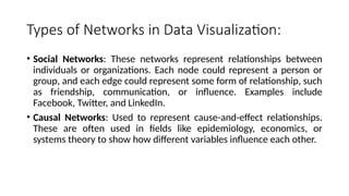
22.
Types of Networksin Data Visualization:
• Social Networks: These networks represent relationships between
individuals or organizations. Each node could represent a person or
group, and each edge could represent some form of relationship, such
as friendship, communication, or influence. Examples include
Facebook, Twitter, and LinkedIn.
• Causal Networks: Used to represent cause-and-effect relationships.
These are often used in fields like epidemiology, economics, or
systems theory to show how different variables influence each other.
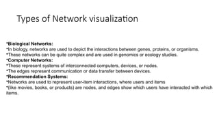
23.
Types of Networkvisualization
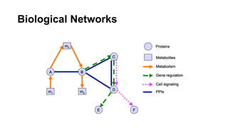
•Biological Networks:
•In biology, networks are used to depict the interactions between genes, proteins, or organisms.
•These networks can be quite complex and are used in genomics or ecology studies.
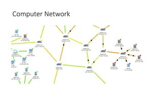
•Computer Networks:
•These represent systems of interconnected computers, devices, or nodes.
•The edges represent communication or data transfer between devices.
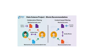
•Recommendation Systems:
•Networks are used to represent user-item interactions, where users and items
•(like movies, books, or products) are nodes, and edges show which users have interacted with which
items.
24.
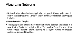
Visualizing Networks:
• Networkdata visualizations typically use graph theory principles to
depict these structures. Some of the common visualization techniques
include:
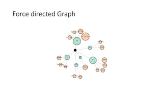
• Force-Directed Graphs:
• These graphs use physics-based simulations to position the nodes in a
way that reflects the relationships. The nodes "repel" each other
while edges "attract" them, leading to a layout where connected
nodes are grouped together.
Recommendation Systems:
•Networks areused to represent user-item interactions, where
users and items (like movies, books, or products) are nodes, and
edges show which users have interacted with which items.
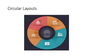
Circular Layouts:
• Nodesare arranged in a circular manner, and edges are drawn to
show relationships. This is often used for networks with a clear
hierarchical or cyclical structure.
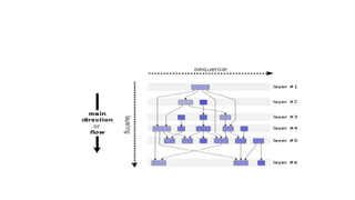
Hierarchical Layouts
• HierarchicalLayouts: These are often used for trees or directed acyclic
graphs (DAGs) to show a top-down structure where nodes are placed
based on their hierarchical relationships.
37.
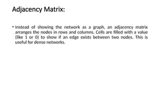
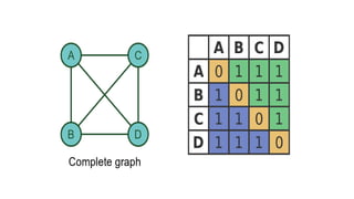
Adjacency Matrix:
• Insteadof showing the network as a graph, an adjacency matrix
arranges the nodes in rows and columns. Cells are filled with a value
(like 1 or 0) to show if an edge exists between two nodes. This is
useful for dense networks.
39.
• Chord Diagrams:Chorddiagrams are used to show relationships
between entities that can be represented in a circular layout. They are
particularly useful for showing data with multiple connections
between a limited set of items.
• .
41.
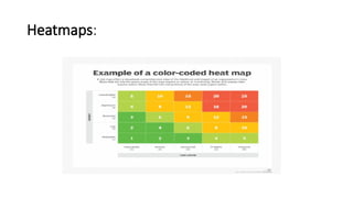
Heatmaps:
• Heatmaps: Whileoften used for displaying correlation matrices,
heatmaps can also be used to show the intensity or weight of
connections between nodes in a network
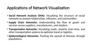
Applications of NetworkVisualization
• Social Network Analysis (SNA): Visualizing the structure of social
networks to analyze relationships, influence, and communities.
• Supply Chain Networks: Understanding the flow of goods and
services across suppliers, manufacturers, and retailers.
• Transportation Networks: Visualizing roads, airports, train lines, and
other transportation systems to optimize travel or logistics.
• Epidemiological Networks: Tracking the spread of diseases through
populations.
44.
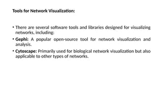
Tools for NetworkVisualization:
• There are several software tools and libraries designed for visualizing
networks, including:
• Gephi: A popular open-source tool for network visualization and
analysis.
• Cytoscape: Primarily used for biological network visualization but also
applicable to other types of networks.
45.
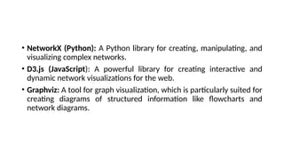
• NetworkX (Python):A Python library for creating, manipulating, and
visualizing complex networks.
• D3.js (JavaScript): A powerful library for creating interactive and
dynamic network visualizations for the web.
• Graphviz: A tool for graph visualization, which is particularly suited for
creating diagrams of structured information like flowcharts and
network diagrams.
46.
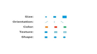
Visual Attributes indata visualization
• In data visualization, visual attributes refer to the properties of the
visual elements that represent data. These attributes play a crucial
role in helping viewers understand, interpret, and derive insights from
the data presented in a visual form. By manipulating these attributes,
you can enhance the clarity, effectiveness, and impact of your
visualization.
47.
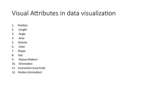
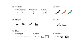
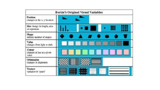
Visual Attributes indata visualization
1. Position
2. Length
3. Angle
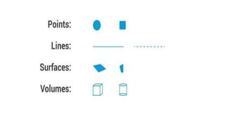
4. Area
5. Volume
6. Color
7. Shape
8. Size
9. Texture/Pattern
10. Orientation
11. Connection (Line/Link)
12. Motion (Animation)
48.
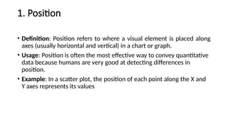
1. Position
• Definition:Position refers to where a visual element is placed along
axes (usually horizontal and vertical) in a chart or graph.
• Usage: Position is often the most effective way to convey quantitative
data because humans are very good at detecting differences in
position.
• Example: In a scatter plot, the position of each point along the X and
Y axes represents its values
50.
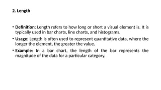
2. Length
• Definition:Length refers to how long or short a visual element is. It is
typically used in bar charts, line charts, and histograms.
• Usage: Length is often used to represent quantitative data, where the
longer the element, the greater the value.
• Example: In a bar chart, the length of the bar represents the
magnitude of the data for a particular category.
52.
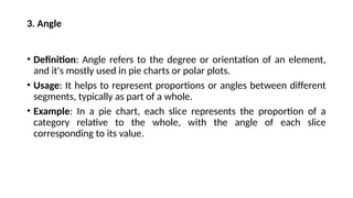
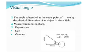
3. Angle
• Definition:Angle refers to the degree or orientation of an element,
and it's mostly used in pie charts or polar plots.
• Usage: It helps to represent proportions or angles between different
segments, typically as part of a whole.
• Example: In a pie chart, each slice represents the proportion of a
category relative to the whole, with the angle of each slice
corresponding to its value.
54.
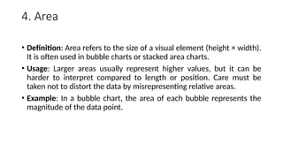
4. Area
• Definition:Area refers to the size of a visual element (height × width).
It is often used in bubble charts or stacked area charts.
• Usage: Larger areas usually represent higher values, but it can be
harder to interpret compared to length or position. Care must be
taken not to distort the data by misrepresenting relative areas.
• Example: In a bubble chart, the area of each bubble represents the
magnitude of the data point.
56.
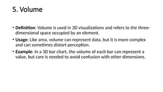
5. Volume
• Definition:Volume is used in 3D visualizations and refers to the three-
dimensional space occupied by an element.
• Usage: Like area, volume can represent data, but it is more complex
and can sometimes distort perception.
• Example: In a 3D bar chart, the volume of each bar can represent a
value, but care is needed to avoid confusion with other dimensions.
58.
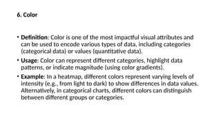
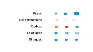
6. Color
• Definition:Color is one of the most impactful visual attributes and
can be used to encode various types of data, including categories
(categorical data) or values (quantitative data).
• Usage: Color can represent different categories, highlight data
patterns, or indicate magnitude (using color gradients).
• Example: In a heatmap, different colors represent varying levels of
intensity (e.g., from light to dark) to show differences in data values.
Alternatively, in categorical charts, different colors can distinguish
between different groups or categories.
60.
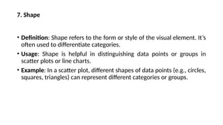
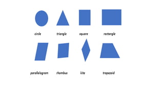
7. Shape
• Definition:Shape refers to the form or style of the visual element. It’s
often used to differentiate categories.
• Usage: Shape is helpful in distinguishing data points or groups in
scatter plots or line charts.
• Example: In a scatter plot, different shapes of data points (e.g., circles,
squares, triangles) can represent different categories or groups.
62.
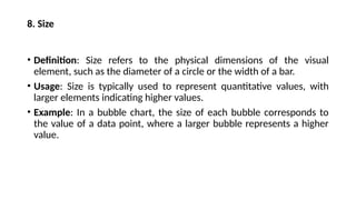
8. Size
• Definition:Size refers to the physical dimensions of the visual
element, such as the diameter of a circle or the width of a bar.
• Usage: Size is typically used to represent quantitative values, with
larger elements indicating higher values.
• Example: In a bubble chart, the size of each bubble corresponds to
the value of a data point, where a larger bubble represents a higher
value.
64.
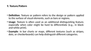
9. Texture/Pattern
• Definition:Texture or pattern refers to the design or pattern applied
to the surface of visual elements, such as bars or regions.
• Usage: Texture is often used as an additional distinguishing feature,
especially when color might be hard to differentiate (e.g., in black-
and-white print).
• Example: In bar charts or maps, different textures (such as stripes,
dots, or checkerboards) can help distinguish different categories.
66.
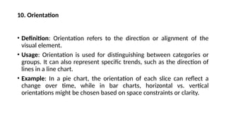
10. Orientation
• Definition:Orientation refers to the direction or alignment of the
visual element.
• Usage: Orientation is used for distinguishing between categories or
groups. It can also represent specific trends, such as the direction of
lines in a line chart.
• Example: In a pie chart, the orientation of each slice can reflect a
change over time, while in bar charts, horizontal vs. vertical
orientations might be chosen based on space constraints or clarity.
68.
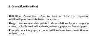
11. Connection (Line/Link)
•Definition: Connection refers to lines or links that represent
relationships or trends between data points.
• Usage: Lines connect data points to show relationships or changes in
values, typically used in line charts, network graphs, or flow diagrams.
• Example: In a line graph, a connected line shows trends over time or
ordered data.
71.
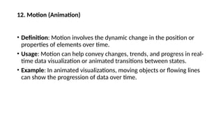
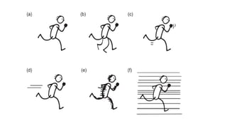
12. Motion (Animation)
•Definition: Motion involves the dynamic change in the position or
properties of elements over time.
• Usage: Motion can help convey changes, trends, and progress in real-
time data visualization or animated transitions between states.
• Example: In animated visualizations, moving objects or flowing lines
can show the progression of data over time.
73.
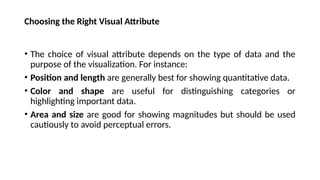
Choosing the RightVisual Attribute
• The choice of visual attribute depends on the type of data and the
purpose of the visualization. For instance:
• Position and length are generally best for showing quantitative data.
• Color and shape are useful for distinguishing categories or
highlighting important data.
• Area and size are good for showing magnitudes but should be used
cautiously to avoid perceptual errors.
74.
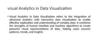
visual Analytics inData Visualization
• Visual Analytics in Data Visualization refers to the integration of
advanced analytics with interactive data visualization to enable
effective exploration and understanding of complex data. It combines
the strengths of human intuition and machine algorithms to create
powerful visual representations of data, helping users uncover
patterns, trends, and insights
75.
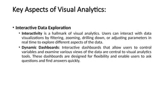
Key Aspects ofVisual Analytics:
• Interactive Data Exploration
• Interactivity is a hallmark of visual analytics. Users can interact with data
visualizations by filtering, zooming, drilling down, or adjusting parameters in
real time to explore different aspects of the data.
• Dynamic Dashboards: Interactive dashboards that allow users to control
variables and examine various views of the data are central to visual analytics
tools. These dashboards are designed for flexibility and enable users to ask
questions and find answers quickly.
77.
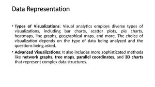
Data Representation
• Typesof Visualizations: Visual analytics employs diverse types of
visualizations, including bar charts, scatter plots, pie charts,
heatmaps, line graphs, geographical maps, and more. The choice of
visualization depends on the type of data being analyzed and the
questions being asked.
• Advanced Visualizations: It also includes more sophisticated methods
like network graphs, tree maps, parallel coordinates, and 3D charts
that represent complex data structures.
79.
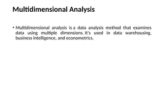
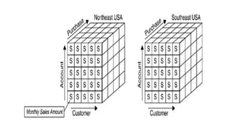
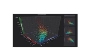
Multidimensional Analysis
• Multidimensionalanalysis is a data analysis method that examines
data using multiple dimensions. It's used in data warehousing,
business intelligence, and econometrics.
82.
Multidimensional Analysis
• BigData: Visual analytics is essential when working with big data
because it allows users to visualize and comprehend multi-
dimensional data sets that would otherwise be difficult to interpret.
• Multiple Data Sources: By combining data from various sources (e.g.,
financial data, customer data, geographic data), visual analytics
enables users to understand correlations and relationships across
different domains.
83.
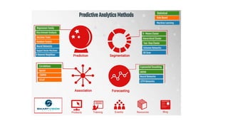
Advanced analytical techniques
•Advanced analytical techniques include data mining, machine
learning, predictive analytics, and more. These techniques help
businesses analyze data to make better decisions, improve customer
satisfaction, and prepare for future events.
84.
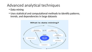
Advanced analytical techniques
•Data mining
• Uses statistical and computational methods to identify patterns,
trends, and dependencies in large datasets
85.
• Predictive analytics
•Uses data mining, machine learning, and statistical models to forecast
the likelihood of future events
87.
• Cohort analysis
•Used to trace how each cohort responds to different events, which
can improve customer retention and user engagement
88.
• Time seriesanalysis
• Deals with data collected over time, making it suitable for forecasting
and trend analysis
89.
• Machine learning
•Uses past data and experiences to create statistical models that can
produce results from data without much human interference
90.
• Regression analysis
•Used to evaluate the bond between variables and to model the future
relationship between them
91.
• Complex eventanalysis
• Analyzes event data from various sources and points out cause-and-
effect relationships
93.
Advanced Analytical Techniques
•Predictive Analytics: Visual analytics tools often integrate predictive
models, such as regression analysis, clustering, or machine learning,
which can be visualized to forecast trends or outcomes.
• Statistical Methods: Visual analytics also incorporates statistical
methods like correlation matrices, hypothesis testing, and
distributions, which are represented in charts or graphs for easier
interpretation.
94.
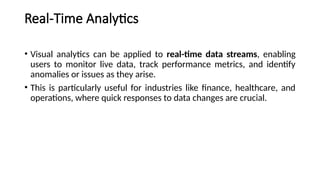
Real-Time Analytics
• Visualanalytics can be applied to real-time data streams, enabling
users to monitor live data, track performance metrics, and identify
anomalies or issues as they arise.
• This is particularly useful for industries like finance, healthcare, and
operations, where quick responses to data changes are crucial.
95.
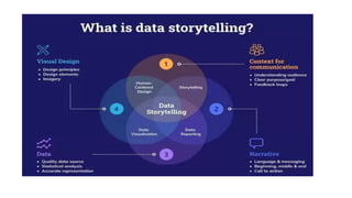
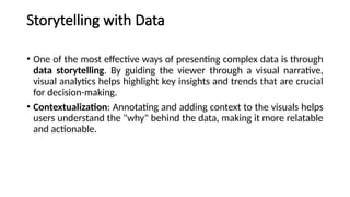
Storytelling with Data
•One of the most effective ways of presenting complex data is through
data storytelling. By guiding the viewer through a visual narrative,
visual analytics helps highlight key insights and trends that are crucial
for decision-making.
• Contextualization: Annotating and adding context to the visuals helps
users understand the "why" behind the data, making it more relatable
and actionable.
96.
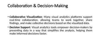
Collaboration & Decision-Making
•Collaborative Visualization: Many visual analytics platforms support
real-time collaboration, allowing teams to work together, share
findings, and make collective decisions based on the visualized data.
• Decision Support: Visual analytics tools empower decision-makers by
presenting data in a way that simplifies the analysis, helping them
make informed decisions faster.
97.
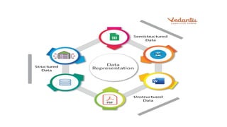
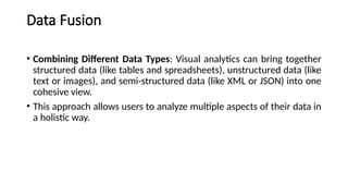
Data Fusion
• CombiningDifferent Data Types: Visual analytics can bring together
structured data (like tables and spreadsheets), unstructured data (like
text or images), and semi-structured data (like XML or JSON) into one
cohesive view.
• This approach allows users to analyze multiple aspects of their data in
a holistic way.
98.
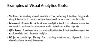
Examples of VisualAnalytics Tools:
• Tableau: A leading visual analytics tool, offering intuitive drag-and-
drop interfaces to create interactive visualizations and dashboards.
• Microsoft Power BI: A business analytics tool that allows users to
connect to various data sources and create interactive reports.
• Qlik Sense: A self-service data visualization tool that enables users to
explore data and discover insights.
• D3.js: A JavaScript library for creating customized, dynamic data
visualizations in web browsers.
99.
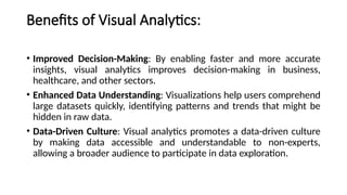
Benefits of VisualAnalytics:
• Improved Decision-Making: By enabling faster and more accurate
insights, visual analytics improves decision-making in business,
healthcare, and other sectors.
• Enhanced Data Understanding: Visualizations help users comprehend
large datasets quickly, identifying patterns and trends that might be
hidden in raw data.
• Data-Driven Culture: Visual analytics promotes a data-driven culture
by making data accessible and understandable to non-experts,
allowing a broader audience to participate in data exploration.
100.
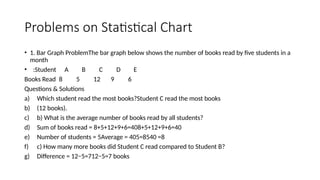
Problems on StatisticalChart
• 1. Bar Graph ProblemThe bar graph below shows the number of books read by five students in a
month
• :Student A B C D E
Books Read 8 5 12 9 6
Questions & Solutions
a) Which student read the most books?Student C read the most books
b) (12 books).
c) b) What is the average number of books read by all students?
d) Sum of books read = 8+5+12+9+6=408+5+12+9+6=40
e) Number of students = 5Average = 405=8540=8
f) c) How many more books did Student C read compared to Student B?
g) Difference = 12−5=712−5=7 books
101.
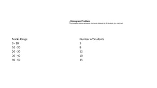
Marks Range Numberof Students
0 - 10 5
10 - 20 8
20 - 30 12
30 - 40 10
40 - 50 15
. Histogram Problem
The histogram below represents the marks obtained by 50 students in a math test:
102.
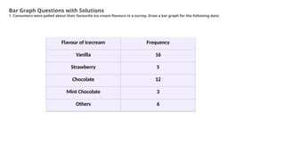
Flavour of IcecreamFrequency
Vanilla 16
Strawberry 5
Chocolate 12
Mint Chocolate 3
Others 6
Bar Graph Questions with Solutions
1. Consumers were polled about their favourite ice cream flavours in a survey. Draw a bar graph for the following data:
103.
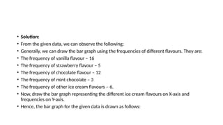
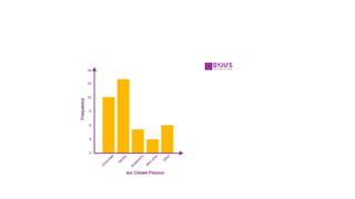
• Solution:
• Fromthe given data, we can observe the following:
• Generally, we can draw the bar graph using the frequencies of different flavours. They are:
• The frequency of vanilla flavour – 16
• The frequency of strawberry flavour – 5
• The frequency of chocolate flavour – 12
• The frequency of mint chocolate – 3
• The frequency of other ice cream flavours – 6.
• Now, draw the bar graph representing the different ice cream flavours on X-axis and
frequencies on Y-axis.
• Hence, the bar graph for the given data is drawn as follows:
105.
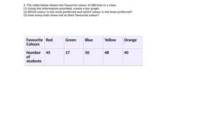
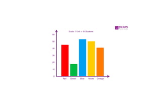
Favourite
Colours
Red Green BlueYellow Orange
Number
of
students
45 17 50 48 40
2. The table below shows the favourite colour of 200 kids in a class.
(1) Using the information provided, create a bar graph.
(2) Which colour is the most preferred and which colour is the least preferred?
(3) How many kids chose red as their favourite colour?
106.
• Solution:
• (1)First, we select an appropriate scale and begin at zero.
• Because the data’s highest value is 50, we know that all of the bars
will fall between 0 and 50, and we’ll choose a scale that keeps the
length between 0 and 50.
• For every 10 students, we take 1 unit. The graph is then drawn and
labelled as seen in the figure.