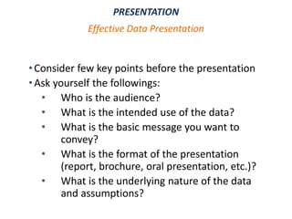
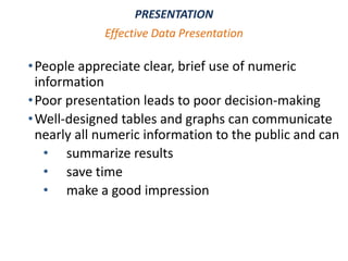
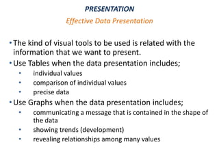
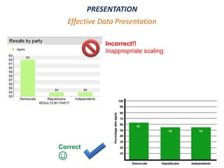
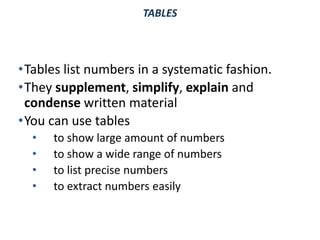
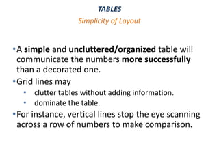
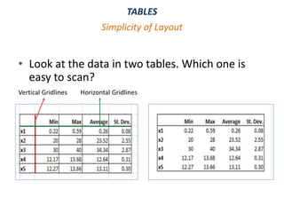
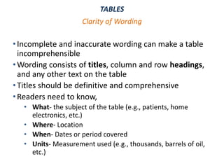
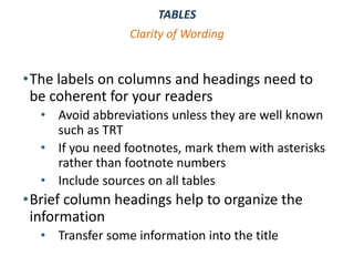
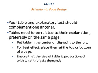
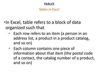
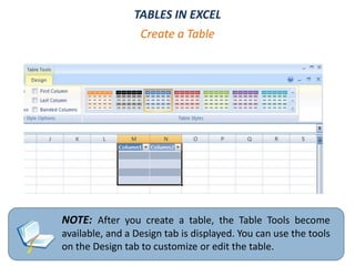
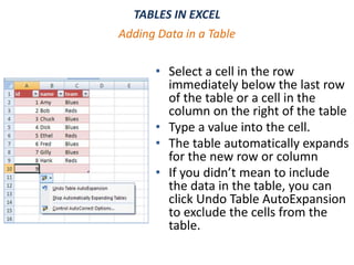
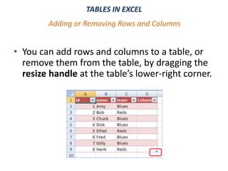
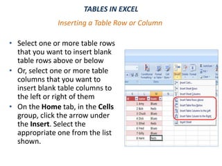
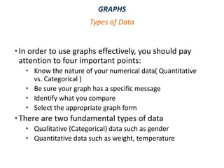
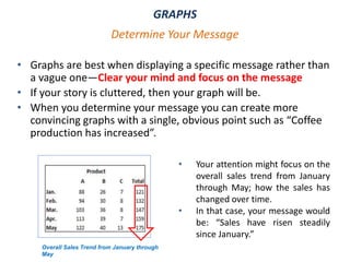
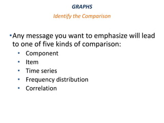
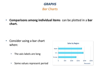
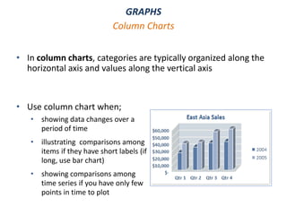
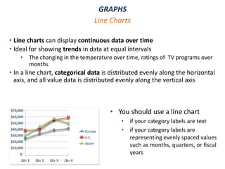
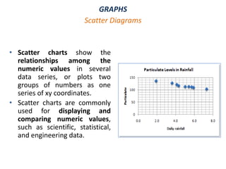
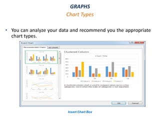
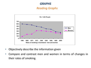
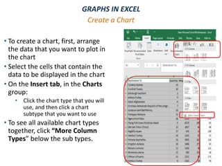
DATA ANALYSIS
MS OFFICE EXCEL - PART II
WEEK 9
DATA ANALYSIS - MS EXCEL
Objectives
At the end of this chapter you will learn data
analysis and Excel basics on how to:
•Represent results of an analysis visually
•Prepare a professional looking table and realize
its importance
•Summarize data by using charts and graphs
•Interpreting the result of an analysis
DATA ANALYSIS - MS EXCEL
Table of Contents
PRESENTING YOUR DATA
1. Effective Data Presentation
2. Tables
i. Simplicity of Layout
ii. Clarity of Wording
iii. Attention to Page Design
iv. Use of Tables in Microsoft Excel
3. Graphs
i. Determine Your Message
ii. Identify your Data and Type of Comparison
iii. Select the Appropriate Graph Form
iv. Use of Graphs in Microsoft Excel
•After analyzing data, we present results to the intended
audience
•Before you decide on how to present the data
• step back for a moment
• think carefully about what you want to say
•Present results in a way that is understandable to the
audience
•Effective data presentation requires understanding:
• the type of data to be utilized
• who the intended audience is
• how the information will be used
PRESENTATION
Effective Data Presentation
•Consider few key points before the presentation
•Ask yourself the followings:
• Who is the audience?
• What is the intended use of the data?
• What is the basic message you want to
convey?
• What is the format of the presentation
(report, brochure, oral presentation, etc.)?
• What is the underlying nature of the data
and assumptions?
PRESENTATION
Effective Data Presentation
•People appreciate clear, brief use of numeric
information
•Poor presentation leads to poor decision-making
•Well-designed tables and graphs can communicate
nearly all numeric information to the public and can
• summarize results
• save time
• make a good impression
PRESENTATION
Effective Data Presentation
•The kind of visual tools to be used is related with the
information that we want to present.
•Use Tables when the data presentation includes;
• individual values
• comparison of individual values
• precise data
•Use Graphs when the data presentation includes;
• communicating a message that is contained in the shape of
the data
• showing trends (development)
• revealing relationships among many values
PRESENTATION
Effective Data Presentation
•Mistakes in presentation may distort the results and mislead
the audience;
• Using unsuitable tools
• Presenting data in a way that is not appropriate for the
situation
• The question is: “agreement with the court's decision on a
case”
• Results: ," 62% of Democratic respondents agreed,
compared to 54% of Republicans, and 54% of Independents
PRESENTATION
Common Mistakes in Data Presentation
PRESENTATION
Effective Data Presentation
Incorrect!!
Inappropriate scaling
Correct
☺
TABLES
•Tables list numbers in a systematic fashion.
•They supplement, simplify, explain and
condense written material
•You can use tables
• to show large amount of numbers
• to show a wide range of numbers
• to list precise numbers
• to extract numbers easily
TABLES
•A simple and uncluttered/organized table will
communicate the numbers more successfully
than a decorated one.
•Grid lines may
• clutter tables without adding information.
• dominate the table.
•For instance, vertical lines stop the eye scanning
across a row of numbers to make comparison.
Simplicity of Layout
TABLES
• Look at the data in two tables. Which one is
easy to scan?
Simplicity of Layout
Vertical Gridlines Horizontal Gridlines
TABLES
•Incomplete and inaccurate wording can make a table
incomprehensible
•Wording consists of titles, column and row headings,
and any other text on the table
•Titles should be definitive and comprehensive
•Readers need to know,
• What- the subject of the table (e.g., patients, home
electronics, etc.)
• Where- Location
• When- Dates or period covered
• Units- Measurement used (e.g., thousands, barrels of oil,
etc.)
Clarity of Wording
TABLES
•The labels on columns and headings need to
be coherent for your readers
• Avoid abbreviations unless they are well known
such as TRT
• If you need footnotes, mark them with asterisks
rather than footnote numbers
• Include sources on all tables
•Brief column headings help to organize the
information
• Transfer some information into the title
Clarity of Wording
TABLES
•Your table and explanatory text should
complement one another.
•Tables need to be related to their explanation,
preferably on the same page.
• Put table in the center or aligned it to the left.
• For best effect, place them at the top or bottom
of a page.
• Ensure that the size of table is proportioned
with what the data demands
Attention to Page Design
TABLES
•In Excel, table refers to a block of data
organized such that
• Each row refers to an item (a person in an
address list, a product in a product catalog,
and so on)
• Each column contains one piece of
information about that item (the postal code
of a contact, the catalog number of a product,
and so on)
Tables in Excel
TABLES
•Typically, the worksheet range defined as a table should
have the following characteristics:
• The top row should consist labels,
• with each label describing the contents of the
• column beneath it.
• Each label should be unique. (The labels row is not compulsory,
but if you omit it, Excel will generate one for you using default
column names.)
• Each column should contain the same kind of information.
• Each category of information that you want to be able to sort by,
search on, or otherwise manipulate individually should occupy a
separate column.
Tables in Excel
TABLES
•You can use the following features of the Excel
to manage data in a table;
• Formatting table data
• Inserting and deleting table rows and columns
• Sorting and filtering
Tables in Excel
TABLES IN EXCEL
• After you have some data in a worksheet range, you
can designate that range as a table by :
Create a Table
• Insert tab
• Select the range of cells that
you want to include in the
table.
• On the Insert tab, in the Table
group, click Table.
• If the selected range contains
column headers, select the My
table has headers check box.
TABLES IN EXCEL
•Another way of creating
table, from Home tab;
• Select the headers and
data
• On the Home tab, in
the Styles group, click
Format as Table.
• From the gallery shown,
click the style you want
to apply to the table.
Create a Table
NOTE: After you create a table, the Table Tools become
available, and a Design tab is displayed. You can use the tools
on the Design tab to customize or edit the table.
Create a Table
TABLES IN EXCEL
TABLES IN EXCEL
• Select a cell in the row
immediately below the last row
of the table or a cell in the
column on the right of the table
• Type a value into the cell.
• The table automatically expands
for the new row or column
• If you didn’t mean to include
the data in the table, you can
click Undo Table AutoExpansion
to exclude the cells from the
table.
Adding Data in a Table
TABLES IN EXCEL
• You can add rows and columns to a table, or
remove them from the table, by dragging the
resize handle at the table’s lower-right corner.
Adding or Removing Rows and Columns
TABLES IN EXCEL
• Select one or more table rows
that you want to insert blank
table rows above or below
• Or, select one or more table
columns that you want to
insert blank table columns to
the left or right of them
• On the Home tab, in the Cells
group, click the arrow under
the Insert. Select the
appropriate one from the list
shown.
Inserting a Table Row or Column
GRAPHS
• Graphs are often excellent ways to display your results
• They surpass tables in demonstrating patterns and
relationships that are difficult to see in tables or
difficult to explain in words
• Images can communicate faster than words or lists of
numbers (“A picture is worth thousand words.”)
• Knowledge of effective charting methods allows one
to present numerical information in a visually-
appealing way.
GRAPHS
•In order to use graphs effectively, you should pay
attention to four important points:
• Know the nature of your numerical data( Quantitative
vs. Categorical )
• Be sure your graph has a specific message
• Identify what you compare
• Select the appropriate graph form
•There are two fundamental types of data
• Qualitative (Categorical) data such as gender
• Quantitative data such as weight, temperature
Types of Data
GRAPHS
• Graphs are best when displaying a specific message rather than
a vague one—Clear your mind and focus on the message
• If your story is cluttered, then your graph will be.
• When you determine your message you can create more
convincing graphs with a single, obvious point such as “Coffee
production has increased”.
Determine Your Message
Overall Sales Trend from January through
May
• Your attention might focus on the
overall sales trend from January
through May; how the sales has
changed over time.
• In that case, your message would
be: “Sales have risen steadily
since January.”
GRAPHS
•Any message you want to emphasize will lead
to one of five kinds of comparison:
• Component
• Item
• Time series
• Frequency distribution
• Correlation
Identify the Comparison
GRAPHS
1. Component comparison shows the size of each part as a
percentage of the total. Keywords in your message can be:
• share , percentage of total, accounted for X percent
2. Item comparison compares how things rank. Words indicating
an item comparison:
• large than, smaller than, equal to
3. Time series comparison shows how parts change over time,
whether trend changes over weeks, months and quarters.
Clues to look for in your message:
• change, grow, increase, decrease, rise, decline, fluctuate
Identify the Comparison
GRAPHS
4. Frequency distribution comparison shows how many
items fall into a series of progressive numerical range.
Terms to look for:
• x to y range, concentration, frequency and distribution
5. Correlation comparison shows whether the relationship
between two variables follows or fails to follow. Clues in
your messages:
• related to, increases with, decreases with, changes with, varies
with, or the converse such as doesn’t increase with
Identify the Comparison
GRAPHS
• Choosing the right graph is important because some types of
graphs are appropriate for specific data
• According to comparison that you used, you will choose one of
the five basic graph forms:
• Pie Charts
• Bar Charts
• Column Charts
• Line Charts
• Scatter Diagrams
Select the Appropriate Graph Form
GRAPHS
• A component comparison can best be demonstrated using a pie
chart
• Because a circle gives an impression of being a total, a pie chart is
ideally suited for showing the size of each part as a percentage of
the whole.
Pie Charts
• When to use pie chart:
• You only have one data series that you
want to plot
• None of the values that you want to plot
are negative
• Almost none of the values that you want to
plot are zero values
• You don't have more than seven categories
GRAPHS
• Comparisons among individual items can be plotted in a bar
chart.
Bar Charts
• Consider using a bar chart
when:
• The axis labels are long
• Some values represent period
GRAPHS
• In column charts, categories are typically organized along the
horizontal axis and values along the vertical axis
Column Charts
• Use column chart when;
• showing data changes over a
period of time
• illustrating comparisons among
items if they have short labels (if
long, use bar chart)
• showing comparisons among
time series if you have only few
points in time to plot
GRAPHS
• Line charts can display continuous data over time
• Ideal for showing trends in data at equal intervals
• The changing in the temperature over time, ratings of TV programs over
months
• In a line chart, categorical data is distributed evenly along the horizontal
axis, and all value data is distributed evenly along the vertical axis
Line Charts
• You should use a line chart
• if your category labels are text
• if your category labels are
representing evenly spaced values
such as months, quarters, or fiscal
years
GRAPHS
• Scatter charts show the
relationships among the
numeric values in several
data series, or plots two
groups of numbers as one
series of xy coordinates.
• Scatter charts are commonly
used for displaying and
comparing numeric values,
such as scientific, statistical,
and engineering data.
Scatter Diagrams
GRAPHS
• Bar Charts are used for showing comparison among categorical
data
• Column charts are used to illustrate comparisons among items ,
to show frequency distribution, to illustrate comparisons among
time series if you have only a few points in time to plot .
• Line Charts are used to display continuous data over time. If you
have many time points to plot, line charts are more suitable
than column charts.
• Pie charts are used to show parts of a whole data usually
expressed in percentages.
• Scatter diagrams are used for the relationship between two
quantitative variables.
Summary
GRAPHS
• You can analyze your data and recommend you the appropriate
chart types.
Chart Types
Insert Chart Box
GRAPHS
• Objectively describe the information given
• Compare and contrast men and women in terms of changes in
their rates of smoking.
Reading Graphs
GRAPHS IN EXCEL
• To create a chart, first, arrange
the data that you want to plot in
the chart
• Select the cells that contain the
data to be displayed in the chart
• On the Insert tab, in the Charts
group:
• Click the chart type that you will
use, and then click a chart
subtype that you want to use
• To see all available chart types
together, click “More Column
Types” below the sub types.
Create a Chart
GRAPHS IN EXCEL
NOTE : The chart will be placed on the worksheet in embedded form.
Create a Chart
Charts
GRAPHS IN EXCEL
If you have already have a chart, but you just want to change its
type
• Select the chart, click the Design tab, and click Change
Chart Type.
• Choose a new chart type in the Change Chart Type box.
Changing Chart Type
Available chart types in Office
GRAPHS IN EXCEL
To add new data series to an existing chart:
• Click the chart that you want to add data series. This will display
the Chart Tools, including Design, Layout, and Format tabs
• Under Chart Tools, on the Design tab, in the Data group, click
Select Data
Changing Data Sources
• This displays Select Data
Source dialog box
• Under Legend Entries (Series),
click Add.
GRAPHS IN EXCEL
• In the Series Name box, type the
name that you want to use for the
series, or select the name from the
worksheet.
• In the Series Values box, type the
reference of the data range to be
included, or select the range from
the worksheet.
Changing Data Sources
Edit Series Box
GRAPHS IN EXCEL
You can also remove data series from an existing chart:
• Click the chart from which you want to remove data
series. Chart Tools will appear.
• Under Chart Tools, On the Design tab, in the Data
group, click Select Data.
• This displays Select Data
Sources dialog box
• Under Legend Entries (Series),
select the series that you want
to remove and then click
Remove.
Changing Data Sources
Quick Analysis
• Quick Analysis button
appears as you select data.
• It allows you to instantly
analyze your data by using
Quick Analysis menu.
• Quick Analysis menu
provides great
convenience when
preparing your data for
presentation.
Quick Analysis Menu
Quick Analysis Tool
References
1. Microsoft Office Support, https://support.office.com/en-us/article/create-a-chart-from-start-to-finish-
0baf399e-dd61-4e18-8a73-b3fd5d5680c2 Last visit: January, 2019
2. Microsoft Office Support, https://support.office.com/en-us/article/available-chart-types-in-office-
a6187218-807e-4103-9e0a-27cdb19afb90 Last visit: January, 2019

IS100 Week 9

  • 1.
    DATA ANALYSIS MS OFFICEEXCEL - PART II WEEK 9
  • 2.
    DATA ANALYSIS -MS EXCEL Objectives At the end of this chapter you will learn data analysis and Excel basics on how to: •Represent results of an analysis visually •Prepare a professional looking table and realize its importance •Summarize data by using charts and graphs •Interpreting the result of an analysis
  • 3.
    DATA ANALYSIS -MS EXCEL Table of Contents PRESENTING YOUR DATA 1. Effective Data Presentation 2. Tables i. Simplicity of Layout ii. Clarity of Wording iii. Attention to Page Design iv. Use of Tables in Microsoft Excel 3. Graphs i. Determine Your Message ii. Identify your Data and Type of Comparison iii. Select the Appropriate Graph Form iv. Use of Graphs in Microsoft Excel
  • 4.
    •After analyzing data,we present results to the intended audience •Before you decide on how to present the data • step back for a moment • think carefully about what you want to say •Present results in a way that is understandable to the audience •Effective data presentation requires understanding: • the type of data to be utilized • who the intended audience is • how the information will be used PRESENTATION Effective Data Presentation
  • 5.
    •Consider few keypoints before the presentation •Ask yourself the followings: • Who is the audience? • What is the intended use of the data? • What is the basic message you want to convey? • What is the format of the presentation (report, brochure, oral presentation, etc.)? • What is the underlying nature of the data and assumptions? PRESENTATION Effective Data Presentation
  • 6.
    •People appreciate clear,brief use of numeric information •Poor presentation leads to poor decision-making •Well-designed tables and graphs can communicate nearly all numeric information to the public and can • summarize results • save time • make a good impression PRESENTATION Effective Data Presentation
  • 7.
    •The kind ofvisual tools to be used is related with the information that we want to present. •Use Tables when the data presentation includes; • individual values • comparison of individual values • precise data •Use Graphs when the data presentation includes; • communicating a message that is contained in the shape of the data • showing trends (development) • revealing relationships among many values PRESENTATION Effective Data Presentation
  • 8.
    •Mistakes in presentationmay distort the results and mislead the audience; • Using unsuitable tools • Presenting data in a way that is not appropriate for the situation • The question is: “agreement with the court's decision on a case” • Results: ," 62% of Democratic respondents agreed, compared to 54% of Republicans, and 54% of Independents PRESENTATION Common Mistakes in Data Presentation
  • 9.
  • 10.
    TABLES •Tables list numbersin a systematic fashion. •They supplement, simplify, explain and condense written material •You can use tables • to show large amount of numbers • to show a wide range of numbers • to list precise numbers • to extract numbers easily
  • 11.
    TABLES •A simple anduncluttered/organized table will communicate the numbers more successfully than a decorated one. •Grid lines may • clutter tables without adding information. • dominate the table. •For instance, vertical lines stop the eye scanning across a row of numbers to make comparison. Simplicity of Layout
  • 12.
    TABLES • Look atthe data in two tables. Which one is easy to scan? Simplicity of Layout Vertical Gridlines Horizontal Gridlines
  • 13.
    TABLES •Incomplete and inaccuratewording can make a table incomprehensible •Wording consists of titles, column and row headings, and any other text on the table •Titles should be definitive and comprehensive •Readers need to know, • What- the subject of the table (e.g., patients, home electronics, etc.) • Where- Location • When- Dates or period covered • Units- Measurement used (e.g., thousands, barrels of oil, etc.) Clarity of Wording
  • 14.
    TABLES •The labels oncolumns and headings need to be coherent for your readers • Avoid abbreviations unless they are well known such as TRT • If you need footnotes, mark them with asterisks rather than footnote numbers • Include sources on all tables •Brief column headings help to organize the information • Transfer some information into the title Clarity of Wording
  • 15.
    TABLES •Your table andexplanatory text should complement one another. •Tables need to be related to their explanation, preferably on the same page. • Put table in the center or aligned it to the left. • For best effect, place them at the top or bottom of a page. • Ensure that the size of table is proportioned with what the data demands Attention to Page Design
  • 16.
    TABLES •In Excel, tablerefers to a block of data organized such that • Each row refers to an item (a person in an address list, a product in a product catalog, and so on) • Each column contains one piece of information about that item (the postal code of a contact, the catalog number of a product, and so on) Tables in Excel
  • 17.
    TABLES •Typically, the worksheetrange defined as a table should have the following characteristics: • The top row should consist labels, • with each label describing the contents of the • column beneath it. • Each label should be unique. (The labels row is not compulsory, but if you omit it, Excel will generate one for you using default column names.) • Each column should contain the same kind of information. • Each category of information that you want to be able to sort by, search on, or otherwise manipulate individually should occupy a separate column. Tables in Excel
  • 18.
    TABLES •You can usethe following features of the Excel to manage data in a table; • Formatting table data • Inserting and deleting table rows and columns • Sorting and filtering Tables in Excel
  • 19.
    TABLES IN EXCEL •After you have some data in a worksheet range, you can designate that range as a table by : Create a Table • Insert tab • Select the range of cells that you want to include in the table. • On the Insert tab, in the Table group, click Table. • If the selected range contains column headers, select the My table has headers check box.
  • 20.
    TABLES IN EXCEL •Anotherway of creating table, from Home tab; • Select the headers and data • On the Home tab, in the Styles group, click Format as Table. • From the gallery shown, click the style you want to apply to the table. Create a Table
  • 21.
    NOTE: After youcreate a table, the Table Tools become available, and a Design tab is displayed. You can use the tools on the Design tab to customize or edit the table. Create a Table TABLES IN EXCEL
  • 22.
    TABLES IN EXCEL •Select a cell in the row immediately below the last row of the table or a cell in the column on the right of the table • Type a value into the cell. • The table automatically expands for the new row or column • If you didn’t mean to include the data in the table, you can click Undo Table AutoExpansion to exclude the cells from the table. Adding Data in a Table
  • 23.
    TABLES IN EXCEL •You can add rows and columns to a table, or remove them from the table, by dragging the resize handle at the table’s lower-right corner. Adding or Removing Rows and Columns
  • 24.
    TABLES IN EXCEL •Select one or more table rows that you want to insert blank table rows above or below • Or, select one or more table columns that you want to insert blank table columns to the left or right of them • On the Home tab, in the Cells group, click the arrow under the Insert. Select the appropriate one from the list shown. Inserting a Table Row or Column
  • 25.
    GRAPHS • Graphs areoften excellent ways to display your results • They surpass tables in demonstrating patterns and relationships that are difficult to see in tables or difficult to explain in words • Images can communicate faster than words or lists of numbers (“A picture is worth thousand words.”) • Knowledge of effective charting methods allows one to present numerical information in a visually- appealing way.
  • 26.
    GRAPHS •In order touse graphs effectively, you should pay attention to four important points: • Know the nature of your numerical data( Quantitative vs. Categorical ) • Be sure your graph has a specific message • Identify what you compare • Select the appropriate graph form •There are two fundamental types of data • Qualitative (Categorical) data such as gender • Quantitative data such as weight, temperature Types of Data
  • 27.
    GRAPHS • Graphs arebest when displaying a specific message rather than a vague one—Clear your mind and focus on the message • If your story is cluttered, then your graph will be. • When you determine your message you can create more convincing graphs with a single, obvious point such as “Coffee production has increased”. Determine Your Message Overall Sales Trend from January through May • Your attention might focus on the overall sales trend from January through May; how the sales has changed over time. • In that case, your message would be: “Sales have risen steadily since January.”
  • 28.
    GRAPHS •Any message youwant to emphasize will lead to one of five kinds of comparison: • Component • Item • Time series • Frequency distribution • Correlation Identify the Comparison
  • 29.
    GRAPHS 1. Component comparisonshows the size of each part as a percentage of the total. Keywords in your message can be: • share , percentage of total, accounted for X percent 2. Item comparison compares how things rank. Words indicating an item comparison: • large than, smaller than, equal to 3. Time series comparison shows how parts change over time, whether trend changes over weeks, months and quarters. Clues to look for in your message: • change, grow, increase, decrease, rise, decline, fluctuate Identify the Comparison
  • 30.
    GRAPHS 4. Frequency distributioncomparison shows how many items fall into a series of progressive numerical range. Terms to look for: • x to y range, concentration, frequency and distribution 5. Correlation comparison shows whether the relationship between two variables follows or fails to follow. Clues in your messages: • related to, increases with, decreases with, changes with, varies with, or the converse such as doesn’t increase with Identify the Comparison
  • 31.
    GRAPHS • Choosing theright graph is important because some types of graphs are appropriate for specific data • According to comparison that you used, you will choose one of the five basic graph forms: • Pie Charts • Bar Charts • Column Charts • Line Charts • Scatter Diagrams Select the Appropriate Graph Form
  • 32.
    GRAPHS • A componentcomparison can best be demonstrated using a pie chart • Because a circle gives an impression of being a total, a pie chart is ideally suited for showing the size of each part as a percentage of the whole. Pie Charts • When to use pie chart: • You only have one data series that you want to plot • None of the values that you want to plot are negative • Almost none of the values that you want to plot are zero values • You don't have more than seven categories
  • 33.
    GRAPHS • Comparisons amongindividual items can be plotted in a bar chart. Bar Charts • Consider using a bar chart when: • The axis labels are long • Some values represent period
  • 34.
    GRAPHS • In columncharts, categories are typically organized along the horizontal axis and values along the vertical axis Column Charts • Use column chart when; • showing data changes over a period of time • illustrating comparisons among items if they have short labels (if long, use bar chart) • showing comparisons among time series if you have only few points in time to plot
  • 35.
    GRAPHS • Line chartscan display continuous data over time • Ideal for showing trends in data at equal intervals • The changing in the temperature over time, ratings of TV programs over months • In a line chart, categorical data is distributed evenly along the horizontal axis, and all value data is distributed evenly along the vertical axis Line Charts • You should use a line chart • if your category labels are text • if your category labels are representing evenly spaced values such as months, quarters, or fiscal years
  • 36.
    GRAPHS • Scatter chartsshow the relationships among the numeric values in several data series, or plots two groups of numbers as one series of xy coordinates. • Scatter charts are commonly used for displaying and comparing numeric values, such as scientific, statistical, and engineering data. Scatter Diagrams
  • 37.
    GRAPHS • Bar Chartsare used for showing comparison among categorical data • Column charts are used to illustrate comparisons among items , to show frequency distribution, to illustrate comparisons among time series if you have only a few points in time to plot . • Line Charts are used to display continuous data over time. If you have many time points to plot, line charts are more suitable than column charts. • Pie charts are used to show parts of a whole data usually expressed in percentages. • Scatter diagrams are used for the relationship between two quantitative variables. Summary
  • 38.
    GRAPHS • You cananalyze your data and recommend you the appropriate chart types. Chart Types Insert Chart Box
  • 39.
    GRAPHS • Objectively describethe information given • Compare and contrast men and women in terms of changes in their rates of smoking. Reading Graphs
  • 40.
    GRAPHS IN EXCEL •To create a chart, first, arrange the data that you want to plot in the chart • Select the cells that contain the data to be displayed in the chart • On the Insert tab, in the Charts group: • Click the chart type that you will use, and then click a chart subtype that you want to use • To see all available chart types together, click “More Column Types” below the sub types. Create a Chart
  • 41.
    GRAPHS IN EXCEL NOTE: The chart will be placed on the worksheet in embedded form. Create a Chart Charts
  • 42.
    GRAPHS IN EXCEL Ifyou have already have a chart, but you just want to change its type • Select the chart, click the Design tab, and click Change Chart Type. • Choose a new chart type in the Change Chart Type box. Changing Chart Type Available chart types in Office
  • 43.
    GRAPHS IN EXCEL Toadd new data series to an existing chart: • Click the chart that you want to add data series. This will display the Chart Tools, including Design, Layout, and Format tabs • Under Chart Tools, on the Design tab, in the Data group, click Select Data Changing Data Sources • This displays Select Data Source dialog box • Under Legend Entries (Series), click Add.
  • 44.
    GRAPHS IN EXCEL •In the Series Name box, type the name that you want to use for the series, or select the name from the worksheet. • In the Series Values box, type the reference of the data range to be included, or select the range from the worksheet. Changing Data Sources Edit Series Box
  • 45.
    GRAPHS IN EXCEL Youcan also remove data series from an existing chart: • Click the chart from which you want to remove data series. Chart Tools will appear. • Under Chart Tools, On the Design tab, in the Data group, click Select Data. • This displays Select Data Sources dialog box • Under Legend Entries (Series), select the series that you want to remove and then click Remove. Changing Data Sources
  • 46.
    Quick Analysis • QuickAnalysis button appears as you select data. • It allows you to instantly analyze your data by using Quick Analysis menu. • Quick Analysis menu provides great convenience when preparing your data for presentation. Quick Analysis Menu Quick Analysis Tool
  • 47.
    References 1. Microsoft OfficeSupport, https://support.office.com/en-us/article/create-a-chart-from-start-to-finish- 0baf399e-dd61-4e18-8a73-b3fd5d5680c2 Last visit: January, 2019 2. Microsoft Office Support, https://support.office.com/en-us/article/available-chart-types-in-office- a6187218-807e-4103-9e0a-27cdb19afb90 Last visit: January, 2019

Editor's Notes

  • #10 Graph 1: Results were displayed along a very narrow scale (1) of percentage points, and thus appeared to show a large gap between Democrats and Republicans/Independents. This presentation obscures the poll's finding that majorities of all the groups sampled agreed with the decision.
  • #11 Demonstration tables organize selected numbers to show a particular point. Most tables used in reports, at meetings and in publications are demonstration tables. Reference tables provide exact and comprehensive information. Train schedules, sport scores and stock market listings are examples of reference tables.
  • #25 To insert table rows, click Insert Table Rows Above. To insert a table row below the last row, click Insert Table Row Below. To insert table columns, click Insert Table Columns to the Left. To insert a table column to the right of the last column, click Insert Table Column to the Right.
  • #28  Choosing a graph form without a message in mind is like trying to color coordinate your wardrobe while blindfolded. Choosing the correct graph form depends completely on your being clear about what your message is.
  • #40 The graph compares the rate of smoking in men and women in Some land between the years 1960 and 2000. It can be clearly seen that the rate of smoking for both men and women is currently declining and that fewer women have smoked throughout the period.