Magazine Assignment: Double Page Spread
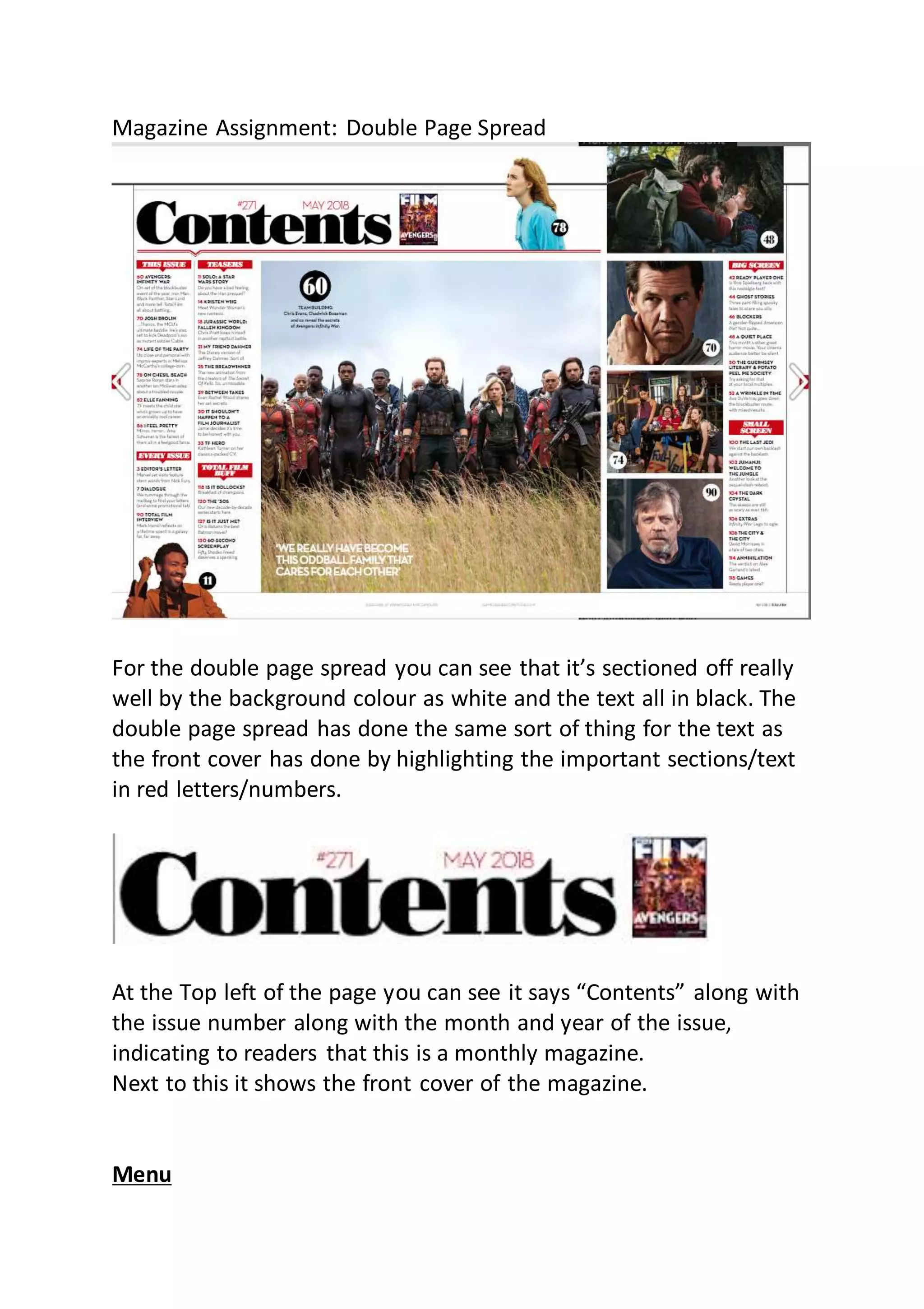
For the double page spread you can see that it’s sectioned off really
well by the background colour as white and the text all in black. The
double page spread has done the same sort of thing for the text as
the front cover has done by highlighting the important sections/text
in red letters/numbers.
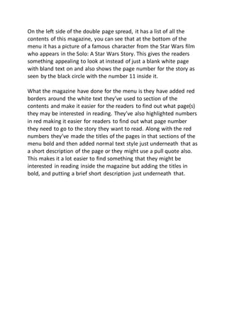
At the Top left of the page you can see it says “Contents” along with
the issue number along with the month and year of the issue,
indicating to readers that this is a monthly magazine.
Next to this it shows the front cover of the magazine.
Menu
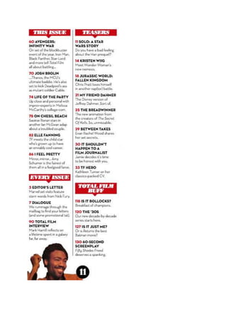
On the left side of the double page spread, it has a list of all the
contents of this magazine, you can see that at the bottom of the
menu it has a picture of a famous character from the Star Wars film
who appears in the Solo: A Star Wars Story. This gives the readers
something appealing to look at instead of just a blank white page
with bland text on and also shows the page number for the story as
seen by the black circle with the number 11 inside it.
What the magazine have done for the menu is they have added red
borders around the white text they’ve used to section of the
contents and make it easier for the readers to find out what page(s)
they may be interested in reading. They’ve also highlighted numbers
in red making it easier for readers to find out what page number
they need to go to the story they want to read. Along with the red
numbers they’ve made the titles of the pages in that sections of the
menu bold and then added normal text style just underneath that as
a short description of the page or they might use a pull quote also.
This makes it a lot easier to find something that they might be
interested in reading inside the magazine but adding the titles in
bold, and putting a brief short description just underneath that.
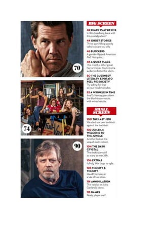
On the right side of the double page spread they’ve done something
a little more interesting in the organization of the magazine.
What the right side of the menu have done to organize the contents
is they’ve put “Big Screen” and “Small Screen” as they’re own
section.

Magazine assignment double page spread Emma 18/10/2018

  • 1.
    Magazine Assignment: DoublePage Spread For the double page spread you can see that it’s sectioned off really well by the background colour as white and the text all in black. The double page spread has done the same sort of thing for the text as the front cover has done by highlighting the important sections/text in red letters/numbers. At the Top left of the page you can see it says “Contents” along with the issue number along with the month and year of the issue, indicating to readers that this is a monthly magazine. Next to this it shows the front cover of the magazine. Menu
  • 3.
    On the leftside of the double page spread, it has a list of all the contents of this magazine, you can see that at the bottom of the menu it has a picture of a famous character from the Star Wars film who appears in the Solo: A Star Wars Story. This gives the readers something appealing to look at instead of just a blank white page with bland text on and also shows the page number for the story as seen by the black circle with the number 11 inside it. What the magazine have done for the menu is they have added red borders around the white text they’ve used to section of the contents and make it easier for the readers to find out what page(s) they may be interested in reading. They’ve also highlighted numbers in red making it easier for readers to find out what page number they need to go to the story they want to read. Along with the red numbers they’ve made the titles of the pages in that sections of the menu bold and then added normal text style just underneath that as a short description of the page or they might use a pull quote also. This makes it a lot easier to find something that they might be interested in reading inside the magazine but adding the titles in bold, and putting a brief short description just underneath that.
  • 5.
    On the rightside of the double page spread they’ve done something a little more interesting in the organization of the magazine. What the right side of the menu have done to organize the contents is they’ve put “Big Screen” and “Small Screen” as they’re own section.