SlideShare a Scribd company logo
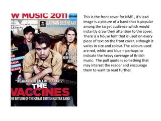
This is the front cover for NME , it’s lead
image is a picture of a band that is popular
among the target audience which would
instantly draw their attention to the cover.
There is a house font that is used on every
piece of text on the front cover, although it
varies in size and colour. The colours used
are red, white and blue – perhaps to
indicate the heavy coverage of British
music. The pull quote is something that
may interest the reader and encourage
them to want to read further.
The contents page is set out in a fairly
unusual way, the title is written in a
completely different font to the front cover.
Only the main articles are shown, and each
one includes a picture and pull quote related
to it. There is a small section at the bottom
which includes regular features, however
this is just written in small black and white
font.
This double page spread includes several design features such as a pull quote from a
member of the band. This is written in bright blue, showing that it is separate from
the rest of the text and to draw attention to it. The use of drop caps is featured here
and there is a standfirst, which introduces the band in a very positive light.
The front cover of Q magazine has a
bold and distinctive masthead. It is a
large capital ‘Q’ in white text on a red
background. This is a simple design but
looks effective and ties in with the
traditional tone of the magazine. There
is a banner of text above the masthead
which reads “The UK’s biggest music
magazine”. This may encourage the
reader to buy it as it is a very positive
statement. The lead image is of several
popular music artists. The reader may
be familiar with many of them and
want to read about them.
This contents page is split into two
main sections – ‘artists of the
century’, a special feature and
regulars of the magazine. They are
both set out very clearly with a
house style of red, white and grey
with the same font used
throughout, although it varies from
capital to lower case letters. The
tone of the magazine is quite
“sensible” and would probably
appeal to middle class adults. The
name of the artist is shown with the
page number so that if the reader
wishes to read about a particular
artist, they can turn straight to the
right page.
This double page spread is set
out in a way that would appeal
to the target audience. The
title is quite noticeable and the
word “noughties” is written in
a different colour to make it
stand out as it is the main
focus of the article. The drop
caps are very big in order to
define the start of each
column. The standfirst is
designed to be witty so it
appeals to the reader. The next
page has a range of images
that people would associate
with “noughties” trends in
bright colours so they stand
out.
The front cover of Kerrang! makes it obvious that
the magazine is designed for a specific type of
reader – someone who is into rock music. The
lead image is of a rockstar in an aggressive
looking pose. Several fonts are used, which all
look quite heavy and everything is written in
capitals. The masthead is obscured by images,
which shows that the magazine is well known by
it’s readers – they would not necessarily need to
look closely to see what the magazine is. It gives
the reader an idea as to what is inside the
magazine, such as interviews, posters and a gig
guide. Overall, the front cover of Kerrang! is
quite busy, using a range of colours and styles.
The contents page is set out very
clearly. It has a house style with
features about different bands stored
under organised headings. This makes
it easy for readers if they wish to read
about a particular band, they can just
turn to the page that applies. There is
a main image which relates to one of
the main stories and two other
previews of main features. The top of
the page displays the magazines issue
number and the date it was released.
At the bottom of the page there is a
letter from the editor and an advert to
encourage people to subscribe.
This double page spread is slightly
unusual as the pull quote is
written aside the lead image,
whereas it is normally placed in
the text. The second word of the
title “Hero” is written in a blurry
font, which relates well to the
blurred image. In the standfirst,
the name of the band and it’s lead
singer are written in red to stand
out from the rest, so the reader
knows who it is about. This is the
same with the drop caps in the
main article.

More Related Content

What's hot

Contents Pages of Magazines
Contents Pages of Magazines Contents Pages of Magazines
Contents Pages of Magazines
stonee1
 
Codes and conventions of a double page spread
Codes and conventions of a double page spreadCodes and conventions of a double page spread
Codes and conventions of a double page spread
deemplemorar16
 
3 detailed analysis of a music magazine
3 detailed analysis of a music magazine3 detailed analysis of a music magazine
3 detailed analysis of a music magazine
asmediayusra
 
Final Research task 3 analysis of own magazine
Final Research task 3 analysis of own magazineFinal Research task 3 analysis of own magazine
Final Research task 3 analysis of own magazine
baldeep17_
 
Muskaan work inc media studies magazine cover page analysys vfuul done
Muskaan work inc media studies magazine cover page analysys vfuul doneMuskaan work inc media studies magazine cover page analysys vfuul done
Muskaan work inc media studies magazine cover page analysys vfuul done
baninadeem
 
Content page analysis by muskaan (3)media work
Content page analysis by muskaan (3)media workContent page analysis by muskaan (3)media work
Content page analysis by muskaan (3)media work
baninadeem
 
As Media Studies Contents Page Analysis
As Media Studies Contents Page AnalysisAs Media Studies Contents Page Analysis
As Media Studies Contents Page Analysis
incredibleburns
 
Analysing magazine double page articles
Analysing magazine double page articlesAnalysing magazine double page articles
Analysing magazine double page articles
chaggarg1
 
Analysis of professional_contents_page new ( upload to blog)
Analysis of professional_contents_page new ( upload to blog)Analysis of professional_contents_page new ( upload to blog)
Analysis of professional_contents_page new ( upload to blog)
stephhhhh
 

What's hot (20)

Contents Pages of Magazines
Contents Pages of Magazines Contents Pages of Magazines
Contents Pages of Magazines
 
FCD 2
FCD 2FCD 2
FCD 2
 
Codes and conventions of a double page spread
Codes and conventions of a double page spreadCodes and conventions of a double page spread
Codes and conventions of a double page spread
 
Media presentation
Media presentationMedia presentation
Media presentation
 
3 detailed analysis of a music magazine
3 detailed analysis of a music magazine3 detailed analysis of a music magazine
3 detailed analysis of a music magazine
 
Nme contents analysis
Nme contents analysisNme contents analysis
Nme contents analysis
 
Contents 1
Contents 1Contents 1
Contents 1
 
Wire analysis
Wire analysis Wire analysis
Wire analysis
 
Final Research task 3 analysis of own magazine
Final Research task 3 analysis of own magazineFinal Research task 3 analysis of own magazine
Final Research task 3 analysis of own magazine
 
Contents 3
Contents 3Contents 3
Contents 3
 
Muskaan work inc media studies magazine cover page analysys vfuul done
Muskaan work inc media studies magazine cover page analysys vfuul doneMuskaan work inc media studies magazine cover page analysys vfuul done
Muskaan work inc media studies magazine cover page analysys vfuul done
 
Content page analysis by muskaan (3)media work
Content page analysis by muskaan (3)media workContent page analysis by muskaan (3)media work
Content page analysis by muskaan (3)media work
 
Contents analysis
Contents analysis Contents analysis
Contents analysis
 
As Media Studies Contents Page Analysis
As Media Studies Contents Page AnalysisAs Media Studies Contents Page Analysis
As Media Studies Contents Page Analysis
 
Analysing magazine double page articles
Analysing magazine double page articlesAnalysing magazine double page articles
Analysing magazine double page articles
 
Analysis of professional_contents_page
Analysis of professional_contents_pageAnalysis of professional_contents_page
Analysis of professional_contents_page
 
Analysis of Music Magazine Covers
Analysis of Music Magazine CoversAnalysis of Music Magazine Covers
Analysis of Music Magazine Covers
 
Analysis of professional_contents_page new ( upload to blog)
Analysis of professional_contents_page new ( upload to blog)Analysis of professional_contents_page new ( upload to blog)
Analysis of professional_contents_page new ( upload to blog)
 
Contents
ContentsContents
Contents
 
Drafts annotations
Drafts annotationsDrafts annotations
Drafts annotations
 

Similar to Analysis of magazines

Similar to Analysis of magazines (20)

Music Magazines - Research
Music Magazines - ResearchMusic Magazines - Research
Music Magazines - Research
 
Research
ResearchResearch
Research
 
Magazine analysis
Magazine analysisMagazine analysis
Magazine analysis
 
Annotation of music magazines
Annotation of music magazinesAnnotation of music magazines
Annotation of music magazines
 
Annotation of 2 music magazines
Annotation of 2 music magazinesAnnotation of 2 music magazines
Annotation of 2 music magazines
 
Annotation of 2 music magazines
Annotation of 2 music magazinesAnnotation of 2 music magazines
Annotation of 2 music magazines
 
Audience research
Audience researchAudience research
Audience research
 
NME analysis
NME analysisNME analysis
NME analysis
 
Research task
Research taskResearch task
Research task
 
Magazine Cover/Contents/DPS Analysis
Magazine Cover/Contents/DPS AnalysisMagazine Cover/Contents/DPS Analysis
Magazine Cover/Contents/DPS Analysis
 
Textual analysis of magazine pages
Textual analysis of magazine pagesTextual analysis of magazine pages
Textual analysis of magazine pages
 
Textual analysis
Textual analysisTextual analysis
Textual analysis
 
Music Magazine Analysis
Music Magazine AnalysisMusic Magazine Analysis
Music Magazine Analysis
 
Music magazine anaylsis
Music magazine anaylsis Music magazine anaylsis
Music magazine anaylsis
 
Task 3 research bmth
Task 3 research bmthTask 3 research bmth
Task 3 research bmth
 
N:\Gsce Media\Analysis Of Magazines
N:\Gsce Media\Analysis Of MagazinesN:\Gsce Media\Analysis Of Magazines
N:\Gsce Media\Analysis Of Magazines
 
Magazine research info
Magazine research infoMagazine research info
Magazine research info
 
Magazine anaylisis
Magazine anaylisisMagazine anaylisis
Magazine anaylisis
 
Magazine anaylisis
Magazine anaylisisMagazine anaylisis
Magazine anaylisis
 
Draft annotations
Draft annotationsDraft annotations
Draft annotations
 

Recently uploaded

Future Visions: Predictions to Guide and Time Tech Innovation, Peter Udo Diehl
Future Visions: Predictions to Guide and Time Tech Innovation, Peter Udo DiehlFuture Visions: Predictions to Guide and Time Tech Innovation, Peter Udo Diehl
Future Visions: Predictions to Guide and Time Tech Innovation, Peter Udo Diehl
Peter Udo Diehl
 
Essentials of Automations: Optimizing FME Workflows with Parameters
Essentials of Automations: Optimizing FME Workflows with ParametersEssentials of Automations: Optimizing FME Workflows with Parameters
Essentials of Automations: Optimizing FME Workflows with Parameters
Safe Software
 

Recently uploaded (20)

Assuring Contact Center Experiences for Your Customers With ThousandEyes
Assuring Contact Center Experiences for Your Customers With ThousandEyesAssuring Contact Center Experiences for Your Customers With ThousandEyes
Assuring Contact Center Experiences for Your Customers With ThousandEyes
 
Demystifying gRPC in .Net by John Staveley
Demystifying gRPC in .Net by John StaveleyDemystifying gRPC in .Net by John Staveley
Demystifying gRPC in .Net by John Staveley
 
FIDO Alliance Osaka Seminar: Passkeys and the Road Ahead.pdf
FIDO Alliance Osaka Seminar: Passkeys and the Road Ahead.pdfFIDO Alliance Osaka Seminar: Passkeys and the Road Ahead.pdf
FIDO Alliance Osaka Seminar: Passkeys and the Road Ahead.pdf
 
Speed Wins: From Kafka to APIs in Minutes
Speed Wins: From Kafka to APIs in MinutesSpeed Wins: From Kafka to APIs in Minutes
Speed Wins: From Kafka to APIs in Minutes
 
Key Trends Shaping the Future of Infrastructure.pdf
Key Trends Shaping the Future of Infrastructure.pdfKey Trends Shaping the Future of Infrastructure.pdf
Key Trends Shaping the Future of Infrastructure.pdf
 
Quantum Computing: Current Landscape and the Future Role of APIs
Quantum Computing: Current Landscape and the Future Role of APIsQuantum Computing: Current Landscape and the Future Role of APIs
Quantum Computing: Current Landscape and the Future Role of APIs
 
Transcript: Selling digital books in 2024: Insights from industry leaders - T...
Transcript: Selling digital books in 2024: Insights from industry leaders - T...Transcript: Selling digital books in 2024: Insights from industry leaders - T...
Transcript: Selling digital books in 2024: Insights from industry leaders - T...
 
FIDO Alliance Osaka Seminar: Passkeys at Amazon.pdf
FIDO Alliance Osaka Seminar: Passkeys at Amazon.pdfFIDO Alliance Osaka Seminar: Passkeys at Amazon.pdf
FIDO Alliance Osaka Seminar: Passkeys at Amazon.pdf
 
Mission to Decommission: Importance of Decommissioning Products to Increase E...
Mission to Decommission: Importance of Decommissioning Products to Increase E...Mission to Decommission: Importance of Decommissioning Products to Increase E...
Mission to Decommission: Importance of Decommissioning Products to Increase E...
 
Kubernetes & AI - Beauty and the Beast !?! @KCD Istanbul 2024
Kubernetes & AI - Beauty and the Beast !?! @KCD Istanbul 2024Kubernetes & AI - Beauty and the Beast !?! @KCD Istanbul 2024
Kubernetes & AI - Beauty and the Beast !?! @KCD Istanbul 2024
 
Future Visions: Predictions to Guide and Time Tech Innovation, Peter Udo Diehl
Future Visions: Predictions to Guide and Time Tech Innovation, Peter Udo DiehlFuture Visions: Predictions to Guide and Time Tech Innovation, Peter Udo Diehl
Future Visions: Predictions to Guide and Time Tech Innovation, Peter Udo Diehl
 
GenAISummit 2024 May 28 Sri Ambati Keynote: AGI Belongs to The Community in O...
GenAISummit 2024 May 28 Sri Ambati Keynote: AGI Belongs to The Community in O...GenAISummit 2024 May 28 Sri Ambati Keynote: AGI Belongs to The Community in O...
GenAISummit 2024 May 28 Sri Ambati Keynote: AGI Belongs to The Community in O...
 
The Future of Platform Engineering
The Future of Platform EngineeringThe Future of Platform Engineering
The Future of Platform Engineering
 
Software Delivery At the Speed of AI: Inflectra Invests In AI-Powered Quality
Software Delivery At the Speed of AI: Inflectra Invests In AI-Powered QualitySoftware Delivery At the Speed of AI: Inflectra Invests In AI-Powered Quality
Software Delivery At the Speed of AI: Inflectra Invests In AI-Powered Quality
 
НАДІЯ ФЕДЮШКО БАЦ «Професійне зростання QA спеціаліста»
НАДІЯ ФЕДЮШКО БАЦ  «Професійне зростання QA спеціаліста»НАДІЯ ФЕДЮШКО БАЦ  «Професійне зростання QA спеціаліста»
НАДІЯ ФЕДЮШКО БАЦ «Професійне зростання QA спеціаліста»
 
Smart TV Buyer Insights Survey 2024 by 91mobiles.pdf
Smart TV Buyer Insights Survey 2024 by 91mobiles.pdfSmart TV Buyer Insights Survey 2024 by 91mobiles.pdf
Smart TV Buyer Insights Survey 2024 by 91mobiles.pdf
 
Exploring UiPath Orchestrator API: updates and limits in 2024 🚀
Exploring UiPath Orchestrator API: updates and limits in 2024 🚀Exploring UiPath Orchestrator API: updates and limits in 2024 🚀
Exploring UiPath Orchestrator API: updates and limits in 2024 🚀
 
Essentials of Automations: Optimizing FME Workflows with Parameters
Essentials of Automations: Optimizing FME Workflows with ParametersEssentials of Automations: Optimizing FME Workflows with Parameters
Essentials of Automations: Optimizing FME Workflows with Parameters
 
From Siloed Products to Connected Ecosystem: Building a Sustainable and Scala...
From Siloed Products to Connected Ecosystem: Building a Sustainable and Scala...From Siloed Products to Connected Ecosystem: Building a Sustainable and Scala...
From Siloed Products to Connected Ecosystem: Building a Sustainable and Scala...
 
How world-class product teams are winning in the AI era by CEO and Founder, P...
How world-class product teams are winning in the AI era by CEO and Founder, P...How world-class product teams are winning in the AI era by CEO and Founder, P...
How world-class product teams are winning in the AI era by CEO and Founder, P...
 

Analysis of magazines

  • 1. This is the front cover for NME , it’s lead image is a picture of a band that is popular among the target audience which would instantly draw their attention to the cover. There is a house font that is used on every piece of text on the front cover, although it varies in size and colour. The colours used are red, white and blue – perhaps to indicate the heavy coverage of British music. The pull quote is something that may interest the reader and encourage them to want to read further.
  • 2. The contents page is set out in a fairly unusual way, the title is written in a completely different font to the front cover. Only the main articles are shown, and each one includes a picture and pull quote related to it. There is a small section at the bottom which includes regular features, however this is just written in small black and white font.
  • 3. This double page spread includes several design features such as a pull quote from a member of the band. This is written in bright blue, showing that it is separate from the rest of the text and to draw attention to it. The use of drop caps is featured here and there is a standfirst, which introduces the band in a very positive light.
  • 4. The front cover of Q magazine has a bold and distinctive masthead. It is a large capital ‘Q’ in white text on a red background. This is a simple design but looks effective and ties in with the traditional tone of the magazine. There is a banner of text above the masthead which reads “The UK’s biggest music magazine”. This may encourage the reader to buy it as it is a very positive statement. The lead image is of several popular music artists. The reader may be familiar with many of them and want to read about them.
  • 5. This contents page is split into two main sections – ‘artists of the century’, a special feature and regulars of the magazine. They are both set out very clearly with a house style of red, white and grey with the same font used throughout, although it varies from capital to lower case letters. The tone of the magazine is quite “sensible” and would probably appeal to middle class adults. The name of the artist is shown with the page number so that if the reader wishes to read about a particular artist, they can turn straight to the right page.
  • 6. This double page spread is set out in a way that would appeal to the target audience. The title is quite noticeable and the word “noughties” is written in a different colour to make it stand out as it is the main focus of the article. The drop caps are very big in order to define the start of each column. The standfirst is designed to be witty so it appeals to the reader. The next page has a range of images that people would associate with “noughties” trends in bright colours so they stand out.
  • 7. The front cover of Kerrang! makes it obvious that the magazine is designed for a specific type of reader – someone who is into rock music. The lead image is of a rockstar in an aggressive looking pose. Several fonts are used, which all look quite heavy and everything is written in capitals. The masthead is obscured by images, which shows that the magazine is well known by it’s readers – they would not necessarily need to look closely to see what the magazine is. It gives the reader an idea as to what is inside the magazine, such as interviews, posters and a gig guide. Overall, the front cover of Kerrang! is quite busy, using a range of colours and styles.
  • 8. The contents page is set out very clearly. It has a house style with features about different bands stored under organised headings. This makes it easy for readers if they wish to read about a particular band, they can just turn to the page that applies. There is a main image which relates to one of the main stories and two other previews of main features. The top of the page displays the magazines issue number and the date it was released. At the bottom of the page there is a letter from the editor and an advert to encourage people to subscribe.
  • 9. This double page spread is slightly unusual as the pull quote is written aside the lead image, whereas it is normally placed in the text. The second word of the title “Hero” is written in a blurry font, which relates well to the blurred image. In the standfirst, the name of the band and it’s lead singer are written in red to stand out from the rest, so the reader knows who it is about. This is the same with the drop caps in the main article.