Aminabad @ Book Call Girls in Lucknow - 450+ Call Girl Cash Payment 🍵 8923113...
Analysis of nme
1. Rule OF Thirds
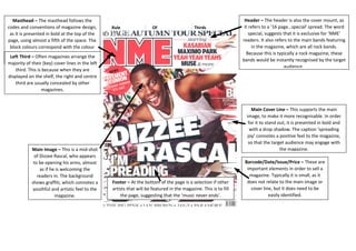
Masthead – The masthead follows the
codes and conventions of magazine design,
as it is presented in bold at the top of the
page, using almost a fifth of the space. The
block colours correspond with the colour
scheme and represent the boldness of
music and the magazine.
Header – The header is also the cover mount, as
it refers to a ’16 page…special’ spread. The word
special, suggests that it is exclusive for ‘NME’
readers. It also refers to the main bands featuring
in the magazine, which are all rock bands.
Because this is typically a rock magazine, these
bands would be instantly recognised by the target
audience.
Left Third – Often magazines arrange the
majority of their (key) cover lines in the left
third. This is because when they are
displayed on the shelf, the right and centre
third are usually concealed by other
magazines.
Main Image – This is a mid-shot the magazine.
of Dizzee Rascal, who appears
to be opening his arms, almost
Footer – At the bottom of the page is a selection if other
artists that will be featured in the magazine. This is to fill
the page, suggesting that the ‘music never ends’.
Main Cover Line – This supports the main
image, to make it more recognisable. In order
for it to stand out, it is presented in bold and
with a drop shadow. The caption ‘spreading
joy’ connotes a positive feel to the magazine,
so that the target audience may engage with
Barcode/Date/Issue/Price – These are
important elements in order to sell a
magazine. Typically it is small, as it
does not relate to the main image or
cover line, but it does need to be
easily identified.
as if he is welcoming the
readers in. The background
shows graffiti, which connotes a
youthful and artistic feel to the
magazine.