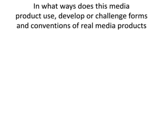
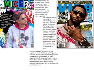
In what ways does this media
product use, develop or challenge forms
and conventions of real media products
Mixer Magazine has no
         particular colour scheme,
         as emphasised by the
         name. More than 3 main
         colours are used. Vibe
         follows the typical
         magazine colour count (3
         main colours probably
         used throughout the
         entire magazine)
                        Vibe magazine uses its
                        main image to
                        promote bling culture
                        (the artist’s pose with
                        the ring on his finger)
                        This “bling” culture is
                        normally associated
                        with the genre that the
                        magazine specialises
                        in. In mixer magazine,
                        the main image is only
                        used to indicate the
                        main artist of the
                        magazine and vaguely
                        represents the genre.
                        This is because the
                        magazine has no real
                        focus on a specific
                        genre.

The word “swagger” in bold red on Vibe
magazine is in red which is eye catching to the
consumer. Audiences familiar with the genre will
know what this phrase means. On mixer
magazine, this effect is almost imitated with the
phrase “New style Hip Hop” Audiences will be
familiar with the phrase Hip Hop. These
additional cover lines are used to familiarise the
potential consumer
Mixer magazine (left) challenges the simplistic look of the average
                                             magazine. The simplistic look of the magazine on the right is easy on the
                                             eyes and plain. Mixer magazine uses a variety of images on the left side
                                             with the main artist next to the intro box on the bottom. The mixed look
                                             of mixer magazine suits the younger audience more because its more eye
                                             intensive.


                                             3 different fonts are used in both magazines. This shows some sort of
                                             consistency. Mixer’s double page spread has no particular colour scheme.
                                             The left side of mixer magazine uses no sense of structure, having many
                                             images and a piece of text on one side. There is also no particular colour
                                             scheme either emphasising the magazine’s name “mixer” which mixes the
                                             conventions used in other music magazines.


The headline for the magazine on the right
Coincides with the content and clothing of
The artist in the main image. The headline
on mixer magazine also coincides with the
Magazines aim with “colour” being a
metaphor for other genres and other styles
of music magazines mixing (or just not
following the typical style that similar
music magazines do)
Vibe’s contents is virtually
                                                   colourless;
                                                   The lack of colour would
                                                   Perhaps turn the audience’s
                                                   Attention to the main image
                                                   (with the eye catching red
                                                   heart)
                                                   Or the actual features. Vibe
                                                   isn’t
                                                   However a typical music
                                                   magazine
                                                   As it has a second focus
                                                   (fashion) The main
                                                   Focus for vibe’s contents
                                                   page is obviously
                                                   The main image. Mixer
                                                   magazine is perhaps too
                                                   Colourful and has no real
                                                   focal image.
                                                   Everything is eye catching
                                                   and colourful.
                                                   The general simplistic
                                                   contents page followed by
                                                   many
                                                   Other music magazines is
                                                   disbanded in Mixer
                                                   magazine.


Also the features of Mixer magazine has no specialised genre.
The front cover may be seen as Hip Hop orientated but articles in
The magazine may not have a correlation to that genre (such as rock equipment on page 20 like guitars or
Albums from bands, and bands aren’t normally associated with Hip Hop) Vibe magazines features has a very straightforward
Approach focusing only on the main genre that the artist in the main image represents (In this case Rap/R&B)

In what ways does this media

  • 1.
    In what waysdoes this media product use, develop or challenge forms and conventions of real media products
  • 2.
    Mixer Magazine hasno particular colour scheme, as emphasised by the name. More than 3 main colours are used. Vibe follows the typical magazine colour count (3 main colours probably used throughout the entire magazine) Vibe magazine uses its main image to promote bling culture (the artist’s pose with the ring on his finger) This “bling” culture is normally associated with the genre that the magazine specialises in. In mixer magazine, the main image is only used to indicate the main artist of the magazine and vaguely represents the genre. This is because the magazine has no real focus on a specific genre. The word “swagger” in bold red on Vibe magazine is in red which is eye catching to the consumer. Audiences familiar with the genre will know what this phrase means. On mixer magazine, this effect is almost imitated with the phrase “New style Hip Hop” Audiences will be familiar with the phrase Hip Hop. These additional cover lines are used to familiarise the potential consumer
  • 3.
    Mixer magazine (left)challenges the simplistic look of the average magazine. The simplistic look of the magazine on the right is easy on the eyes and plain. Mixer magazine uses a variety of images on the left side with the main artist next to the intro box on the bottom. The mixed look of mixer magazine suits the younger audience more because its more eye intensive. 3 different fonts are used in both magazines. This shows some sort of consistency. Mixer’s double page spread has no particular colour scheme. The left side of mixer magazine uses no sense of structure, having many images and a piece of text on one side. There is also no particular colour scheme either emphasising the magazine’s name “mixer” which mixes the conventions used in other music magazines. The headline for the magazine on the right Coincides with the content and clothing of The artist in the main image. The headline on mixer magazine also coincides with the Magazines aim with “colour” being a metaphor for other genres and other styles of music magazines mixing (or just not following the typical style that similar music magazines do)
  • 4.
    Vibe’s contents isvirtually colourless; The lack of colour would Perhaps turn the audience’s Attention to the main image (with the eye catching red heart) Or the actual features. Vibe isn’t However a typical music magazine As it has a second focus (fashion) The main Focus for vibe’s contents page is obviously The main image. Mixer magazine is perhaps too Colourful and has no real focal image. Everything is eye catching and colourful. The general simplistic contents page followed by many Other music magazines is disbanded in Mixer magazine. Also the features of Mixer magazine has no specialised genre. The front cover may be seen as Hip Hop orientated but articles in The magazine may not have a correlation to that genre (such as rock equipment on page 20 like guitars or Albums from bands, and bands aren’t normally associated with Hip Hop) Vibe magazines features has a very straightforward Approach focusing only on the main genre that the artist in the main image represents (In this case Rap/R&B)