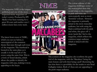
The colour scheme of this
                                                               magazine challenges some of
 The magazine NME is the longest                               the stereotypical ideas that
 published and one of the most                                 would relate to the magazine,
 respected music magazines of                                  as pink and white are
 today’s society. Produced by IPC                              stereotypically seen as more
 Media it has been running for a                               ‘feminine’ colours. However
 great 58 years and reaches over 1                             the magazine is primarily
 million music fans every week.                                aimed at the more masculine
                                                               audience, but with using the
                                                               black combined with the pink
                                                               and white, this gives off a
                                                               more ‘punk-like’ feel to the
The latest front cover of NME,                                 magazine, which reflects the
which you can see below, is                                    common target audience
stereotypical of the common                                    which is linked with this
theme that runs through each issue                             magazine.
of the magazine. The masthead is
located in the same place as it
usually is in the top left of the
cover, using the same font. This is
a form of brand identity, which       The content of the magazine also confirms the punk
allows the public to identify the     feel of the magazine, with the ‘Macabees’ being the
magazine with ease, making it more    main feature and with their being a puff illustrating the
appealing to the buyer.               fact that there is a possibility for the reader to win Noel
                                      Gallagher tickets. Both of these acts are appealing to
                                      the punk target audience.
The magazine ‘Vibe’ is also an extremely popular
                                and well sought after music magazine of today’s
                                society which is produced by ‘Vibe Lifestyle
                                Network’.
                      The conventions of this
                      particular version of the
                      magazine, not only challenges the
                      stereotypical concepts of this
                      brand, but also challenges the
                                                           However the use of sans
                      dominant ideology of magazine
                                                           serif font on the magazine
                      conventions. As for a start, the
                                                           shows that the magazine still
                      coverlines of the magazine are
The colour’s of the                                        is there for entertainment
                      not spread over the cover they
magazine are also                                          purposes giving off a rather
                      are located rather close together
very minimalistic,                                         relaxed feel, showing that the
                      on the right hand side of the
with just one main                                         target audience is being
                      cover, in relatively small font.
colour being used,                                         represented, as the magazine
                      The possible reason for this is
alongside black and                                        is generally more appealing
                      because the main story of the
white. This also is                                        to the younger audience.
                      magazine is playing an important
allowing the sole                                          Therefore sophisticated
                      role in the media at the moment,
focus to be on the                                         ideas and text would not be
                      therefor the magazine is focusing
main storyline.                                            extremely appealing.
                      mostly on Rihanna and her
                      current state of affairs.
The colour scheme for the magazine is
                                 stereotypical for Bob Marley therefor drawing the
                                 attention to the target audience. Another
 The magazine ‘Mojo’             convention of the magazine, which draws the
 is a music magazine             audience, is, is the use of a puff illustrating the
 that is mainly aimed at         fact that a free cd is on offer with the magazine,
 the older, male target          which is also a point of interest for the audience.
 audience. The
 magazine generally
 focuses on music                                                The Masthead of the
 from previous                                                   magazine is using the
 generations as seen in                                          same common font,
 this magazine, which                                            which is always used, and
 has a main cover story                                          also placed in the same
 of ‘Bob Marley’.                                                area as usual. This gives a
                                                                 brand identity to the
                                                                 magazine for regular
The house style of the                                           readers to easily identify
magazine is relatively                                           it, making it appealing to
consistent throughout the                                        buy, as it is not hard to
issues, with this one being no                                   locate.
exception.

Musicmagazineanalysis

  • 2.
    The colour schemeof this magazine challenges some of The magazine NME is the longest the stereotypical ideas that published and one of the most would relate to the magazine, respected music magazines of as pink and white are today’s society. Produced by IPC stereotypically seen as more Media it has been running for a ‘feminine’ colours. However great 58 years and reaches over 1 the magazine is primarily million music fans every week. aimed at the more masculine audience, but with using the black combined with the pink and white, this gives off a more ‘punk-like’ feel to the The latest front cover of NME, magazine, which reflects the which you can see below, is common target audience stereotypical of the common which is linked with this theme that runs through each issue magazine. of the magazine. The masthead is located in the same place as it usually is in the top left of the cover, using the same font. This is a form of brand identity, which The content of the magazine also confirms the punk allows the public to identify the feel of the magazine, with the ‘Macabees’ being the magazine with ease, making it more main feature and with their being a puff illustrating the appealing to the buyer. fact that there is a possibility for the reader to win Noel Gallagher tickets. Both of these acts are appealing to the punk target audience.
  • 3.
    The magazine ‘Vibe’is also an extremely popular and well sought after music magazine of today’s society which is produced by ‘Vibe Lifestyle Network’. The conventions of this particular version of the magazine, not only challenges the stereotypical concepts of this brand, but also challenges the However the use of sans dominant ideology of magazine serif font on the magazine conventions. As for a start, the shows that the magazine still coverlines of the magazine are The colour’s of the is there for entertainment not spread over the cover they magazine are also purposes giving off a rather are located rather close together very minimalistic, relaxed feel, showing that the on the right hand side of the with just one main target audience is being cover, in relatively small font. colour being used, represented, as the magazine The possible reason for this is alongside black and is generally more appealing because the main story of the white. This also is to the younger audience. magazine is playing an important allowing the sole Therefore sophisticated role in the media at the moment, focus to be on the ideas and text would not be therefor the magazine is focusing main storyline. extremely appealing. mostly on Rihanna and her current state of affairs.
  • 4.
    The colour schemefor the magazine is stereotypical for Bob Marley therefor drawing the attention to the target audience. Another The magazine ‘Mojo’ convention of the magazine, which draws the is a music magazine audience, is, is the use of a puff illustrating the that is mainly aimed at fact that a free cd is on offer with the magazine, the older, male target which is also a point of interest for the audience. audience. The magazine generally focuses on music The Masthead of the from previous magazine is using the generations as seen in same common font, this magazine, which which is always used, and has a main cover story also placed in the same of ‘Bob Marley’. area as usual. This gives a brand identity to the magazine for regular The house style of the readers to easily identify magazine is relatively it, making it appealing to consistent throughout the buy, as it is not hard to issues, with this one being no locate. exception.