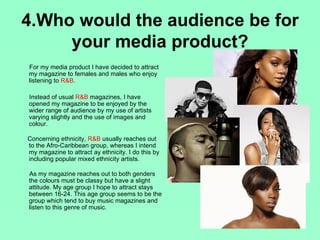
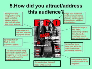
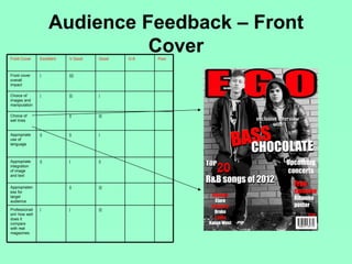
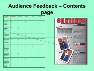
This document provides an evaluation of the coursework for a media foundation course. It discusses how the student's media product uses conventions of real media products through similarities and differences in the front cover, contents page, and double page spread layout and design. It represents a particular social group through its choice of artists, images, and content. The product would be well-suited for distribution by IPC Media due to their experience and wide audience reach. The intended audience is both female and male, aged 16-24, of mixed ethnicities who enjoy R&B music. Feedback was provided on different elements that showed the product was well-received overall. The student also reflects on what they learned about technologies like Photoshop and In
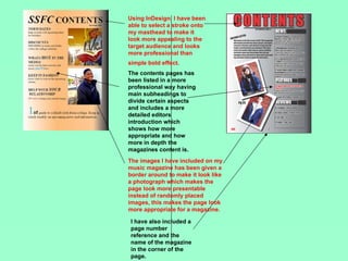
Reconception - Intelligent Asset Management for Shopping CentresSCG International
Presentation by Clive Woodger, Chairman of SCG London at the Moscow Real Estate exhibition REX 2012.
Presentation explores how shopping centres have become destinations. Reconception strategy aims to create added value experiences for visitors and shoppers to improve sales performance for tenants, achieve high rental yields and maximise capital. Creating a first choice perception for target audiences through asset management and alignment of brand touchpoints - rethinking opportunities and reinventing experiences.
Clive Woodger's presentation at 16th APRCE (Asia - Pacific Retailers Convention & Exhibition, Istanbul, September 2013) on the importance of brand strategy for successful commercial design
Achieving a Successful Homing Offer Challenges & Trends.International Snapshot.SCG International
DIY, HOUSEHOLD & FURNITURE RETAIL RUSSIA.
The annual conference organised by B2B Conference Group.
International Summit of industry products for home and garden repair.
Trends and challenges. International outlook.
Presentation by Clive Woodger, SCG International founder.
Moscow, Russia.
May 2015.
Meeting the Challenges of the Empowered Consumers. Creating Successful First ...SCG International
Meeting the challenges of the empowered consumer.
Creating successful first choice destination brands.
Expert presentation illustrates the most problematic issues of the field and their practical solutions.
Clive Woodger at I Summit for Shopping and Entertainment Centers Owners and Managers: in a search of breakthrough idea, Ukrainian Real Estate Club.
Kyiv, May 2015.
Презентация "Искусство создания среды обитания". Создание пространства, в котором людям приятно находиться. Успешный брендинг пространств для проживания, работы и досуга.
Clive Woodger & Anna Poberezhna spoke @ workshop "Shopping Centre Challenges in Crisis Times – Factors for Success"
Kyiv, June 2015.
Organised by Ukrainian Building Community, SCG International and DTZ Ukraine.
City Development The Influence of Architecture Art of Place Branding. SCG International
Lecture by Clive Woodger about the Architecture and Branding Trends in Urban Planning.
Achieving successful destination brands for living, work, rest & play.
Organised by Ukrainian Steel Construction Center.
Kyiv, May 2015.
Through a teamwork approach, SCG International & IDNT create destination brands and design concepts that add value for all stakeholders by enhancing customer experience, building loyalty and achieving competitive advantage.
Our combined multidisciplinary resource provides a wealth of international expertise across different sectors & markets.
Check our websites for more projects:
www.scg.international
www.idnt.ua
Clive Woodger's conference about the Ultimate Retail Brand Experience. Organised by 3M Colombia. The main topics were: The Empowered Consumer, Retail Touchpoint's, Retail Transformations and Transformation Challenges.
3.0 Project 2_ Developing My Brand Identity Kit.pptxtanyjahb
A personal brand exploration presentation summarizes an individual's unique qualities and goals, covering strengths, values, passions, and target audience. It helps individuals understand what makes them stand out, their desired image, and how they aim to achieve it.
Premium MEAN Stack Development Solutions for Modern BusinessesSynapseIndia
Stay ahead of the curve with our premium MEAN Stack Development Solutions. Our expert developers utilize MongoDB, Express.js, AngularJS, and Node.js to create modern and responsive web applications. Trust us for cutting-edge solutions that drive your business growth and success.
Know more: https://www.synapseindia.com/technology/mean-stack-development-company.html
Skye Residences | Extended Stay Residences Near Toronto Airportmarketingjdass
Experience unparalleled EXTENDED STAY and comfort at Skye Residences located just minutes from Toronto Airport. Discover sophisticated accommodations tailored for discerning travelers.
Website Link :
https://skyeresidences.com/
https://skyeresidences.com/about-us/
https://skyeresidences.com/gallery/
https://skyeresidences.com/rooms/
https://skyeresidences.com/near-by-attractions/
https://skyeresidences.com/commute/
https://skyeresidences.com/contact/
https://skyeresidences.com/queen-suite-with-sofa-bed/
https://skyeresidences.com/queen-suite-with-sofa-bed-and-balcony/
https://skyeresidences.com/queen-suite-with-sofa-bed-accessible/
https://skyeresidences.com/2-bedroom-deluxe-queen-suite-with-sofa-bed/
https://skyeresidences.com/2-bedroom-deluxe-king-queen-suite-with-sofa-bed/
https://skyeresidences.com/2-bedroom-deluxe-queen-suite-with-sofa-bed-accessible/
#Skye Residences Etobicoke, #Skye Residences Near Toronto Airport, #Skye Residences Toronto, #Skye Hotel Toronto, #Skye Hotel Near Toronto Airport, #Hotel Near Toronto Airport, #Near Toronto Airport Accommodation, #Suites Near Toronto Airport, #Etobicoke Suites Near Airport, #Hotel Near Toronto Pearson International Airport, #Toronto Airport Suite Rentals, #Pearson Airport Hotel Suites
Business Valuation Principles for EntrepreneursBen Wann
This insightful presentation is designed to equip entrepreneurs with the essential knowledge and tools needed to accurately value their businesses. Understanding business valuation is crucial for making informed decisions, whether you're seeking investment, planning to sell, or simply want to gauge your company's worth.
Buy Verified PayPal Account | Buy Google 5 Star Reviewsusawebmarket
Buy Verified PayPal Account
Looking to buy verified PayPal accounts? Discover 7 expert tips for safely purchasing a verified PayPal account in 2024. Ensure security and reliability for your transactions.
PayPal Services Features-
🟢 Email Access
🟢 Bank Added
🟢 Card Verified
🟢 Full SSN Provided
🟢 Phone Number Access
🟢 Driving License Copy
🟢 Fasted Delivery
Client Satisfaction is Our First priority. Our services is very appropriate to buy. We assume that the first-rate way to purchase our offerings is to order on the website. If you have any worry in our cooperation usually You can order us on Skype or Telegram.
24/7 Hours Reply/Please Contact
usawebmarketEmail: support@usawebmarket.com
Skype: usawebmarket
Telegram: @usawebmarket
WhatsApp: +1(218) 203-5951
USA WEB MARKET is the Best Verified PayPal, Payoneer, Cash App, Skrill, Neteller, Stripe Account and SEO, SMM Service provider.100%Satisfection granted.100% replacement Granted.
Taurus Zodiac Sign_ Personality Traits and Sign Dates.pptxmy Pandit
Explore the world of the Taurus zodiac sign. Learn about their stability, determination, and appreciation for beauty. Discover how Taureans' grounded nature and hardworking mindset define their unique personality.
Falcon stands out as a top-tier P2P Invoice Discounting platform in India, bridging esteemed blue-chip companies and eager investors. Our goal is to transform the investment landscape in India by establishing a comprehensive destination for borrowers and investors with diverse profiles and needs, all while minimizing risk. What sets Falcon apart is the elimination of intermediaries such as commercial banks and depository institutions, allowing investors to enjoy higher yields.
Cracking the Workplace Discipline Code Main.pptxWorkforce Group
Cultivating and maintaining discipline within teams is a critical differentiator for successful organisations.
Forward-thinking leaders and business managers understand the impact that discipline has on organisational success. A disciplined workforce operates with clarity, focus, and a shared understanding of expectations, ultimately driving better results, optimising productivity, and facilitating seamless collaboration.
Although discipline is not a one-size-fits-all approach, it can help create a work environment that encourages personal growth and accountability rather than solely relying on punitive measures.
In this deck, you will learn the significance of workplace discipline for organisational success. You’ll also learn
• Four (4) workplace discipline methods you should consider
• The best and most practical approach to implementing workplace discipline.
• Three (3) key tips to maintain a disciplined workplace.
India Orthopedic Devices Market: Unlocking Growth Secrets, Trends and Develop...Kumar Satyam
According to TechSci Research report, “India Orthopedic Devices Market -Industry Size, Share, Trends, Competition Forecast & Opportunities, 2030”, the India Orthopedic Devices Market stood at USD 1,280.54 Million in 2024 and is anticipated to grow with a CAGR of 7.84% in the forecast period, 2026-2030F. The India Orthopedic Devices Market is being driven by several factors. The most prominent ones include an increase in the elderly population, who are more prone to orthopedic conditions such as osteoporosis and arthritis. Moreover, the rise in sports injuries and road accidents are also contributing to the demand for orthopedic devices. Advances in technology and the introduction of innovative implants and prosthetics have further propelled the market growth. Additionally, government initiatives aimed at improving healthcare infrastructure and the increasing prevalence of lifestyle diseases have led to an upward trend in orthopedic surgeries, thereby fueling the market demand for these devices.
RMD24 | Debunking the non-endemic revenue myth Marvin Vacquier Droop | First ...BBPMedia1
Marvin neemt je in deze presentatie mee in de voordelen van non-endemic advertising op retail media netwerken. Hij brengt ook de uitdagingen in beeld die de markt op dit moment heeft op het gebied van retail media voor niet-leveranciers.
Retail media wordt gezien als het nieuwe advertising-medium en ook mediabureaus richten massaal retail media-afdelingen op. Merken die niet in de betreffende winkel liggen staan ook nog niet in de rij om op de retail media netwerken te adverteren. Marvin belicht de uitdagingen die er zijn om echt aansluiting te vinden op die markt van non-endemic advertising.
Discover the innovative and creative projects that highlight my journey throu...dylandmeas
Discover the innovative and creative projects that highlight my journey through Full Sail University. Below, you’ll find a collection of my work showcasing my skills and expertise in digital marketing, event planning, and media production.
2. 1.In what way does your media
product use, develop or use
forms and conventions or real
media products?
3. Front Cover – Similarities
Masthead - placed at the top of
the page as a statement and as
a main attraction to the reader.
Both mastheads appear to have
a bold font with a shape rather
then rigged which suggests loud
and not rock etc.
Barcode/ Price – both barcodes are
placed at the bottom of the page to
not stand out to the reader but to be
slightly spotted as it is important to
have. The price remains alongside
the barcode on both magazines.
Main Image – both images have
two artists. I have used two males
whereas the other one female and
one male. The facial expressions
seem to be similar both representing
attitude and staring into the camera.
Main sell line – The sell line is made
to stand out on the magazine on both.
The use of red and white are also used
on each to compliment the colours
used and keep it consistent.
Sell lines – Both magazines have
sell lines alongside the main image
written in smaller font as it isn't of
huge importance.
4. Front Cover – Differences
Background – I have given my magazine a
background of a wall instead of a plain back
canvas to give a more casual and edge
towards the mood of the magazine.
Main Image – The main image on my
magazine has been done in black and white
effect, whereas the real product is done in
colour and most likely been airbrushed. The
stance of the artists are also different, my
cover shows them facing their whole body
towards the camera, the other having them
at a slight turn with faces not directly facing
the camera. I have done this to allow the
reader see the whole body of the artists to
get more detail of the style and allows the
reader to have more contact and relation
towards the artists in the image.
Barcode – Barcode has been placed on
opposite sides of the cover. With price on
top of the barcode instead of alongside it. I
had no purpose on where to place the
barcode, just due to having text on the
opposite side, this was the only appropriate
place.
Sell lines – my sell lines appear to have less
information but written in larger font
compared to the other who has it all on one
side. This allows the reader to not have to
read into much detail, getting straight to the
point and making it stand out clearer and
easier towards the reader.
5. Contents page
Similarities – Both magazines contain the essential features to
the magazine, masthead, subheadings, images, issue number
and list of page numbers to each feature within. This making
my magazine include what is needed to account for a real
magazine. Both backgrounds also have a faded effect using
black and white to create this mood of style and class. Also
using the rule of thirds, both magazines have the list of page
numbers and features placed on the right hand side of the
page. Both images used have also been edited to enhance
the artists appearance making them look more stylish.
Differences – the layout and appearance of the
magazines show quite a big contrast. The main heading
on the real magazine has been countered down onto 3
lines having separate lines for some letters. Mine
however is just a simple heading at the top of the page to
let it easily stand out, giving a more common structure to
a contents page. Images as well are different as I have
included two smaller images whist the real magazine has
one focus image which takes up near enough the page,
this is done due to having to main artists being focused
on in my magazine, making it also look more interesting
having more images than just the one. My magazine also
included a editors letter unlike the other and seems to
include more writing. Due to my magazine being the first
edition, I have included the editors letter as a way of
introducing the style and contents of the magazine.
6. Double Page Spread
Similarities – Both texts have placed an image alongside a selection of text
to support it. The content both cover the same amount, mine being a
interview whilst the other being an article. The text included has both also
been placed in columns. There is also an introduction above the articles to
give a starter to it, this makes the spread look more professional. Both
articles focus on one singular artist. There is a use of black, white and grey
for the background with a use of colour on the image to make the spread
look more presentational and attractive to the reader.
Differences – The image I have used is a different shot to the one used in
the real magazine. I haven't included any props to support the image
either. I have not included any props due to wanting the image to easily
stand out and be the main focus to address who the main artist is. My page
appears more separate, having text on one side and an image on the
other, not having the image and text going over both pages like the main
text in the other magazine. This is done to make the spread look more
structured and allow it to be easily read if you reader wishes to read or just
look at the images. My magazine appears more of a rougher type, whereas
the other being more delicate and stylish. My image has been placed on
the right page instead of the left having the text also being the opposite as
the other magazine. I have given my text a border and more of a use of
colour within the text, whereas the other keeping to black. This allows the
text to stand out and appear more inviting to read rather than text being
oddly written.
7. 2.How does your media product
represent particular social groups?
R&B originated in the 1940’s began as However, I have decided to make a different
abbreviated ‘Rhythm and blues’ which over approach to R&B making it seem more
the years has changed due to the culture rough and classy, giving a slight edge to
and society also changing. It came from the R&B. The magazine should suggest more
African American culture, using hard jazzy than one type of R&B genre, giving a more
beats with gradually turned into rock’n’roll open approach to music, yet keeping to the
and soul music. classic stereotypical aspects to R&B – the
music. My magazine includes aspects of
In modern society, R&B is stereotypically such to relate to this audience:
portrayed to 16-24 year olds of mixed races.
-the latest urban trends
- list of upcoming new music from favourite
Their interests base on going out, going to artists (Rihanna, Drake)
gigs and urban fashion. They tend to listen - keeping confidence and attitude
to this music to relate to their lives, giving - wanting to keep in style, new trends, whilst
them a relation between them, the artists being unique, different and individual.
and the music they play.
List of contents pages all List of latest popular
suggest the selected R&B artists. Use of
genre, such as Nicki black ,white and red
Minaj winning a Grammy to suggest the
and Rihanna and magazine to have
Coldplay performing as edge but still casual.
a duo.
8. 3.What kind of institution might
distribute your media product and
why?
IPC Media is a consumer magazine and digital
publisher in the United Kingdom with a large portfolio
selling over 350 million copies each year.
IPC Media is a leading UK consumer magazine
publisher. Almost two in every three UK women and
over 45% of UK men read an IPC magazine. That's
almost 27 million UK adults.
IPC sells a mix of music genre to reach out to all
readers.
They distribute very well known and highly bought
magazine NME, showing how popular this institution is
and is well experienced in the media industry.
To conclude, this institution would be a great
investment and company to handle my magazine,
expanding the genre of music magazines and having
the experience to get this magazine selling.
9. 4.Who would the audience be for
your media product?
For my media product I have decided to attract
my magazine to females and males who enjoy
listening to R&B.
Instead of usual R&B magazines, I have
opened my magazine to be enjoyed by the
wider range of audience by my use of artists
varying slightly and the use of images and
colour.
Concerning ethnicity, R&B usually reaches out
to the Afro-Caribbean group, whereas I intend
my magazine to attract ay ethnicity. I do this by
including popular mixed ethnicity artists.
As my magazine reaches out to both genders
the colours must be classy but have a slight
attitude. My age group I hope to attract stays
between 16-24. This age group seems to be the
group which tend to buy music magazines and
listen to this genre of music.
10. 5.How did you attract/address
this audience?
Background and Large, bold masthead
image colour being which covers whole top
black and white of cover, standing out to
suggest a classy the audience, grabbing
take on R&B rather their attention.
than bright and wild.
Dominant image of
Information and two artists,
sell lines referring intervening with the
to popular artists. text, having the
masthead behind
and sell lines on top.
Updates chart on
R&B, to keep
audience updated. Having free items
being held within the
magazine to attract
Top popular artists being the readers attention.
listed at the bottom of the
magazine cover to suggest
the type of music the
magazines covers. An agreeable price
Constant colour theme of for the content of the
magazine.
black, white and red.
11. Audience Feedback – Front
Front Cover Excellent
Cover
V.Good Good O.K Poor
Front cover | ||||
overall
impact
Choice of | ||| |
images and
manipulation
Choice of || |||
sell lines
Appropriate || || |
use of
language
Appropriate || | ||
integration
of image
and text
Appropriaten || |||
ess for
target
audience
Professionali | | |||
sm/ how well
does it
compare
with real
magazines.
12. Audience Feedback – Contents
page
Contents Excellent V.Good Good O.K Poor
Page
Contents || | ||
overall
impact
Choice of || |||
images
and
manipulati
on
Choice of || || |
contents/p
ages
Appropriat | || ||
e use of
language
Appropriat | || ||
e
integration
of image
and text
Appropriat | ||| |
eness for
audience
Profession | | || |
alism/ how
well does
it compare
with real
contents
pages
13. Audience Feedback – Double
Page Spread
Contents Excellent V.Good Good O.K Poor
Page
Contents || | ||
cover –
overall
impact
Choice of | ||| |
images
and
manipulati
on
Choice of || |||
headings/l
ayout/desi
gn
Appropriat | || ||
e use of
language
Appropriat | | || |
e
integration
of image
and text
Appropriat || | ||
eness for
audience
Profession | || | |
alism/ how
well does
it compare
with real
articles
14. Audience Feedback
Excelle Very Good Satisfac Poor
• Overall, how would you nt Good tory
rate this magazine? | || ||
Strengths Weaknesses
Good images manipulation Bit plain at parts
Soft but piercing colour use Include more text or images to make it
stand out more
Strong images
15. 6. What have you learnt about
technologies from the process of
constructing this product?
Learning how to use to Using internet websites of
features of InDesign to music magazines to
create my contents, collect information and
double spread and to inspiration for my own
place all my magazine magazine, for example
together. NME and VIBE.
Using digital cameras
to get my original
images, considering Using moodle on
shot, angle and use of the Solihull Sixth
persons within the form gateway to
image. collect resources.
How to use Photoshop to
manipulate images and to
create my front cover,
making the magazine look
more professional.
16. Using adobe PhotoShop
These images represent the starting and end point of my work using Adobe Photoshop. It allows you too see how I
have manipulated the image and turned it into a front cover.
To change the image, I adjusted the levels of the colour and changed it from colour to black and white. This creating
the image to have more of an effect, standing out beyond the text I have inserted onto the page.
Just through using and applying text, embossing and giving a drop shadow on the sell lines, creates this image to now
appear as a magazine cover.
The masthead at the top of the page singularly creates this photo to develop into a magazine through the of colour
and border on the words to make the word ‘ego’ stand out clear and also follow the colour scheme which I use
throughout.
17. Using InDesign
Through using InDesign I was able to create my contents page. I was able to
insert my original images plus also giving them a border around this image to
make it look like a photograph. By enhancing it further with a drop shadow on
the image, it makes it appear more effective, stands out and makes it look
more professional. Is used this on both images to keep it consistent and well
laid out. This makes my magazine appear more enticing and stands out as a
contents page, giving it more content other than just text.
18. Using InDesign
Through the use of Indesign I have been able to include content and
make the magazine look more professional and stylish. Above, it
shows how through the use of variation of swatches (colours) I have
been able to change the colour of text to make certain words stand out
or for separation of separate paragraphs to be easily read. Also by
having a stroke on such important words it allows the magazine to look
more professional and attract the readers eye. The stroke and colour
border of the words also shows the spread to look more stylish and
attractive to the target audience.
19. 7. Looking back at your
preliminary task, what do you
feel you have learnt in the
progression from it to the full
product?
20. Preliminary Task Final Product
How to use
effecting on
borders and text,
such as drop
shadow to make
it stand out and
look effective.
How to manipulate
images using
Photoshop
Use of varied camera
angles and shots to
provide variety.
My overall presentation and Using InDesign to
colour scheme throughout create an effective
appears more like a real professional
magazine than the other due magazine.
to the detail I've put into it.
21. Through use of
Photoshop, I’ve been
able to make the
masthead have
backdrop effects and
colour variation to
make the magazine
look more realistic
and professional.
The sell lines have
no been given
effects and also
variation of colour
to make the cover
look more
interesting. I have
written more sell
lines also to fill the
page more.
I have also
experimented with a
black and white
effect other than
only adjusting the
brightness as I had
before.
Placed the price
alongside the
barcode allowing
the reader to know
the price before
purchase.
22. Using InDesign, I have been
able to select a stroke onto
my masthead to make it
look more appealing to the
target audience and looks
more professional than
simple bold effect.
The contents pages has
been listed in a more
professional way having
main subheadings to
divide certain aspects
and includes a more
detailed editors
introduction which
shows how more
appropriate and how
more in depth the
magazines content is.
The images I have included on my
music magazine has been given a
border around to make it look like
a photograph which makes the
page look more presentable
instead of randomly placed
images, this makes the page look
more appropriate for a magazine.
I have also included a
page number
reference and the
name of the magazine
in the corner of the
page.