Download to read offline
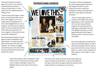

The document summarizes a magazine content page. It has many small images previewing articles and artists to highlight it as a music magazine. A large central image is the main story. While the layout is not cluttered, it has plenty of information. The colors are vibrant rather than typical pink, and the page numbers are stylized to match the magazine's theme. Overall the page has a quirky yet classy design that appeals to its target audience.


