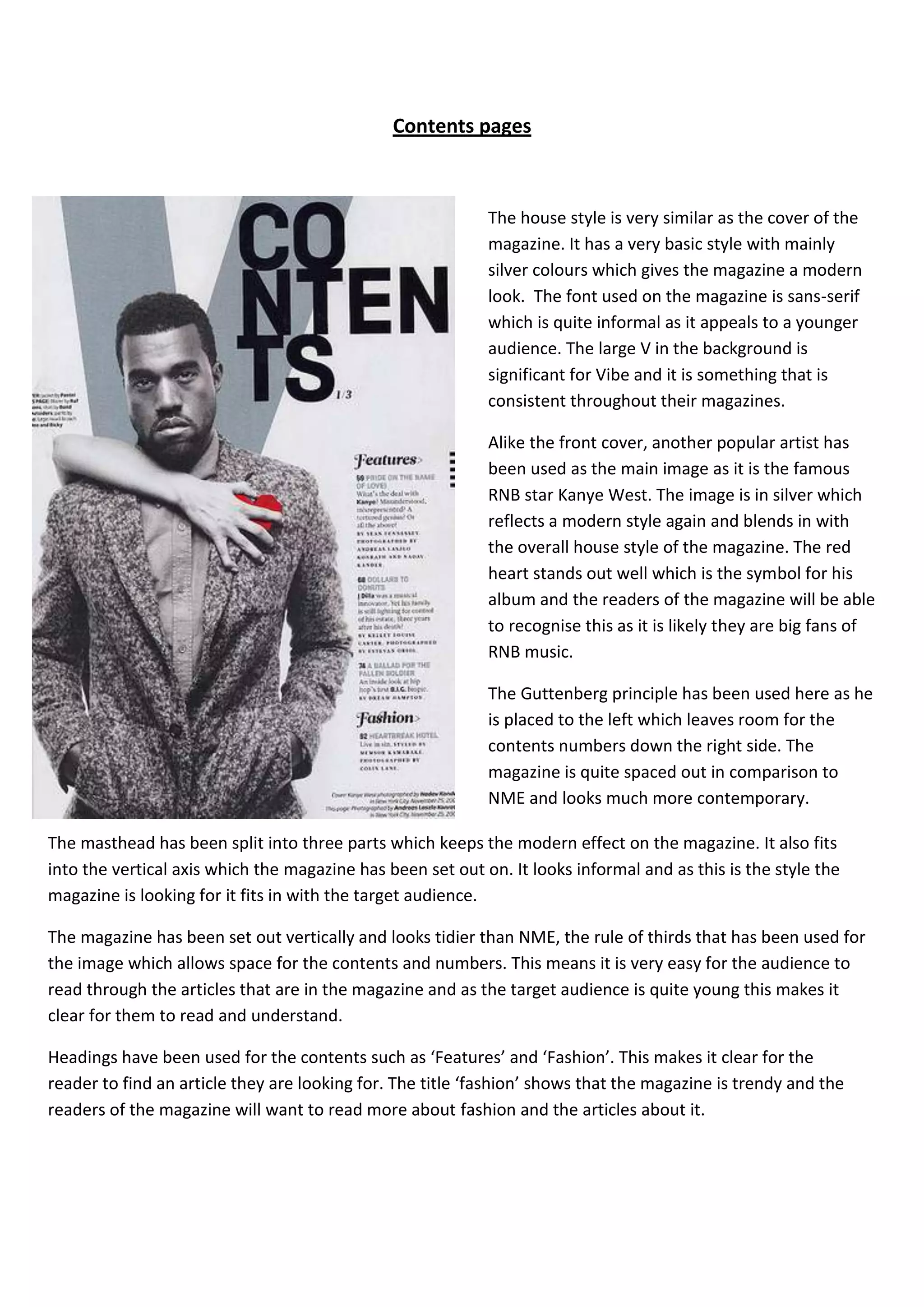
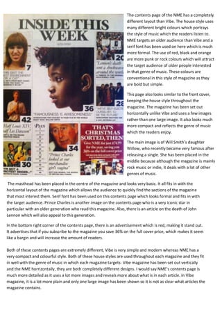
Contents pages


                                                            The house style is very similar as the cover of the
                                                            magazine. It has a very basic style with mainly
                                                            silver colours which gives the magazine a modern
                                                            look. The font used on the magazine is sans-serif
                                                            which is quite informal as it appeals to a younger
                                                            audience. The large V in the background is
                                                            significant for Vibe and it is something that is
                                                            consistent throughout their magazines.

                                                            Alike the front cover, another popular artist has
                                                            been used as the main image as it is the famous
                                                            RNB star Kanye West. The image is in silver which
                                                            reflects a modern style again and blends in with
                                                            the overall house style of the magazine. The red
                                                            heart stands out well which is the symbol for his
                                                            album and the readers of the magazine will be able
                                                            to recognise this as it is likely they are big fans of
                                                            RNB music.

                                                            The Guttenberg principle has been used here as he
                                                            is placed to the left which leaves room for the
                                                            contents numbers down the right side. The
                                                            magazine is quite spaced out in comparison to
                                                            NME and looks much more contemporary.

The masthead has been split into three parts which keeps the modern effect on the magazine. It also fits
into the vertical axis which the magazine has been set out on. It looks informal and as this is the style the
magazine is looking for it fits in with the target audience.

The magazine has been set out vertically and looks tidier than NME, the rule of thirds that has been used for
the image which allows space for the contents and numbers. This means it is very easy for the audience to
read through the articles that are in the magazine and as the target audience is quite young this makes it
clear for them to read and understand.

Headings have been used for the contents such as ‘Features’ and ‘Fashion’. This makes it clear for the
reader to find an article they are looking for. The title ‘fashion’ shows that the magazine is trendy and the
readers of the magazine will want to read more about fashion and the articles about it.
The contents page of the NME has a completely
                                                                   different layout than Vibe. The house style uses
                                                                   many different bright colours which portrays
                                                                   the style of music which the readers listen to.
                                                                   NME targets an older audience than Vibe and a
                                                                   serif font has been used on here which is much
                                                                   more formal. The use of red, black and orange
                                                                   are more punk or rock colours which will attract
                                                                   the target audience of older people interested
                                                                   in that genre of music. These colours are
                                                                   conventional in this style of magazine as they
                                                                   are bold but simple.

                                                                   This page also looks similar to the front cover,
                                                                   keeping the house style throughout the
                                                                   magazine. The magazine has been set out
                                                                   horizontally unlike Vibe and uses a few images
                                                                   rather than one large image. It also looks much
                                                                   more compact and reflects the genre of music
                                                                   which the readers enjoy.

                                                                   The main image is of Will Smith’s daughter
                                                                   Willow, who recently became very famous after
                                                                   releasing a single. She has been placed in the
                                                                   middle because although the magazine is mainly
                                                                   rock music or indie, it deals with a lot of other
                                                                   genres of music.

 The masthead has been placed in the centre of the magazine and looks very basic. It all fits in with the
horizontal layout of the magazine which allows the audience to quickly find the sections of the magazine
that most interest them. Serif font has been used on this contents page which looks formal and fits in with
the target audience. Prince Charles is another image on the contents page who is a very iconic star in
particular with an older generation who read this magazine. Also, there is an article on the death of John
Lennon which will also appeal to this generation.

In the bottom right corner of the contents page, there is an advertisement which is red, making it stand out.
It advertises that if you subscribe to the magazine you save 36% on the full cover price, which makes it seem
like a bargin and will increase the amount of readers.

Both of these contents pages are extremely different, Vibe is very simple and modern whereas NME has a
very compact and colourful style. Both of these house styles are used throughout each magazine and they fit
in well with the genre of music in which each magazine targets. Vibe magazine has been set out vertically
and the NME horrizontally, they are both completely different designs. I would say NME’s contents page is
much more detailed as it uses a lot more images and reveals more about what is in each article. In Vibe
magazine, it is a lot more plain and only one large image has been shown so it is not as clear what articles the
magazine contains.

Contents pages comparison

  • 1.
    Contents pages The house style is very similar as the cover of the magazine. It has a very basic style with mainly silver colours which gives the magazine a modern look. The font used on the magazine is sans-serif which is quite informal as it appeals to a younger audience. The large V in the background is significant for Vibe and it is something that is consistent throughout their magazines. Alike the front cover, another popular artist has been used as the main image as it is the famous RNB star Kanye West. The image is in silver which reflects a modern style again and blends in with the overall house style of the magazine. The red heart stands out well which is the symbol for his album and the readers of the magazine will be able to recognise this as it is likely they are big fans of RNB music. The Guttenberg principle has been used here as he is placed to the left which leaves room for the contents numbers down the right side. The magazine is quite spaced out in comparison to NME and looks much more contemporary. The masthead has been split into three parts which keeps the modern effect on the magazine. It also fits into the vertical axis which the magazine has been set out on. It looks informal and as this is the style the magazine is looking for it fits in with the target audience. The magazine has been set out vertically and looks tidier than NME, the rule of thirds that has been used for the image which allows space for the contents and numbers. This means it is very easy for the audience to read through the articles that are in the magazine and as the target audience is quite young this makes it clear for them to read and understand. Headings have been used for the contents such as ‘Features’ and ‘Fashion’. This makes it clear for the reader to find an article they are looking for. The title ‘fashion’ shows that the magazine is trendy and the readers of the magazine will want to read more about fashion and the articles about it.
  • 2.
    The contents pageof the NME has a completely different layout than Vibe. The house style uses many different bright colours which portrays the style of music which the readers listen to. NME targets an older audience than Vibe and a serif font has been used on here which is much more formal. The use of red, black and orange are more punk or rock colours which will attract the target audience of older people interested in that genre of music. These colours are conventional in this style of magazine as they are bold but simple. This page also looks similar to the front cover, keeping the house style throughout the magazine. The magazine has been set out horizontally unlike Vibe and uses a few images rather than one large image. It also looks much more compact and reflects the genre of music which the readers enjoy. The main image is of Will Smith’s daughter Willow, who recently became very famous after releasing a single. She has been placed in the middle because although the magazine is mainly rock music or indie, it deals with a lot of other genres of music. The masthead has been placed in the centre of the magazine and looks very basic. It all fits in with the horizontal layout of the magazine which allows the audience to quickly find the sections of the magazine that most interest them. Serif font has been used on this contents page which looks formal and fits in with the target audience. Prince Charles is another image on the contents page who is a very iconic star in particular with an older generation who read this magazine. Also, there is an article on the death of John Lennon which will also appeal to this generation. In the bottom right corner of the contents page, there is an advertisement which is red, making it stand out. It advertises that if you subscribe to the magazine you save 36% on the full cover price, which makes it seem like a bargin and will increase the amount of readers. Both of these contents pages are extremely different, Vibe is very simple and modern whereas NME has a very compact and colourful style. Both of these house styles are used throughout each magazine and they fit in well with the genre of music in which each magazine targets. Vibe magazine has been set out vertically and the NME horrizontally, they are both completely different designs. I would say NME’s contents page is much more detailed as it uses a lot more images and reveals more about what is in each article. In Vibe magazine, it is a lot more plain and only one large image has been shown so it is not as clear what articles the magazine contains.