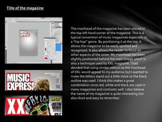
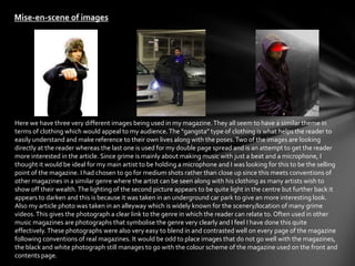
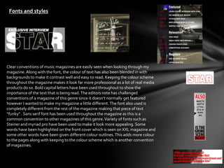
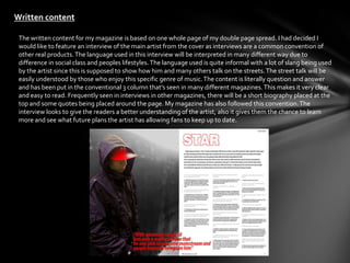
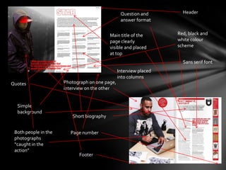
In what ways does your media product
use, develop or challenge forms and
conventions of real media products?
Title of the magazine


                        The masthead of the magazine has been placed in
                        the top left hand corner of the magazine. This is a
                        typical convention of music magazines especially in
                        a “hip hop” genre. By positioning it at the top, it
                        allows the magazine to be easily spotted and
                        recognised. It also allows the reader to focus on
                        other aspects of the cover. My masthead has been
                        slightly positioned behind the main image which is
                        also a technique used by XXL magazine. I had
                        decided that using similar colours to the masthead
                        of XXL would appeal to my audience but I wanted to
                        make the letters stand out a little more so the black
                        outline was used. I think this makes a great
                        combination since red, white and black are used in
                        many magazines and contrasts well. I also believe
                        the name of my magazine is quite interesting but
                        also short and easy to remember.
Mise-en-scene of images


Here we have three very different images being used in my magazine. They all seem to have a similar theme in
terms of clothing which would appeal to my audience. The “gangsta” type of clothing is what helps the reader to
easily understand and make reference to their own lives along with the poses. Two of the images are looking
directly at the reader whereas the last one is used for my double page spread and is an attempt to get the reader
more interested in the article. Since grime is mainly about making music with just a beat and a microphone, I
thought it would be ideal for my main artist to be holding a microphone and I was looking for this to be the selling
point of the magazine. I had chosen to go for medium shots rather than close up since this meets conventions of
other magazines in a similar genre where the artist can be seen along with his clothing as many artists wish to
show off their wealth. The lighting of the second picture appears to be quite light in the centre but further back it
appears to darken and this is because it was taken in an underground car park to give an more interesting look.
Also my article photo was taken in an alleyway which is widely known for the scenery/location of many grime
videos. This gives the photograph a clear link to the genre in which the reader can relate to. Often used in other
music magazines are photographs that symbolise the genre very clearly and I feel I have done this quite
effectively. These photographs were also very easy to blend in and contrasted well on every page of the magazine
following conventions of real magazines. It would be odd to place images that do not go well with the magazines,
the black and white photograph still manages to go with the colour scheme of the magazine used on the front and
contents page.
Fonts and styles


Clear conventions of music magazines are easily seen when looking through my
magazine. Along with the font, the colour of text has also been blended in with
backgrounds to make it contrast well and easy to read. Keeping the colour scheme
throughout the magazine makes it look far more professional as a lot of real media
products do so. Bold capital letters have been used throughout to show the
importance of the text that is being read. The editors note has challenged
conventions of a magazine of this genre since it doesn’t normally get featured
however I wanted to make my magazine a little different. The font also used is
completely different from the rest of the magazine making that piece of text
“funky” . Sans serif font has been used throughout the magazine as this is a
common convention to other magazines of this genre. Variety of fonts such as
Steiner and myriad pro have been used to make it look more appealing. Some
words have been highlighted on the front cover which is seen on XXL magazine and
some other words have been given different colour outlines. This adds more colour
to the pages along with keeping to the colour scheme which is another convention
of magazines.
Written content

 The written content for my magazine is based on one whole page of my double page spread. I had decided I
 would like to feature an interview of the main artist from the cover as interviews are a common convention of
 other real products. The language used in this interview will be interpreted in many different way due to
 difference in social class and peoples lifestyles. The language used is quite informal with a lot of slang being used
 by the artist since this is supposed to show how him and many others talk on the streets. The street talk will be
 easily understood by those who enjoy this specific genre of music. The content is literally question and answer
 and has been put in the conventional 3 column that’s seen in many different magazines. This makes it very clear
 and easy to read. Frequently seen in interviews in other magazines, there will be a short biography placed at the
 top and some quotes being placed around the page. My magazine has also followed this convention. The
 interview looks to give the readers a better understanding of the artist, also it gives them the chance to learn
 more and see what future plans the artist has allowing fans to keep up to date.
Music genre and how your magazine suggests it


 The music genre of my magazine can be clearly identified by anybody since there are a lot of
 stereotypes visible. Many different elements go together that can make it very easy to see
 what type of genre the magazine is. First thing that can be easily identified the clothing used in
 the photographs. Certain clothing are associated with different social class and because of the
 way the characters in the photographs are dressed, it can be easily seen as to which genre they
 belong to. The use of hoods, caps, hats, baggy dark clothing are all stereotypes linked strongly
 to this genre. Also readers can easily assume from the poses of the characters that the
 magazine is about hip hop/grime since this type of body language is widely seen in many music
 videos of this genre. If the magazine was to be placed around magazines from other genres,
 the urban/street look will make it clear as to how the magazine will be about grime. The front
 cover also features many other artists which are known in the grime scene. Another way of
 identifying the genre of the magazine is by looking at the language used in the interview. The
 artist clearly uses language which is mainly considered to be street talk. This is used by many
 grime artists and those of social class linked directly to this genre.
Barcode, website,
Layout and other conventions   issue number and
                               price

                               Tag line

                               Main masthead,
                               slightly covered
                                Cover photo
                                of artist
                                looking at
                                reader
                               Highlighted text


                                 Cover line


                               Simplistic
                               background


                                Subtext

                               Other artists
Masthead
                                                                Editors note


                                                               Colour scheme of
                                            Header             white, red and
                                                               black


                                                                   Footer
                                             Caption of main
                                             image

Simple
background           Main image of
                     contents page

                          Sans serif font
  Advert

                          Page number


   Catchphrase for
   advert
Question and        Header
                                                 answer format


                                           Main title of the       Red, black and
                                           page clearly            white colour
                                           visible and placed      scheme
                                           at top
                                                                     Sans serif font
                                                Interview placed
                                                into columns
Quotes                Photograph on one page,
                      interview on the other


  Simple
  background
                         Short biography


 Both people in the      Page number
 photographs
 “caught in the
 action”
                            Footer

Eval 1

  • 1.
    In what waysdoes your media product use, develop or challenge forms and conventions of real media products?
  • 2.
    Title of themagazine The masthead of the magazine has been placed in the top left hand corner of the magazine. This is a typical convention of music magazines especially in a “hip hop” genre. By positioning it at the top, it allows the magazine to be easily spotted and recognised. It also allows the reader to focus on other aspects of the cover. My masthead has been slightly positioned behind the main image which is also a technique used by XXL magazine. I had decided that using similar colours to the masthead of XXL would appeal to my audience but I wanted to make the letters stand out a little more so the black outline was used. I think this makes a great combination since red, white and black are used in many magazines and contrasts well. I also believe the name of my magazine is quite interesting but also short and easy to remember.
  • 3.
    Mise-en-scene of images Herewe have three very different images being used in my magazine. They all seem to have a similar theme in terms of clothing which would appeal to my audience. The “gangsta” type of clothing is what helps the reader to easily understand and make reference to their own lives along with the poses. Two of the images are looking directly at the reader whereas the last one is used for my double page spread and is an attempt to get the reader more interested in the article. Since grime is mainly about making music with just a beat and a microphone, I thought it would be ideal for my main artist to be holding a microphone and I was looking for this to be the selling point of the magazine. I had chosen to go for medium shots rather than close up since this meets conventions of other magazines in a similar genre where the artist can be seen along with his clothing as many artists wish to show off their wealth. The lighting of the second picture appears to be quite light in the centre but further back it appears to darken and this is because it was taken in an underground car park to give an more interesting look. Also my article photo was taken in an alleyway which is widely known for the scenery/location of many grime videos. This gives the photograph a clear link to the genre in which the reader can relate to. Often used in other music magazines are photographs that symbolise the genre very clearly and I feel I have done this quite effectively. These photographs were also very easy to blend in and contrasted well on every page of the magazine following conventions of real magazines. It would be odd to place images that do not go well with the magazines, the black and white photograph still manages to go with the colour scheme of the magazine used on the front and contents page.
  • 4.
    Fonts and styles Clearconventions of music magazines are easily seen when looking through my magazine. Along with the font, the colour of text has also been blended in with backgrounds to make it contrast well and easy to read. Keeping the colour scheme throughout the magazine makes it look far more professional as a lot of real media products do so. Bold capital letters have been used throughout to show the importance of the text that is being read. The editors note has challenged conventions of a magazine of this genre since it doesn’t normally get featured however I wanted to make my magazine a little different. The font also used is completely different from the rest of the magazine making that piece of text “funky” . Sans serif font has been used throughout the magazine as this is a common convention to other magazines of this genre. Variety of fonts such as Steiner and myriad pro have been used to make it look more appealing. Some words have been highlighted on the front cover which is seen on XXL magazine and some other words have been given different colour outlines. This adds more colour to the pages along with keeping to the colour scheme which is another convention of magazines.
  • 5.
    Written content Thewritten content for my magazine is based on one whole page of my double page spread. I had decided I would like to feature an interview of the main artist from the cover as interviews are a common convention of other real products. The language used in this interview will be interpreted in many different way due to difference in social class and peoples lifestyles. The language used is quite informal with a lot of slang being used by the artist since this is supposed to show how him and many others talk on the streets. The street talk will be easily understood by those who enjoy this specific genre of music. The content is literally question and answer and has been put in the conventional 3 column that’s seen in many different magazines. This makes it very clear and easy to read. Frequently seen in interviews in other magazines, there will be a short biography placed at the top and some quotes being placed around the page. My magazine has also followed this convention. The interview looks to give the readers a better understanding of the artist, also it gives them the chance to learn more and see what future plans the artist has allowing fans to keep up to date.
  • 6.
    Music genre andhow your magazine suggests it The music genre of my magazine can be clearly identified by anybody since there are a lot of stereotypes visible. Many different elements go together that can make it very easy to see what type of genre the magazine is. First thing that can be easily identified the clothing used in the photographs. Certain clothing are associated with different social class and because of the way the characters in the photographs are dressed, it can be easily seen as to which genre they belong to. The use of hoods, caps, hats, baggy dark clothing are all stereotypes linked strongly to this genre. Also readers can easily assume from the poses of the characters that the magazine is about hip hop/grime since this type of body language is widely seen in many music videos of this genre. If the magazine was to be placed around magazines from other genres, the urban/street look will make it clear as to how the magazine will be about grime. The front cover also features many other artists which are known in the grime scene. Another way of identifying the genre of the magazine is by looking at the language used in the interview. The artist clearly uses language which is mainly considered to be street talk. This is used by many grime artists and those of social class linked directly to this genre.
  • 7.
    Barcode, website, Layout andother conventions issue number and price Tag line Main masthead, slightly covered Cover photo of artist looking at reader Highlighted text Cover line Simplistic background Subtext Other artists
  • 8.
    Masthead Editors note Colour scheme of Header white, red and black Footer Caption of main image Simple background Main image of contents page Sans serif font Advert Page number Catchphrase for advert
  • 9.
    Question and Header answer format Main title of the Red, black and page clearly white colour visible and placed scheme at top Sans serif font Interview placed into columns Quotes Photograph on one page, interview on the other Simple background Short biography Both people in the Page number photographs “caught in the action” Footer