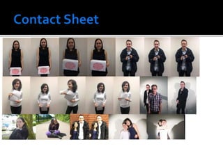
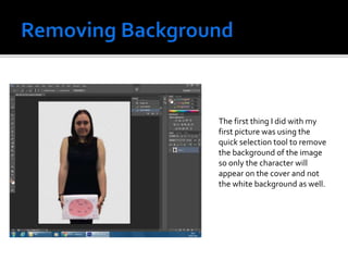
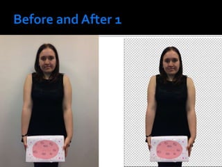
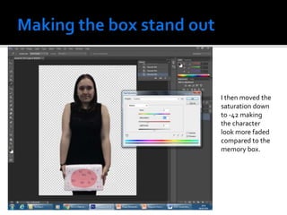
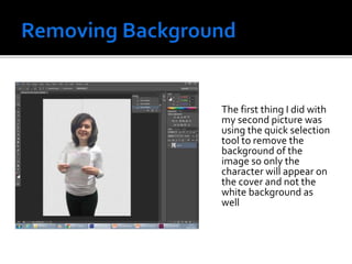
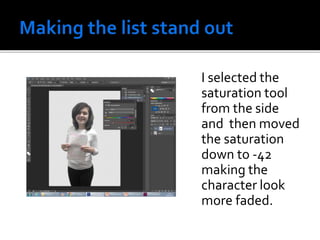
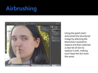
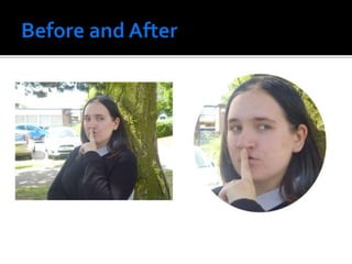
These images are suitable for my magazine colour as the first three (which would be
used for the main anchorage on different covers) were taken in natural lighting which
will input to the realistic tone of the film.The fourth picture will be suitable for a
thumbnail as it was taken in film noir lighting, creating the shadows which are common
inThriller films.The mise en scene of the images is also quite good as the costumes and
props are all suitable for the film they are portraying along with the facial expressions.
The first thing I did with my
first picture was using the
quick selection tool to remove
the background of the image
so only the character will
appear on the cover and not
the white background as well.
The second thing I did was airbrush the actor’s face. I did this by using the eye dropper
tool and then selecting a bit of skin close to the area I wanted to cover to make sure
the colour was consistent.After selecting a suitable colour, I then used the brush tool
to cover up any blemishes.
The third thing I did was get rid of the red eye in the picture. I did this by using the
default setting on the red-eye tool.
I wanted to experiment with making the box stand out more so something on the cover
really pops out.The first thing I did was using the magnetic lasso tool, select the memories
box from the image. I then feathered the selected area using the feather feature at the top
and selecting 15 pixels.
Then using the filter drop down menu, I selected Gaussian blur and selected 2.5 pixels so
that the character is slightly blurred in the background and the box stands out. I then
went to the Image drop down menu, selected adjustments and then hue and saturation.
I then moved the
saturation down
to -42 making
the character
look more faded
compared to the
memory box.
The first thing I did with
my second picture was
using the quick selection
tool to remove the
background of the
image so only the
character will appear on
the cover and not the
white background as
well
The first thing I did
was using the
magnetic lasso tool,
select the list from the
image. I then
feathered the selected
area using the feather
feature at the top and
selecting 15 pixels.
Then using the filter
drop down menu, I
selected Gaussian
blur and selected
2.5 pixels so that
the character is
slightly blurred in
the background and
the list stands out
I selected the
saturation tool
from the side
and then moved
the saturation
down to -42
making the
character look
more faded.
Using the quick
selection tool I
removed the
background of the
image so only the
character will appear
on the cover and not
the white
background as well
By duplicating the
layers and then
selecting multiply
makes the image
darker. I then
changed the
opacity to 27 which
then gets rid of the
majority of
shadows on the
photo.
I used the
Elliptical
Marquee tool
to shape my
thumbnail
image into a
circle so I can
insert it into
the corner of
my magazine.
Using the patch tool I
airbrushed the thumbnail
image by selecting the
blemishes I wanted to
replace and then selected
a clear bit of skin to
replace it with, making
sure I kept the skin tone
the same.
First I created the sticker using word before opening it in
photoshop and using the transform tool, rotated it
slightly. I then used the Polygonal lasso to select the part
of the circle that would peel up.
I then created a new layer using “layer via cut” and
rotated the selected area 180º I then clicked on the layer
and selected colour overlay, turning the section white.
I then created a new layer above the main one and used
the brush tool to create a shadow under the folded part
of the sticker. I then selected transform again and
warped the folded section.
After that I then got rid of the colour overlay on the
folded section and instead selected gradient overlay. I
adjusted the angle to -29 before dragging the white
over.
Image manipulation

Image manipulation

  • 3.
    These images aresuitable for my magazine colour as the first three (which would be used for the main anchorage on different covers) were taken in natural lighting which will input to the realistic tone of the film.The fourth picture will be suitable for a thumbnail as it was taken in film noir lighting, creating the shadows which are common inThriller films.The mise en scene of the images is also quite good as the costumes and props are all suitable for the film they are portraying along with the facial expressions.
  • 5.
    The first thingI did with my first picture was using the quick selection tool to remove the background of the image so only the character will appear on the cover and not the white background as well.
  • 6.
    The second thingI did was airbrush the actor’s face. I did this by using the eye dropper tool and then selecting a bit of skin close to the area I wanted to cover to make sure the colour was consistent.After selecting a suitable colour, I then used the brush tool to cover up any blemishes.
  • 7.
    The third thingI did was get rid of the red eye in the picture. I did this by using the default setting on the red-eye tool.
  • 9.
    I wanted toexperiment with making the box stand out more so something on the cover really pops out.The first thing I did was using the magnetic lasso tool, select the memories box from the image. I then feathered the selected area using the feather feature at the top and selecting 15 pixels.
  • 10.
    Then using thefilter drop down menu, I selected Gaussian blur and selected 2.5 pixels so that the character is slightly blurred in the background and the box stands out. I then went to the Image drop down menu, selected adjustments and then hue and saturation.
  • 11.
    I then movedthe saturation down to -42 making the character look more faded compared to the memory box.
  • 13.
    The first thingI did with my second picture was using the quick selection tool to remove the background of the image so only the character will appear on the cover and not the white background as well
  • 15.
    The first thingI did was using the magnetic lasso tool, select the list from the image. I then feathered the selected area using the feather feature at the top and selecting 15 pixels.
  • 16.
    Then using thefilter drop down menu, I selected Gaussian blur and selected 2.5 pixels so that the character is slightly blurred in the background and the list stands out
  • 17.
    I selected the saturationtool from the side and then moved the saturation down to -42 making the character look more faded.
  • 21.
    Using the quick selectiontool I removed the background of the image so only the character will appear on the cover and not the white background as well
  • 22.
    By duplicating the layersand then selecting multiply makes the image darker. I then changed the opacity to 27 which then gets rid of the majority of shadows on the photo.
  • 23.
    I used the Elliptical Marqueetool to shape my thumbnail image into a circle so I can insert it into the corner of my magazine.
  • 24.
    Using the patchtool I airbrushed the thumbnail image by selecting the blemishes I wanted to replace and then selected a clear bit of skin to replace it with, making sure I kept the skin tone the same.
  • 26.
    First I createdthe sticker using word before opening it in photoshop and using the transform tool, rotated it slightly. I then used the Polygonal lasso to select the part of the circle that would peel up.
  • 27.
    I then createda new layer using “layer via cut” and rotated the selected area 180º I then clicked on the layer and selected colour overlay, turning the section white.
  • 28.
    I then createda new layer above the main one and used the brush tool to create a shadow under the folded part of the sticker. I then selected transform again and warped the folded section.
  • 29.
    After that Ithen got rid of the colour overlay on the folded section and instead selected gradient overlay. I adjusted the angle to -29 before dragging the white over.