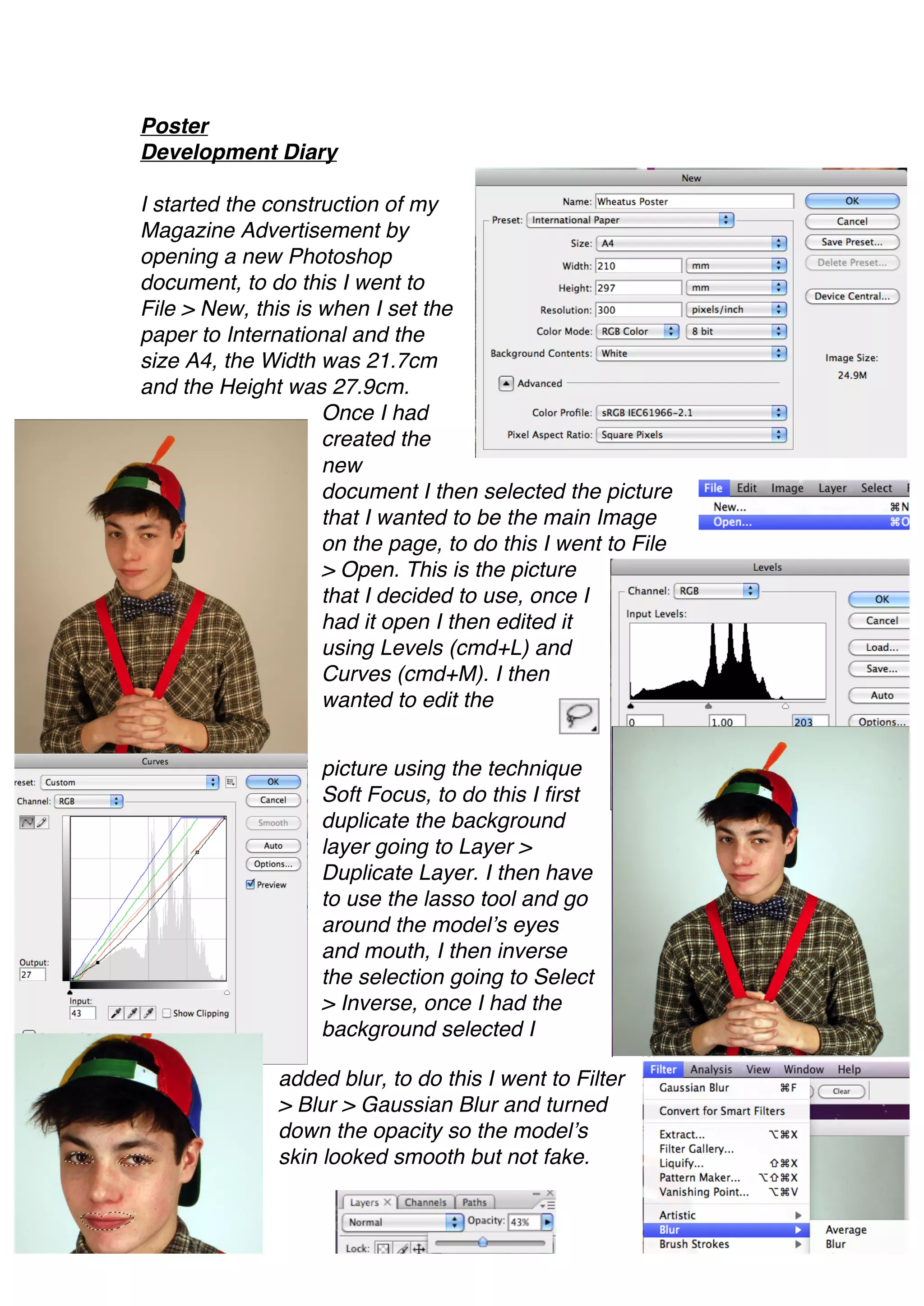
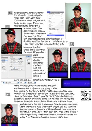
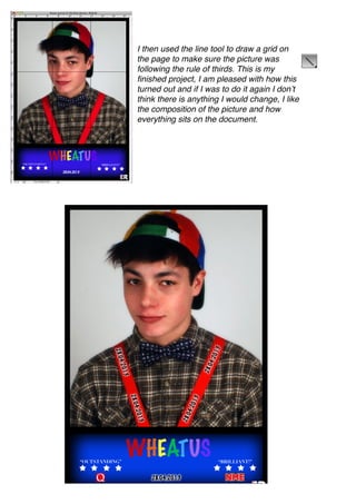
Poster
Development Diary

I started the construction of my
Magazine Advertisement by
opening a new Photoshop
document, to do this I went to
File > New, this is when I set the
paper to International and the
size A4, the Width was 21.7cm
and the Height was 27.9cm.
                    Once I had
                    created the
                    new
                    document I then selected the picture
                    that I wanted to be the main Image
                    on the page, to do this I went to File
                    > Open. This is the picture
                    that I decided to use, once I
                    had it open I then edited it
                    using Levels (cmd+L) and
                    Curves (cmd+M). I then
                    wanted to edit the


                   picture using the technique
                   Soft Focus, to do this I first
                   duplicate the background
                   layer going to Layer >
                   Duplicate Layer. I then have
                   to use the lasso tool and go
                   around the model’s eyes
                   and mouth, I then inverse
                   the selection going to Select
                   > Inverse, once I had the
                   background selected I

               added blur, to do this I went to Filter
               > Blur > Gaussian Blur and turned
               down the opacity so the model’s
               skin looked smooth but not fake.
I then dragged the picture onto
the blank document using the
move tool, I then used Free
Transform to make the picture fit
better on the page. This is the
finished image. I then put a
          boarder around the
          document and also put
          a box below the picture
          that would be filled
          with information on the album release, to
          do this I used the line tool and set the width to
          1cm. I then used the rectangle tool to put a
          rectangle into the
          space at the bottom of
          the page, I then added
                     drop
                     shadow by
                     double
                     clicking on
                     the layer
                     with the
                     shape on it.
                     I then added
                     text to it
using the text tool I selected the font Didot as it

looks the most professional and as though it
would represent a big music company. I also
then added the text for the WHEATUS header, for this I used
Marker Felt to keep the house style the same for the digi-pack, I
changed the colour of each word by highlighting the letter and
selecting a colour. Using the same font I added the date up the
braces of the model, I used Edit > Transform > Rotate. I then
      added stars to the box to represent how the album has been
      rated, to do this I used the custom shape tool and selected
      the star shape, holding the shift key down to make sure the
      star stays in proportion. I then added the logo to the picture I
      did this by pasting the picture onto the poster document and
      using Free Transform to adjust the size of the logo.
I then used the line tool to draw a grid on
the page to make sure the picture was
following the rule of thirds. This is my
finished project, I am pleased with how this
turned out and if I was to do it again I don’t
think there is anything I would change, I like
the composition of the picture and how
everything sits on the document.

Poster diary

  • 1.
    Poster Development Diary I startedthe construction of my Magazine Advertisement by opening a new Photoshop document, to do this I went to File > New, this is when I set the paper to International and the size A4, the Width was 21.7cm and the Height was 27.9cm. Once I had created the new document I then selected the picture that I wanted to be the main Image on the page, to do this I went to File > Open. This is the picture that I decided to use, once I had it open I then edited it using Levels (cmd+L) and Curves (cmd+M). I then wanted to edit the picture using the technique Soft Focus, to do this I first duplicate the background layer going to Layer > Duplicate Layer. I then have to use the lasso tool and go around the model’s eyes and mouth, I then inverse the selection going to Select > Inverse, once I had the background selected I added blur, to do this I went to Filter > Blur > Gaussian Blur and turned down the opacity so the model’s skin looked smooth but not fake.
  • 2.
    I then draggedthe picture onto the blank document using the move tool, I then used Free Transform to make the picture fit better on the page. This is the finished image. I then put a boarder around the document and also put a box below the picture that would be filled with information on the album release, to do this I used the line tool and set the width to 1cm. I then used the rectangle tool to put a rectangle into the space at the bottom of the page, I then added drop shadow by double clicking on the layer with the shape on it. I then added text to it using the text tool I selected the font Didot as it looks the most professional and as though it would represent a big music company. I also then added the text for the WHEATUS header, for this I used Marker Felt to keep the house style the same for the digi-pack, I changed the colour of each word by highlighting the letter and selecting a colour. Using the same font I added the date up the braces of the model, I used Edit > Transform > Rotate. I then added stars to the box to represent how the album has been rated, to do this I used the custom shape tool and selected the star shape, holding the shift key down to make sure the star stays in proportion. I then added the logo to the picture I did this by pasting the picture onto the poster document and using Free Transform to adjust the size of the logo.
  • 3.
    I then usedthe line tool to draw a grid on the page to make sure the picture was following the rule of thirds. This is my finished project, I am pleased with how this turned out and if I was to do it again I don’t think there is anything I would change, I like the composition of the picture and how everything sits on the document.