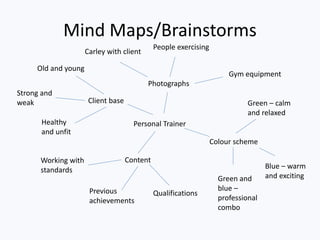
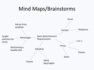
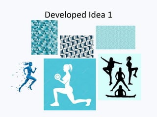
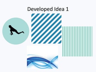
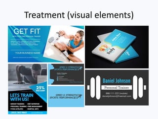
The document provides details of ideas generated for advertising materials for a personal trainer client named Carley. Three developed ideas are presented with mockups and evaluations.
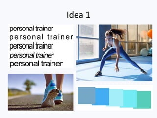
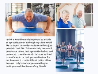
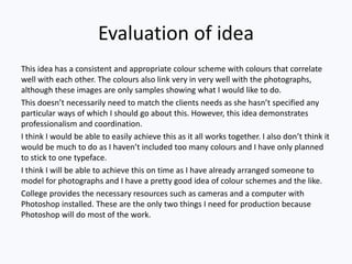
Idea 1 features a blue and green color scheme with sample photos of people exercising. It is evaluated as professional and coordinated but may not fully meet the client's needs.
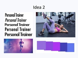
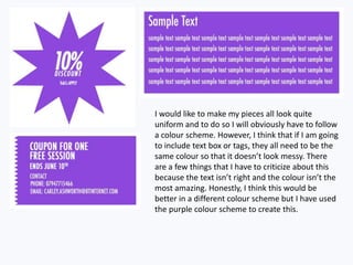
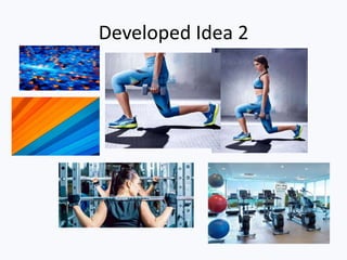
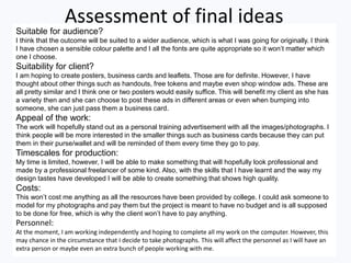
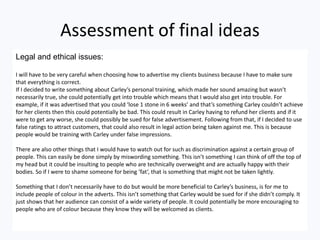
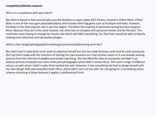
Idea 2 uses a purple color scheme described as bold and exciting. Photographic concepts are ambitious but realistic to achieve. It is assessed as attractive but may set too high of standards.
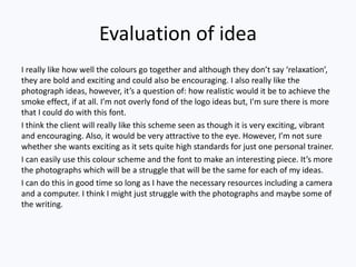
Idea 3 proposes using clipart or self-generated images in Photoshop to avoid photo issues. A green color scheme is presented as easy to achieve and matching the client's ideals. It