Download to read offline

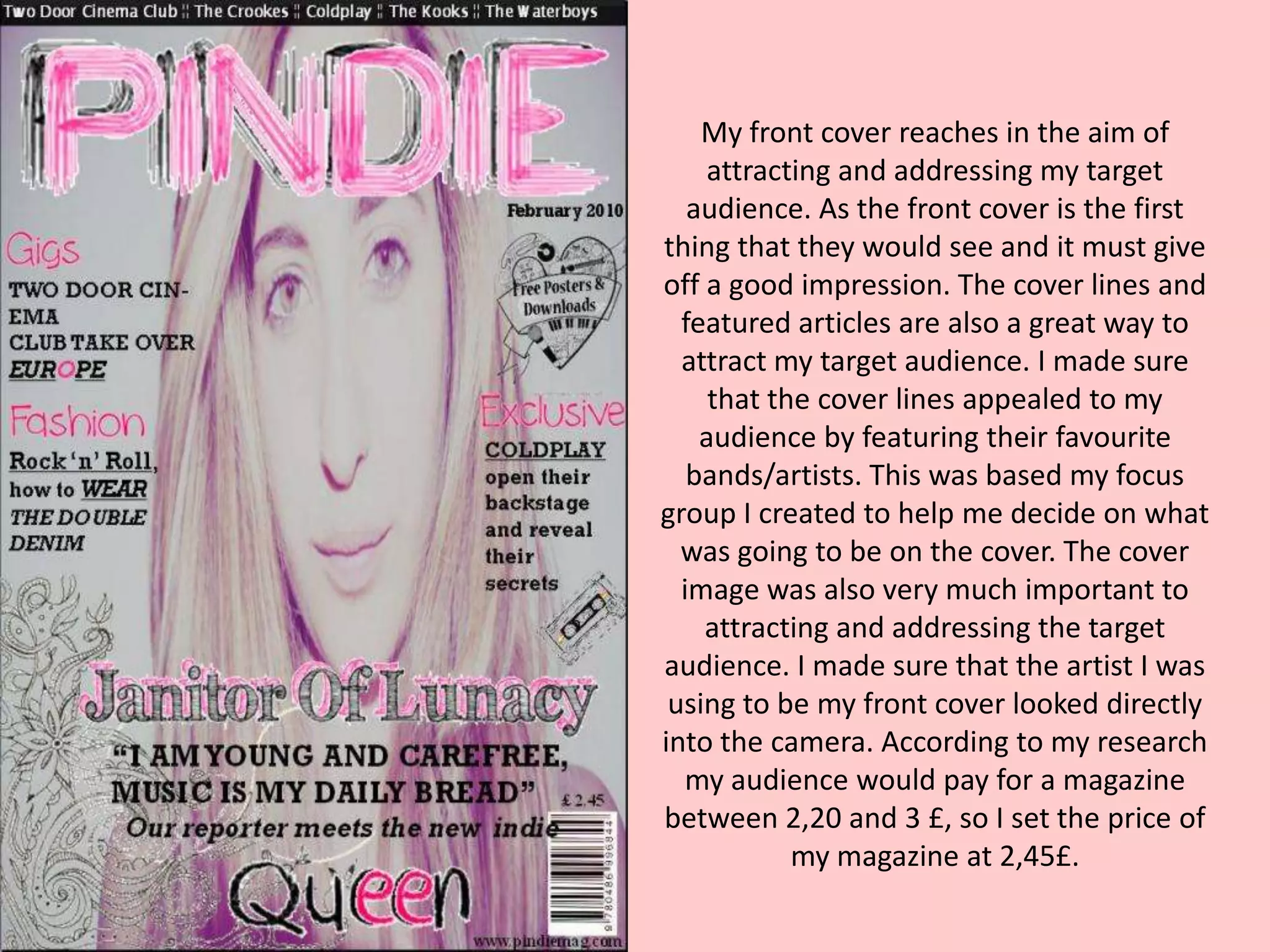
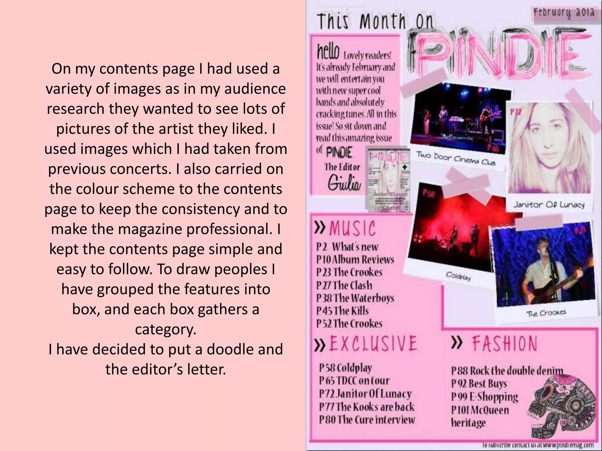


The document discusses the design choices for the front cover, contents page, and a double-page spread for a music magazine. The front cover features the target audience's favorite bands/artists to attract readers. A focus group helped decide the cover elements. The contents page uses images and keeps a consistent color scheme. The double-page spread maintains the color scheme and features a large cover image on one page with the title below, along with bold text and quotes to break up the column of text for easy reading.


