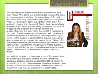
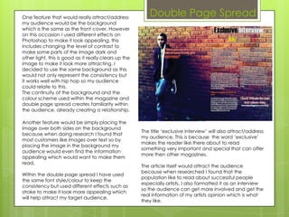
How did you
attract/address
your audience?
Front cover
First, I believe my main cover image on the front cover was
one major feature that attracted my target audience. The
reason for this was because of his ethnicity, I could have used
even a Chinese actor for my artist as my cover image but it
wouldn’t be very appealing and instead strange because
the hip hop genre is normally referred to by afro Caribbean's
so my target audience would be able to refer to this. There is
also his pose which his head is slightly slanted to represent his
coolness and ‘swagger’, this is another topic that my
audience would understand and find attracting. My actor
also represents my target audience that I want to attract.

Second feature that I used to attract/address my audience
was the gold coloured brick wall in the background. The hip
hop industry was born from the streets and this is where it all
started, the colour gold adds to its royalty and how prestigious
this genre is now. My audience would really appreciate this as
well as finding the colour gold bright and appealing.

Another way in which my front cover attracts the audience is
through the cover/sell lines used. These cover lines include
different specific topics which my audience would be able to
refer to. These include cover lines such as ‘R.I.P 2pac’ who is
one of the most famous rappers of all time in the music
industry, this will want to make my key demographic read
more as they find this information really interesting
Contents Page
First, one important feature that attracts my audience is the
main image. After doing research I decided increase the size of
my target audience to attract female audience’s for better
success which is why I used a female actress/artist as my main
image. My actor gives direct eye contact which allows the
reader to engage from the outset. She is also shown positively
smiling which is always great as it brightens up the mood of the
magazine and creates a positive vibe towards the
reader, attracting and convincing them that this magazine is
very good. She looks very sophisticated and well dressed which
is another factor since in the hip hop industry you need stylish
clothes so the audience would relate to this and may want to
read on more so they can get the same style as ‘Lil Kimmi’. This
is also emphasised with a caption that says ‘get her style’ which
not only helps to anchor the image but informs the audience
you can look just like her. Her image also represents my female
target audience which is very useful as they can relate to
‘Kimmi’

Second feature would be the colour scheme. This would attract
my audience as the colour scheme includes very strong
aggressive colours which are usually referred to hip hop as its
hard hitting and gritty. The colours are also allow the information
to stand out which would attract the audience and want to
make them read more as everything is so clear/visible.
One feature that would really attract/address
                                                          Double Page Spread
my audience would be the background
which is the same as the front cover. However
on this occasion I used different effects on
Photoshop to make it look appealing, this
includes changing the level of contrast to
make some parts of the image dark and
other light, this is good as it really clears up the
image to make it look more attracting. I
decided to use the same background as this
would not only represent the consistency but
it works well with hip hop so my audience
could relate to this.
The continuity of the background and the
colour scheme used within the magazine and
double page spread creates familiarity within
the audience, already creating a relationship.

Another feature would be simply placing the
image over both sides on the background
                                                       The title ‘exclusive interview’ will also attract/address
because when doing research I found that
                                                       my audience. This is because the word ‘exclusive’
most customers like images over text so by
                                                       makes the reader like there about to read
placing the image in the background my
                                                       something very important and special that can offer
audience would even find the information
                                                       more then other magazines.
appealing which would want to make them
read.
                                                       The article itself would attract the audience
                                                       because when researched I found that the
Within the double page spread I have used
                                                       population like to read about successful people
the same font style/colour to keep the
                                                       especially artists. I also formatted it as an interview
consistency but used different effects such as
                                                       so the audience can get more involved and get the
stroke to make it look more appealing which
                                                       real information of my artists opinion which is what
will help attract my target audience.
                                                       they like.

Evaluation question 5

  • 1.
  • 2.
    Front cover First, Ibelieve my main cover image on the front cover was one major feature that attracted my target audience. The reason for this was because of his ethnicity, I could have used even a Chinese actor for my artist as my cover image but it wouldn’t be very appealing and instead strange because the hip hop genre is normally referred to by afro Caribbean's so my target audience would be able to refer to this. There is also his pose which his head is slightly slanted to represent his coolness and ‘swagger’, this is another topic that my audience would understand and find attracting. My actor also represents my target audience that I want to attract. Second feature that I used to attract/address my audience was the gold coloured brick wall in the background. The hip hop industry was born from the streets and this is where it all started, the colour gold adds to its royalty and how prestigious this genre is now. My audience would really appreciate this as well as finding the colour gold bright and appealing. Another way in which my front cover attracts the audience is through the cover/sell lines used. These cover lines include different specific topics which my audience would be able to refer to. These include cover lines such as ‘R.I.P 2pac’ who is one of the most famous rappers of all time in the music industry, this will want to make my key demographic read more as they find this information really interesting
  • 3.
    Contents Page First, oneimportant feature that attracts my audience is the main image. After doing research I decided increase the size of my target audience to attract female audience’s for better success which is why I used a female actress/artist as my main image. My actor gives direct eye contact which allows the reader to engage from the outset. She is also shown positively smiling which is always great as it brightens up the mood of the magazine and creates a positive vibe towards the reader, attracting and convincing them that this magazine is very good. She looks very sophisticated and well dressed which is another factor since in the hip hop industry you need stylish clothes so the audience would relate to this and may want to read on more so they can get the same style as ‘Lil Kimmi’. This is also emphasised with a caption that says ‘get her style’ which not only helps to anchor the image but informs the audience you can look just like her. Her image also represents my female target audience which is very useful as they can relate to ‘Kimmi’ Second feature would be the colour scheme. This would attract my audience as the colour scheme includes very strong aggressive colours which are usually referred to hip hop as its hard hitting and gritty. The colours are also allow the information to stand out which would attract the audience and want to make them read more as everything is so clear/visible.
  • 4.
    One feature thatwould really attract/address Double Page Spread my audience would be the background which is the same as the front cover. However on this occasion I used different effects on Photoshop to make it look appealing, this includes changing the level of contrast to make some parts of the image dark and other light, this is good as it really clears up the image to make it look more attracting. I decided to use the same background as this would not only represent the consistency but it works well with hip hop so my audience could relate to this. The continuity of the background and the colour scheme used within the magazine and double page spread creates familiarity within the audience, already creating a relationship. Another feature would be simply placing the image over both sides on the background The title ‘exclusive interview’ will also attract/address because when doing research I found that my audience. This is because the word ‘exclusive’ most customers like images over text so by makes the reader like there about to read placing the image in the background my something very important and special that can offer audience would even find the information more then other magazines. appealing which would want to make them read. The article itself would attract the audience because when researched I found that the Within the double page spread I have used population like to read about successful people the same font style/colour to keep the especially artists. I also formatted it as an interview consistency but used different effects such as so the audience can get more involved and get the stroke to make it look more appealing which real information of my artists opinion which is what will help attract my target audience. they like.