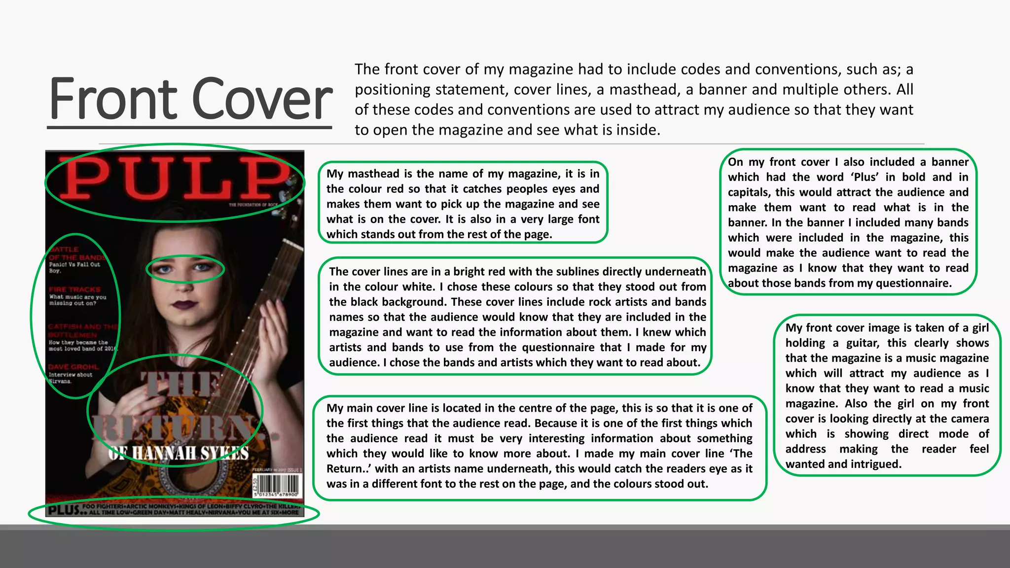
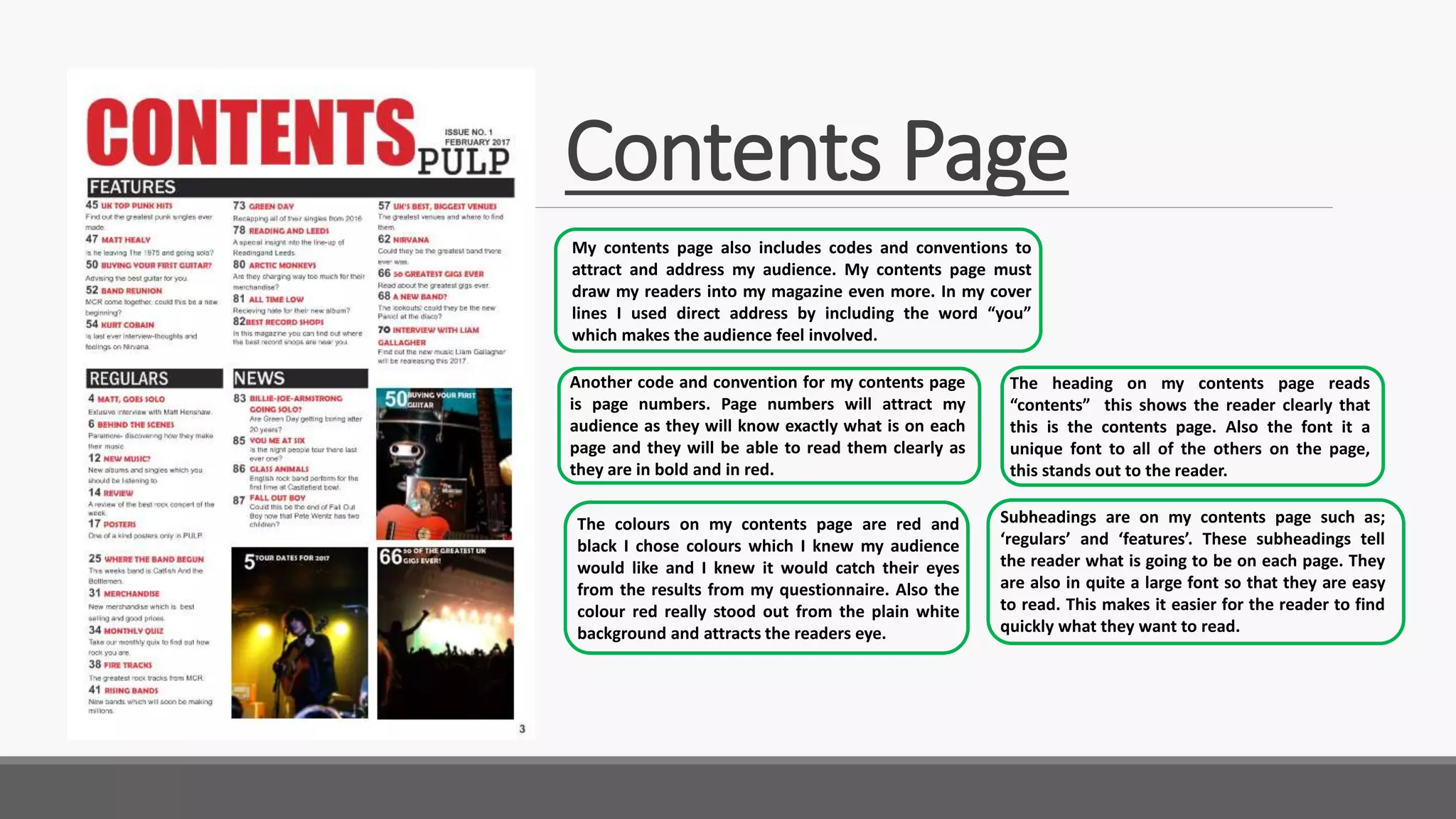
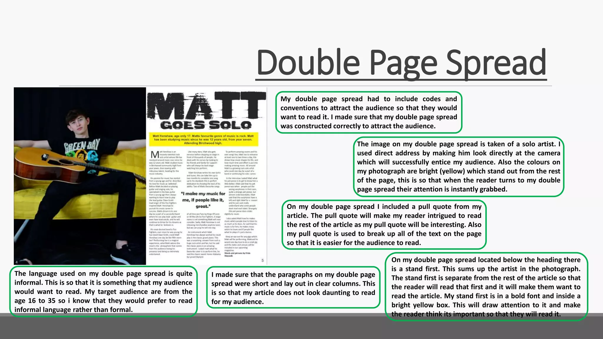
5.How did you attract/address your audience?
FRIDA WAYWELL To attract and address my audience I had to include the codes and
conventions of a media magazine. I used the correct codes and
conventions for my magazine cover, contents page and double
page spread.
Front Cover
The front cover of my magazine had to include codes and conventions, such as; a
positioning statement, cover lines, a masthead, a banner and multiple others. All
of these codes and conventions are used to attract my audience so that they want
to open the magazine and see what is inside.
My masthead is the name of my magazine, it is in
the colour red so that it catches peoples eyes and
makes them want to pick up the magazine and see
what is on the cover. It is also in a very large font
which stands out from the rest of the page.
The cover lines are in a bright red with the sublines directly underneath
in the colour white. I chose these colours so that they stood out from
the black background. These cover lines include rock artists and bands
names so that the audience would know that they are included in the
magazine and want to read the information about them. I knew which
artists and bands to use from the questionnaire that I made for my
audience. I chose the bands and artists which they want to read about.
My main cover line is located in the centre of the page, this is so that it is one of
the first things that the audience read. Because it is one of the first things which
the audience read it must be very interesting information about something
which they would like to know more about. I made my main cover line ‘The
Return..’ with an artists name underneath, this would catch the readers eye as it
was in a different font to the rest on the page, and the colours stood out.
On my front cover I also included a banner
which had the word ‘Plus’ in bold and in
capitals, this would attract the audience and
make them want to read what is in the
banner. In the banner I included many bands
which were included in the magazine, this
would make the audience want to read the
magazine as I know that they want to read
about those bands from my questionnaire.
My front cover image is taken of a girl
holding a guitar, this clearly shows
that the magazine is a music magazine
which will attract my audience as I
know that they want to read a music
magazine. Also the girl on my front
cover is looking directly at the camera
which is showing direct mode of
address making the reader feel
wanted and intrigued.
Contents Page
My contents page also includes codes and conventions to
attract and address my audience. My contents page must
draw my readers into my magazine even more. In my cover
lines I used direct address by including the word “you”
which makes the audience feel involved.
The colours on my contents page are red and
black I chose colours which I knew my audience
would like and I knew it would catch their eyes
from the results from my questionnaire. Also the
colour red really stood out from the plain white
background and attracts the readers eye.
The heading on my contents page reads
“contents” this shows the reader clearly that
this is the contents page. Also the font it a
unique font to all of the others on the page,
this stands out to the reader.
Another code and convention for my contents page
is page numbers. Page numbers will attract my
audience as they will know exactly what is on each
page and they will be able to read them clearly as
they are in bold and in red.
Subheadings are on my contents page such as;
‘regulars’ and ‘features’. These subheadings tell
the reader what is going to be on each page. They
are also in quite a large font so that they are easy
to read. This makes it easier for the reader to find
quickly what they want to read.
Double Page Spread
My double page spread had to include codes and
conventions to attract the audience so that they would
want to read it. I made sure that my double page spread
was constructed correctly to attract the audience.
I made sure that the paragraphs on my double page
spread were short and lay out in clear columns. This
is so that my article does not look daunting to read
for my audience.
On my double page spread I included a pull quote from my
article. The pull quote will make my reader intrigued to read
the rest of the article as my pull quote will be interesting. Also
my pull quote is used to break up all of the text on the page
so that it is easier for the audience to read.
The image on my double page spread is taken of a solo artist. I
used direct address by making him look directly at the camera
which will successfully entice my audience. Also the colours on
my photograph are bright (yellow) which stand out from the rest
of the page, this is so that when the reader turns to my double
page spread their attention is instantly grabbed.
The language used on my double page spread is quite
informal. This is so that it is something that my audience
would want to read. My target audience are from the
age 16 to 35 so i know that they would prefer to read
informal language rather than formal.
On my double page spread located below the heading there
is a stand first. This sums up the artist in the photograph.
The stand first is separate from the rest of the article so that
the reader will read that first and it will make them want to
read the article. My stand first is in a bold font and inside a
bright yellow box. This will draw attention to it and make
the reader think its important so that they will read it.

Question 5

  • 1.
    5.How did youattract/address your audience? FRIDA WAYWELL To attract and address my audience I had to include the codes and conventions of a media magazine. I used the correct codes and conventions for my magazine cover, contents page and double page spread.
  • 2.
    Front Cover The frontcover of my magazine had to include codes and conventions, such as; a positioning statement, cover lines, a masthead, a banner and multiple others. All of these codes and conventions are used to attract my audience so that they want to open the magazine and see what is inside. My masthead is the name of my magazine, it is in the colour red so that it catches peoples eyes and makes them want to pick up the magazine and see what is on the cover. It is also in a very large font which stands out from the rest of the page. The cover lines are in a bright red with the sublines directly underneath in the colour white. I chose these colours so that they stood out from the black background. These cover lines include rock artists and bands names so that the audience would know that they are included in the magazine and want to read the information about them. I knew which artists and bands to use from the questionnaire that I made for my audience. I chose the bands and artists which they want to read about. My main cover line is located in the centre of the page, this is so that it is one of the first things that the audience read. Because it is one of the first things which the audience read it must be very interesting information about something which they would like to know more about. I made my main cover line ‘The Return..’ with an artists name underneath, this would catch the readers eye as it was in a different font to the rest on the page, and the colours stood out. On my front cover I also included a banner which had the word ‘Plus’ in bold and in capitals, this would attract the audience and make them want to read what is in the banner. In the banner I included many bands which were included in the magazine, this would make the audience want to read the magazine as I know that they want to read about those bands from my questionnaire. My front cover image is taken of a girl holding a guitar, this clearly shows that the magazine is a music magazine which will attract my audience as I know that they want to read a music magazine. Also the girl on my front cover is looking directly at the camera which is showing direct mode of address making the reader feel wanted and intrigued.
  • 3.
    Contents Page My contentspage also includes codes and conventions to attract and address my audience. My contents page must draw my readers into my magazine even more. In my cover lines I used direct address by including the word “you” which makes the audience feel involved. The colours on my contents page are red and black I chose colours which I knew my audience would like and I knew it would catch their eyes from the results from my questionnaire. Also the colour red really stood out from the plain white background and attracts the readers eye. The heading on my contents page reads “contents” this shows the reader clearly that this is the contents page. Also the font it a unique font to all of the others on the page, this stands out to the reader. Another code and convention for my contents page is page numbers. Page numbers will attract my audience as they will know exactly what is on each page and they will be able to read them clearly as they are in bold and in red. Subheadings are on my contents page such as; ‘regulars’ and ‘features’. These subheadings tell the reader what is going to be on each page. They are also in quite a large font so that they are easy to read. This makes it easier for the reader to find quickly what they want to read.
  • 4.
    Double Page Spread Mydouble page spread had to include codes and conventions to attract the audience so that they would want to read it. I made sure that my double page spread was constructed correctly to attract the audience. I made sure that the paragraphs on my double page spread were short and lay out in clear columns. This is so that my article does not look daunting to read for my audience. On my double page spread I included a pull quote from my article. The pull quote will make my reader intrigued to read the rest of the article as my pull quote will be interesting. Also my pull quote is used to break up all of the text on the page so that it is easier for the audience to read. The image on my double page spread is taken of a solo artist. I used direct address by making him look directly at the camera which will successfully entice my audience. Also the colours on my photograph are bright (yellow) which stand out from the rest of the page, this is so that when the reader turns to my double page spread their attention is instantly grabbed. The language used on my double page spread is quite informal. This is so that it is something that my audience would want to read. My target audience are from the age 16 to 35 so i know that they would prefer to read informal language rather than formal. On my double page spread located below the heading there is a stand first. This sums up the artist in the photograph. The stand first is separate from the rest of the article so that the reader will read that first and it will make them want to read the article. My stand first is in a bold font and inside a bright yellow box. This will draw attention to it and make the reader think its important so that they will read it.