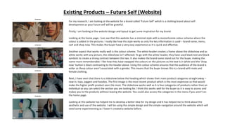
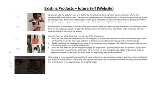
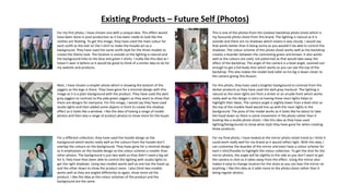
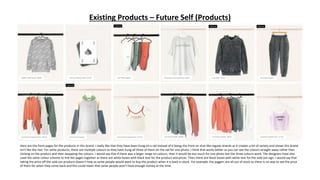
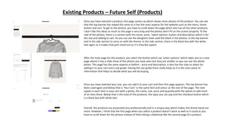
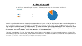
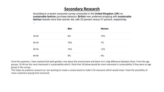
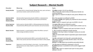
The document provides a summary of the website for the clothing brand Future Self. Key points include:
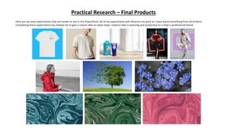
- The website has a minimal, monochrome design with white, black and photos to draw attention.
- Product categories are shown through an initial slideshow and additional sections.
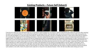
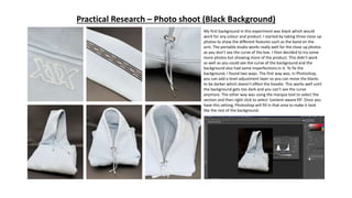
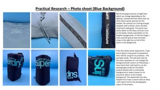
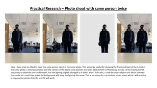
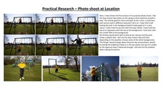
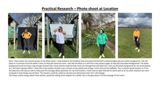
- Photos on the website were taken during outdoor photo shoots with natural lighting.
- Individual product pages could be improved by making the pages longer and adding social media.
- The brand's Instagram utilizes photos from shoots and color schemes to showcase new collections.
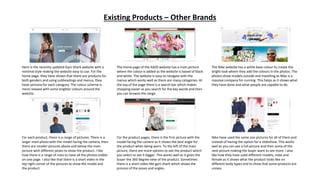
- Looking at other brands' websites provided inspiration for designing accessible and visually appealing pages.


![Bibliography
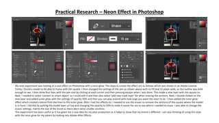
1. Adobe. 2019. Make a neon effect. [ONLINE] Available at: https://helpx.adobe.com/photoshop/how-to/neon-
effect.html. [Accessed 11 March 2021].
2. Deyes, A., 2021. Future Self Clothing. [online] Future Self. Available at: https://www.futureselfshop.com.
[Accessed 11 March 2021].
3. Monster Post. 2021. 20 Best Photoshop Video Tutorials to Watch in 2020. [online] Available at:
<https://www.templatemonster.com/blog/20-best-photoshop-tutorials [Accessed 6 April 2020].
4. MQ Mental Health. 2021. Mental Health Conditions | MQ Mental Health Research. [ONLINE] Available
at: https://www.mqmentalhealth.org/whyresearch/conditions/?gclid=Cj0KCQiAnKeCBhDPARIsAFDTLTJbEpiH5
GOW74zSyTUANezQGymCDJQwL_sxpCvVDWC_32itQNth28waAo21EALw_wcB. [Accessed 11 March 2021].
5. Sign into your Microsoft account. 2021. Sign into your Microsoft account. [ONLINE] Available
at: https://www.office.com/launch/forms?auth=1. [Accessed 11 March 2021].
6. Website Builder Tips. 2021. Wix vs Squarespace in 2021 — Choosing the Best Website Builder. [online]
Available at: <https://www.websitebuildertips.com/comparison/wix-vs-
squarespace/?utm_campaign=ma_websitebuildertips_bi_wix_uk^73196818972&experiment_id=172977424
3^^462266265336^wix%20vs%20squarespace^e&gclid=CjwKCAjwgOGCBhAlEiwA7FUXkq9a_cKm_KQn7oy_k
WyfwMEauSFgVpPr8MUZBox1hqx2K7MYeKmD_xoC2NkQAvD_BwE> [Accessed 22 March 2021].](https://image.slidesharecdn.com/research-210519104328/85/Research-49-320.jpg)


