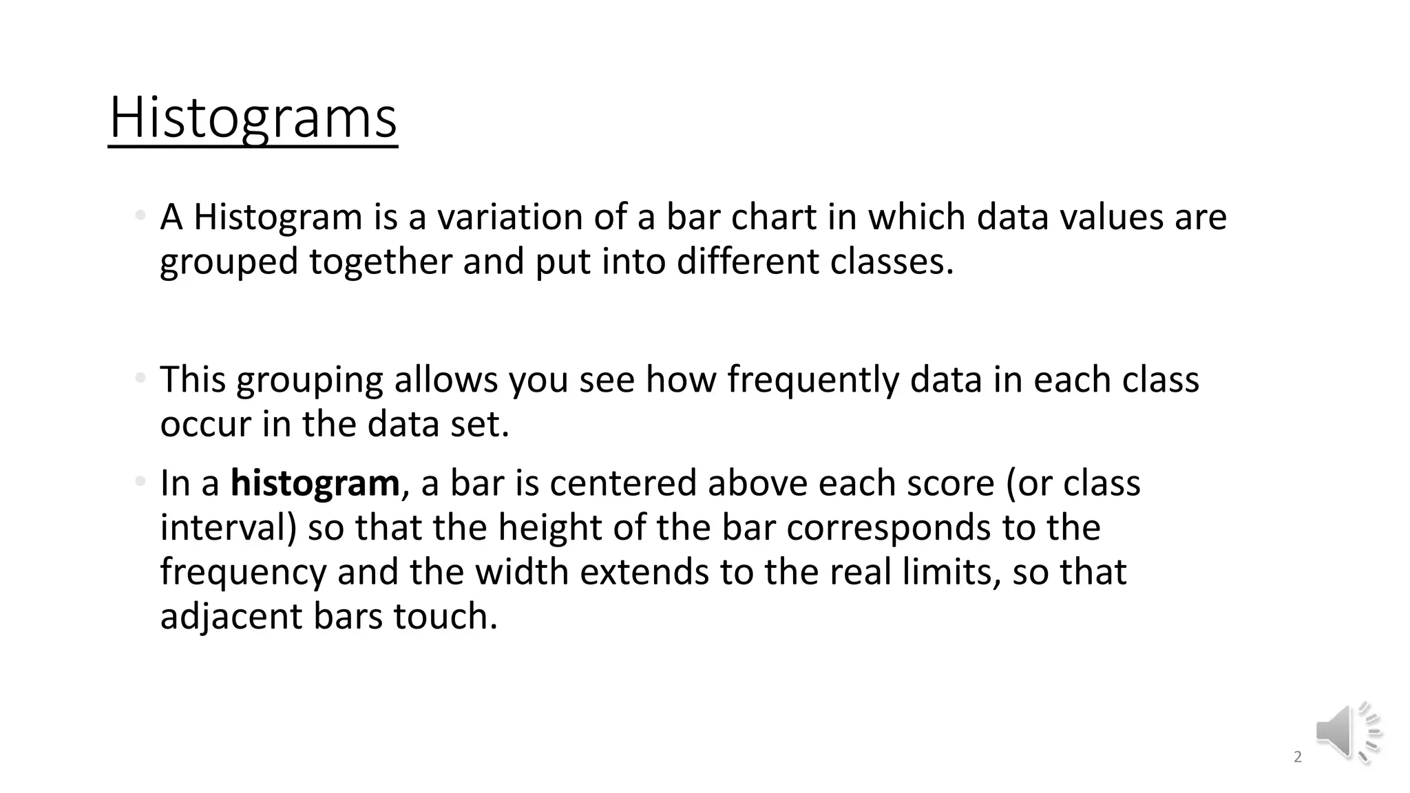
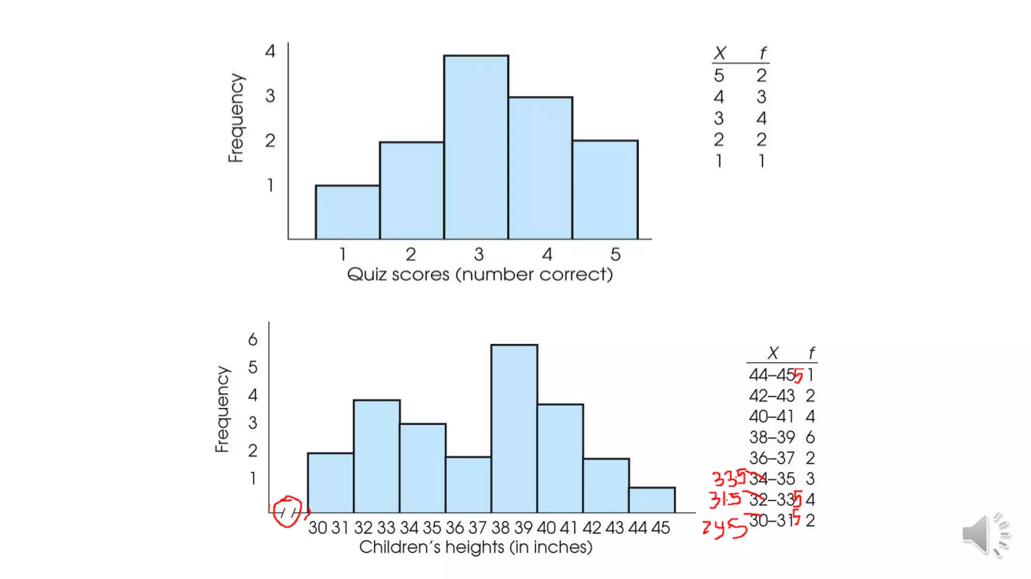
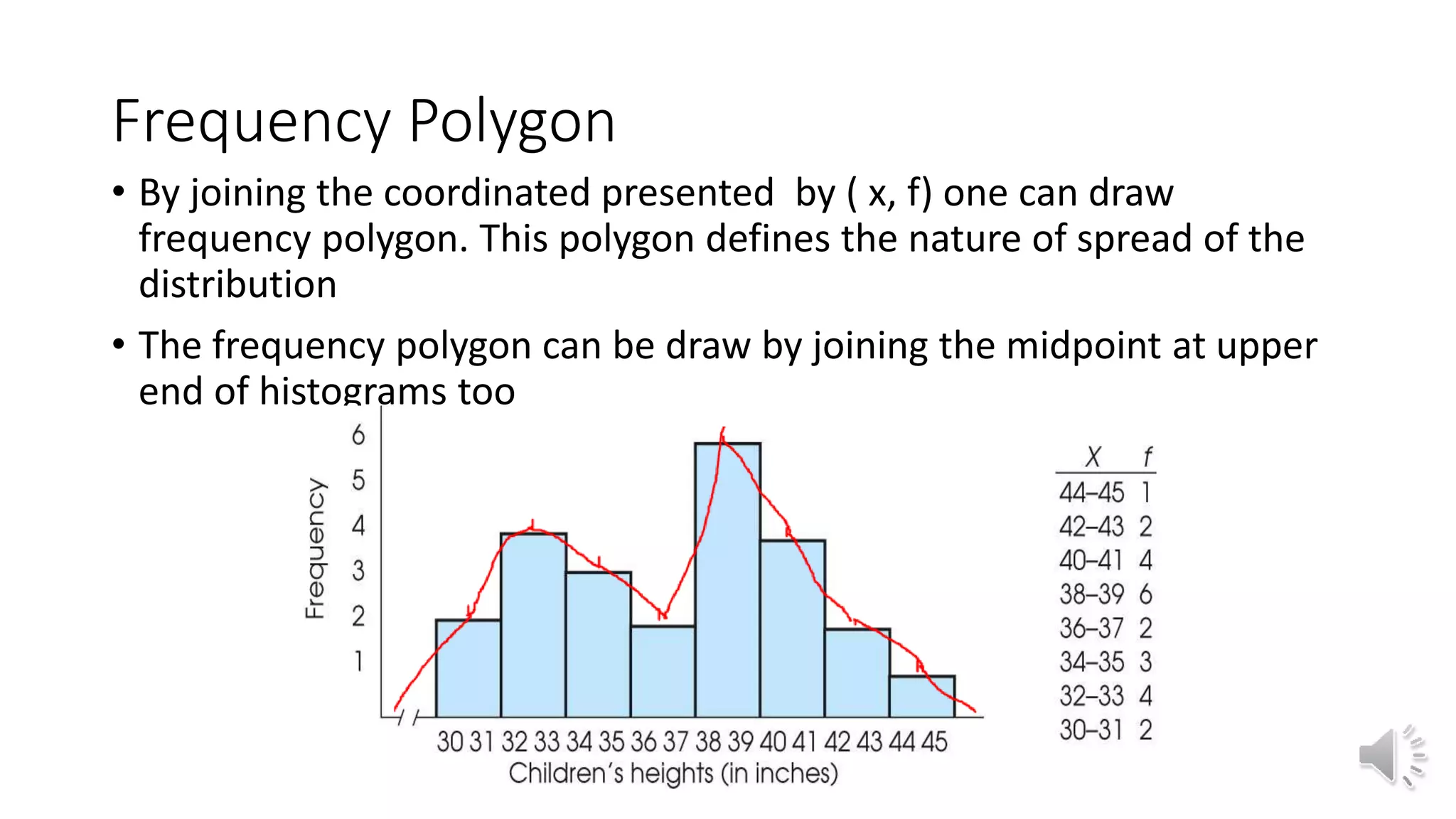
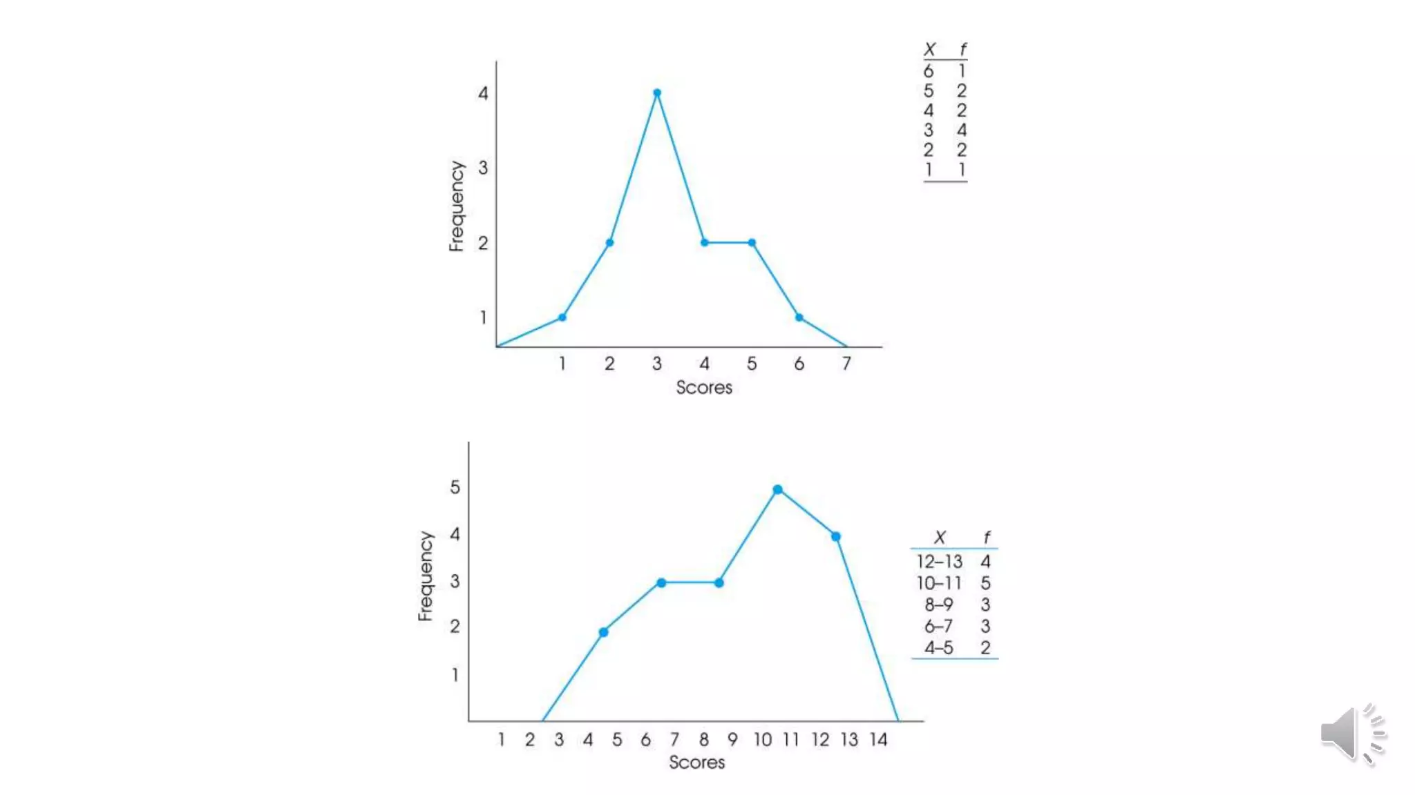
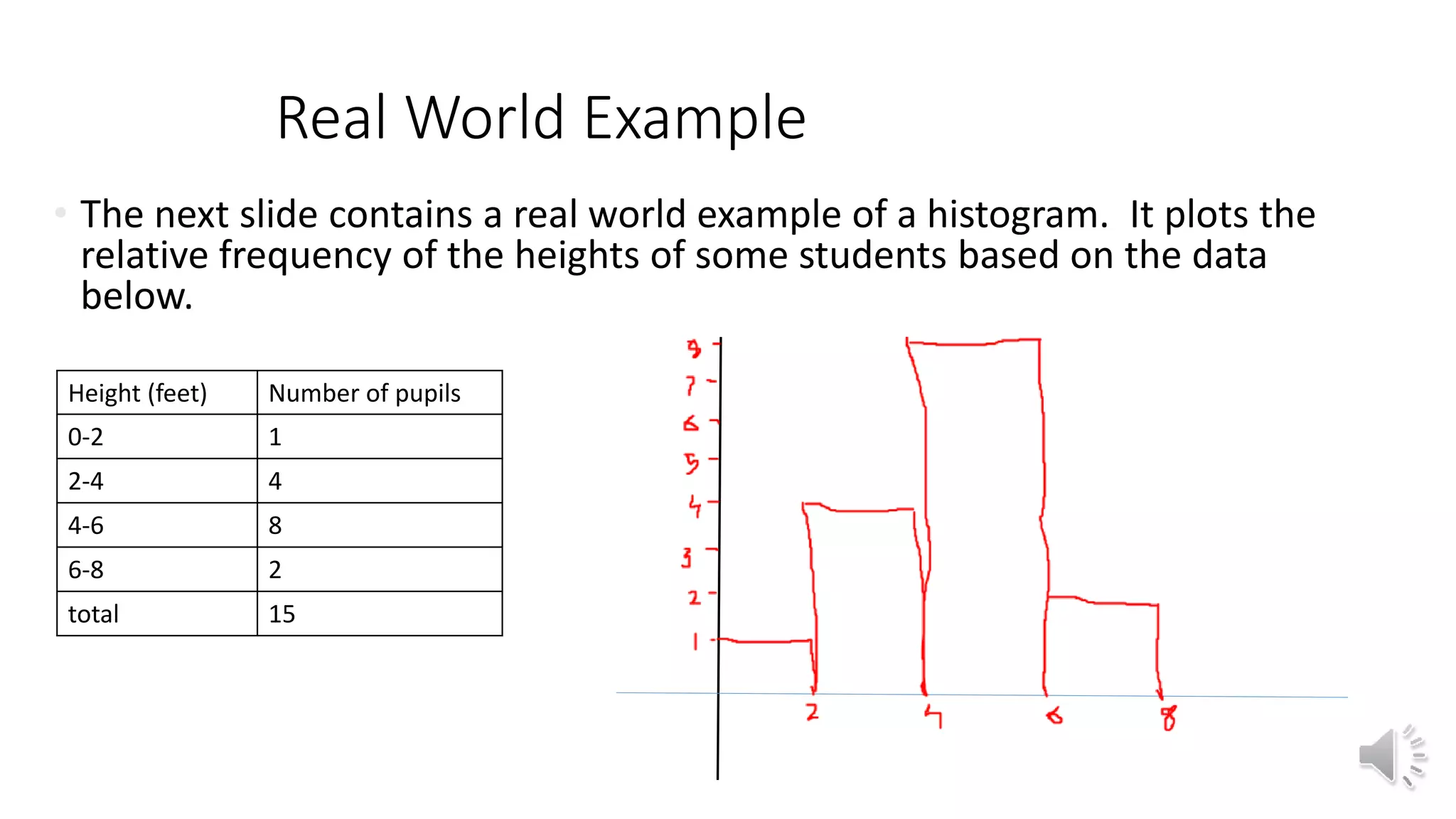
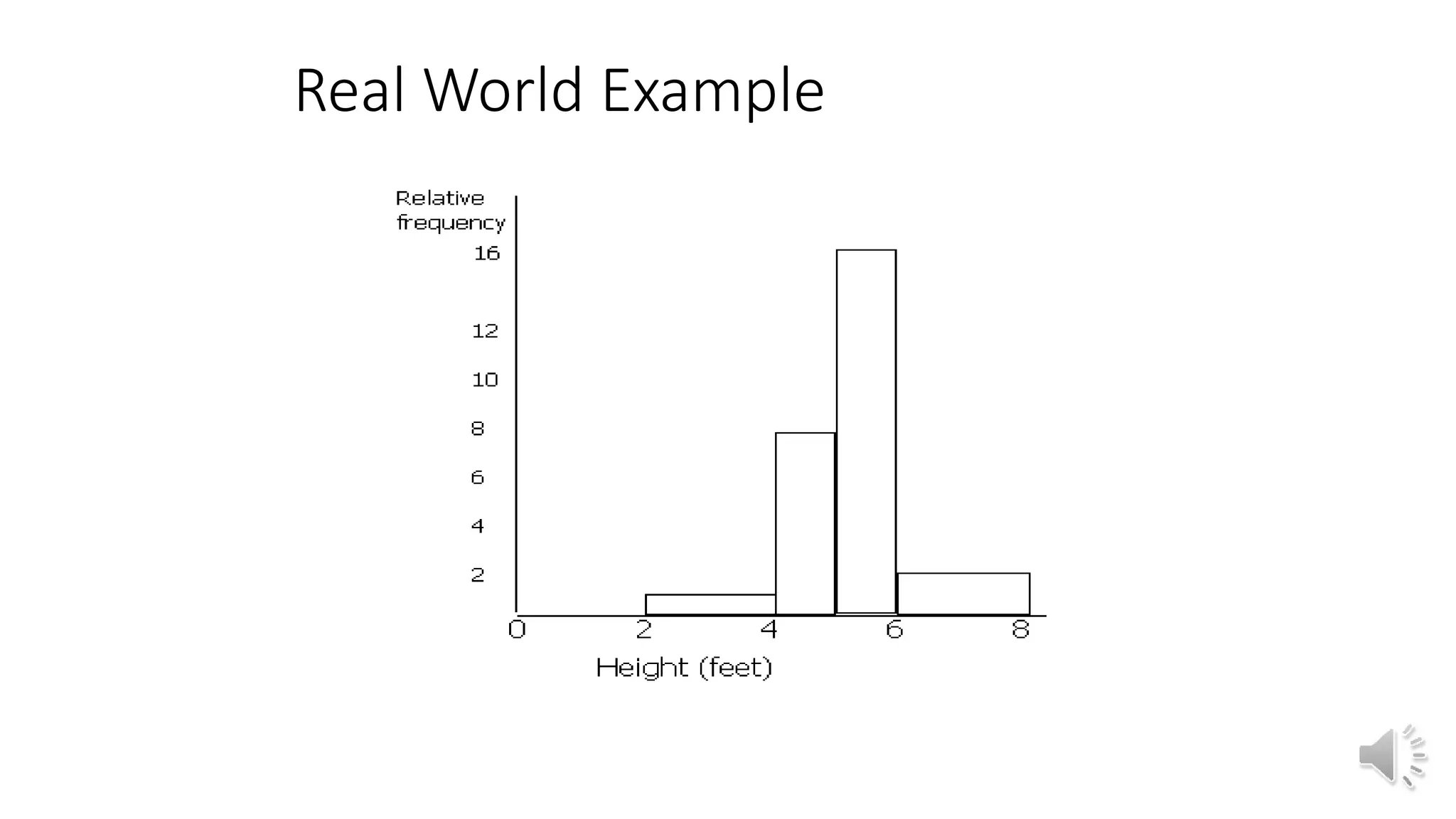
This document discusses different graphical representations of data including bar diagrams, histograms, and frequency polygons. It defines histograms as a variation of a bar chart that groups data values into classes and shows their frequencies. Frequency polygons are created by joining the points representing the class frequencies to show the overall distribution shape. An example histogram is provided plotting the relative frequencies of student heights based on their heights and number of pupils.