Downloaded 192 times
![2/11/2014
3
2-13
Histogram
HISTOGRAM A graph in which the classes are marked on the
horizontal axis and the class frequencies on the vertical axis. The
class frequencies are represented by the heights of the bars and
the bars are drawn adjacent to each other.
2-14
Frequency Polygon
A frequency polygon
also shows the shape
of a distribution and is
similar to a histogram.
It consists of line
segments connecting
the points formed by
the intersections of the
class midpoints and the
class frequencies.
2-15
Histogram Versus Frequency Polygon
Both provide a quick picture of the main characteristics of the
data (highs, lows, points of concentration, etc.)
The histogram has the advantage of depicting each class as a
rectangle, with the height of the rectangular bar representing
the number in each class.
The frequency polygon has an advantage over the histogram. It
allows us to compare directly two or more frequency
distributions.
2-16
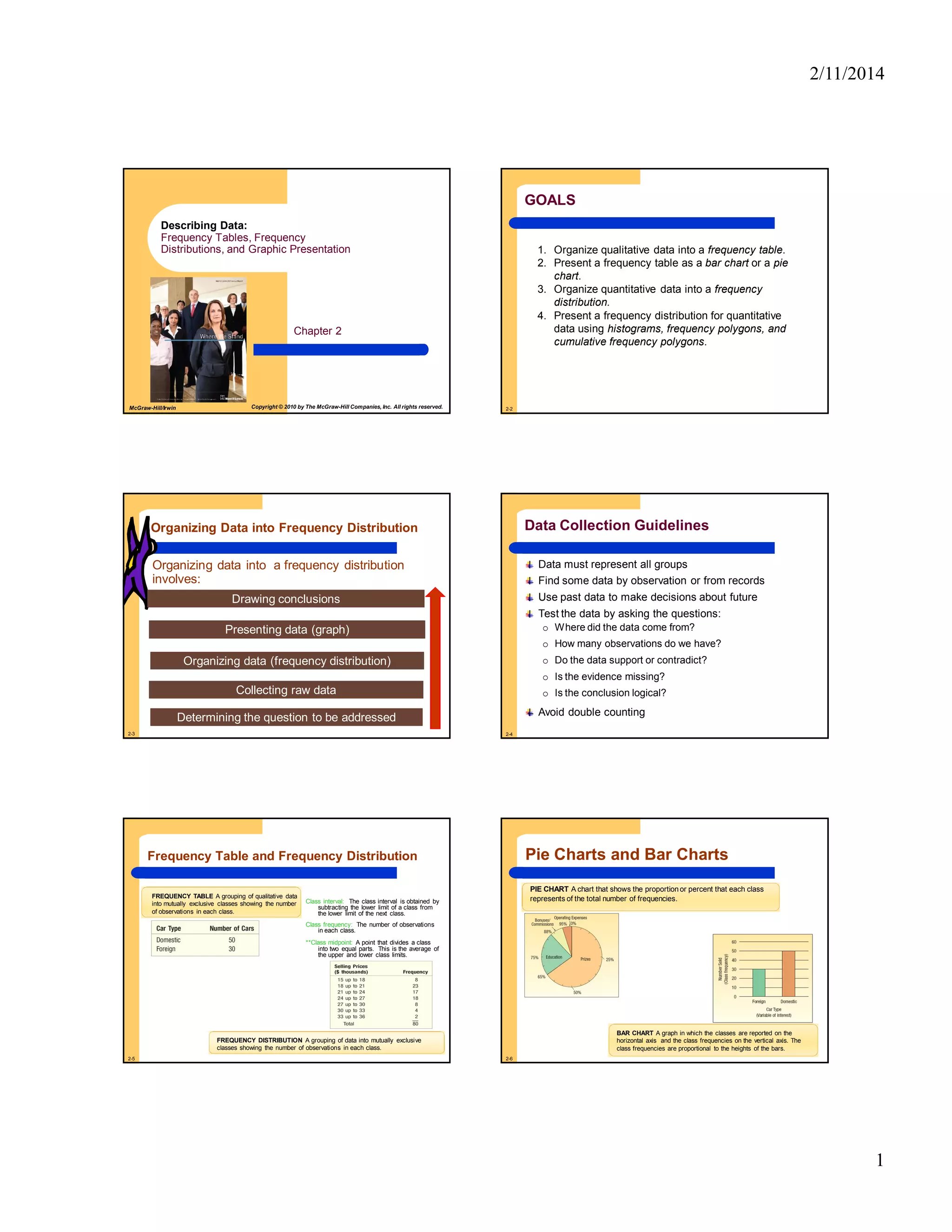
Cumulative Frequency Distribution
Selling Prices
($ 000) Frequency
Less than
Class
Cumulative
Frequency
15 up to 18 8 Less than 15 0
Less than 18 8
18 up to 21 23 Less than 21 31
21 up to 24 17 Less than 24 48
24 up to 27 18 Less than 27 66
27 up to 30 8 Less than 30 74
30 up to 33 4 Less than 33 78
33 up to 36 2 Less than 36 80
Total 80
2-17
Cumulative Frequency Distribution
2-18
Cumulative Frequency Distribution
More than Class Cum. Freq.
More than 14 80 [80]
More than 17 72 [80-8]
More than 20 49 [72-23]
More than 23 32 [49-17]
More than 26 14 [32-18]
More than 29 06 [14-8]
More than 32 02 [6-4]
More than 35 00 [2-2]](https://image.slidesharecdn.com/chap00214e-140409121635-phpapp01/85/Frequency-Tables-Frequency-Distributions-and-Graphic-Presentation-3-320.jpg)

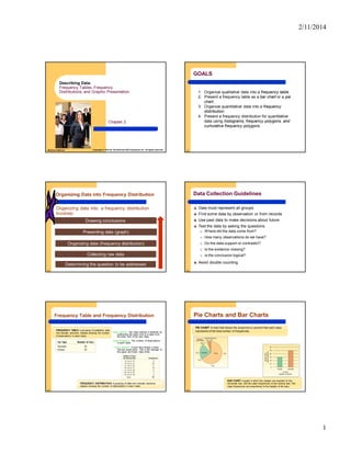
This document provides an overview of key concepts for describing data through frequency tables, distributions, and graphs. It defines important terms like frequency table, distribution, class, interval and discusses how to organize both qualitative and quantitative data. Guidelines for data collection are provided. Examples are given to demonstrate how to construct frequency tables and distributions and convert them to relative frequencies. Finally, different types of graphs for presenting frequency distributions are described, including histograms, polygons and cumulative distributions.