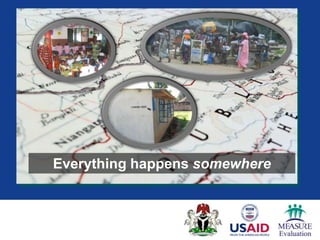
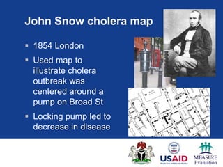
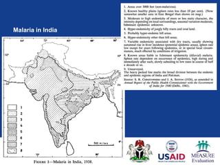
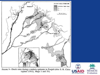
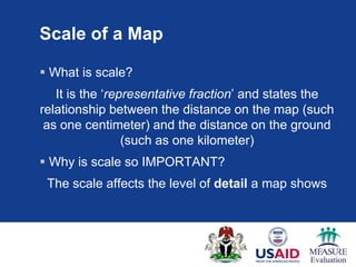
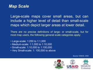
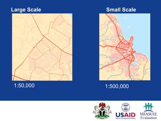
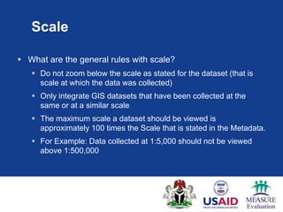
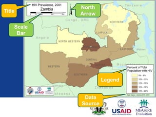
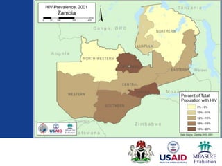
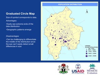
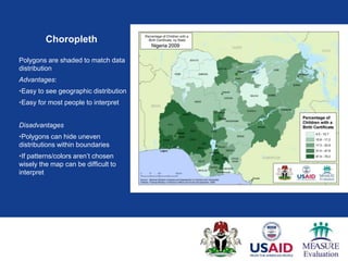
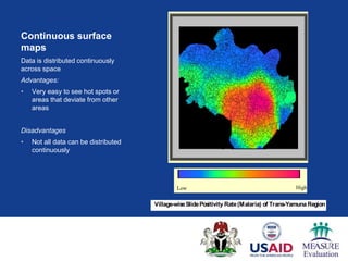
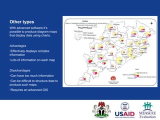
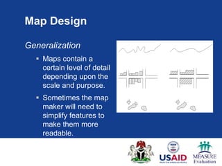
Geographic Context
Everything happens somewhere
Knowing where things happen can
help us understand why things
happen.
Location and Health

 There is a close link between geography and
  health.
Question

 What are some ways that people‟s health can be
  affected by geography?


Geography can affect health through landscape,
 location of services, location of population in
 need, human interaction with landscape
Medical geography

 A branch of geography that looks at the relation
  between location and people‟s health
 Concepts are useful beyond medical geography
 Long history of use of geography to understand
  health and disease patterns.
John Snow cholera map

 1854 London
 Used map to
  illustrate cholera
  outbreak was
  centered around a
  pump on Broad St
 Locking pump led to
  decrease in disease
Malaria in India
Maps

 Valuable tool for displaying data and helping
  people understand data and direct action
 Picture of a place which can give you a better
  understanding
 When well-made, a map can give both content
  and context
Important Properties of Maps

 When creating maps there are four factors that
  are important
    Scale
    Legend
    Title
    Source
All affect the context of data displayed and how the
           data is and can be INTERPRETED
Scale of a Map

 What is scale?
   It is the „representative fraction‟ and states the
relationship between the distance on the map (such
 as one centimeter) and the distance on the ground
                 (such as one kilometer)
 Why is scale so IMPORTANT?
 The scale affects the level of detail a map shows
Map Scale

Large-scale maps cover small areas, but can
include a higher level of detail than small-scale
maps which depict larger areas at lower detail.
There are no precise definitions of large- or small-scale, but for
most map users, the following general scale categories apply:

• Large-scale: 1:250 to 1:1,000
• Medium-scale: 1:1,000 to 1:10,000
• Small-scale: 1:10,000 to 1:100,000
• Very Small-scale: 1: 100,000 to above
                                                    Source: ICIMOD, 2000
Large Scale   Small Scale


1:50,000      1:500,000
Scale

 What are the general rules with scale?
    Do not zoom below the scale as stated for the dataset (that is
     scale at which the data was collected)
    Only integrate GIS datasets that have been collected at the
     same or at a similar scale
    The maximum scale a dataset should be viewed is
     approximately 100 times the Scale that is stated in the Metadata.
    For Example: Data collected at 1:5,000 should not be viewed
     above 1:500,000
North
Title
            Arrow

    Scale
     Bar


                     Legend


             Data
            Source
TYPES OF MAP
Concentration of Vulnerable Population-Meerut City
                                               POPULATION DISTRIBUTION
                                                        (Using 2 Km Radius)


Graduated Circle Map
Size of symbol corresponds to data.
Advantages:
•Easily see extreme ends of the
data distribution
•Geographic patterns emerge


Disadvantages
•Can be challenging to differentiate
the middle of the distribution since
the eye can‟t easily detect small
differences in size


                      Map credit UHRC
Choropleth

Polygons are shaded to match data
distribution
Advantages:
•Easy to see geographic distribution
•Easy for most people to interpret


Disadvantages
•Polygons can hide uneven
distributions within boundaries
•If patterns/colors aren‟t chosen
wisely the map can be difficult to
interpret
2002                                                           2004
                  2002                                                    2004


Continuous surface
maps
Data is distributed continuously
across space
Advantages:
•   Very easy to see hot spots or
    areas that deviate from other
    areas


Disadvantages
•   Not all data can be distributed
    continuously

            Depiction of Malaria incidences in Trans Yamuna Region (Allahabad D

                                                     Low                 High                       High
                              Low

                                             Village-wise Slide Positivity Rate (Malaria) of Trans-Yamuna Region

                                      2002                                                           2004
Other types
With advanced software it‟s
possible to produce diagram maps
that display data using charts.


Advantages
•Effectively displays complex
information
•Lots of information on each map


Disadvantages
•Can have too much information
•Can be difficult to structure data to
produce such maps
•Requires an advanced GIS
Which map style should you use?

 Depends on type of data you have
 What purpose you want the map to serve
 Sometimes a matter of experimentation to find
  the map style that best fits the data and purpose
  of the map


It‟s important to pick the type of map that makes the
    data most useful
Basic cartographic concepts

 Map Design
   Cartographic standards
   Generalization
   Graphic Variables
   Use of Color
   Classification of Data
   Methods of Mapping
Map Design


Map making is both science and art.

Maps influence people‟s perception of space. This
influence is partly because of convention and partly
because of the graphics used.

People understand the world differently, express this
understanding differently in maps, and gain different
understanding from the maps.
Cartographic standards
There are cartographic standards that have emerged that
make it easier to interpret and read maps.


These standards do not have to be followed, but if they aren‟t
your map may be less readable.
Administrative
Boundaries
--Most often black or
gray.


--The higher the
administrative unit
the thicker the line
Roads
Color and line styles to
represent road type with
major roads being
thicker or more
distinctively colored than
minor roads.
Rivers and Lakes
--Blue
--Streams dashed,
lines light blue
Map Design

Generalization
   Maps contain a
    certain level of detail
    depending upon the
    scale and purpose.
   Sometimes the map
    maker will need to
    simplify features to
    make them more
    readable.
Use of Color

Color perception has psychological, physiological and
conventional aspects.

It has been noted that it is difficult to perceive color in small areas,
and more contrast is perceived between some colors than
between others.

In addition to distinguishing nominal categories, color differences
are also used to show deviations or gradation.

                                                Hue

                                          Saturation

                                            Intensity


                                                           Source: ICIMOD
Use of Color

 Color blindness
   5-8% of men
   0.5% of women
Black-and-white
 Consider
  method of
  reproduction
  or output of
  maps
Making an effective map is a
matter of finding the right balance
between the limitations of the
data, the needs of the map reader
and the message you, as the map
maker, want to convey.
Issues to Remember
Maps can LIE!!

 Maps are just one person‟s representation of the
  “real world”
 Like any source of information they can be
  misleading especially when used out of context
 How maps can be deceiving
    Inappropriate Legend
    Inappropriate Scale
    Inappropriate Data Classification


                                         Source: ICIMOD,
Key points

 Everything happens somewhere
 Geography is a common denominator across
  human activity
 There are different types of maps. Picking the
  right style means balancing the needs of the
  reader, the data and the message you as
  mapmaker want to convey.
Key points

 The mapmaker can use colors, symbology, and
  generalization techniques to make maps
  readable to the audience.
Any questions?

Geographic Context

  • 1.
  • 3.
  • 4.
    Knowing where thingshappen can help us understand why things happen.
  • 5.
    Location and Health There is a close link between geography and health.
  • 6.
    Question  What aresome ways that people‟s health can be affected by geography? Geography can affect health through landscape, location of services, location of population in need, human interaction with landscape
  • 7.
    Medical geography  Abranch of geography that looks at the relation between location and people‟s health  Concepts are useful beyond medical geography  Long history of use of geography to understand health and disease patterns.
  • 8.
    John Snow choleramap  1854 London  Used map to illustrate cholera outbreak was centered around a pump on Broad St  Locking pump led to decrease in disease
  • 9.
  • 11.
    Maps  Valuable toolfor displaying data and helping people understand data and direct action  Picture of a place which can give you a better understanding  When well-made, a map can give both content and context
  • 12.
    Important Properties ofMaps  When creating maps there are four factors that are important  Scale  Legend  Title  Source All affect the context of data displayed and how the data is and can be INTERPRETED
  • 13.
    Scale of aMap  What is scale? It is the „representative fraction‟ and states the relationship between the distance on the map (such as one centimeter) and the distance on the ground (such as one kilometer)  Why is scale so IMPORTANT? The scale affects the level of detail a map shows
  • 14.
    Map Scale Large-scale mapscover small areas, but can include a higher level of detail than small-scale maps which depict larger areas at lower detail. There are no precise definitions of large- or small-scale, but for most map users, the following general scale categories apply: • Large-scale: 1:250 to 1:1,000 • Medium-scale: 1:1,000 to 1:10,000 • Small-scale: 1:10,000 to 1:100,000 • Very Small-scale: 1: 100,000 to above Source: ICIMOD, 2000
  • 15.
    Large Scale Small Scale 1:50,000 1:500,000
  • 16.
    Scale  What arethe general rules with scale?  Do not zoom below the scale as stated for the dataset (that is scale at which the data was collected)  Only integrate GIS datasets that have been collected at the same or at a similar scale  The maximum scale a dataset should be viewed is approximately 100 times the Scale that is stated in the Metadata.  For Example: Data collected at 1:5,000 should not be viewed above 1:500,000
  • 17.
    North Title Arrow Scale Bar Legend Data Source
  • 19.
  • 20.
    Concentration of VulnerablePopulation-Meerut City POPULATION DISTRIBUTION (Using 2 Km Radius) Graduated Circle Map Size of symbol corresponds to data. Advantages: •Easily see extreme ends of the data distribution •Geographic patterns emerge Disadvantages •Can be challenging to differentiate the middle of the distribution since the eye can‟t easily detect small differences in size Map credit UHRC
  • 21.
    Choropleth Polygons are shadedto match data distribution Advantages: •Easy to see geographic distribution •Easy for most people to interpret Disadvantages •Polygons can hide uneven distributions within boundaries •If patterns/colors aren‟t chosen wisely the map can be difficult to interpret
  • 22.
    2002 2004 2002 2004 Continuous surface maps Data is distributed continuously across space Advantages: • Very easy to see hot spots or areas that deviate from other areas Disadvantages • Not all data can be distributed continuously Depiction of Malaria incidences in Trans Yamuna Region (Allahabad D Low High High Low Village-wise Slide Positivity Rate (Malaria) of Trans-Yamuna Region 2002 2004
  • 23.
    Other types With advancedsoftware it‟s possible to produce diagram maps that display data using charts. Advantages •Effectively displays complex information •Lots of information on each map Disadvantages •Can have too much information •Can be difficult to structure data to produce such maps •Requires an advanced GIS
  • 24.
    Which map styleshould you use?  Depends on type of data you have  What purpose you want the map to serve  Sometimes a matter of experimentation to find the map style that best fits the data and purpose of the map It‟s important to pick the type of map that makes the data most useful
  • 25.
    Basic cartographic concepts Map Design  Cartographic standards  Generalization  Graphic Variables  Use of Color  Classification of Data  Methods of Mapping
  • 26.
    Map Design Map makingis both science and art. Maps influence people‟s perception of space. This influence is partly because of convention and partly because of the graphics used. People understand the world differently, express this understanding differently in maps, and gain different understanding from the maps.
  • 27.
    Cartographic standards There arecartographic standards that have emerged that make it easier to interpret and read maps. These standards do not have to be followed, but if they aren‟t your map may be less readable.
  • 28.
    Administrative Boundaries --Most often blackor gray. --The higher the administrative unit the thicker the line
  • 29.
    Roads Color and linestyles to represent road type with major roads being thicker or more distinctively colored than minor roads.
  • 30.
    Rivers and Lakes --Blue --Streamsdashed, lines light blue
  • 31.
    Map Design Generalization  Maps contain a certain level of detail depending upon the scale and purpose.  Sometimes the map maker will need to simplify features to make them more readable.
  • 32.
    Use of Color Colorperception has psychological, physiological and conventional aspects. It has been noted that it is difficult to perceive color in small areas, and more contrast is perceived between some colors than between others. In addition to distinguishing nominal categories, color differences are also used to show deviations or gradation. Hue Saturation Intensity Source: ICIMOD
  • 33.
    Use of Color Color blindness  5-8% of men  0.5% of women
  • 34.
    Black-and-white  Consider method of reproduction or output of maps
  • 35.
    Making an effectivemap is a matter of finding the right balance between the limitations of the data, the needs of the map reader and the message you, as the map maker, want to convey.
  • 36.
    Issues to Remember Mapscan LIE!!  Maps are just one person‟s representation of the “real world”  Like any source of information they can be misleading especially when used out of context  How maps can be deceiving  Inappropriate Legend  Inappropriate Scale  Inappropriate Data Classification Source: ICIMOD,
  • 37.
    Key points  Everythinghappens somewhere  Geography is a common denominator across human activity  There are different types of maps. Picking the right style means balancing the needs of the reader, the data and the message you as mapmaker want to convey.
  • 38.
    Key points  Themapmaker can use colors, symbology, and generalization techniques to make maps readable to the audience.
  • 39.