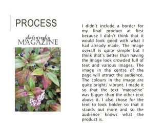
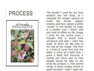
This document describes the process of designing a magazine cover. The designer initially did not include a border because it did not look good with the existing design. They then made changes to reduce the thickness of the border and add a white stroke. For the central image, no effects were added to avoid an unnatural look. Two fonts were used for the title - a curvy font and a bold font to make it stand out. The final design was kept simple to avoid clutter and clearly communicate what the product is.