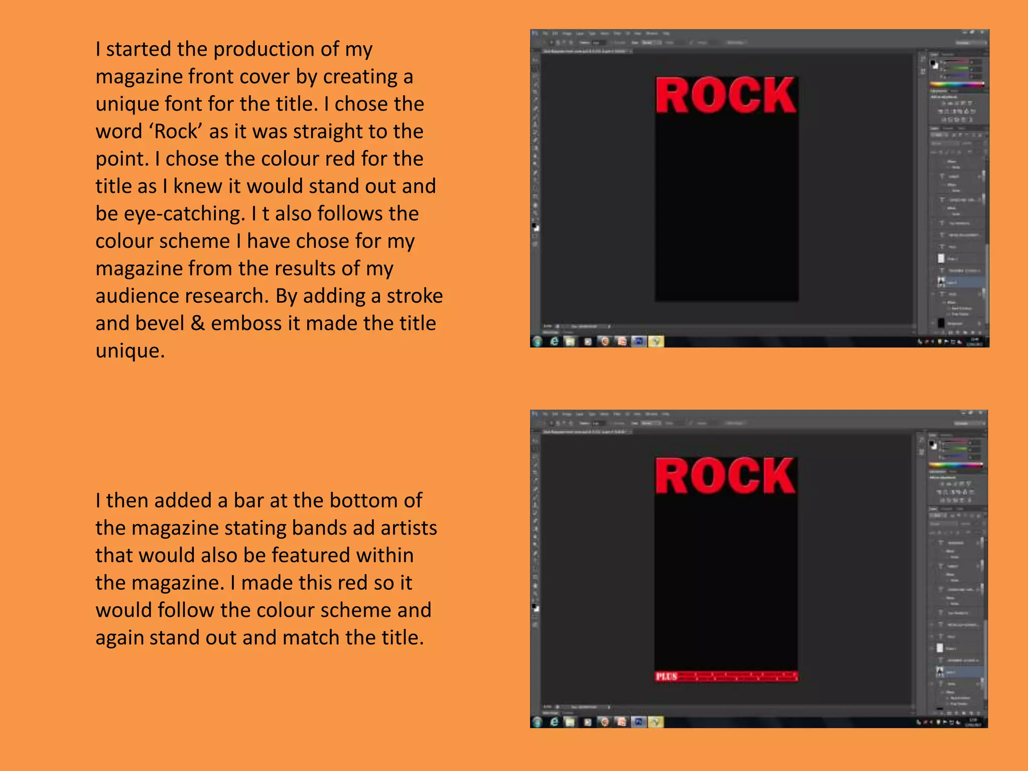
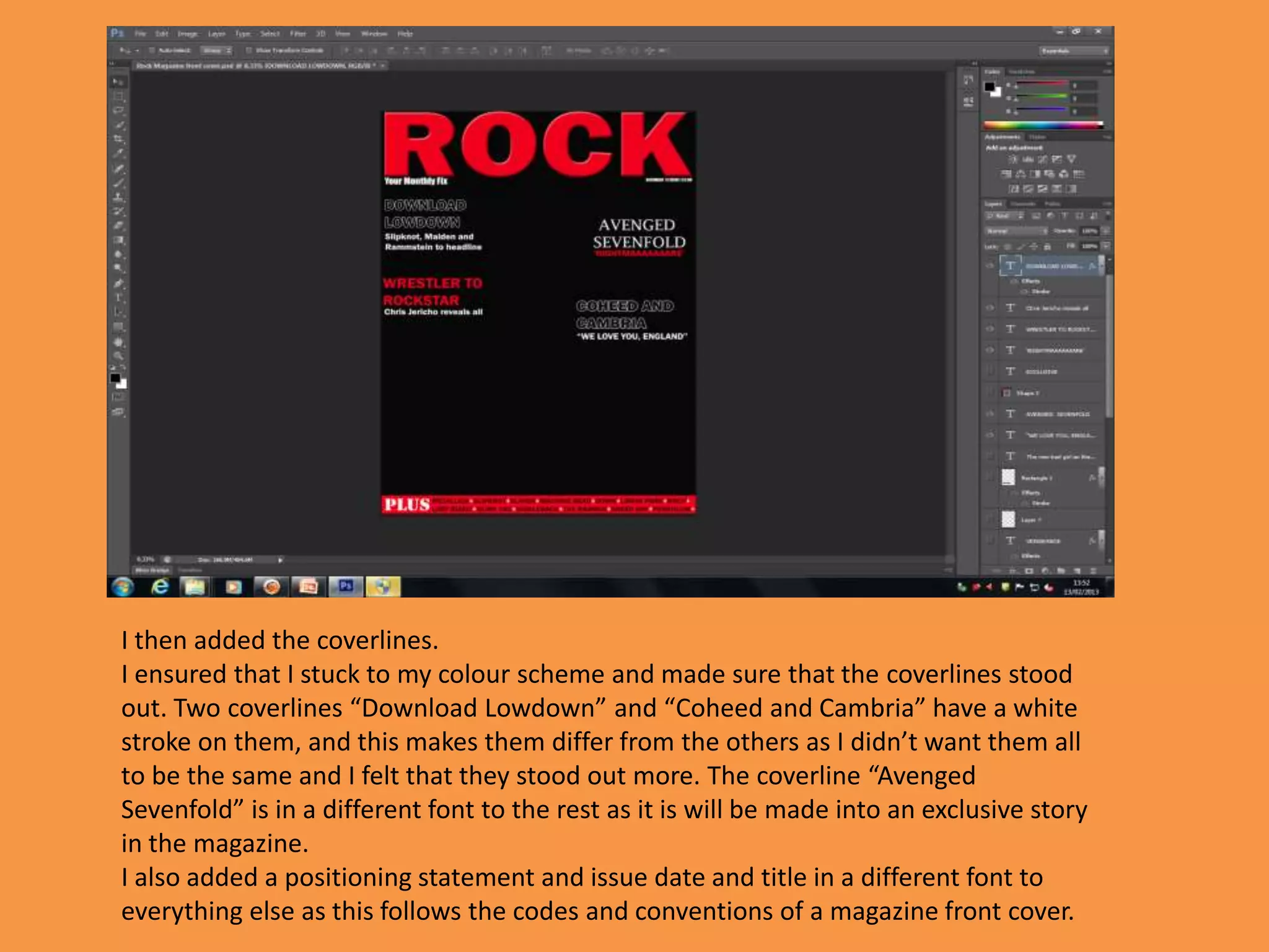
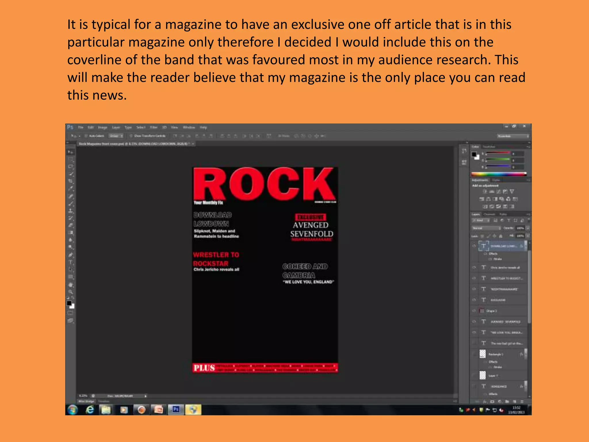
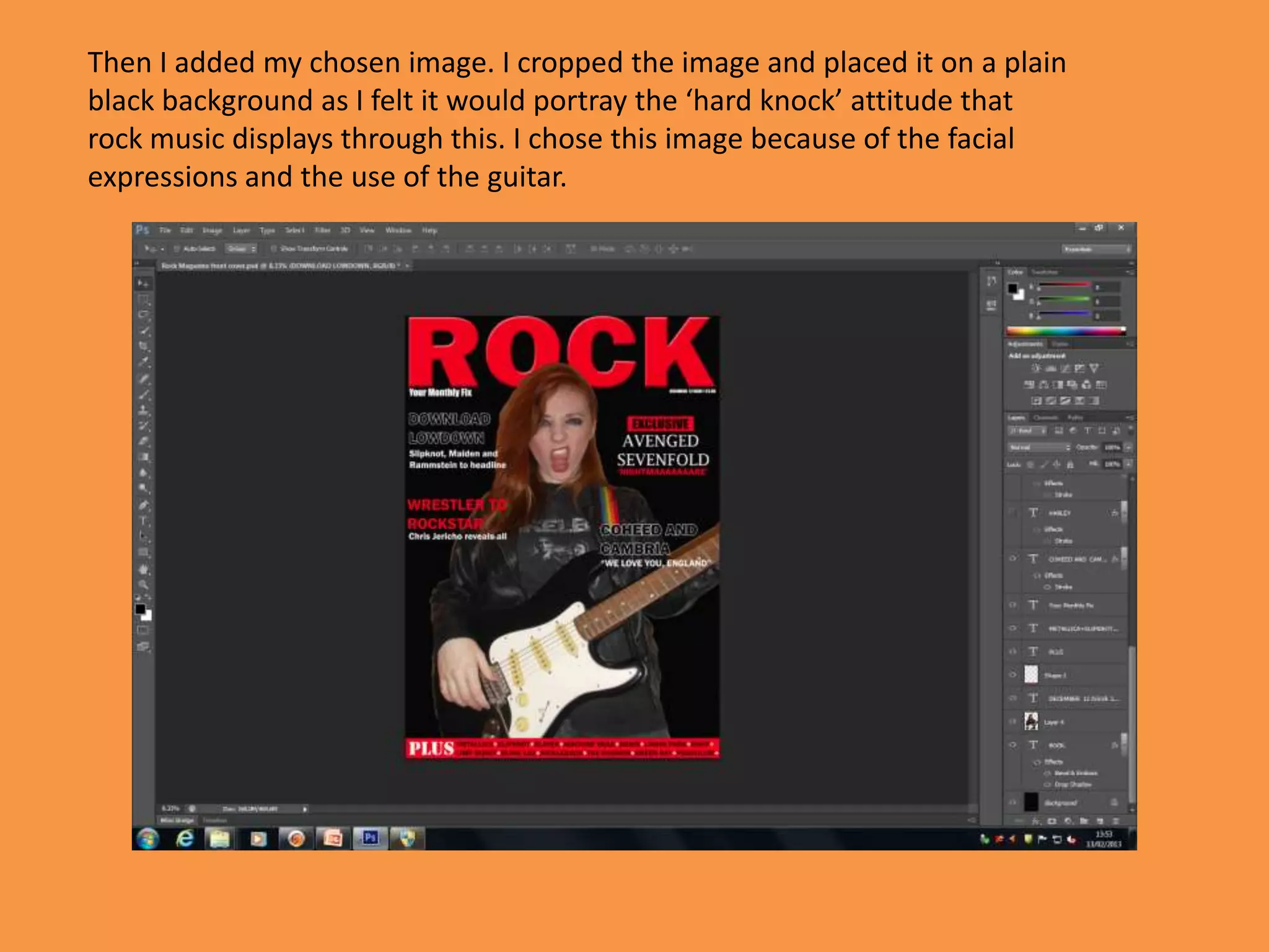
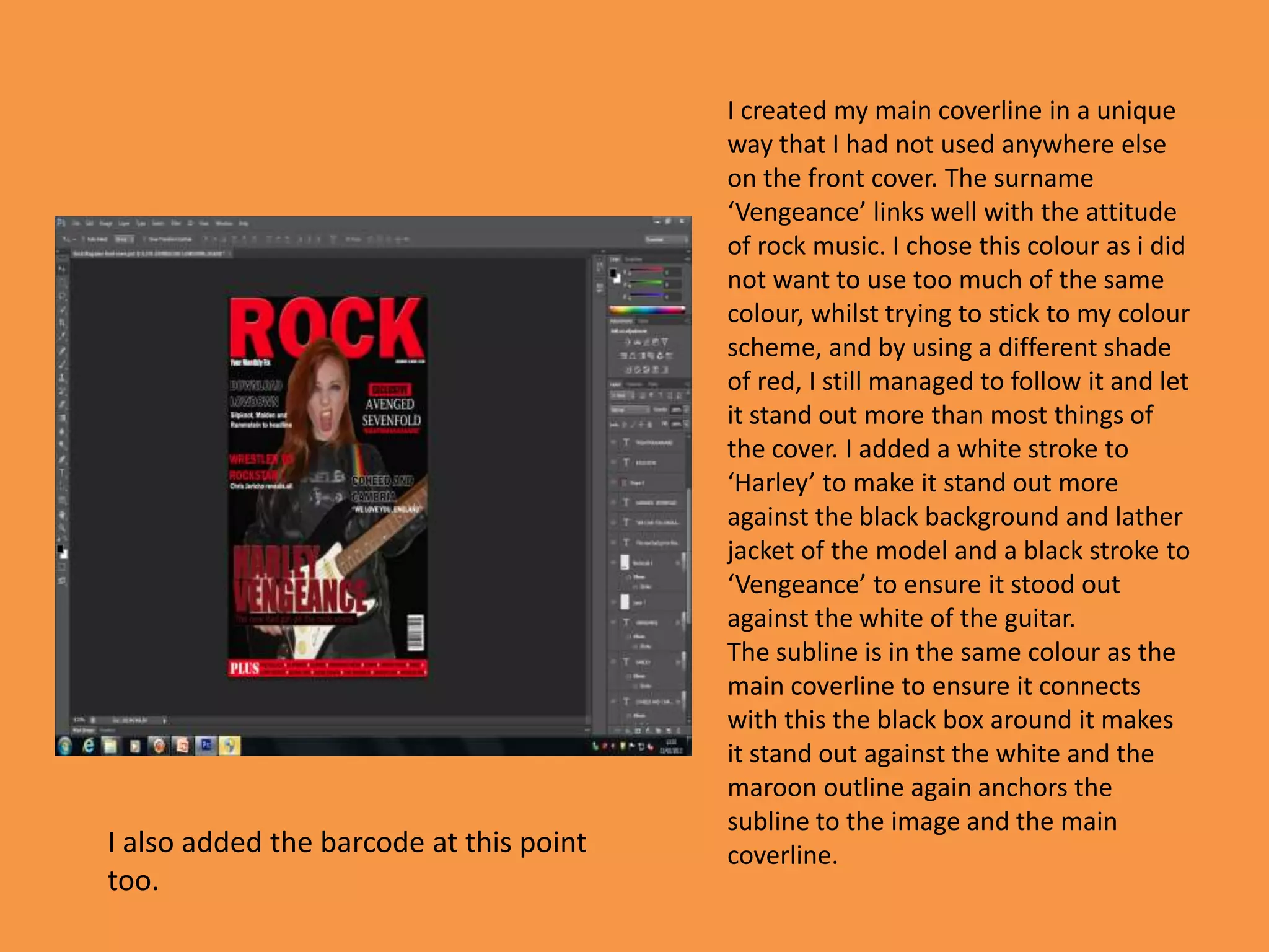
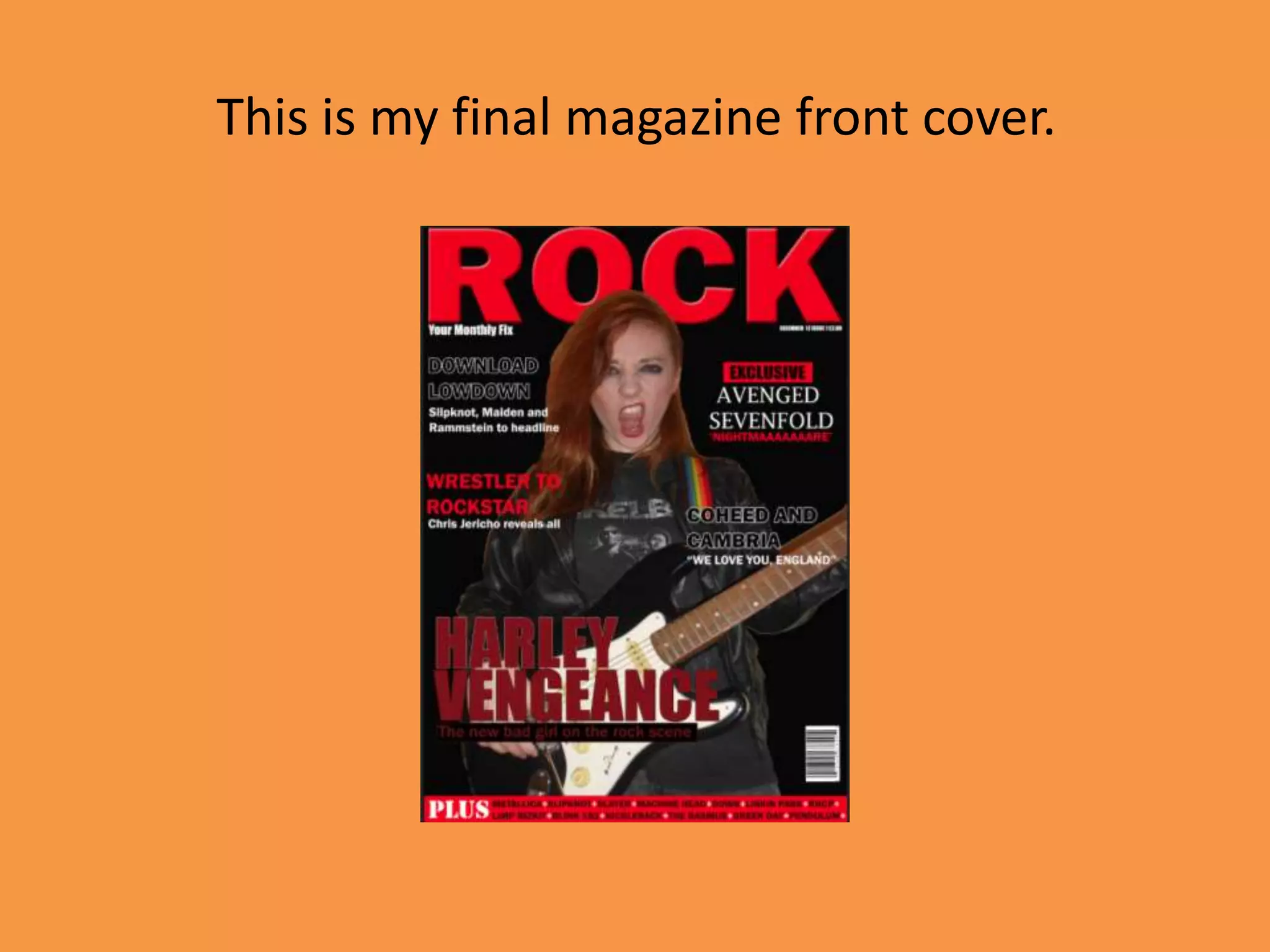
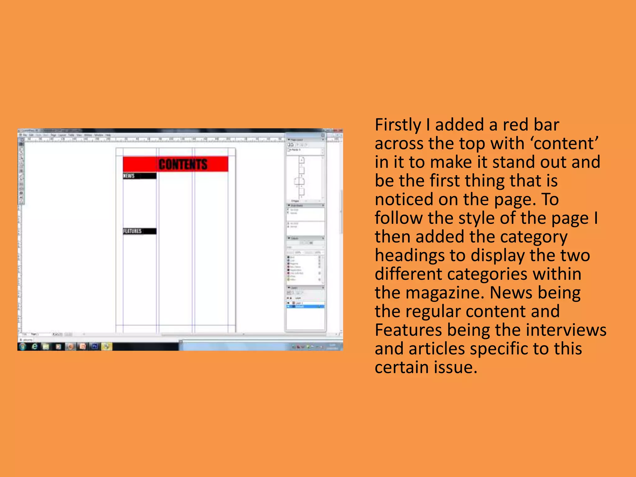
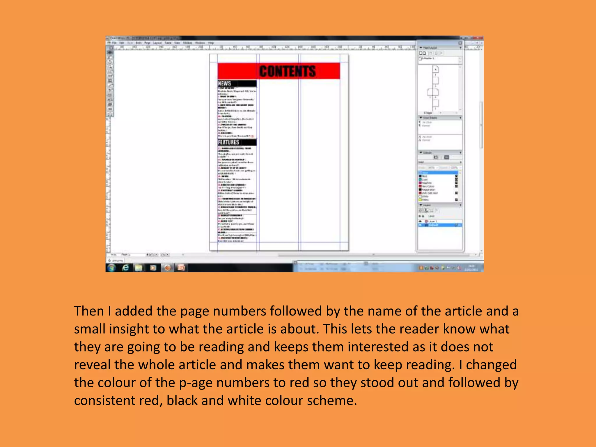
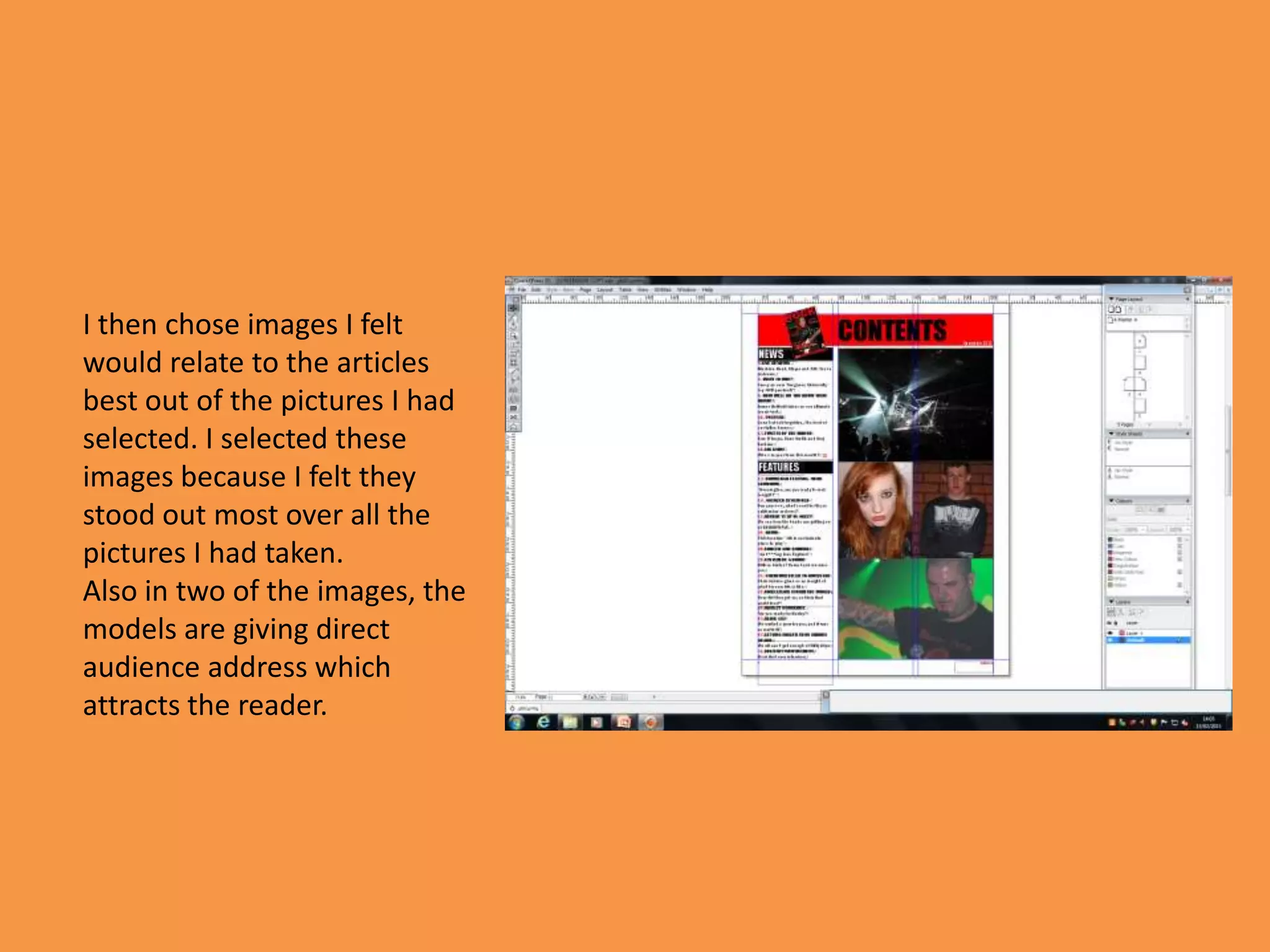
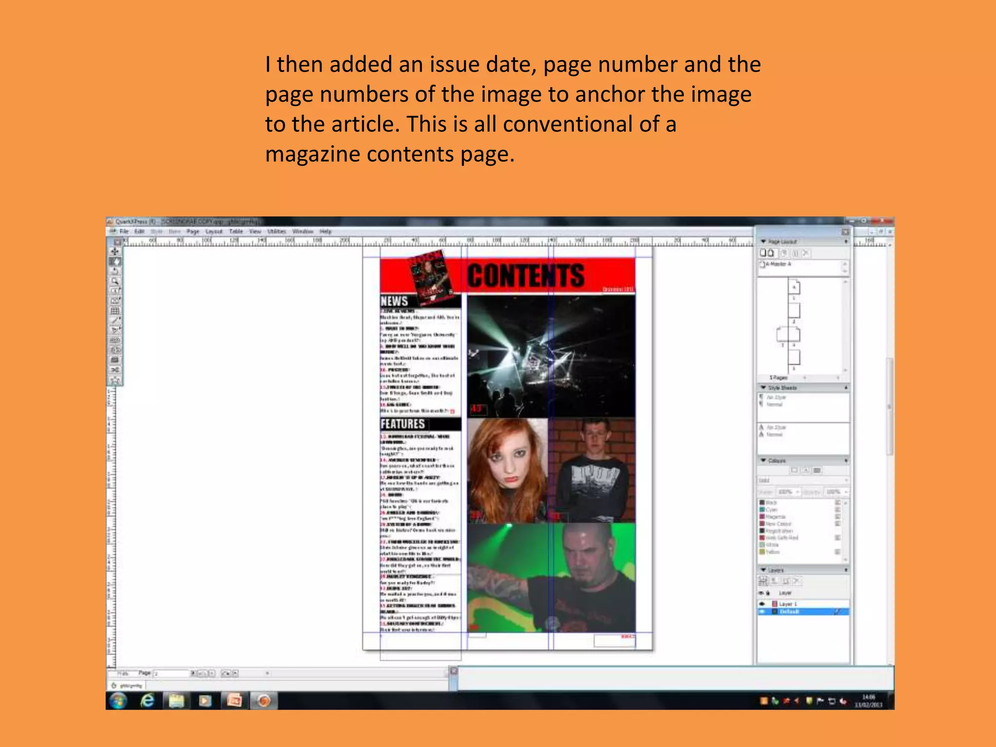
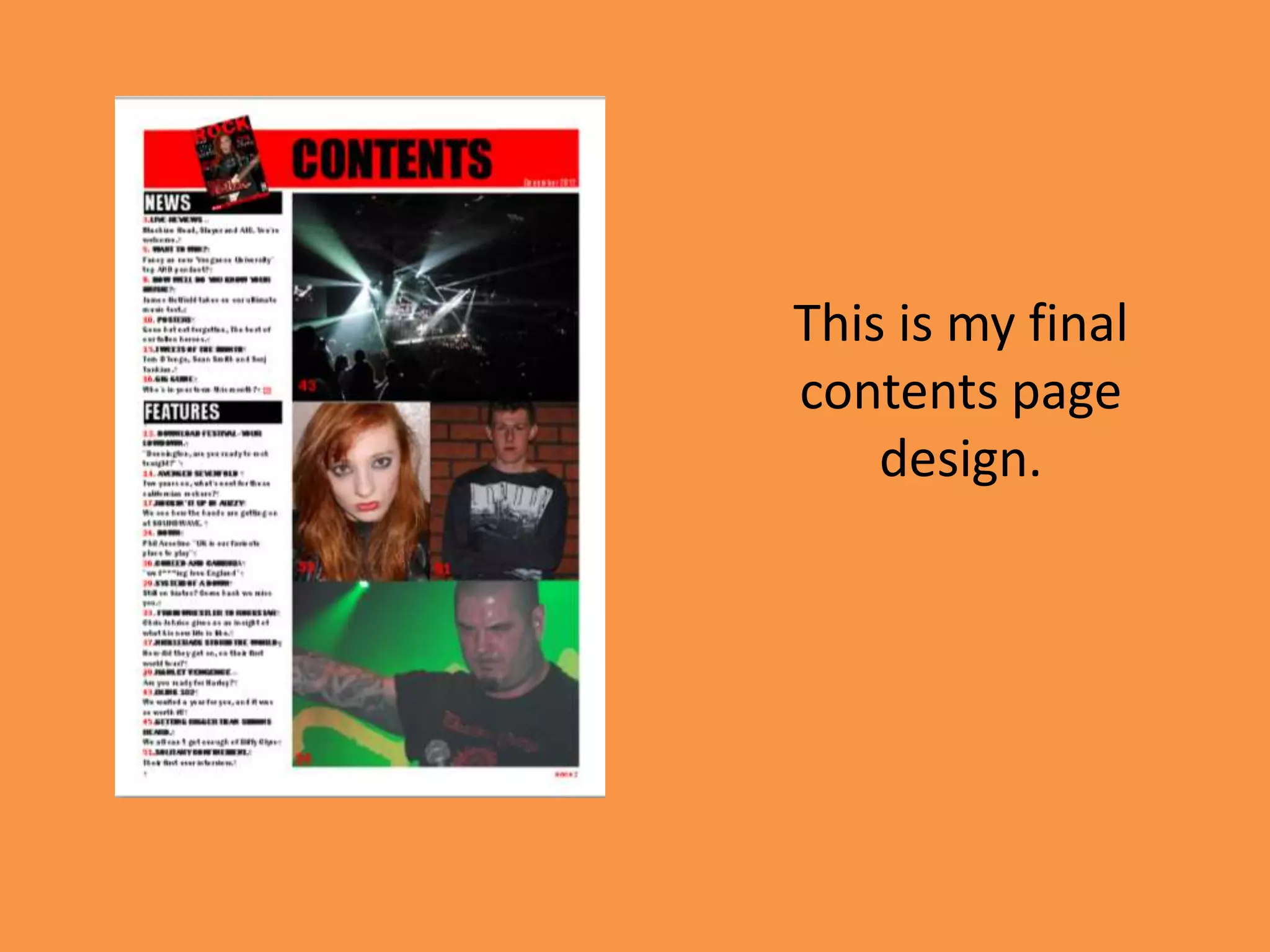
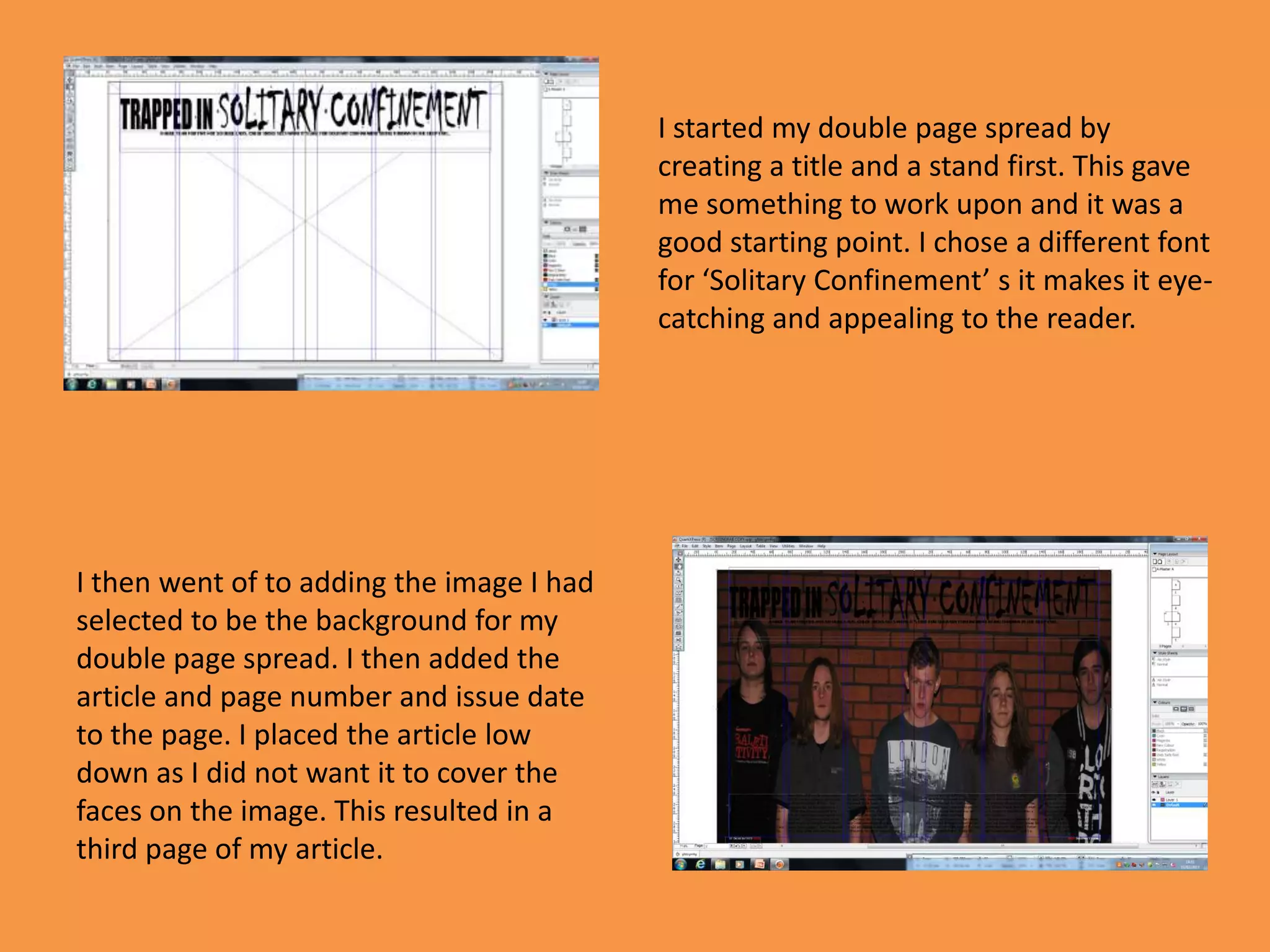
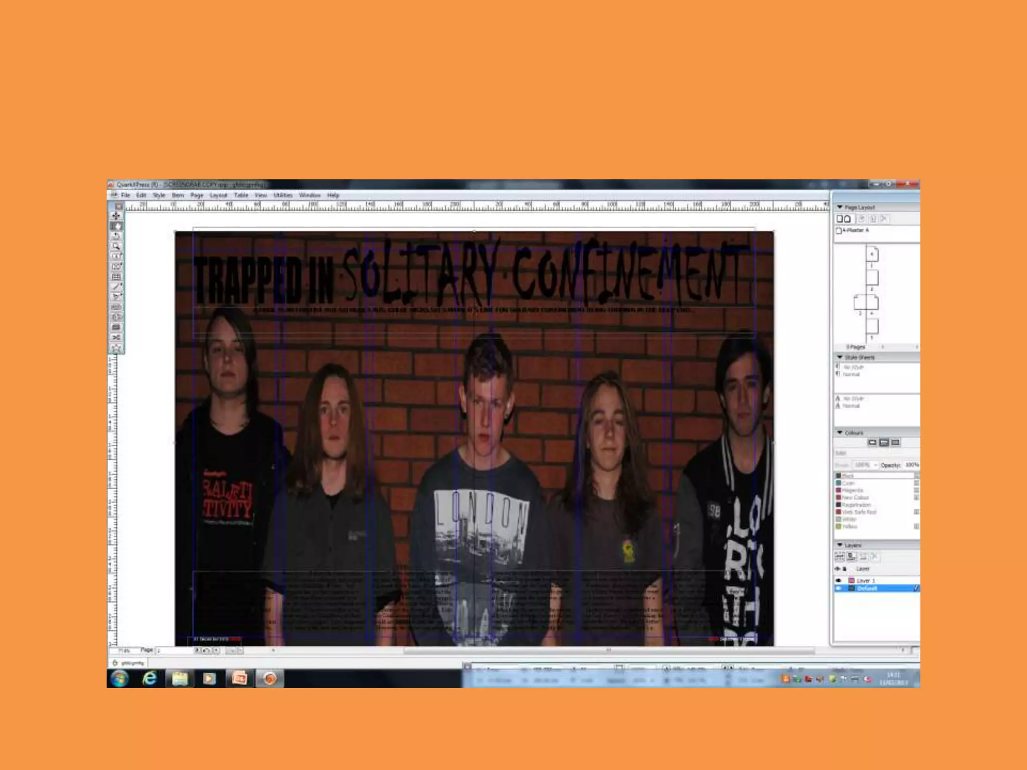
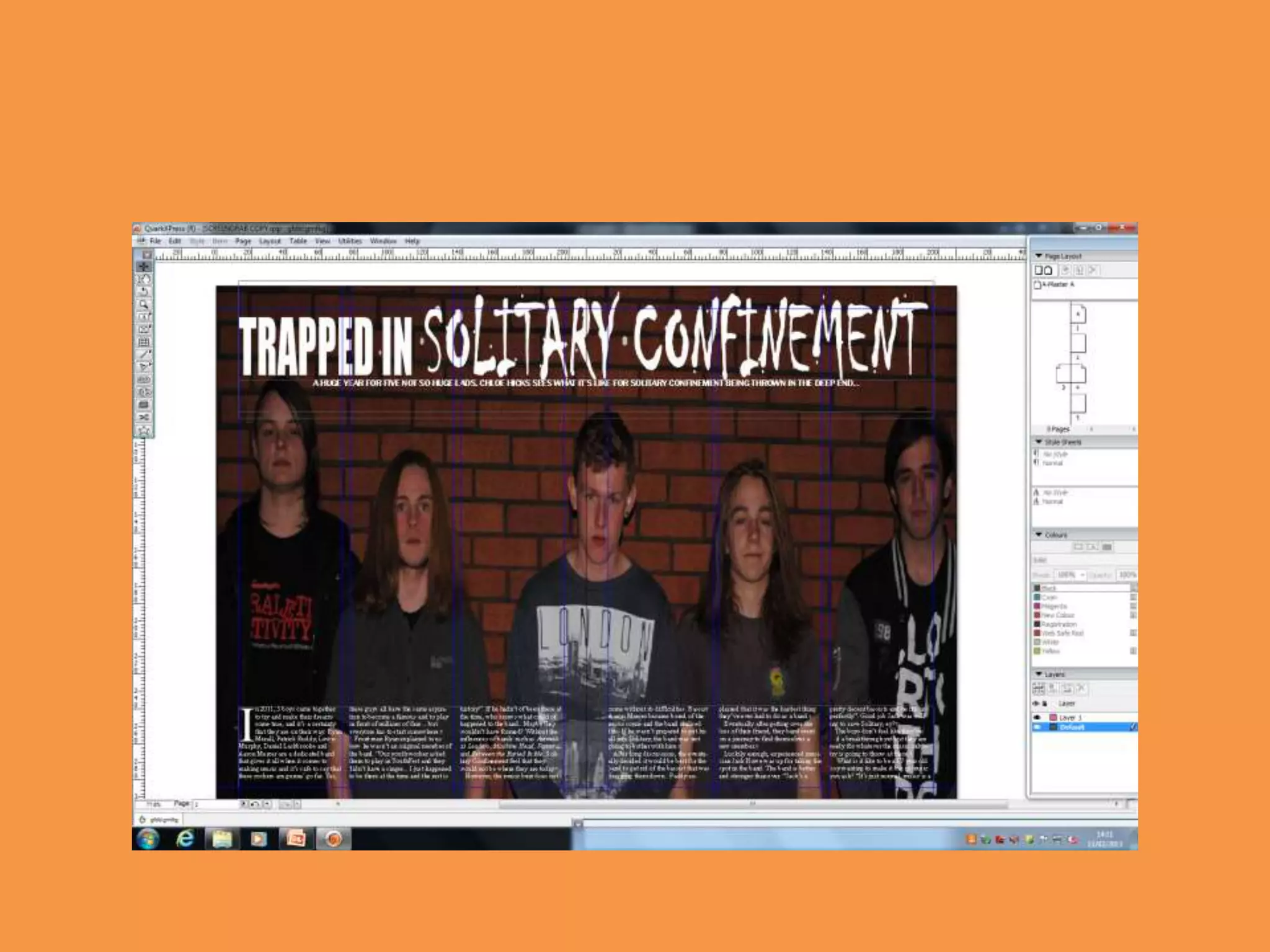
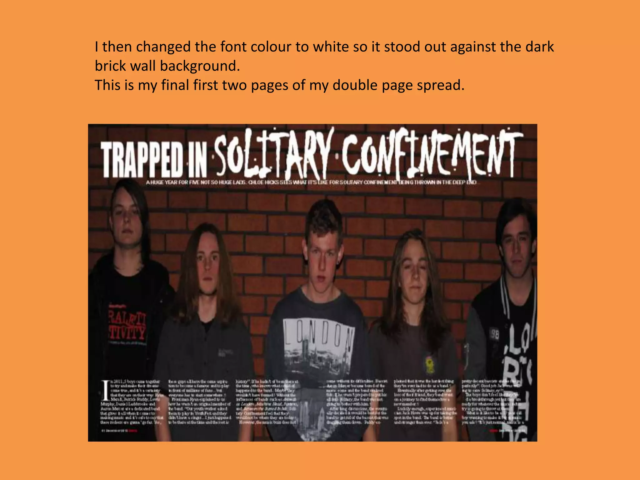
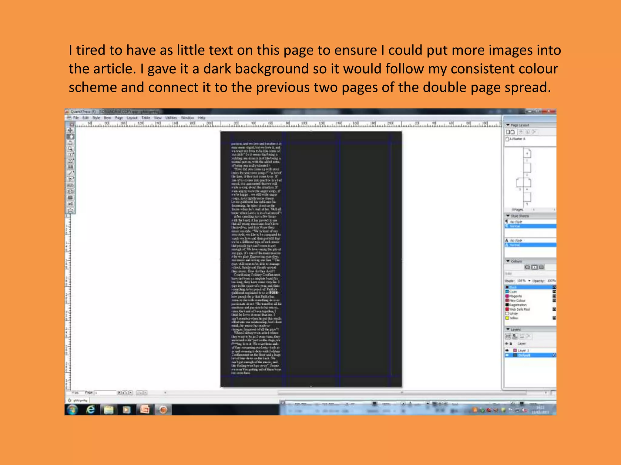
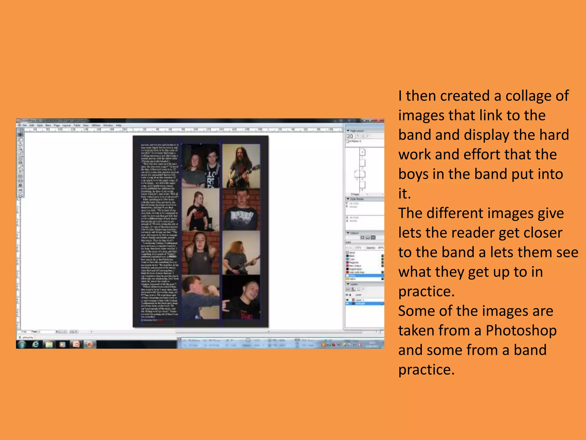
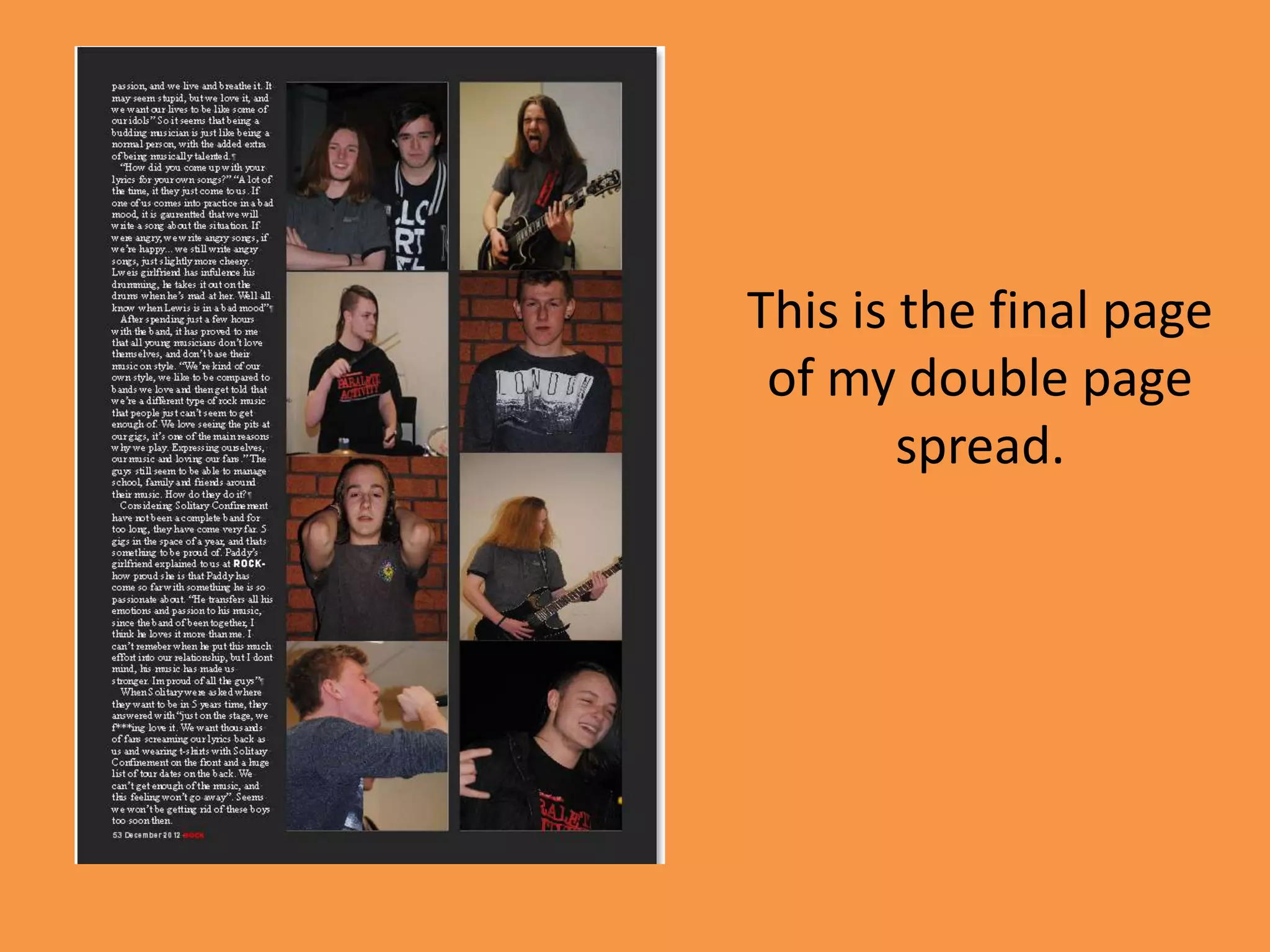
I started the production of my
magazine front cover by creating a
unique font for the title. I chose the
word ‘Rock’ as it was straight to the
point. I chose the colour red for the
title as I knew it would stand out and
be eye-catching. I t also follows the
colour scheme I have chose for my
magazine from the results of my
audience research. By adding a stroke
and bevel & emboss it made the title
unique.


I then added a bar at the bottom of
the magazine stating bands ad artists
that would also be featured within
the magazine. I made this red so it
would follow the colour scheme and
again stand out and match the title.
I then added the coverlines.
I ensured that I stuck to my colour scheme and made sure that the coverlines stood
out. Two coverlines “Download Lowdown” and “Coheed and Cambria” have a white
stroke on them, and this makes them differ from the others as I didn’t want them all
to be the same and I felt that they stood out more. The coverline “Avenged
Sevenfold” is in a different font to the rest as it is will be made into an exclusive story
in the magazine.
I also added a positioning statement and issue date and title in a different font to
everything else as this follows the codes and conventions of a magazine front cover.
It is typical for a magazine to have an exclusive one off article that is in this
particular magazine only therefore I decided I would include this on the
coverline of the band that was favoured most in my audience research. This
will make the reader believe that my magazine is the only place you can read
this news.
Then I added my chosen image. I cropped the image and placed it on a plain
black background as I felt it would portray the ‘hard knock’ attitude that
rock music displays through this. I chose this image because of the facial
expressions and the use of the guitar.
I created my main coverline in a unique
                                         way that I had not used anywhere else
                                         on the front cover. The surname
                                         ‘Vengeance’ links well with the attitude
                                         of rock music. I chose this colour as i did
                                         not want to use too much of the same
                                         colour, whilst trying to stick to my colour
                                         scheme, and by using a different shade
                                         of red, I still managed to follow it and let
                                         it stand out more than most things of
                                         the cover. I added a white stroke to
                                         ‘Harley’ to make it stand out more
                                         against the black background and lather
                                         jacket of the model and a black stroke to
                                         ‘Vengeance’ to ensure it stood out
                                         against the white of the guitar.
                                         The subline is in the same colour as the
                                         main coverline to ensure it connects
                                         with this the black box around it makes
                                         it stand out against the white and the
                                         maroon outline again anchors the
                                         subline to the image and the main
I also added the barcode at this point   coverline.
too.
This is my final magazine front cover.
Firstly I added a red bar
across the top with ‘content’
in it to make it stand out and
be the first thing that is
noticed on the page. To
follow the style of the page I
then added the category
headings to display the two
different categories within
the magazine. News being
the regular content and
Features being the interviews
and articles specific to this
certain issue.
Then I added the page numbers followed by the name of the article and a
small insight to what the article is about. This lets the reader know what
they are going to be reading and keeps them interested as it does not
reveal the whole article and makes them want to keep reading. I changed
the colour of the p-age numbers to red so they stood out and followed by
consistent red, black and white colour scheme.
I then chose images I felt
would relate to the articles
best out of the pictures I had
selected. I selected these
images because I felt they
stood out most over all the
pictures I had taken.
Also in two of the images, the
models are giving direct
audience address which
attracts the reader.
I then added an issue date, page number and the
page numbers of the image to anchor the image
to the article. This is all conventional of a
magazine contents page.
This is my final
contents page
    design.
I started my double page spread by
                                           creating a title and a stand first. This gave
                                           me something to work upon and it was a
                                           good starting point. I chose a different font
                                           for ‘Solitary Confinement’ s it makes it eye-
                                           catching and appealing to the reader.


I then went of to adding the image I had
selected to be the background for my
double page spread. I then added the
article and page number and issue date
to the page. I placed the article low
down as I did not want it to cover the
faces on the image. This resulted in a
third page of my article.
I then changed the font colour to white so it stood out against the dark
brick wall background.
This is my final first two pages of my double page spread.
I tired to have as little text on this page to ensure I could put more images into
the article. I gave it a dark background so it would follow my consistent colour
scheme and connect it to the previous two pages of the double page spread.
I then created a collage of
images that link to the
band and display the hard
work and effort that the
boys in the band put into
it.
The different images give
lets the reader get closer
to the band a lets them see
what they get up to in
practice.
Some of the images are
taken from a Photoshop
and some from a band
practice.
This is the final page
 of my double page
        spread.

Screengrabs

  • 1.
    I started theproduction of my magazine front cover by creating a unique font for the title. I chose the word ‘Rock’ as it was straight to the point. I chose the colour red for the title as I knew it would stand out and be eye-catching. I t also follows the colour scheme I have chose for my magazine from the results of my audience research. By adding a stroke and bevel & emboss it made the title unique. I then added a bar at the bottom of the magazine stating bands ad artists that would also be featured within the magazine. I made this red so it would follow the colour scheme and again stand out and match the title.
  • 2.
    I then addedthe coverlines. I ensured that I stuck to my colour scheme and made sure that the coverlines stood out. Two coverlines “Download Lowdown” and “Coheed and Cambria” have a white stroke on them, and this makes them differ from the others as I didn’t want them all to be the same and I felt that they stood out more. The coverline “Avenged Sevenfold” is in a different font to the rest as it is will be made into an exclusive story in the magazine. I also added a positioning statement and issue date and title in a different font to everything else as this follows the codes and conventions of a magazine front cover.
  • 3.
    It is typicalfor a magazine to have an exclusive one off article that is in this particular magazine only therefore I decided I would include this on the coverline of the band that was favoured most in my audience research. This will make the reader believe that my magazine is the only place you can read this news.
  • 4.
    Then I addedmy chosen image. I cropped the image and placed it on a plain black background as I felt it would portray the ‘hard knock’ attitude that rock music displays through this. I chose this image because of the facial expressions and the use of the guitar.
  • 5.
    I created mymain coverline in a unique way that I had not used anywhere else on the front cover. The surname ‘Vengeance’ links well with the attitude of rock music. I chose this colour as i did not want to use too much of the same colour, whilst trying to stick to my colour scheme, and by using a different shade of red, I still managed to follow it and let it stand out more than most things of the cover. I added a white stroke to ‘Harley’ to make it stand out more against the black background and lather jacket of the model and a black stroke to ‘Vengeance’ to ensure it stood out against the white of the guitar. The subline is in the same colour as the main coverline to ensure it connects with this the black box around it makes it stand out against the white and the maroon outline again anchors the subline to the image and the main I also added the barcode at this point coverline. too.
  • 6.
    This is myfinal magazine front cover.
  • 7.
    Firstly I addeda red bar across the top with ‘content’ in it to make it stand out and be the first thing that is noticed on the page. To follow the style of the page I then added the category headings to display the two different categories within the magazine. News being the regular content and Features being the interviews and articles specific to this certain issue.
  • 8.
    Then I addedthe page numbers followed by the name of the article and a small insight to what the article is about. This lets the reader know what they are going to be reading and keeps them interested as it does not reveal the whole article and makes them want to keep reading. I changed the colour of the p-age numbers to red so they stood out and followed by consistent red, black and white colour scheme.
  • 9.
    I then choseimages I felt would relate to the articles best out of the pictures I had selected. I selected these images because I felt they stood out most over all the pictures I had taken. Also in two of the images, the models are giving direct audience address which attracts the reader.
  • 10.
    I then addedan issue date, page number and the page numbers of the image to anchor the image to the article. This is all conventional of a magazine contents page.
  • 11.
    This is myfinal contents page design.
  • 12.
    I started mydouble page spread by creating a title and a stand first. This gave me something to work upon and it was a good starting point. I chose a different font for ‘Solitary Confinement’ s it makes it eye- catching and appealing to the reader. I then went of to adding the image I had selected to be the background for my double page spread. I then added the article and page number and issue date to the page. I placed the article low down as I did not want it to cover the faces on the image. This resulted in a third page of my article.
  • 15.
    I then changedthe font colour to white so it stood out against the dark brick wall background. This is my final first two pages of my double page spread.
  • 16.
    I tired tohave as little text on this page to ensure I could put more images into the article. I gave it a dark background so it would follow my consistent colour scheme and connect it to the previous two pages of the double page spread.
  • 17.
    I then createda collage of images that link to the band and display the hard work and effort that the boys in the band put into it. The different images give lets the reader get closer to the band a lets them see what they get up to in practice. Some of the images are taken from a Photoshop and some from a band practice.
  • 18.
    This is thefinal page of my double page spread.