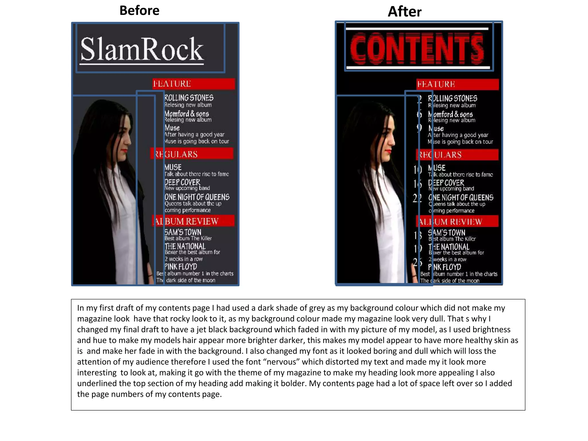
The document summarizes changes made to layout and design elements of a rock music magazine. The background color and font were changed on the double page spread to draw focus to the text and images rather than the background. The main image direction and text placement were also adjusted on the double page spread to make better use of space. On the front cover, the font was changed to have a "smashed" look fitting of a rock magazine, and additional text and a second image were added to fill out the space. The contents page background was changed from a dull gray to black, the model's hair was adjusted to blend with the background better, and the font was changed to be more "distorted" and interesting to look at,