
Recommended
More Related Content
What's hot
What's hot (20)
Viewers also liked
Viewers also liked (9)
Similar to Front cover analysis, kerrang!, mojo, q
Similar to Front cover analysis, kerrang!, mojo, q (20)
More from AnthonyTeazdale
More from AnthonyTeazdale (16)
Recently uploaded
Recently uploaded (20)
Front cover analysis, kerrang!, mojo, q
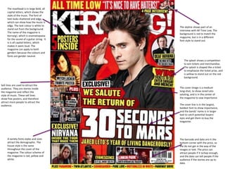
- 1. The masthead is in large bold, all capital letters, which shows the style of the music. The font of text looks shattered and edgy, which can show how the music is edgy. The text colour is white to stand out from the background. The name of the magazine is Kerrang!, which is onomatopoeia for the sound of a guitar string. It is is all capital letters, which makes it seem loud. The magazine can apply to both genders because the colours and fonts are gender neutral. Sell lines are used to attract the audience. They are stories inside the magazine and reflect the style of music. These sell lines show free posters, and therefore attract more people to attract the audience. A variety fonts styles and sizes attract the demographic. The house style is the same throughout the cover of the magazine. The colour scheme of the magazine is red, yellow and white. The skyline shows part of an interview with All Time Low. The background is red to match the magazine, but is in a different font style to stand out. The splash shows a competition to win tickets and merchandise. The splash is shaped like a ticket to emphasize the ticket prize, and is yellow to stand out on the red background. The cover image is a medium long-shot, to show Jared Leto saluting, and is in the center of the magazine to sow importance The cover line is in the largest, boldest font to show importance, and the bands’ name is in larger text to catch potential buyers’ eyes and get them to buy the magazine. The barcode and date are in the bottom corner with the price, so the do not get in the way of the images or text. The price can attract people if it ischep enough, and the date can tell people if the audience if the stories are up to date.
- 2. The masthead is on the top of the magazine to show its importance. The font is simple so it doesn’t distract from the main image, and so it can fit with a variety of music styles. The main image of Roger Waters covers the logo, which shows that he is a big star. The main image is a medium shot, to shoe facial expression, but not feel too close. The image background is a wall to show the theme of the Pink Floyd album, The Wall. The puff is red to stand out out, but fit with the colour scheme. It shows the USP of the free CD, which will attract customers to buy the magazine. The skyline shows another article and an image to attract the audience. It does not have a background colour so it doesn’t distract from the main image. The articles are arranged in columns to fit more in and fill up the page. The house style is red, white and black. White and black are contrasts so they make each other pop, while red stands out on both. The barcode is placed in the bottom right hand side of the page so it doesn’t obstruct the main image.
- 3. The magazine title is shown in large font and a classic font. This makes it more prominent an important. The font used makes it seem like a quality magazine, and the red background provides a contrast, making it pop. The main image is a long shot. This sows Noels’ pose as well as looking natural. The amplifier shows some of his main quotes from the article to attract people to see the quotes in context and what they relate to. The barcode is placed in the bottom left of the cover, so it does not obstruct the image or the articles. This makes it easier for the buyers to see. The articles are shown down the side in a column, so it is easier to fit more in. They all use the same font and color style. The style is reminiscent of a concert poster to link it to music. This is shown by the usage and font of the word ‘featuring’ at the top of the article. The colour scheme is red and black, which stand out on the gradient grey background. Quotes and images of band and band members are used to attract the audience to articles. The splash is used to attract the audience as it shows musicians and bands such as The Killers, Deadmau5 and Velvet Underground. It is shaped and coloured like a golden record label, which shows the theme of albums.