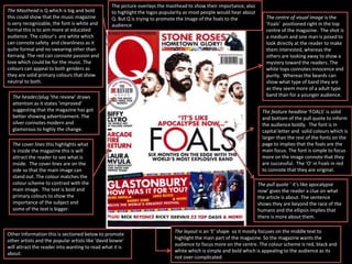
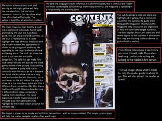
The Masthead is Q which is big and bold
this could show that the music magazine
is very recognizable, the font is white and
formal this is to aim more at educated
audience. The colour’s are white which
can connote safety and cleanliness as it
quite formal and no swearing other than
Kerrang. The red can connote passion and
love which could be for the music. The
colours can appeal to both genders as
they are solid primary colours that show
neutral to both.
The layout is an ‘E’ shape so it mostly focuses on the middle text to
highlight the main part of the magazine. So the magazine wants the
audience to focus more on the centre. The colour scheme is red, black and
white which is simple and bold which is appealing to the audience as its
not over-complicated
The centre of visual image is the
‘Foals’ positioned right in the top
centre of the magazine. The shot is
a medium and one man is posed to
look directly at the reader to make
them interested, whereas the
others are looking away to show a
mystery toward the readers. The
white tops connotes innocence and
purity. Whereas the beards can
show what type of band they are
as they seem more of a adult type
band than for a younger audience.The header/plug ‘the review’ draws
attention as it states ‘improved’
suggesting that the magazine has got
better showing advertisement. The
silver connotes modern and
glamorous to highly the change.
The picture overlays the masthead to show their importance, also
to highlight the logos popularity as most people would hear about
Q. But Q is trying to promote the image of the foals to the
audience
The feature headline ‘FOALS’ is solid
and bottom of the pull quote to inform
the audience boldly. The font is in
capital letter and solid colours which is
larger than the rest of the fonts on the
page to implies that the foals are the
main focus. The font is simple to focus
more on the image connote that they
are successful. The ‘O’ in Foals in red
to connote that they are original.
The pull quote ‘ it’s like apocalypse
now’ gives the reader a clue on what
the article is about. The sentence
shows they are beyond the race of the
humans and the ellipsis implies that
there is more about them.
The cover lines this highlights what
is inside the magazine this is will
attract the reader to see what is
inside. The cover lines are on the
side so that the main image can
stand out. The colour matches the
colour scheme to contrast with the
main image. The text is bold and
primary colours to show the
importance of the subject and
some of the text is bigger.
Other Information this is sectioned below to promote
other artists and the popular artists like ‘david bowie’
will attract the reader into wanting to read what it is
about.
The stone roses has mostly
quarter of the page this implies
there are the top cover of the
magazine to show how important
they are compared too. The
magazine is using an image
already taken to connote the
funniness and success of the artist
as they have images taken of
them.
The content is positioned on the top
to highlight what the page is. This is
to inform the reader what it is inside.
The font is bold to make it stand out
also the colour white connotes
cleanliness this can show they type
of the language. The red box is their
to contrast with the background so
the text can stand out. The red
connotes the leadership and power
that the magazine has for the reader
as it will attract the reader. The logo
is next to it to make the brand stand
out.
The font is repeated ‘contents’ font is the
same has the subheadings to draw
attention.
The colour scheme matches the
front cover is simple to match
the traditional colour that Q
uses. There are also other
colours yellow to connote
happiness and bright that the
magazine and the subjects
brings. The orange connotes
creativity to show what the artist
is like. The variety of colour can
show the different types of
music there is in the issue.
The sub-headings grab the
readers attention , the text is
bold to grab the attention of
the reader. The bold writing
shows the information is
important. The black connotes
release and magic to show the
new artists and the release of
their music and interviews. The
list can represent how much
the magazine has inside.
The page numbers are enlarge to
show the reader where exactly it is to
eye catch them. The font is simple
and bold to represent the
importance.
The layout is structured and
organised suggesting that is
straight into the subject and only
into music. It is clear to read
and to understand as it
sectioned into parts to make
some of the parts stand out all
at once.
Direct address ‘all abroad’ joining
the reader will make them feel
involved and being a part of it so it
makes them feel comfortable and
relaxed also its quite informal as its
using shorten words to attract the
target audience
The main image is a
medium close up of
each of the artists. Only
two of the artists are
looking at the reader
but they look quite
serious this connotes
what they think about
the career .The colour
white can connote the
band is innocent. Two
are facing away which
can show they have
something to hide to
make the reader
interested. One is
looking down to
suggest there emotion
and could express what
there music is like.
The colour scheme
is simple and basic
as its only white and
black like modern
this could relate
back to the genre of
music they play.
The artists also
match with the
colour scheme to
contrast with the
background. The
bits of red can show
they have tiny
elements of danger
in them waiting for
it to come out.
The article is about not
the music but
themselves this relates
back to the image as
they are all looking not
professional, they could
be doing this to interest
the reader into wanting
to find out more about
them
The quote is enlarged and bold to
highlight what type of band they are
and stands out to the reader, the red
of the name shows that the person is
passionate to who they are.
The layout of the picture is a shape of an ‘U’ to show the band could be unique and doesn't’t need the
typical band picture , this shows to the audience they are different. The Centre of image focus is the
male artists in comparison to the text as they are much larger than the text and stand out, this could
signify that that they are successful and big in the music industry as the double page spread shows
how big they are by having them surrounding the page. This could also suggest that the band needs to
be well-known . The skin tone matches the background to connote a positive success.
The man on the top could suggest he is the leader
as he's on top of the chain and goes down by list.
The image itself of his hand position shows that it
could implies that it makes the audience attract to
his face as it looks like he's thinking
Some of the paragraphs
have large letters at the
start of the paragraph
this can show that
these will be the main
part of the article as
they will stand out
more to the audience.
The bold big black font
shows the success the
band are. The simple
font stand out and
contrasts with the
white background as it
makes the text stand
out
The target audience
will be aimed at
teenagers as it very
simple language plus
the layout and colour
schemes as they are
very simple and basic
.
The title is bold and white, to stand out to the
audience, and attract them. The masthead is
covered my a person this can show how well
known the magazine is, as it makes the
magazine not seem unrecognizable to the
audience. The positioned of the masthead at the
top shows that the importance of the magazine
as its on top from the rest. The font seems
onomatopoeic as it looks like the font is like
sound waves from a song, to show more of a
music magazine. The capital letters and the
exclamation mark seems to look like its being
shouted to highlight also what the music genre
is and the target audience. The broken glass
effect shows like rebels and bad this could also
implies what the target audience is.
The main images shows different popular artists
like oli Sykes , the shots of the pictures are
staged photos to attract and help the audience
to feel included Into them events. The layout of
the pictures are live an upside down V to show
the importance of each artists. Oli Sykes is
positioned at the top of the page with the
masthead and he is pulling is hands up the same
length of the masthead this could show how
popular and superior he is. He is focus point of
the image and that could highlight power.
The text is bold and easy to recognize, and stand out from the page as thee bright colours. This will help
the audience highlight the main points of the magazine inside.
The colour scheme is bright and
fire , this could connote danger
and anger and excitement this is
because the colours are shown to
be quite ‘loud’ and vibrant. The
colours can attract the audience as
they are bright and stand out from
the competitors.
The layout of the magazine is quite
messy to connote the type of
music the magazine produces and
this can highlight to the audience
and hint what is inside and what it
is like. The plug/header highlights
what is inside with ‘6 killer posters’
this will attract the audience as its
like free presents. The bright
yellow will also make it stand out
as the colour shows to be alerting.
The price and bar code is a common convention
on a magazine. It is quite small as its not really
that important to the audience but it has to be
there. The price is £6.95 hitting the middle class
value.
The red and black part at the bottom
shows more information the
magazine has, this will attract the
audience also the colours kerrang has
used can show danger and warning
this can show the type of target
audience that are interested.
The colour scheme is very dark and
alerting as the bright yellow will help
the text stand out, the black can
represent mystery this can show what
type of context will be inside. The
yellow is bright for an attention grabber.
The main image is a man holding a skull
,he is positioned to be quite hunch back
and making the skull the main focus
point. This can show fear and scariness as
the skull is represented as it could
highlight the type of music that links with
the artist like death. His appearance is
shown to be quite gothic and scary like
appealing to the target audience of dark
and heavy metal. The skull can show the
artist is not innocent and quite
dangerous. The pale skin can make him
look vampire like to link back to the black
gothic theme of the picture. The clothing
of black leather is quite bold but its
contrasts with the artists as he is dressed
in a lot of black to show that he is very
dark and can link back to his music. He is
positioned on the left side of the page to
show he is the main focus point and this is
different from competitors like Q as there
text is on the right, this can show Kerrang
is different from other competitors
making them stand out. The facial
expression is quite mysterious and is
trying to look intimidating this is to
highlight to the reader to look on what he
wants to say .
The layout is shown to be simple and split into two sections , with an image and text. This simple content page
will help the reader navigate to where hey want to go.
The text and language is quite informal as it shortens words, this is to make the reader
feel more comfortable as it will help them enjoy it more as the magazine is speaking in
a very friendly and warming tone.
The sub headings is bold and black and
highlighted in yellow, this is to make it
easier for the audience to guide them
through the magazine. This makes the
magazine very structured and organised
as this will benefit the target audience .
The bold capitals letters will stand out and
more appeal to the audience it also seems
like they are shouting to the audience to
go to the that section.
The editors notes make it seem very
personal this will make the readers
feel very comfortable as they are
talking to the reader in first person.
The sub images show what is inside
to help the reader guide to where to
go. This will also attract the reader as
it will
 AS Level Music Magazine Analysis

AS Level Music Magazine Analysis

  • 1.
    The Masthead isQ which is big and bold this could show that the music magazine is very recognizable, the font is white and formal this is to aim more at educated audience. The colour’s are white which can connote safety and cleanliness as it quite formal and no swearing other than Kerrang. The red can connote passion and love which could be for the music. The colours can appeal to both genders as they are solid primary colours that show neutral to both. The layout is an ‘E’ shape so it mostly focuses on the middle text to highlight the main part of the magazine. So the magazine wants the audience to focus more on the centre. The colour scheme is red, black and white which is simple and bold which is appealing to the audience as its not over-complicated The centre of visual image is the ‘Foals’ positioned right in the top centre of the magazine. The shot is a medium and one man is posed to look directly at the reader to make them interested, whereas the others are looking away to show a mystery toward the readers. The white tops connotes innocence and purity. Whereas the beards can show what type of band they are as they seem more of a adult type band than for a younger audience.The header/plug ‘the review’ draws attention as it states ‘improved’ suggesting that the magazine has got better showing advertisement. The silver connotes modern and glamorous to highly the change. The picture overlays the masthead to show their importance, also to highlight the logos popularity as most people would hear about Q. But Q is trying to promote the image of the foals to the audience The feature headline ‘FOALS’ is solid and bottom of the pull quote to inform the audience boldly. The font is in capital letter and solid colours which is larger than the rest of the fonts on the page to implies that the foals are the main focus. The font is simple to focus more on the image connote that they are successful. The ‘O’ in Foals in red to connote that they are original. The pull quote ‘ it’s like apocalypse now’ gives the reader a clue on what the article is about. The sentence shows they are beyond the race of the humans and the ellipsis implies that there is more about them. The cover lines this highlights what is inside the magazine this is will attract the reader to see what is inside. The cover lines are on the side so that the main image can stand out. The colour matches the colour scheme to contrast with the main image. The text is bold and primary colours to show the importance of the subject and some of the text is bigger. Other Information this is sectioned below to promote other artists and the popular artists like ‘david bowie’ will attract the reader into wanting to read what it is about.
  • 2.
    The stone roseshas mostly quarter of the page this implies there are the top cover of the magazine to show how important they are compared too. The magazine is using an image already taken to connote the funniness and success of the artist as they have images taken of them. The content is positioned on the top to highlight what the page is. This is to inform the reader what it is inside. The font is bold to make it stand out also the colour white connotes cleanliness this can show they type of the language. The red box is their to contrast with the background so the text can stand out. The red connotes the leadership and power that the magazine has for the reader as it will attract the reader. The logo is next to it to make the brand stand out. The font is repeated ‘contents’ font is the same has the subheadings to draw attention. The colour scheme matches the front cover is simple to match the traditional colour that Q uses. There are also other colours yellow to connote happiness and bright that the magazine and the subjects brings. The orange connotes creativity to show what the artist is like. The variety of colour can show the different types of music there is in the issue. The sub-headings grab the readers attention , the text is bold to grab the attention of the reader. The bold writing shows the information is important. The black connotes release and magic to show the new artists and the release of their music and interviews. The list can represent how much the magazine has inside. The page numbers are enlarge to show the reader where exactly it is to eye catch them. The font is simple and bold to represent the importance. The layout is structured and organised suggesting that is straight into the subject and only into music. It is clear to read and to understand as it sectioned into parts to make some of the parts stand out all at once. Direct address ‘all abroad’ joining the reader will make them feel involved and being a part of it so it makes them feel comfortable and relaxed also its quite informal as its using shorten words to attract the target audience
  • 3.
    The main imageis a medium close up of each of the artists. Only two of the artists are looking at the reader but they look quite serious this connotes what they think about the career .The colour white can connote the band is innocent. Two are facing away which can show they have something to hide to make the reader interested. One is looking down to suggest there emotion and could express what there music is like. The colour scheme is simple and basic as its only white and black like modern this could relate back to the genre of music they play. The artists also match with the colour scheme to contrast with the background. The bits of red can show they have tiny elements of danger in them waiting for it to come out. The article is about not the music but themselves this relates back to the image as they are all looking not professional, they could be doing this to interest the reader into wanting to find out more about them The quote is enlarged and bold to highlight what type of band they are and stands out to the reader, the red of the name shows that the person is passionate to who they are. The layout of the picture is a shape of an ‘U’ to show the band could be unique and doesn't’t need the typical band picture , this shows to the audience they are different. The Centre of image focus is the male artists in comparison to the text as they are much larger than the text and stand out, this could signify that that they are successful and big in the music industry as the double page spread shows how big they are by having them surrounding the page. This could also suggest that the band needs to be well-known . The skin tone matches the background to connote a positive success. The man on the top could suggest he is the leader as he's on top of the chain and goes down by list. The image itself of his hand position shows that it could implies that it makes the audience attract to his face as it looks like he's thinking Some of the paragraphs have large letters at the start of the paragraph this can show that these will be the main part of the article as they will stand out more to the audience. The bold big black font shows the success the band are. The simple font stand out and contrasts with the white background as it makes the text stand out The target audience will be aimed at teenagers as it very simple language plus the layout and colour schemes as they are very simple and basic .
  • 4.
    The title isbold and white, to stand out to the audience, and attract them. The masthead is covered my a person this can show how well known the magazine is, as it makes the magazine not seem unrecognizable to the audience. The positioned of the masthead at the top shows that the importance of the magazine as its on top from the rest. The font seems onomatopoeic as it looks like the font is like sound waves from a song, to show more of a music magazine. The capital letters and the exclamation mark seems to look like its being shouted to highlight also what the music genre is and the target audience. The broken glass effect shows like rebels and bad this could also implies what the target audience is. The main images shows different popular artists like oli Sykes , the shots of the pictures are staged photos to attract and help the audience to feel included Into them events. The layout of the pictures are live an upside down V to show the importance of each artists. Oli Sykes is positioned at the top of the page with the masthead and he is pulling is hands up the same length of the masthead this could show how popular and superior he is. He is focus point of the image and that could highlight power. The text is bold and easy to recognize, and stand out from the page as thee bright colours. This will help the audience highlight the main points of the magazine inside. The colour scheme is bright and fire , this could connote danger and anger and excitement this is because the colours are shown to be quite ‘loud’ and vibrant. The colours can attract the audience as they are bright and stand out from the competitors. The layout of the magazine is quite messy to connote the type of music the magazine produces and this can highlight to the audience and hint what is inside and what it is like. The plug/header highlights what is inside with ‘6 killer posters’ this will attract the audience as its like free presents. The bright yellow will also make it stand out as the colour shows to be alerting. The price and bar code is a common convention on a magazine. It is quite small as its not really that important to the audience but it has to be there. The price is £6.95 hitting the middle class value. The red and black part at the bottom shows more information the magazine has, this will attract the audience also the colours kerrang has used can show danger and warning this can show the type of target audience that are interested.
  • 5.
    The colour schemeis very dark and alerting as the bright yellow will help the text stand out, the black can represent mystery this can show what type of context will be inside. The yellow is bright for an attention grabber. The main image is a man holding a skull ,he is positioned to be quite hunch back and making the skull the main focus point. This can show fear and scariness as the skull is represented as it could highlight the type of music that links with the artist like death. His appearance is shown to be quite gothic and scary like appealing to the target audience of dark and heavy metal. The skull can show the artist is not innocent and quite dangerous. The pale skin can make him look vampire like to link back to the black gothic theme of the picture. The clothing of black leather is quite bold but its contrasts with the artists as he is dressed in a lot of black to show that he is very dark and can link back to his music. He is positioned on the left side of the page to show he is the main focus point and this is different from competitors like Q as there text is on the right, this can show Kerrang is different from other competitors making them stand out. The facial expression is quite mysterious and is trying to look intimidating this is to highlight to the reader to look on what he wants to say . The layout is shown to be simple and split into two sections , with an image and text. This simple content page will help the reader navigate to where hey want to go. The text and language is quite informal as it shortens words, this is to make the reader feel more comfortable as it will help them enjoy it more as the magazine is speaking in a very friendly and warming tone. The sub headings is bold and black and highlighted in yellow, this is to make it easier for the audience to guide them through the magazine. This makes the magazine very structured and organised as this will benefit the target audience . The bold capitals letters will stand out and more appeal to the audience it also seems like they are shouting to the audience to go to the that section. The editors notes make it seem very personal this will make the readers feel very comfortable as they are talking to the reader in first person. The sub images show what is inside to help the reader guide to where to go. This will also attract the reader as it will