The document summarizes the key elements of a magazine design aimed at students. It discusses the bold masthead that catches students' attention, headlines about life after school and college to indicate it is aimed at students. The colors are clear and stand out to make it less formal for teenagers. The masthead color stands out against the black background. The front cover image of a cricket player represents success and the headlines create a border around it. However, the circles on the cover look out of place and the white text is hard to read against the image in places. The contents page uses bold colored, underlined fonts to grab attention. The magazine seems aimed at teenagers leaving school to give advice on adulthood.
Operation “Blue Star” is the only event in the history of Independent India where the state went into war with its own people. Even after about 40 years it is not clear if it was culmination of states anger over people of the region, a political game of power or start of dictatorial chapter in the democratic setup.
The people of Punjab felt alienated from main stream due to denial of their just demands during a long democratic struggle since independence. As it happen all over the word, it led to militant struggle with great loss of lives of military, police and civilian personnel. Killing of Indira Gandhi and massacre of innocent Sikhs in Delhi and other India cities was also associated with this movement.
Welcome to TechSoup New Member Orientation and Q&A (May 2024).pdfTechSoup
In this webinar you will learn how your organization can access TechSoup's wide variety of product discount and donation programs. From hardware to software, we'll give you a tour of the tools available to help your nonprofit with productivity, collaboration, financial management, donor tracking, security, and more.
The Indian economy is classified into different sectors to simplify the analysis and understanding of economic activities. For Class 10, it's essential to grasp the sectors of the Indian economy, understand their characteristics, and recognize their importance. This guide will provide detailed notes on the Sectors of the Indian Economy Class 10, using specific long-tail keywords to enhance comprehension.
For more information, visit-www.vavaclasses.com
Palestine last event orientationfvgnh .pptxRaedMohamed3
An EFL lesson about the current events in Palestine. It is intended to be for intermediate students who wish to increase their listening skills through a short lesson in power point.
Unit 8 - Information and Communication Technology (Paper I).pdfThiyagu K
This slides describes the basic concepts of ICT, basics of Email, Emerging Technology and Digital Initiatives in Education. This presentations aligns with the UGC Paper I syllabus.
How to Create Map Views in the Odoo 17 ERPCeline George
The map views are useful for providing a geographical representation of data. They allow users to visualize and analyze the data in a more intuitive manner.
We all have good and bad thoughts from time to time and situation to situation. We are bombarded daily with spiraling thoughts(both negative and positive) creating all-consuming feel , making us difficult to manage with associated suffering. Good thoughts are like our Mob Signal (Positive thought) amidst noise(negative thought) in the atmosphere. Negative thoughts like noise outweigh positive thoughts. These thoughts often create unwanted confusion, trouble, stress and frustration in our mind as well as chaos in our physical world. Negative thoughts are also known as “distorted thinking”.
This is a presentation by Dada Robert in a Your Skill Boost masterclass organised by the Excellence Foundation for South Sudan (EFSS) on Saturday, the 25th and Sunday, the 26th of May 2024.
He discussed the concept of quality improvement, emphasizing its applicability to various aspects of life, including personal, project, and program improvements. He defined quality as doing the right thing at the right time in the right way to achieve the best possible results and discussed the concept of the "gap" between what we know and what we do, and how this gap represents the areas we need to improve. He explained the scientific approach to quality improvement, which involves systematic performance analysis, testing and learning, and implementing change ideas. He also highlighted the importance of client focus and a team approach to quality improvement.
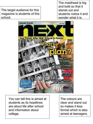
1. The target audience for this magazine is students of this school. The masthead is big and bold so that it stands out and students notice it and wonder what it is. You can tell this is aimed at students as its headlines are about life after school and information about college. The colours are clear and stand out so makes it less formal which is also aimed at teenagers.
2. The colour of the Masthead is a really good choice of colour to use against the black background because it stands out a lot. The masthead is also quite good because it is in block capitals and its quite bold, this catches the eye of the target audience. The image is very good for this “School Sport” magazine because there is a man playing cricket who looks like he has caught the ball and is cheering. This is good because the target audience will see this and think their school is as good as this man who has caught the ball. This also represents success which is good in a school environment. The headlines around the image create a border around the image to make it stand out more, the headlines are broken up because every other one is white and then in-between them, they are yellow. The headlines in yellow show more importance because they are the same colour as the masthead. The bad things about this front cover are that the circles look out of place with everything else and distract the target audience from the main image and the masthead. Also, The white text is hard to read in some places as it clashes with the part of the image behind the cricket player.
3. The fonts on the contents page are a bold coloured and underlined to stand out. These are used to get the attention of the reader. You can tell the magazine is aimed at teenagers who are getting ready to leave school and either go to college or to a job because the titles are all based on adulthood which gives advice to the reader. The background image has a faded affect which works well as it doesn’t take all the attention of the writing. The titles have a white outline which distorts the eye which can cause frustration towards the reader.
4. The target audience for this magazine is teenage girls because the background is pink and also one of the subjects is about make up tips. The colour scheme is a bit boring as it is only two colours but the two colours chosen work well together because the white writing stands out on the pink background. The images could be more affective if they where in the right places because it makes the text change places and takes all the attention away from the text which is not what you want. By looking at the photos it easy to see that the magazine is an informal magazine because the photos are of girls having a laugh and of an eye which doesn’t really go with the magazines style