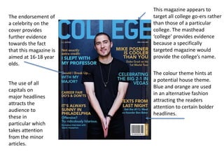
Clearly demonstrates who the
magazine is targeted at which
makes it easier for the parents to
pick up the magazine knowing fully
that the information inside is for
them.
This mid-shot of a student
clearly explains that that the
information inside is about
students within this age.
The student in the image
is wearing the uniform
of a school which is the
primary target audience.
The reader will associate
the image of this child
with the success of the
school.
The “parent” is printed
larger than the name
of the magazine in the
masthead. This implies
to the audience that
they are the priority
and that the parents
opinion of the school
might matter more
than the schools
reputation.
The colour scheme of
white, pink and purple
should continue
throughout as a house
style which will create
a cohesive magazine.
The image of the
uniform fits this colour
scheme and this allows
for continuity which is
more aesthetically
pleasing for the reader. The use of a faded background to focus on the one
student implies that your child is their main priority
which makes the audience feel special.
This image is edited and layered so that the girls head is
contrasted against the background of the image and the
white of the page. This allows the image to be the most
prominent factor on the cover which implies the the
student’s education is first and foremost.
No clear colour scheme
which confuses the
reader because it looks
unprofessional and
unorganised. This
suggests that there will be
no house style. This could
mean that the articles
have no common link and
that the designer has put
no thought into the
magazines aesthetic side.
Keeping all the text to
one side allows more
focus on the image
and text separately.
The actual writing is
short and concise and
makes it obvious that
the magazine is aimed
at the students. The bottom four pieces of text appear to follow the
colour scheme of the tie in the image which allows
for continuity ,however, this theme is not continued
for the rest of the cover.
The masthead is clear and well
placed but ‘weekly’ implies
that this is how often the
magazine will be released
;however, underneath it says
’autumn edition’ implying that
it is released seasonally.
The image clearly
presents the theme
of the magazine as a
school theme. The
positioning of the
subject portrays the
purpose of the
articles within the
magazine to revolve
around hard work
and studying.
A clear formal masthead
implies that the audience
is older students at
college/university. This
means that all the stories
and pieces featured on
the front page must
follow the theme of this
target audience.
The use of the colour
theme turquoise and
white suggest that this is
the house style and will
continue throughout. This
allows the audience to
enjoy the aesthetics of
the magazine.
The change of colour to highlight ‘special insert’ implies that
this issue is unique to others because the contents of this insert
might be useful for the audience.
The fact that the image
covers the entirety of the
page implies that the
magazine is open and
fully disclosing all
information that they
have because the
position of the student is
inviting and friendly.
The linking of the
text ‘Global learning’
and the positioning
of the globe in the
bottom left of the
page allows for
continuity and
reassurance for the
audience as this acts
as a visual aid.
This magazine appears to
target all college go-ers rather
than those of a particular
college. The masthead
‘college’ provides evidence
because a specifically
targeted magazine would
provide the college’s name.
The colour theme hints at
a potential house theme.
Blue and orange are used
in an alternative fashion
attracting the readers
attention to certain bolder
headlines.
The endorsement of
a celebrity on the
cover provides
further evidence
towards the fact
that this magazine is
aimed at 16-18 year
olds.
The use of all
capitals on
major headlines
attracts the
audience to
these in
particular which
takes attention
from the minor
articles.

Magazines

  • 1.
    Clearly demonstrates whothe magazine is targeted at which makes it easier for the parents to pick up the magazine knowing fully that the information inside is for them. This mid-shot of a student clearly explains that that the information inside is about students within this age. The student in the image is wearing the uniform of a school which is the primary target audience. The reader will associate the image of this child with the success of the school. The “parent” is printed larger than the name of the magazine in the masthead. This implies to the audience that they are the priority and that the parents opinion of the school might matter more than the schools reputation. The colour scheme of white, pink and purple should continue throughout as a house style which will create a cohesive magazine. The image of the uniform fits this colour scheme and this allows for continuity which is more aesthetically pleasing for the reader. The use of a faded background to focus on the one student implies that your child is their main priority which makes the audience feel special. This image is edited and layered so that the girls head is contrasted against the background of the image and the white of the page. This allows the image to be the most prominent factor on the cover which implies the the student’s education is first and foremost.
  • 2.
    No clear colourscheme which confuses the reader because it looks unprofessional and unorganised. This suggests that there will be no house style. This could mean that the articles have no common link and that the designer has put no thought into the magazines aesthetic side. Keeping all the text to one side allows more focus on the image and text separately. The actual writing is short and concise and makes it obvious that the magazine is aimed at the students. The bottom four pieces of text appear to follow the colour scheme of the tie in the image which allows for continuity ,however, this theme is not continued for the rest of the cover. The masthead is clear and well placed but ‘weekly’ implies that this is how often the magazine will be released ;however, underneath it says ’autumn edition’ implying that it is released seasonally. The image clearly presents the theme of the magazine as a school theme. The positioning of the subject portrays the purpose of the articles within the magazine to revolve around hard work and studying.
  • 3.
    A clear formalmasthead implies that the audience is older students at college/university. This means that all the stories and pieces featured on the front page must follow the theme of this target audience. The use of the colour theme turquoise and white suggest that this is the house style and will continue throughout. This allows the audience to enjoy the aesthetics of the magazine. The change of colour to highlight ‘special insert’ implies that this issue is unique to others because the contents of this insert might be useful for the audience. The fact that the image covers the entirety of the page implies that the magazine is open and fully disclosing all information that they have because the position of the student is inviting and friendly. The linking of the text ‘Global learning’ and the positioning of the globe in the bottom left of the page allows for continuity and reassurance for the audience as this acts as a visual aid.
  • 4.
    This magazine appearsto target all college go-ers rather than those of a particular college. The masthead ‘college’ provides evidence because a specifically targeted magazine would provide the college’s name. The colour theme hints at a potential house theme. Blue and orange are used in an alternative fashion attracting the readers attention to certain bolder headlines. The endorsement of a celebrity on the cover provides further evidence towards the fact that this magazine is aimed at 16-18 year olds. The use of all capitals on major headlines attracts the audience to these in particular which takes attention from the minor articles.