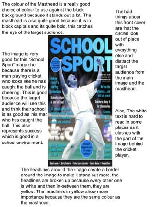
The colour of the Masthead is a really good choice of colour to use against the black background because it stands out a lot. The masthead is also quite good because it is in block capitals and its quite bold, this catches the eye of the target audience.   The image is very good for this “School Sport” magazine because there is a man playing cricket who looks like he has caught the ball and is cheering. This is good because the target audience will see this and think their school is as good as this man who has caught the ball. This also represents success which is good in a school environment.   The headlines around the image create a border around the image to make it stand out more, the headlines are broken up because every other one is white and then in-between them, they are yellow. The headlines in yellow show more importance because they are the same colour as the masthead.  The bad things about this front cover are that the circles look out of place with everything else and distract the target audience from the main image and the masthead.  Also, The white text is hard to read in some places as it clashes with the part of the image behind the cricket player.

Front cover..

  • 1.
    The colour ofthe Masthead is a really good choice of colour to use against the black background because it stands out a lot. The masthead is also quite good because it is in block capitals and its quite bold, this catches the eye of the target audience. The image is very good for this “School Sport” magazine because there is a man playing cricket who looks like he has caught the ball and is cheering. This is good because the target audience will see this and think their school is as good as this man who has caught the ball. This also represents success which is good in a school environment. The headlines around the image create a border around the image to make it stand out more, the headlines are broken up because every other one is white and then in-between them, they are yellow. The headlines in yellow show more importance because they are the same colour as the masthead. The bad things about this front cover are that the circles look out of place with everything else and distract the target audience from the main image and the masthead. Also, The white text is hard to read in some places as it clashes with the part of the image behind the cricket player.