The document analyzes the color scheme and design elements used in the front covers of several school magazines. It discusses how the bold and contrasting colors are used to make text and images stand out to attract readers' attention. The colors also provide visual cues about the schools' branding and gender identity. Key colors like blue, pink, yellow and white are analyzed for their symbolism and how they relate to the schools' uniforms and branding.
I have anaylsed two existing ,magazine front covers and two existing content pages. I have put things in about what the magazines positive and negative points are.
Analysing front covers and contents pages of existing magazinesLauren_Maskrey
This is my powerpoint presentation which i have done that shows 2 existing magazine front covers, and 2 existing magazine content pages. These will help me when i want to analyse my own magazine.
I have anaylsed two existing ,magazine front covers and two existing content pages. I have put things in about what the magazines positive and negative points are.
AS Media Studies Foundation Preliminary Taskmarkodjuricic
AS Media Studies Foundation Preliminary Task:
- Introduction
- Sample Of Questionnaire
- Questionnaire Analysis
- Questionnaire Summary
- Secondary Research
- Typography Analysis
- Magazine Front Cover and Content Page Draft 1
- School Magazine Color Scheme
- School Magazine Front Cover and Content Page Draft 2
- School Magazine Front Cover and Content Page Draft 3
- Front Cover Photo-Shoot Final Pictures
- Content Page Final Photo Competition Pictures
- Content Page Photo-Shoot Final Pictures
- Content Page Photo-Shoot Final Pictures
- Content Page Photo-Shoot Final Pictures
- Content Page Photo-Shoot Final Pictures
- Content Page Photo-Shoot Final Pictures
- Photo-Shoot Front Cover & Content Page Final Page
- School Magazine Final Front Cover and Content Page
- AS Media School Magazine Evolution
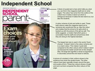
1. A block of purple text is here which tells you what
you can find in the magazine itself and on what
pages. The colour has come from the outline of the
uniform but it makes it stand out which is
ambiguous because it makes the text stand out, but
also the students.
A colour scheme of pink and white is used. These
bold colours make the magazine stand out to
someone who would pick this up. Also the colour
pink implies that the school is for girls which is
backed up with the picture of the girl as well. The
white suggests a modern feel which gives a
connotation that the staff and school know what
they are doing to the highest standard.
The largest text size is used in the words ‘Exam
choices’. It doesn’t stick to the colour scheme and
is a cream colour. This makes it quite bold
compared to the other colours which makes it stand
out because the reader would look at this straight.
Also, the large text signifies a sense of importance.
In secondary school the end result is GSCEs.
A picture of a student in their uniform shows to the
audience how smart the student looks. The other
colours have been specially chosen around the grey
and purple uniform. These two colours shows a rough
and worn-out look compared the other colours of the
page.
Independent School
2. The colour white here stands out to the other colours on
the page because it’s quite bold compared to the
background. Also the font is bold and no other text on
the page is, which also shows that it is the main title.
The white text is shown throughout the front cover as
well which makes it look professional.
The colour of the text is white, but it is complimented
with a blue background. Compared to the magazine
background, it creates a happy emotion because it’s
bright and bold. Also the colour blue show
connotations of a boy which shows that everyone is
respected and treated the same, which gives the
school a good name.
The colour of the text is white and corresponds to the other
writing colour. There is a pink background which gives
connotations of girls, which tells you that it’s a girl’s school
as well as a boy’s school from the blue above. This colour
again contrasts the image behind it and makes it stand out
for the reader to see, which would draw their attention into
the magazine, so they know what they’ll find inside.
This font colour is yellow and points out the main part
of the magazine which is about teenage stress. This
part would appeal to students who would go to the
school and this bright colour would attract them to the
magazine, as they may not be interested in reading
anything else.
3. Harlow High
The main colour scheme is black and yellow, which
suggests that those colours is the main school
colours. This could relate to the uniform and the logo
as well. These colours make the front cover of the
magazine bold and would stand out to a reader.
However, the connotations associated with black isn't
that good. It relates with mystery, death and evil but as
I sais before, the uniform may have influenced this.
The colour grey is a lighter shade of black
which compliments it well. This colour again
may have something to do with school such
as the uniform or building. It relaxes your
eyes from the bright yellow and black which
is less striking to look at. Also if the colour
wasn’t grey, the logo would of blended in
with the black, which would mean that you
wouldn't be able to tell what the shape of
the logo was like.
The writing colour is yellow here as well, which
relates to the logo and the colour of the main title.
Some of the writing is hard to read over some
colours of the picture background, but works well
over a black background. The colour yellow fives
connotations of bright and joyful which could
relate to the school’s daily atmosphere.
4. Academy Magazine
The title is the colour white which stand out well
with the blue top and bottom border because it
makes it bold and easily readable and
recognisable.
The top and bottom border both are the colour blue.
This relates to the uniform because in the picture the
students have blue shirts on. Also this suggests that
blue is the main school colour. The colour blue at the
top and bottom makes the magazine look professional
because it’s a neutral light blue shade which gives a
connotation of calmness. Also it stands out because
of the contrast with the writing.
The colour red goes well with the blue and white colour
because it makes it stand out compared the the rest of
the magazine content on this page. This effect draws the
reader straight into the red parts which is probably what
the designer wanted for them to read first.
This colour which is turquoise compliment the
blue and white well. It doesn’t stand out as much
as the white but relates to the colour of the
student ties that they are wearing in the picture.
Incorporating this colour shows the reader what
the main school colours are which it would make
it recognisable and memorable.