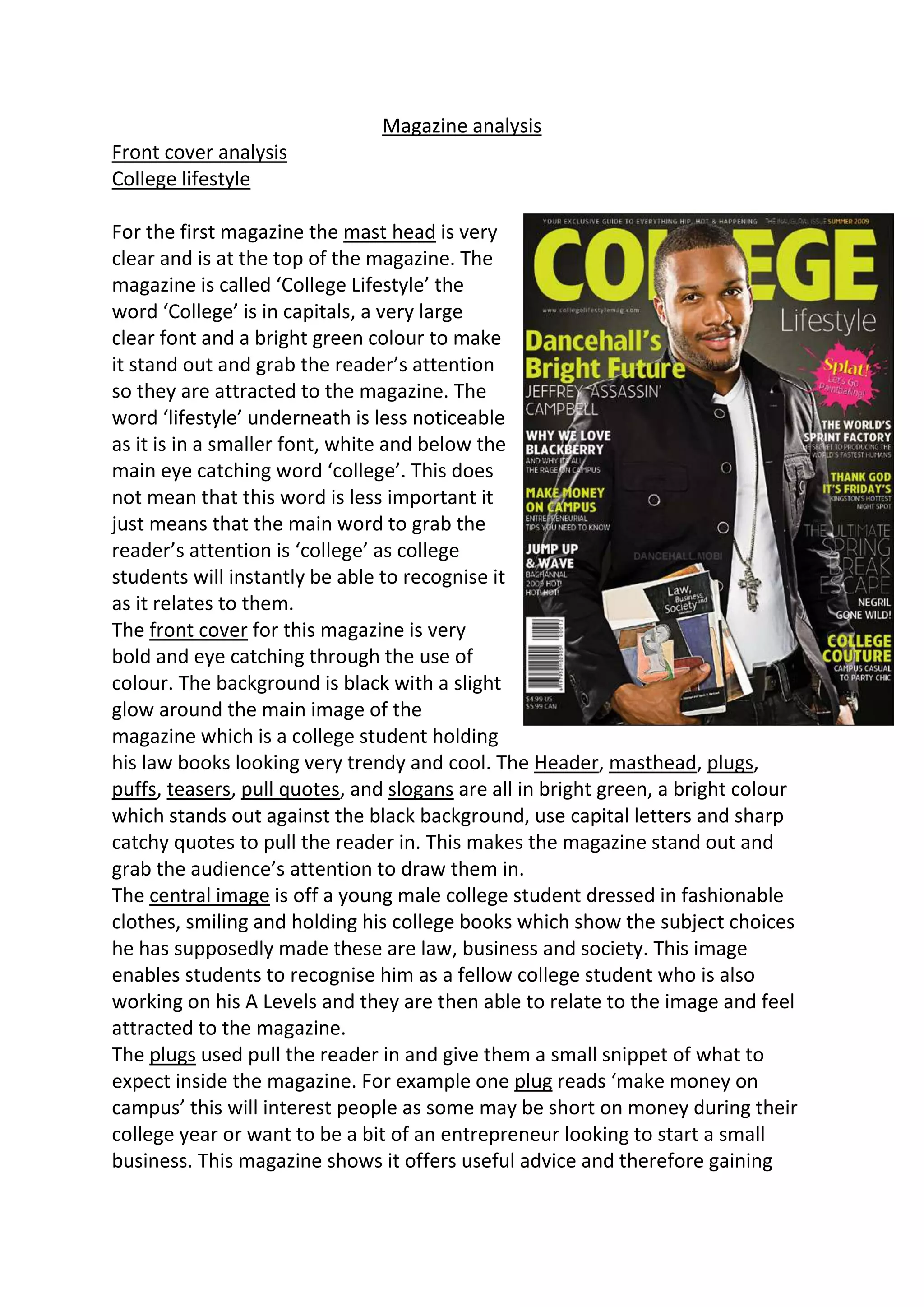
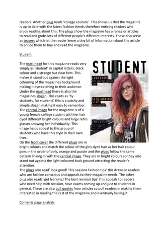
Magazine analysis
Front cover analysis
College lifestyle

For the first magazine the mast head is very
clear and is at the top of the magazine. The
magazine is called ‘College Lifestyle’ the
word ‘College’ is in capitals, a very large
clear font and a bright green colour to make
it stand out and grab the reader’s attention
so they are attracted to the magazine. The
word ‘lifestyle’ underneath is less noticeable
as it is in a smaller font, white and below the
main eye catching word ‘college’. This does
not mean that this word is less important it
just means that the main word to grab the
reader’s attention is ‘college’ as college
students will instantly be able to recognise it
as it relates to them.
The front cover for this magazine is very
bold and eye catching through the use of
colour. The background is black with a slight
glow around the main image of the
magazine which is a college student holding
his law books looking very trendy and cool. The Header, masthead, plugs,
puffs, teasers, pull quotes, and slogans are all in bright green, a bright colour
which stands out against the black background, use capital letters and sharp
catchy quotes to pull the reader in. This makes the magazine stand out and
grab the audience’s attention to draw them in.
The central image is off a young male college student dressed in fashionable
clothes, smiling and holding his college books which show the subject choices
he has supposedly made these are law, business and society. This image
enables students to recognise him as a fellow college student who is also
working on his A Levels and they are then able to relate to the image and feel
attracted to the magazine.
The plugs used pull the reader in and give them a small snippet of what to
expect inside the magazine. For example one plug reads ‘make money on
campus’ this will interest people as some may be short on money during their
college year or want to be a bit of an entrepreneur looking to start a small
business. This magazine shows it offers useful advice and therefore gaining
readers. Another plug reads ‘college couture’. This shows us that the magazine
is up to date with the latest fashion trends therefore enticing readers who
enjoy reading about this. The plugs show the magazine has a range or articles
to read and grabs lots of different people’s different interests. These also serve
as teasers which let the reader know a tiny bit of information about the article
to entice them to buy and read the magazine.

Student

The mast head for this magazine reads very
simply as ‘student’ in capital letters, black
colour and a strange but clear font. This
makes it stand out against the light
colouring of the magazines background
making it eye-catching to their audience.
Under the masthead there is also the
magazines slogan. This reads as ‘by
students, for students’ this is a catchy and
simple slogan making it easy to remember.
The central image for the magazine is of a
young female college student with her hair
dyed different bright colours and large retro
glasses showing her individuality. This
image helps appeal to this group of
students who have this style in their own
lives.
On the front cover the different plugs are in
bright colours and match the colour of the girls dyed hair as her hair colour
goes in the order of pink, orange and purple and the plugs follow the same
pattern linking in with the central image. They are in bright colours so they also
stand out against the light coloured back ground attracting the reader’s
attention.
The plugs also read’ look good! This seasons fashion tips’ this draws in readers
who are fashion conscious and appeals to their magazine needs. The other
plug also reads ‘get learning! The best revision tips’ this appeals to readers
who need help with revision, have exams coming up and just to students in
general. These are also pull quotes from articles so pull readers in making them
interested in reading the rest of the magazine and eventually buying it.

Contents page analysis
For the contents page the colour scheme is green
and white with a black text colour making the
page eye catching and the font stand out clearly
against the colours. The layout of the page is that
the central image is in the idle of three students
smiling holding their college cards proudly. This
helps readers identify with the students in the
image. The mast head reads ‘contents’ in a bold
black font making it stand out and underneath is a
slogan reading ‘your heart is in the work’ showing
that this magazine is a work focused magazine.
The contents are the listed using bullet points but
these are arranged in different areas of the page
instead of one long boring list making it boring
and tiresome to read.
There are also plugs on this page gibing a small bit
of information about an article making you want
to read on even more as it has gained your
interest.
Some of the bullet points are; ‘course work troubles?’ ‘NUS discounts’ and
‘student of the month’ with all of these gaining the reader’s interest.

The next contents page has a white background and
then black font with the main titles in bright eye
catching colours. This magazine has used graphical
features to help attract the audience with pictures
from article such as of students that are featured in
some of the articles in the magazine. This adds interest
to the plugs and teasers such as ‘learn how to play the
guitar in two weeks’ with the image of a student
playing a guitar. This is also an example of anchorage
by tying the meaning of the text with the image.
Each of these images also have their page number on
it so if that example of anchorage interested you, you
could skip straight to that article to read it.
One of the plugs used reads ‘the complete guide to
rock fashion’ this draws readers in who like to read
bout fashion and especially rock. This also gives us an
insight to who the primary audience would be for this magazine. Not just
college students but college students who were into rock as well.

Contents and cover analysis

  • 1.
    Magazine analysis Front coveranalysis College lifestyle For the first magazine the mast head is very clear and is at the top of the magazine. The magazine is called ‘College Lifestyle’ the word ‘College’ is in capitals, a very large clear font and a bright green colour to make it stand out and grab the reader’s attention so they are attracted to the magazine. The word ‘lifestyle’ underneath is less noticeable as it is in a smaller font, white and below the main eye catching word ‘college’. This does not mean that this word is less important it just means that the main word to grab the reader’s attention is ‘college’ as college students will instantly be able to recognise it as it relates to them. The front cover for this magazine is very bold and eye catching through the use of colour. The background is black with a slight glow around the main image of the magazine which is a college student holding his law books looking very trendy and cool. The Header, masthead, plugs, puffs, teasers, pull quotes, and slogans are all in bright green, a bright colour which stands out against the black background, use capital letters and sharp catchy quotes to pull the reader in. This makes the magazine stand out and grab the audience’s attention to draw them in. The central image is off a young male college student dressed in fashionable clothes, smiling and holding his college books which show the subject choices he has supposedly made these are law, business and society. This image enables students to recognise him as a fellow college student who is also working on his A Levels and they are then able to relate to the image and feel attracted to the magazine. The plugs used pull the reader in and give them a small snippet of what to expect inside the magazine. For example one plug reads ‘make money on campus’ this will interest people as some may be short on money during their college year or want to be a bit of an entrepreneur looking to start a small business. This magazine shows it offers useful advice and therefore gaining
  • 2.
    readers. Another plugreads ‘college couture’. This shows us that the magazine is up to date with the latest fashion trends therefore enticing readers who enjoy reading about this. The plugs show the magazine has a range or articles to read and grabs lots of different people’s different interests. These also serve as teasers which let the reader know a tiny bit of information about the article to entice them to buy and read the magazine. Student The mast head for this magazine reads very simply as ‘student’ in capital letters, black colour and a strange but clear font. This makes it stand out against the light colouring of the magazines background making it eye-catching to their audience. Under the masthead there is also the magazines slogan. This reads as ‘by students, for students’ this is a catchy and simple slogan making it easy to remember. The central image for the magazine is of a young female college student with her hair dyed different bright colours and large retro glasses showing her individuality. This image helps appeal to this group of students who have this style in their own lives. On the front cover the different plugs are in bright colours and match the colour of the girls dyed hair as her hair colour goes in the order of pink, orange and purple and the plugs follow the same pattern linking in with the central image. They are in bright colours so they also stand out against the light coloured back ground attracting the reader’s attention. The plugs also read’ look good! This seasons fashion tips’ this draws in readers who are fashion conscious and appeals to their magazine needs. The other plug also reads ‘get learning! The best revision tips’ this appeals to readers who need help with revision, have exams coming up and just to students in general. These are also pull quotes from articles so pull readers in making them interested in reading the rest of the magazine and eventually buying it. Contents page analysis
  • 3.
    For the contentspage the colour scheme is green and white with a black text colour making the page eye catching and the font stand out clearly against the colours. The layout of the page is that the central image is in the idle of three students smiling holding their college cards proudly. This helps readers identify with the students in the image. The mast head reads ‘contents’ in a bold black font making it stand out and underneath is a slogan reading ‘your heart is in the work’ showing that this magazine is a work focused magazine. The contents are the listed using bullet points but these are arranged in different areas of the page instead of one long boring list making it boring and tiresome to read. There are also plugs on this page gibing a small bit of information about an article making you want to read on even more as it has gained your interest. Some of the bullet points are; ‘course work troubles?’ ‘NUS discounts’ and ‘student of the month’ with all of these gaining the reader’s interest. The next contents page has a white background and then black font with the main titles in bright eye catching colours. This magazine has used graphical features to help attract the audience with pictures from article such as of students that are featured in some of the articles in the magazine. This adds interest to the plugs and teasers such as ‘learn how to play the guitar in two weeks’ with the image of a student playing a guitar. This is also an example of anchorage by tying the meaning of the text with the image. Each of these images also have their page number on it so if that example of anchorage interested you, you could skip straight to that article to read it. One of the plugs used reads ‘the complete guide to rock fashion’ this draws readers in who like to read bout fashion and especially rock. This also gives us an insight to who the primary audience would be for this magazine. Not just college students but college students who were into rock as well.