𓀤Call On 6297143586 𓀤 Ultadanga Call Girls In All Kolkata 24/7 Provide Call W...
Analysis of Cover - Q
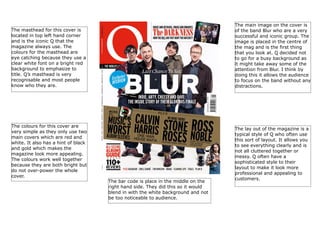
1. The main image on the cover is
of the band Blur who are a very
successful and iconic group. The
image is placed in the centre of
the mag and is the first thing
that you look at. Q decided not
to go for a busy background as
it might take away some of the
attention from Blur. I think by
doing this it allows the audience
to focus on the band without any
distractions.
The masthead for this cover is
located in top left hand corner
and is the iconic Q that the
magazine always use. The
colours for the masthead are
eye catching because they use a
clear white font on a bright red
background to emphasize to
title. Q’s masthead is very
recognisable and most people
know who they are.
The colours for this cover are
very simple as they only use two
main covers which are red and
white. It also has a hint of black
and gold which makes the
magazine look more appealing.
The colours work well together
because they are both bright but
do not over-power the whole
cover.
The bar code is place in the middle on the
right hand side. They did this so it would
blend in with the white background and not
be too noticeable to audience.
The lay out of the magazine is a
typical style of Q who often use
this sort of layout. It allows you
to see everything clearly and is
not all cluttered together or
messy. Q often have a
sophisticated style to their
layout to make it look more
professional and appealing to
customers.