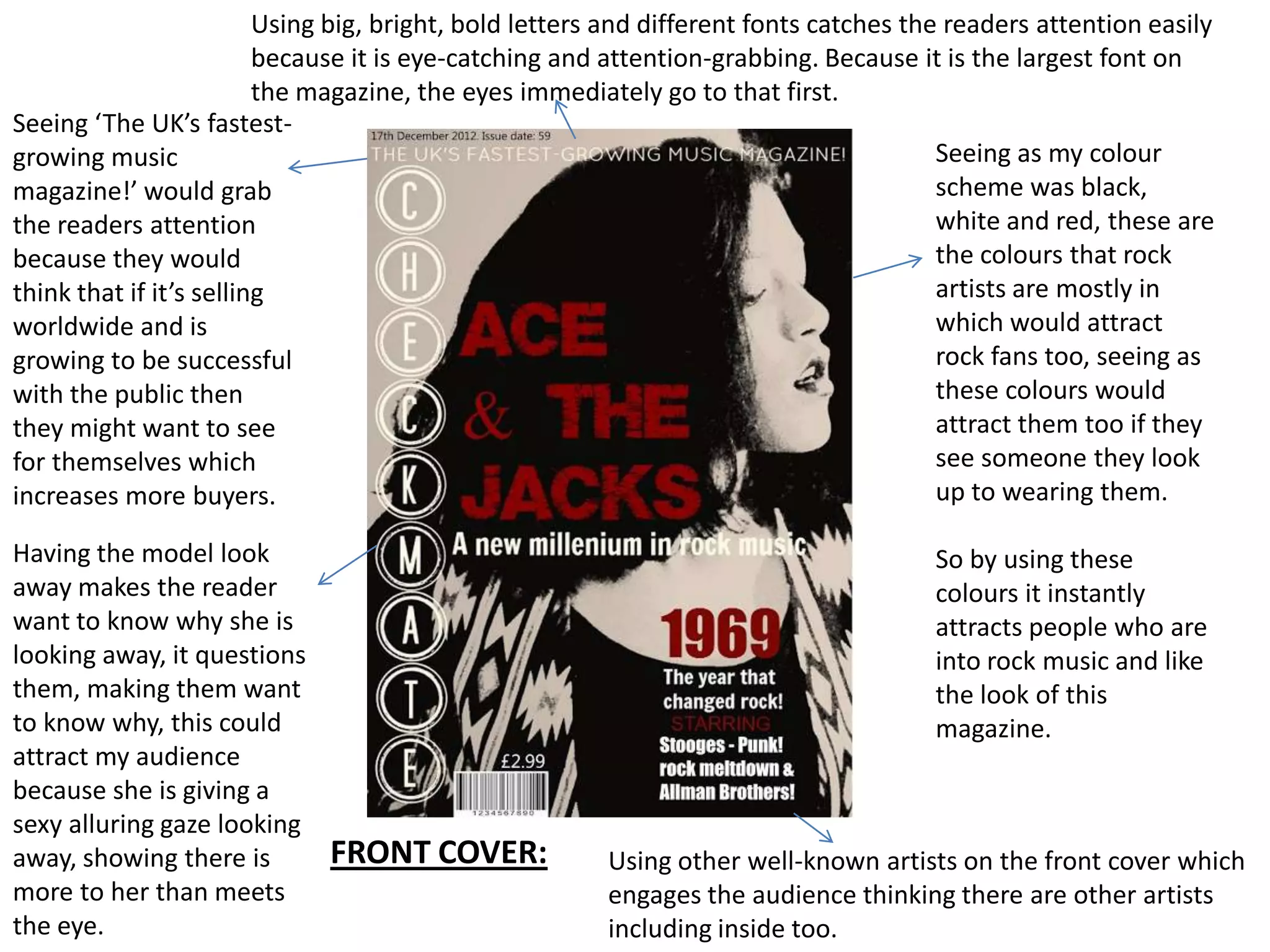
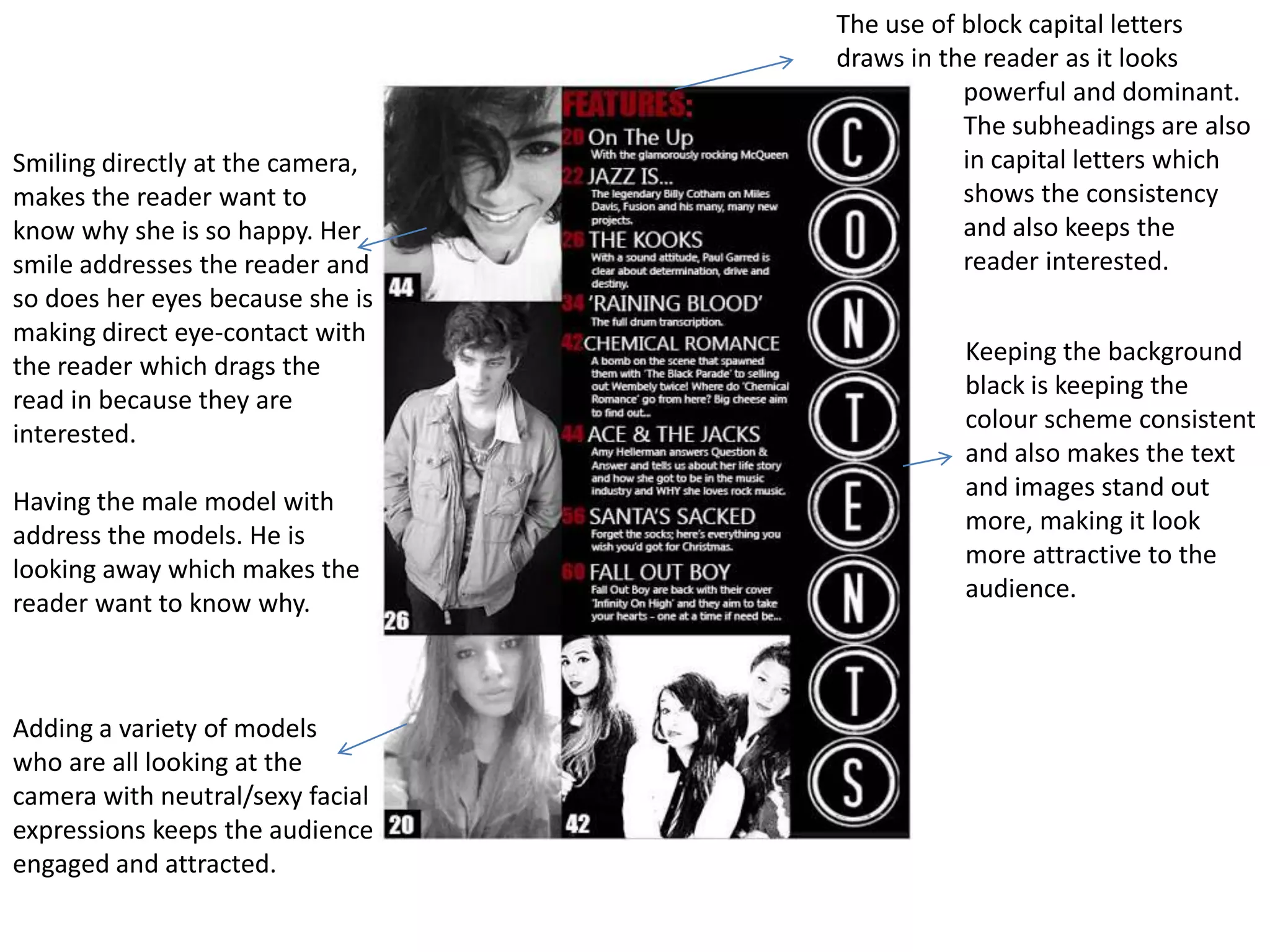
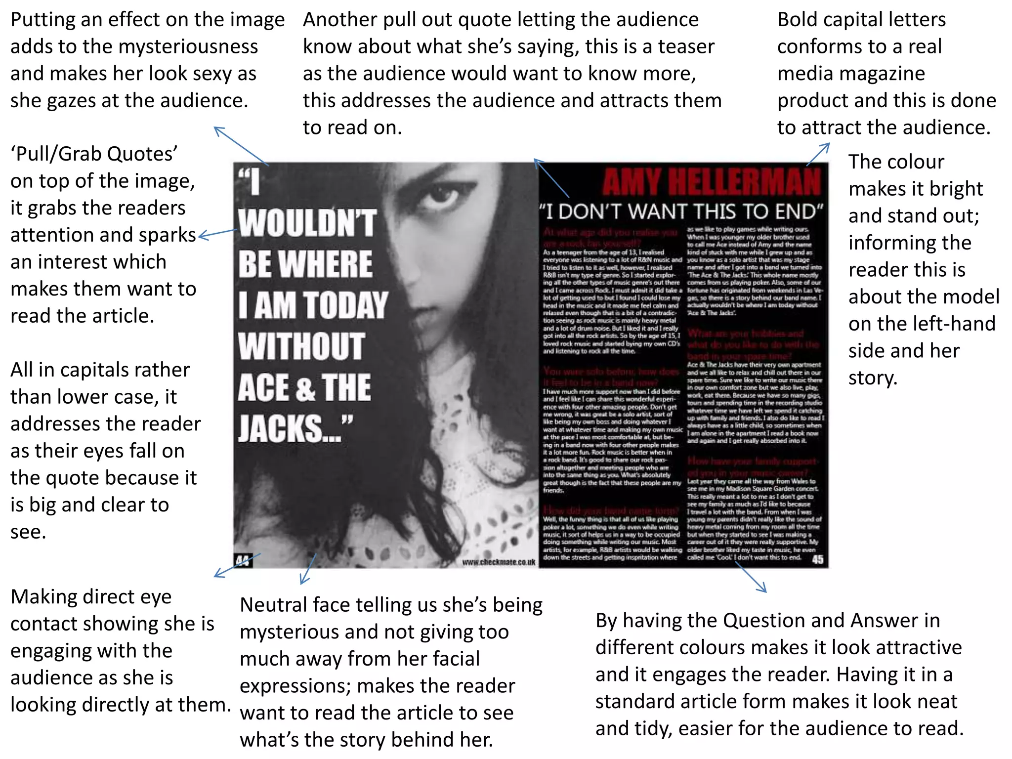
The document summarizes how the magazine cover addressed and attracted its audience in 3 sentences:
The cover used large bold fonts, bright colors like black, white and red that are popular with rock music fans, and prominent placement of well-known artists to catch readers' attention and attract rock music enthusiasts. Multiple models with direct gazes at the camera and intriguing expressions like looking away engaged and questioned the audience. Pull quotes, capitalization, and consistent formatting kept readers interested in learning more about the stories and artists featured.