TEST BANK For Evidence-Based Practice for Nurses Appraisal and Application of...
Analysis of advert 3
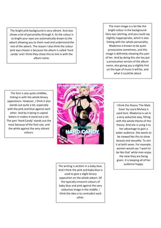
1. The bright pink background is very vibrant. And also
shows a lot of personality through it. As the colour is
so bright your eyes are automatically drawn to the
advert allowing you to them read and understand the
rest of the advert. The reason I also think the colour
pink was chosen is because the album is called ‘hard
candy’ and I think they chose this to link in with the
album name.
The main image is a lot like the
bright colour in the background.
Very eye catching, and you could say
slightly inappropriate, which is also
linking with her whole personality.
Madonna is known to be quite
provocative sometimes, and this
image is definitely showing this part
of her. And by doing this she has put
a provocative version of the album
name, also giving you a slightly hint
on the type of music it will be, and
what it could be about
The writing is written in a baby blue.
And I think the pink and baby blue is
used to give a slight binary
opposition on the whole advert. Of
the typically innocent colours of
baby blue and pink against the very
seductive image in the middle. I
think the idea is to contradict each
other.
The font is also quite childlike,
linking in with the whole binary
oppositions. However, I think it also
stands out quite a lot, especially
with the pink and blue against each
other. And by it being in capital
letters in makes it stand out a lot.
The part ‘Hard Candy’ stands out the
most because of the font size, and
the white against the very vibrant
colours.
I think the theory ‘The Male
Gaze’ by Laura Mulvey is
used here. Madonna is sat in
a very seductive way, fitting
with the whole theme of this
theory. And she is using it to
her advantage to gain a
wider audience. She wants to
be viewed like this to show
beauty and sexuality. To aim
it at both sexes. For example,
women would say ‘I want to
be like that’ while men enjoy
the view they are being
given. It is keeping all of her
audience happy.