1. Masthead
Salford City College
Eccles Centre
AS Media Studies
Foundation Portfolio
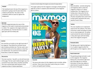
The masthead covers the top of the magazine in
bold which is going to be the place where the
audience will look first. The colour of the
masthead is white to stand out against the
background.
Comment on how the design of the magazine cover attracts the target audience:
The target audience for this magazine is teenagers of both genders
aged 18+ as Ibiza is a popular party destination as the magazine
genre is dance.
Colour
Blue and yellow - connotes being free
and happiness which is what the
magazine is about as it is about
holidays Ibiza. This magazine has a
holiday vibe in Ibiza which fits the
genre as Ibiza is a dance destination.
The blue and yellow have a warm tone
to them which represents the sunny
weather found in Ibiza.
Main image
Typefaces
The main image dominates the cover of the
magazine as the model is stood quite provocatively
in a bikini. This appeals to the target audience as
she symbolises sex. The fact that she is in a bikini
again goes with the holiday vibe.
The main headlines are in bold which
stand out for the audience. The colour
of the text is white and yellow to stand
out on a blue background. The yellow
could connote the sand on the beach
in Ibiza which goes with the holiday
vibe of the magazine and genre.
Coverlines
Photography Lighting
The coverlines are mainly on the right hand side of
the magazine. They follow the consistent house
style of yellow and white text. The text used is sans
serif which stands out to the audience so that they
can read the text. The coverlines let the audience
know what is inside the magazine.
The lighting used is high key lighting as
it is an upbeat magazine which fits
with the genre of the magazine; dance
Design Principles Used?
Main cover line
The main coverline ‘ Ibiza 08’ is on the left hand side
of the page. The text used is bold and again uses the
consistent house style colours of yellow and white.
This main coverline goes with the genre of the
magazine as Ibiza is a dance destination.
House Style
The house sytle colours on this magazine cover are white, yellow
and blue. These colours have been used as they are a ll warm
colours and signify beach holidays.
The gutenburg design principle is used
on this magazine. This magazine
follows this as the bottom right hand
side of the page has no relevant
information so they have added an
advertisement to guide the view to
this corner of the page.