
Recommended
More Related Content
What's hot
What's hot (15)
Similar to college deconstruction
Similar to college deconstruction (20)
Recently uploaded
Recently uploaded (20)
college deconstruction
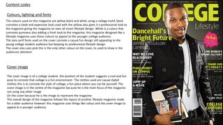
- 1. Content codes Colours, lighting and fonts The colours used on this magazine are yellow black and white using a college motif, black connotes a sleek and expensive look used with the yellow also gives it a professional look to the magazine giving the magazine an over all smart lifestyle design. White is a colour that connotes pureness also adding a fresh look to the magazine, this magazine designed like a lifestyle magazine uses these colours to appeal to the younger college audience. The sans serif fonts used on the cover connote a casual fun design still appealing to the young college student audience but keeping its professional lifestyle design The cover also uses pink this is the only other colour on the cover, its used to draw in the audiences attention Cover image The cover image is of a college student, the position of the student suggests a cool and fun pose to connote that college is a fun environment. The clothes used are casual styled clothes this is to connote the style of college, a fun place where you can be yourself. The cover image is in the centre of the magazine because he is the main focus of the magazine not using any other image On the cover because he is the image to represent the magazine. The overall design of the magazine follows the layout of another lifestyle magazine made for a older audience however this magazine uses things like colour and the cover image to appeal to a younger audience.
- 2. Technical codes The shot used for this cover image is a medium shot, this is because the main focus of the cover image is the clothing and the pose of the subject. The camera angle is direct level camera angle. This type of camera angle is very conventional for this genre of magazines I.e. lifestyle. The lighting of the magazine is high key this is because it gives the magazine a bright aspirational and youthful look appealing to an audience of young aspiring students The fonts are all sans serif to connote a fun youthful look, the yellow and white fonts are used to break up each different subject. The bold sections of text highlight specific important subjects within the magazine to draw the reader in this is commonly used on cover lines because this is the larges text on the cover other than the masthead and is on of the first things the consumer’s eye will be drawn too.
- 3. Language codes The puff on the image is in the shape of a paint splat, the puff also contains the word splat this is onomatopoeia used on the cover to connote the sound of the splat on the magazine this is done because it grabs the audiences attention. The colour of the word bright is yellow, yellow is a bright colour that connotes excitement and vibrancy when used with the word bright it connotes the emotions behind the word and the colour. THANK GOD IT’S FRIDAYS is also in yellow to again connote excitement and vibrancy. The phrase also represents and exciting activity linking Fridays with fun activity's. The use of the phrase WHY WE LOVE BLACKBERRYS is used as product placement and is used to target an audience who uses that product. Appealing to a wealthy target audience this all again links to the aspirational students is trying to target.