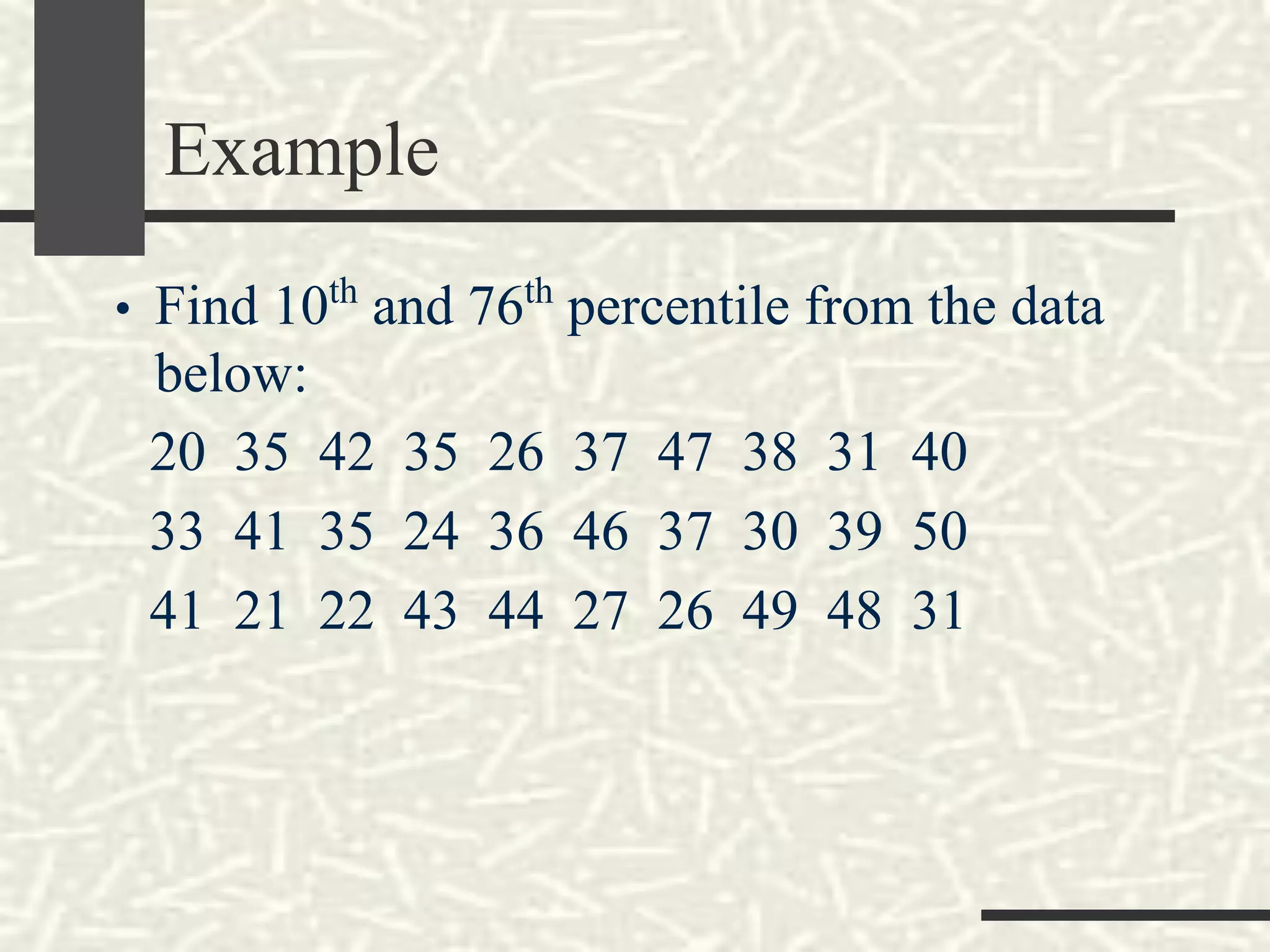
Chapter 2
Summarizing Data: Listing and
Grouping
Stem-and-Leaf Displays
• A statistical technique for displaying a set of data.
• Each numerical value is divided into two parts: the
leading digits become the stem and the trailing
digits become the leaf.
• Ex: Stock prices on twelve consecutive days for a
major publicly traded company
Example
• The first row of a stem-and-leaf chart
appears as follows: 62 1 3 3 7 9. Assume
whole number values.
a. What is the “possible range” of the values
in this row?
b. How many data values are in this row?
c. List the actual values in this row of data.
Quartiles
- Divide a set of observations into 4 equal parts
Lp
= (n+1)
Example
• 20, 15, 12, 11, 18, 11, 19, 15, 18
Find the Q1, Q2 and Q3!
Example of Quartiles
Using the twelve stock prices, we can find the
median, 25th
, and 75th
percentiles as follows:
Quartile 1
Quartile 3
Median
96
92
91
88
86
85
84
83
82
79
78
69
12
11
10
9
8
7
6
5
4
3
2
1
25th
percentile
Price at 3.25 observation = 79 + .25(82-79)
= 79.75
50th
percentile: Median
Price at 6.50 observation = 84 + .5(85-84)
= 84.50
75th
percentile
Price at 9.75 observation = 88 + .75(91-88)
= 90.25
Q1
Q2
Q3
Q4
Percentile
Example
• Find 10th
and 76th
percentile from the data
below:
20 35 42 35 26 37 47 38 31 40
33 41 35 24 36 46 37 30 39 50
41 21 22 43 44 27 26 49 48 31
Frequency Distributions
• A grouping of data into mutually exclusive
categories showing the number of observations in
each class.
• Constructing a frequency distribution involves:
- Determining the question to be addressed
- Collecting raw data
- Organizing data (Frequency Distributions)
- Presenting data (Graph)
- Drawing Conclusion
Frequency and Categorical
Distributions
Frequency Distribution
Categorical Distribution
Some Rules in Choosing the
Classes
• Hardly ever use fewer than 6 or more than
15 classes
• Make sure each item (measurement or
observation) goes into only one class
• Use classes covering equal ranges (or
intervals) of values
Organizing Data (Frequency
Distributions)
• Arrange data from the smallest to the largest
• Determine “Range” from data
Range = Largest data – Smallest data
• Determine how many class (k);
A. Trial and Error
B. [Sturgess Formula] k = 1 + 3.3 log n ; k need to be rounded, k =
class(s), n = data
C. 2k
> n; n = data
• Determine the length of class interval (i)
i = R/k
• Determine the first lower class limit
• Write down frequency in table with tally according with the data
Parts of Frequency Distributions
• Class
• Class limits; lower class limits and upper
class limits
• Class boundary or real class limits
• Class midpoint or class marks
• Class interval
• Class Frequency
Two Ways to Modify Frequency
Distributions to Suit Particular Needs
• Percentage
Distribution
By dividing each class
frequency by the total
number of items grouped
and then multiplying by
100%
• Cumulative
Distribution
(Frequency and
Percentage)
To convert it into a “less than”,
or “more than”
Example
• Below is the data of 50 employee's salary in
a year (in million Rupiah)
80 18 69 51 71 92 35 28 60 45
63 59 64 98 47 49 48 64 58 74
85 56 72 38 89 55 28 67 84 78
37 73 65 66 86 96 57 76 57 19
54 76 49 53 83 55 83 47 64 39
Construct a frequency distribution!
Graphical Presentation
• Histogram is a graph in which the class midpoints
or limits are marked on the horizontal axis and the
class frequencies on the vertical axis. The class
frequencies are represented by the heights
of the bars and the bars are drawn adjacent
to each other.
Graphical Presentation
• Frequency Polygon consists of line segments
connecting the points formed by the class
midpoint and the class frequency.
Graphical Presentation
• Cumulative Frequency Distribution is used to
determine how many or what proportion of the
data values are below or above a certain value.
Other Useful Charts
• Bar Chart can be used to depict any of the levels
of measurement
• Pie Chart is useful for displaying a relative
frequency distribution. A circle is divided
proportionally to the relative frequency and
portions of the circle are allocated for the different
groups.
Bar Chart and Pie Chart
Bar Chart Pie Chart
End of Lecture

Summarizing Data : Listing and Grouping pdf

  • 1.
    Chapter 2 Summarizing Data:Listing and Grouping
  • 2.
    Stem-and-Leaf Displays • Astatistical technique for displaying a set of data. • Each numerical value is divided into two parts: the leading digits become the stem and the trailing digits become the leaf. • Ex: Stock prices on twelve consecutive days for a major publicly traded company
  • 3.
    Example • The firstrow of a stem-and-leaf chart appears as follows: 62 1 3 3 7 9. Assume whole number values. a. What is the “possible range” of the values in this row? b. How many data values are in this row? c. List the actual values in this row of data.
  • 4.
    Quartiles - Divide aset of observations into 4 equal parts Lp = (n+1)
  • 5.
    Example • 20, 15,12, 11, 18, 11, 19, 15, 18 Find the Q1, Q2 and Q3!
  • 6.
    Example of Quartiles Usingthe twelve stock prices, we can find the median, 25th , and 75th percentiles as follows: Quartile 1 Quartile 3 Median
  • 7.
    96 92 91 88 86 85 84 83 82 79 78 69 12 11 10 9 8 7 6 5 4 3 2 1 25th percentile Price at 3.25observation = 79 + .25(82-79) = 79.75 50th percentile: Median Price at 6.50 observation = 84 + .5(85-84) = 84.50 75th percentile Price at 9.75 observation = 88 + .75(91-88) = 90.25 Q1 Q2 Q3 Q4 Percentile
  • 8.
    Example • Find 10th and76th percentile from the data below: 20 35 42 35 26 37 47 38 31 40 33 41 35 24 36 46 37 30 39 50 41 21 22 43 44 27 26 49 48 31
  • 9.
    Frequency Distributions • Agrouping of data into mutually exclusive categories showing the number of observations in each class. • Constructing a frequency distribution involves: - Determining the question to be addressed - Collecting raw data - Organizing data (Frequency Distributions) - Presenting data (Graph) - Drawing Conclusion
  • 10.
    Frequency and Categorical Distributions FrequencyDistribution Categorical Distribution
  • 11.
    Some Rules inChoosing the Classes • Hardly ever use fewer than 6 or more than 15 classes • Make sure each item (measurement or observation) goes into only one class • Use classes covering equal ranges (or intervals) of values
  • 12.
    Organizing Data (Frequency Distributions) •Arrange data from the smallest to the largest • Determine “Range” from data Range = Largest data – Smallest data • Determine how many class (k); A. Trial and Error B. [Sturgess Formula] k = 1 + 3.3 log n ; k need to be rounded, k = class(s), n = data C. 2k > n; n = data • Determine the length of class interval (i) i = R/k • Determine the first lower class limit • Write down frequency in table with tally according with the data
  • 13.
    Parts of FrequencyDistributions • Class • Class limits; lower class limits and upper class limits • Class boundary or real class limits • Class midpoint or class marks • Class interval • Class Frequency
  • 14.
    Two Ways toModify Frequency Distributions to Suit Particular Needs • Percentage Distribution By dividing each class frequency by the total number of items grouped and then multiplying by 100% • Cumulative Distribution (Frequency and Percentage) To convert it into a “less than”, or “more than”
  • 15.
    Example • Below isthe data of 50 employee's salary in a year (in million Rupiah) 80 18 69 51 71 92 35 28 60 45 63 59 64 98 47 49 48 64 58 74 85 56 72 38 89 55 28 67 84 78 37 73 65 66 86 96 57 76 57 19 54 76 49 53 83 55 83 47 64 39 Construct a frequency distribution!
  • 16.
    Graphical Presentation • Histogramis a graph in which the class midpoints or limits are marked on the horizontal axis and the class frequencies on the vertical axis. The class frequencies are represented by the heights of the bars and the bars are drawn adjacent to each other.
  • 17.
    Graphical Presentation • FrequencyPolygon consists of line segments connecting the points formed by the class midpoint and the class frequency.
  • 18.
    Graphical Presentation • CumulativeFrequency Distribution is used to determine how many or what proportion of the data values are below or above a certain value.
  • 19.
    Other Useful Charts •Bar Chart can be used to depict any of the levels of measurement • Pie Chart is useful for displaying a relative frequency distribution. A circle is divided proportionally to the relative frequency and portions of the circle are allocated for the different groups.
  • 20.
    Bar Chart andPie Chart Bar Chart Pie Chart
  • 21.