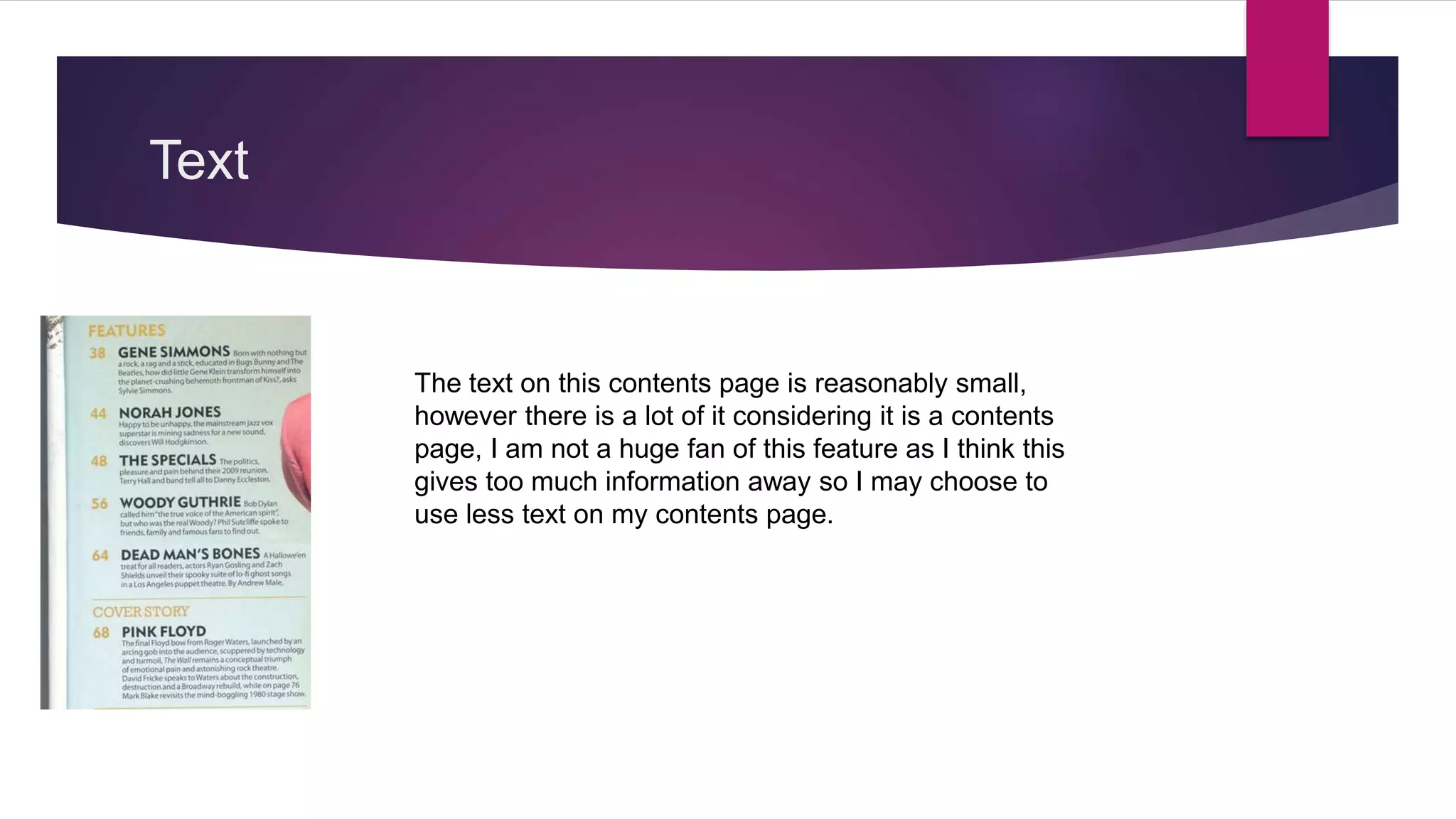
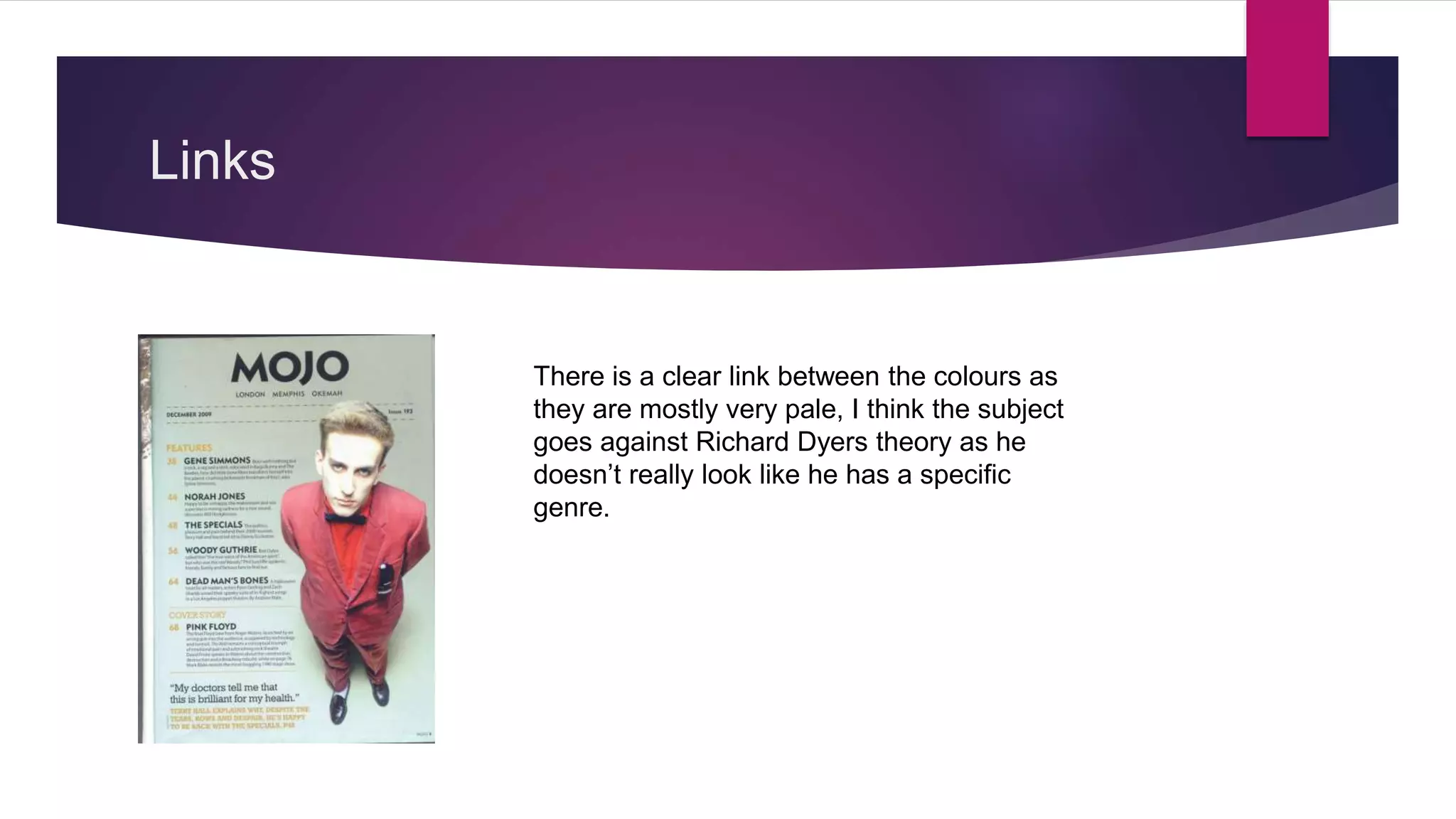
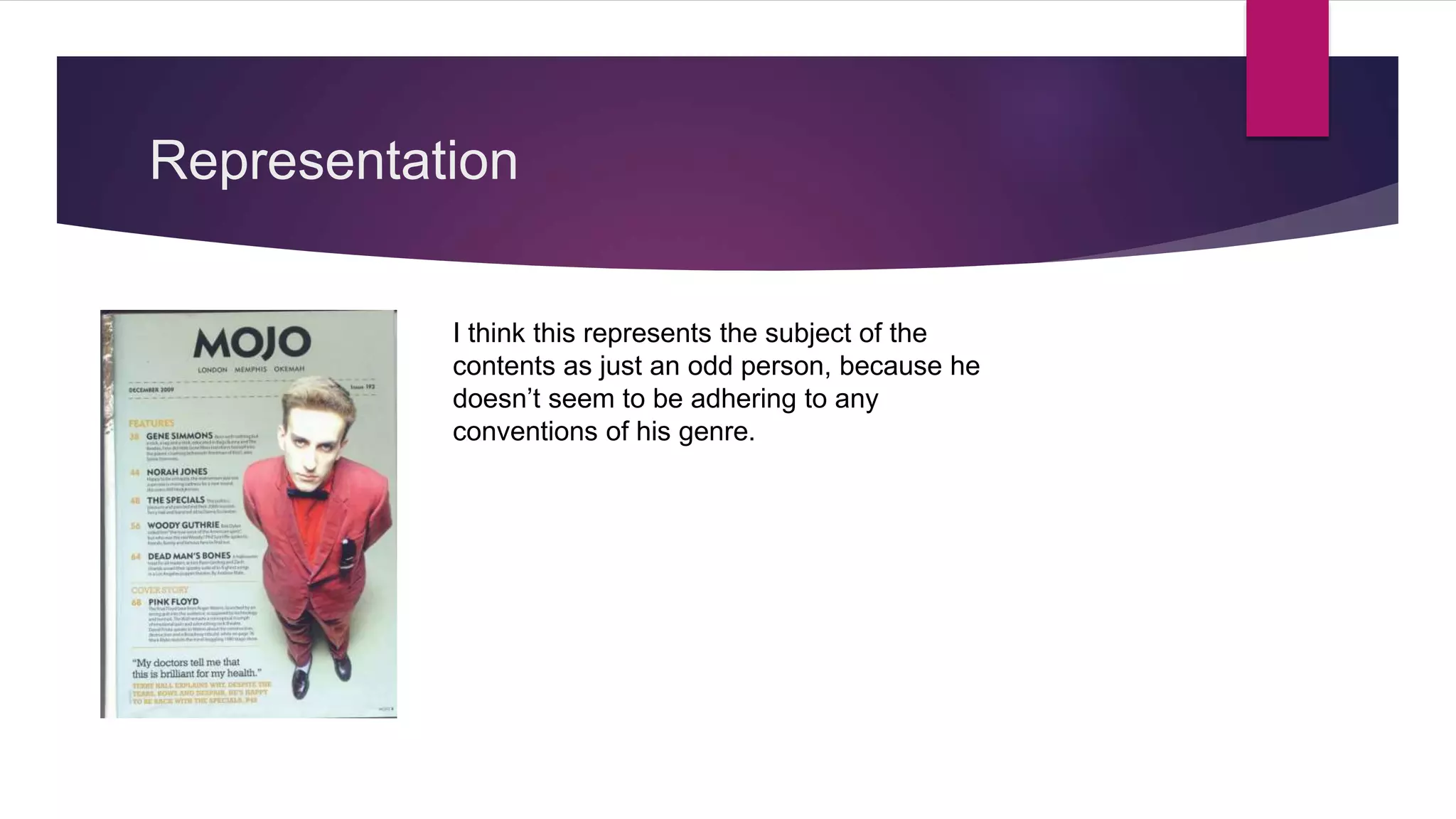
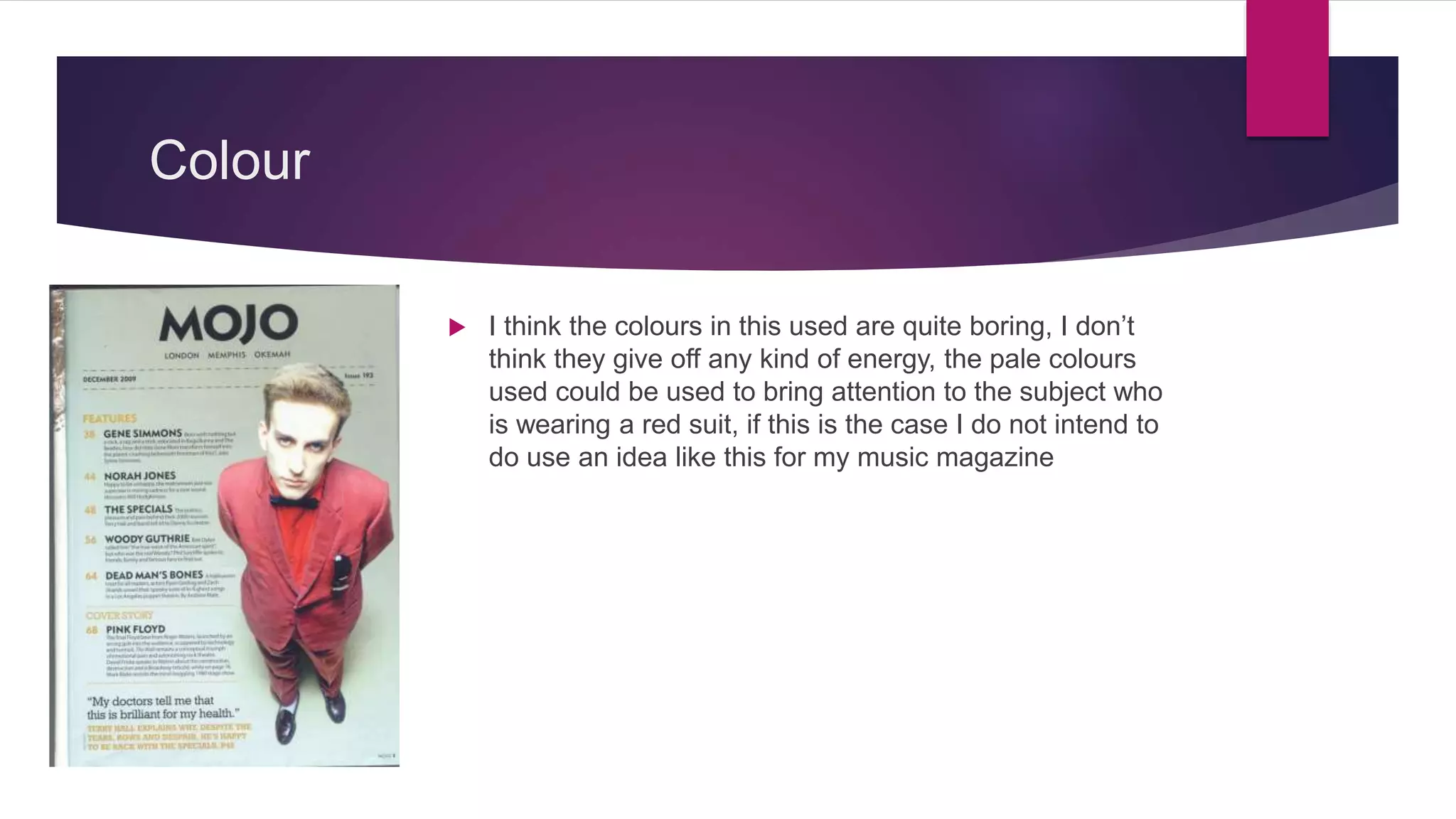
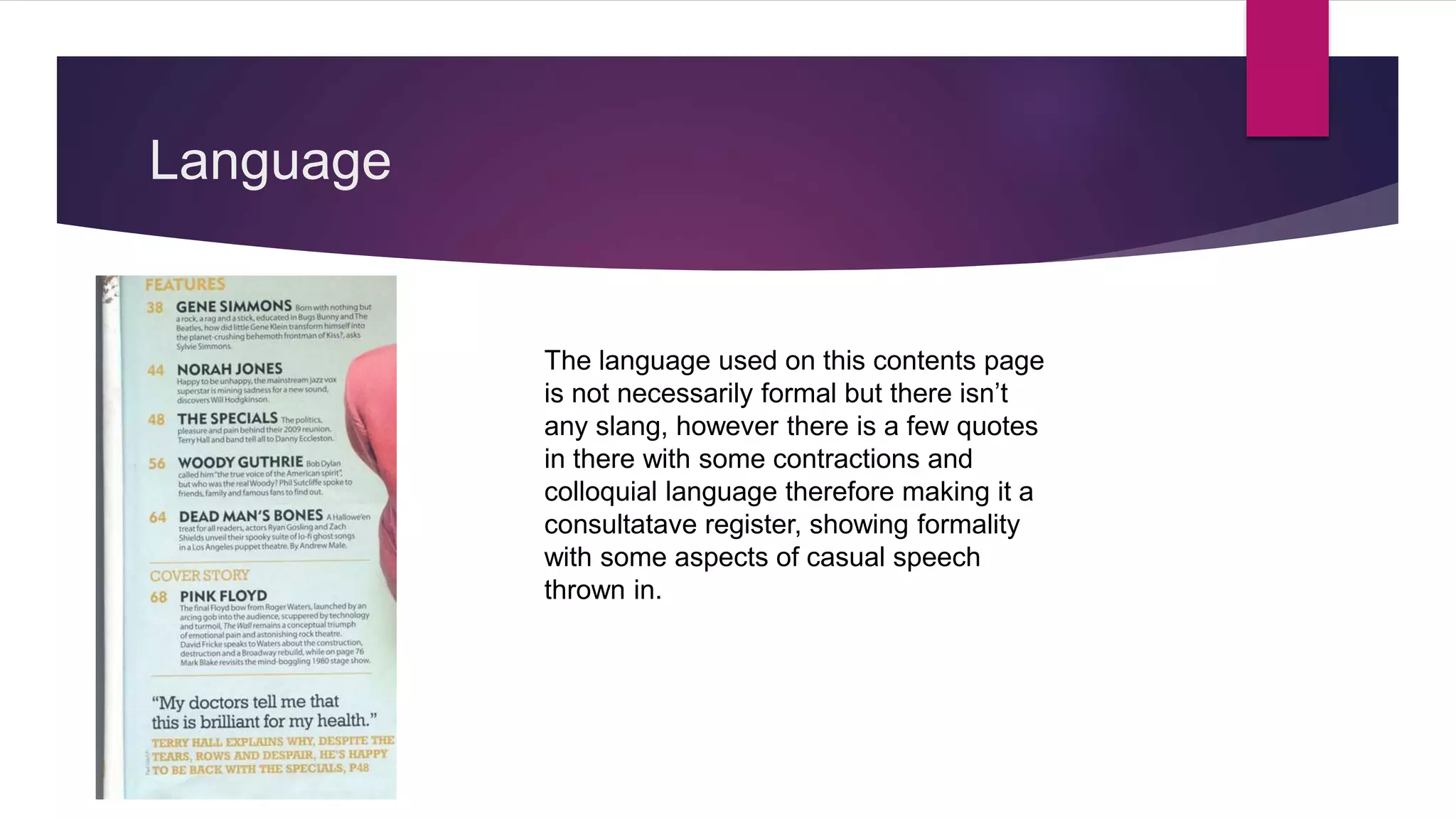
Contents research 3
BY RYAN FRANKISH
Images
This image was captured at a high angle
making the subject look small and
innocent, however his pale make up
makes him look very out of the ordinary
and I also like how the subject is within
the text wrapping of the contents, I may
choose to use this in my music magazine.
Font
 The font on this contents page is san serif, I think it is
interpreted as quite a modern style of font and due to
this fact I may choose to use it in my music magazine.
Text
The text on this contents page is reasonably small,
however there is a lot of it considering it is a contents
page, I am not a huge fan of this feature as I think this
gives too much information away so I may choose to
use less text on my contents page.
Links
There is a clear link between the colours as
they are mostly very pale, I think the subject
goes against Richard Dyers theory as he
doesn’t really look like he has a specific
genre.
Representation
I think this represents the subject of the
contents as just an odd person, because he
doesn’t seem to be adhering to any
conventions of his genre.
Colour
 I think the colours in this used are quite boring, I don’t
think they give off any kind of energy, the pale colours
used could be used to bring attention to the subject who
is wearing a red suit, if this is the case I do not intend to
do use an idea like this for my music magazine
Language
The language used on this contents page
is not necessarily formal but there isn’t
any slang, however there is a few quotes
in there with some contractions and
colloquial language therefore making it a
consultatave register, showing formality
with some aspects of casual speech
thrown in.
Detail
 On this contents page there is a lot of detail, I
personally would not use this in my magazine as I
think the contents should be very brief so the
customer feels more obliged to read the article
because they don’t know a lot about it.
Layout
 I like the layout of this as the there is one column of
text that is aligned to the left, however on the right it
follows the shape of the image of the subject which
is a feature I may choose to use in my magazine.

Contents research 3

  • 1.
  • 2.
    Images This image wascaptured at a high angle making the subject look small and innocent, however his pale make up makes him look very out of the ordinary and I also like how the subject is within the text wrapping of the contents, I may choose to use this in my music magazine.
  • 3.
    Font  The fonton this contents page is san serif, I think it is interpreted as quite a modern style of font and due to this fact I may choose to use it in my music magazine.
  • 4.
    Text The text onthis contents page is reasonably small, however there is a lot of it considering it is a contents page, I am not a huge fan of this feature as I think this gives too much information away so I may choose to use less text on my contents page.
  • 5.
    Links There is aclear link between the colours as they are mostly very pale, I think the subject goes against Richard Dyers theory as he doesn’t really look like he has a specific genre.
  • 6.
    Representation I think thisrepresents the subject of the contents as just an odd person, because he doesn’t seem to be adhering to any conventions of his genre.
  • 7.
    Colour  I thinkthe colours in this used are quite boring, I don’t think they give off any kind of energy, the pale colours used could be used to bring attention to the subject who is wearing a red suit, if this is the case I do not intend to do use an idea like this for my music magazine
  • 8.
    Language The language usedon this contents page is not necessarily formal but there isn’t any slang, however there is a few quotes in there with some contractions and colloquial language therefore making it a consultatave register, showing formality with some aspects of casual speech thrown in.
  • 9.
    Detail  On thiscontents page there is a lot of detail, I personally would not use this in my magazine as I think the contents should be very brief so the customer feels more obliged to read the article because they don’t know a lot about it.
  • 10.
    Layout  I likethe layout of this as the there is one column of text that is aligned to the left, however on the right it follows the shape of the image of the subject which is a feature I may choose to use in my magazine.