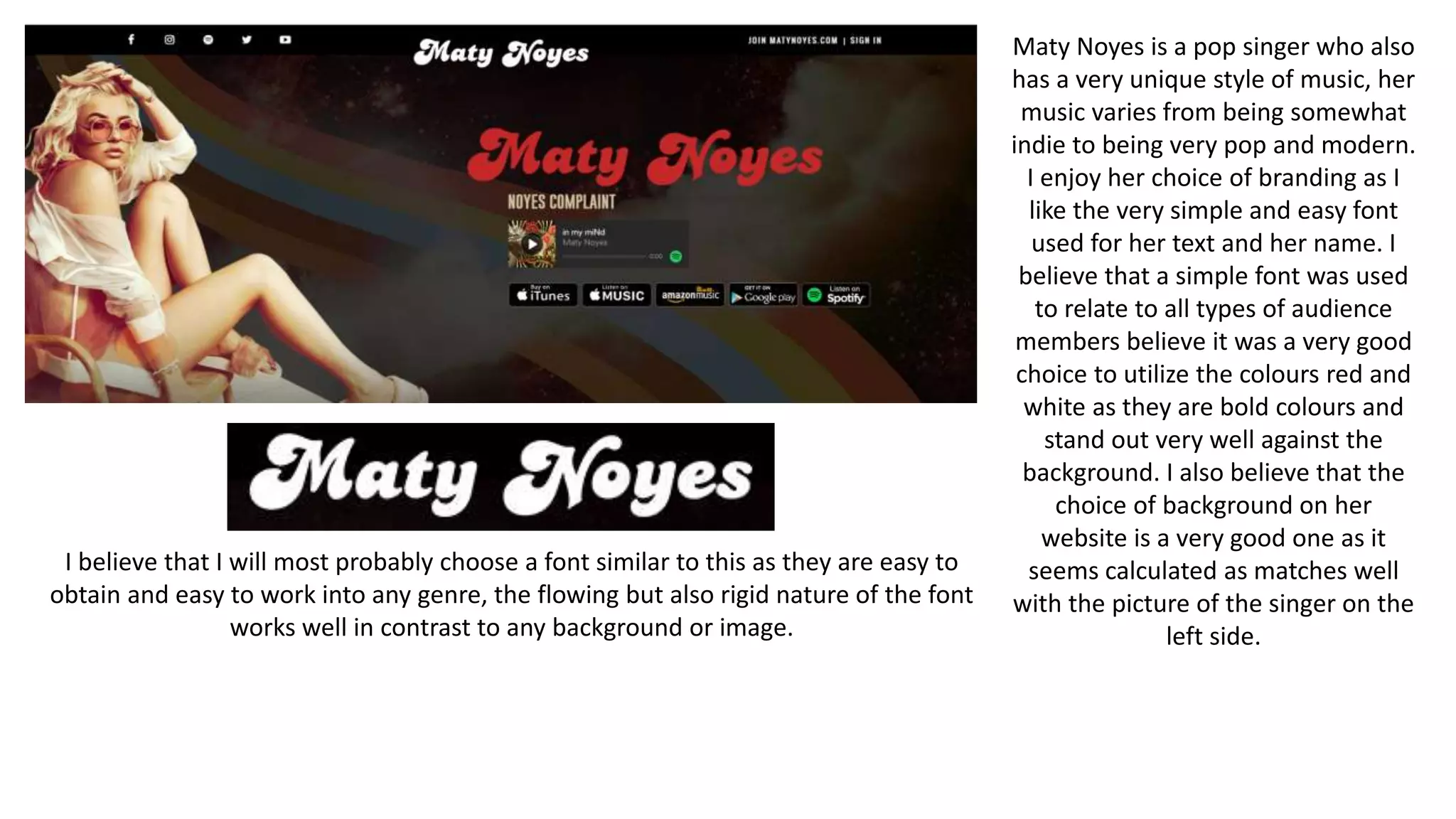
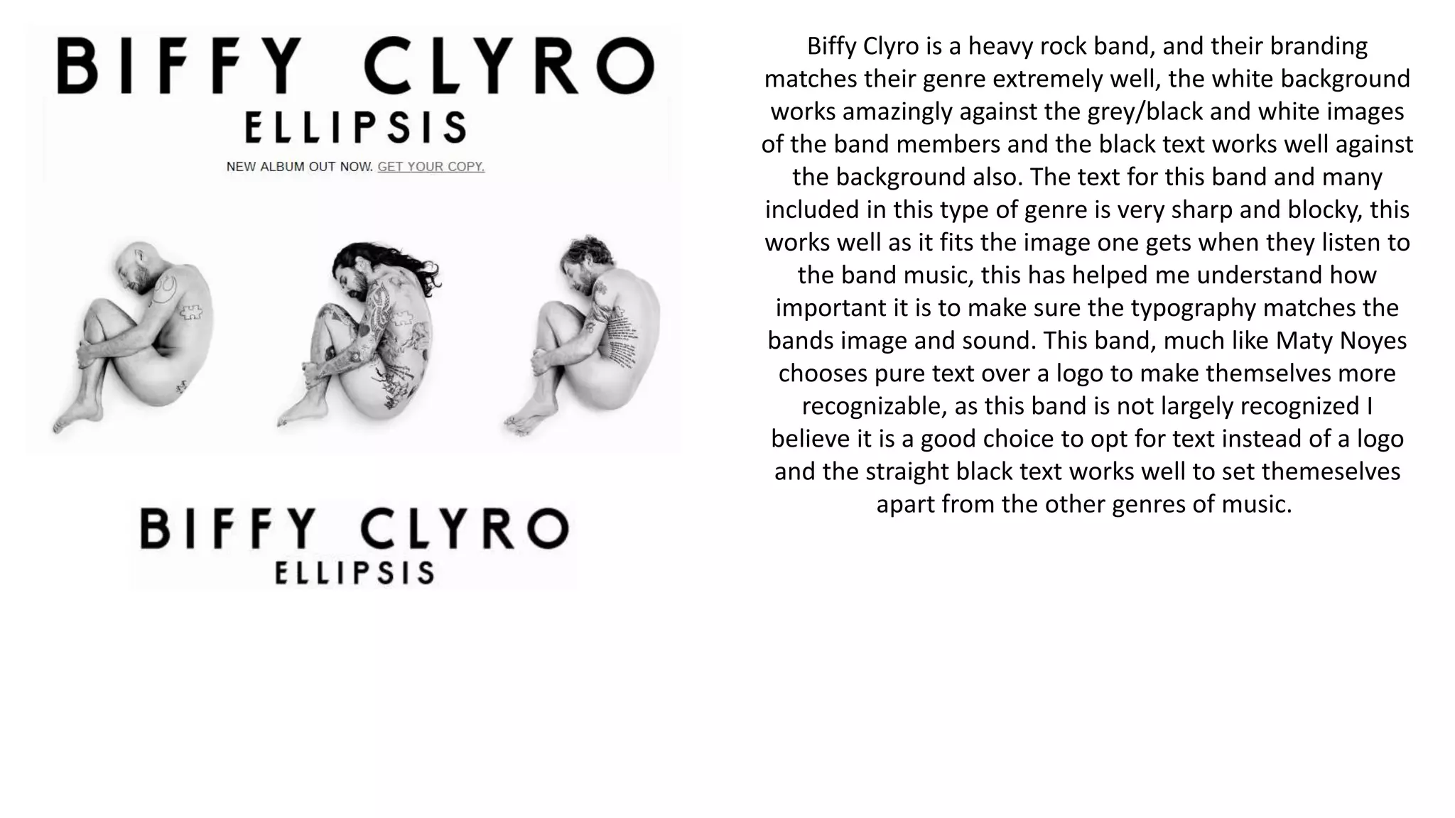
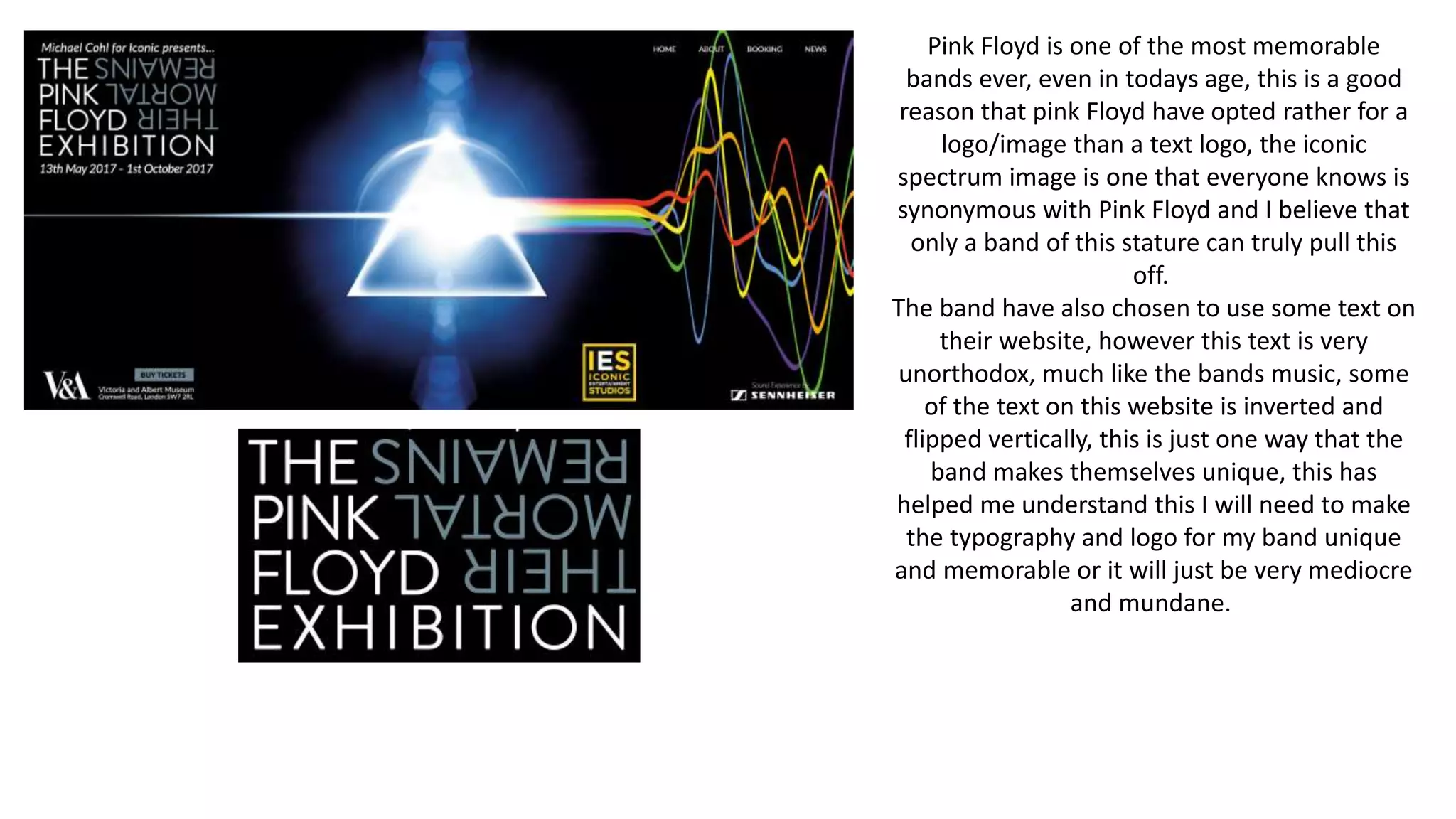
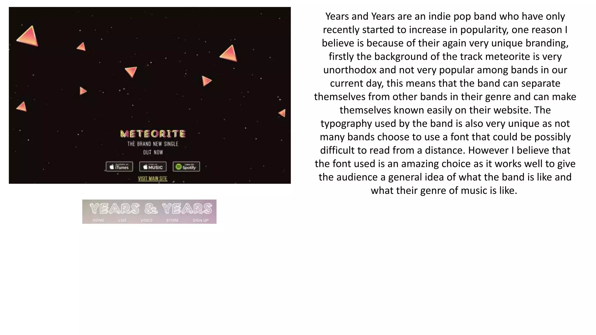
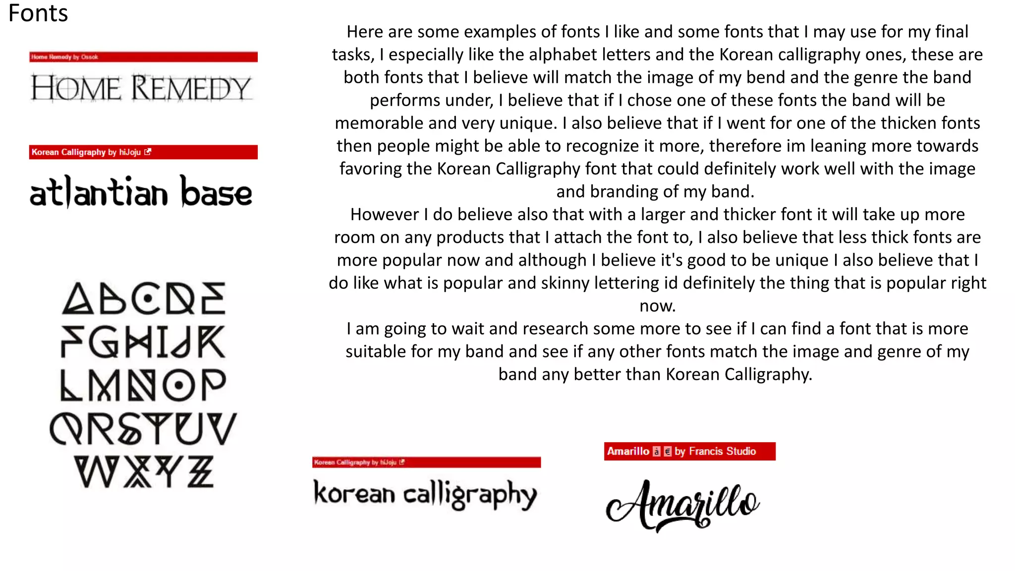
The document discusses branding and typography choices for various musical artists. It analyzes fonts used by artists like Maty Noyes, Biffy Clyro, Pink Floyd, and Years and Years. Key points made include that simpler fonts can appeal to broader audiences, and fonts should match the artist's image and music genre. Bold colors against plain backgrounds are also discussed. The document considers how Panic! At The Disco varies their font to stand out. It shows font examples and the author leans towards a thick Korean calligraphy font but notes thinner fonts may be more popular.