
Recommended
More Related Content
What's hot
What's hot (18)
Viewers also liked
Viewers also liked (20)
Similar to Font ideas
Similar to Font ideas (20)
Recently uploaded
Recently uploaded (20)
Font ideas
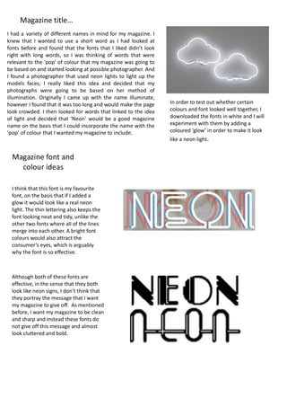
- 1. I had a variety of different names in mind for my magazine. I knew that I wanted to use a short word as I had looked at fonts before and found that the fonts that I liked didn’t look right with long words, so I was thinking of words that were relevant to the ‘pop’ of colour that my magazine was going to be based on and started looking at possible photographer. And I found a photographer that used neon lights to light up the models faces; I really liked this idea and decided that my photographs were going to be based on her method of illumination. Originally I came up with the name illuminate, however I found that it was too long and would make the page look crowded. I then looked for words that linked to the idea of light and decided that ‘Neon’ would be a good magazine name on the basis that I could incorporate the name with the ‘pop’ of colour that I wanted my magazine to include. Magazine title… Magazine font and colour ideas In order to test out whether certain colours and font looked well together, I downloaded the fonts in white and I will experiment with them by adding a coloured ‘glow’ in order to make it look like a neon light. I think that this font is my favourite font, on the basis that if I added a glow it would look like a real neon light. The thin lettering also keeps the font looking neat and tidy, unlike the other two fonts where all of the lines merge into each other. A bright font colours would also attract the consumer’s eyes, which is arguably why the font is so effective. Although both of these fonts are effective, in the sense that they both look like neon signs, I don’t think that they portray the message that I want my magazine to give off. As mentioned before, I want my magazine to be clean and sharp and instead these fonts do not give off this message and almost look cluttered and bold.