This document provides an analysis of three music magazine covers and contents pages. It examines how they conform to various design theories.
For the Fader magazine cover, it summarizes that the cover uses a simple four color palette as recommended by Roger Black, features minimal text for a clean look, and places the iconic "F" logo to identify the magazine.
The analysis of the Billboard contents page notes that it draws the eye to Ariana Grande using rule of thirds composition and depicts her in a way that addresses the male gaze. It also unusually places the "Contents" text alongside rather than across the top as recommended by Black to change the pace.
The Rolling Stones double page spread is summarized as having
Explore the multifaceted world of Muntadher Saleh, an Iraqi polymath renowned for his expertise in visual art, writing, design, and pharmacy. This SlideShare delves into his innovative contributions across various disciplines, showcasing his unique ability to blend traditional themes with modern aesthetics. Learn about his impactful artworks, thought-provoking literary pieces, and his vision as a Neo-Pop artist dedicated to raising awareness about Iraq's cultural heritage. Discover why Muntadher Saleh is celebrated as "The Last Polymath" and how his multidisciplinary talents continue to inspire and influence.
The Legacy of Breton In A New Age by Master Terrance LindallBBaez1
Brave Destiny 2003 for the Future for Technocratic Surrealmageddon Destiny for Andre Breton Legacy in Agenda 21 Technocratic Great Reset for Prison Planet Earth Galactica! The Prophecy of the Surreal Blasphemous Desires from the Paradise Lost Governments!
2137ad Merindol Colony Interiors where refugee try to build a seemengly norm...luforfor
This are the interiors of the Merindol Colony in 2137ad after the Climate Change Collapse and the Apocalipse Wars. Merindol is a small Colony in the Italian Alps where there are around 4000 humans. The Colony values mainly around meritocracy and selection by effort.
The perfect Sundabet Slot mudah menang Promo new member Animated PDF for your conversation. Discover and Share the best GIFs on Tenor
Admin Ramah Cantik Aktif 24 Jam Nonstop siap melayani pemain member Sundabet login via apk sundabet rtp daftar slot gacor daftar
2137ad - Characters that live in Merindol and are at the center of main storiesluforfor
Kurgan is a russian expatriate that is secretly in love with Sonia Contado. Henry is a british soldier that took refuge in Merindol Colony in 2137ad. He is the lover of Sonia Contado.
thGAP - BAbyss in Moderno!! Transgenic Human Germline Alternatives ProjectMarc Dusseiller Dusjagr
thGAP - Transgenic Human Germline Alternatives Project, presents an evening of input lectures, discussions and a performative workshop on artistic interventions for future scenarios of human genetic and inheritable modifications.
To begin our lecturers, Marc Dusseiller aka "dusjagr" and Rodrigo Martin Iglesias, will give an overview of their transdisciplinary practices, including the history of hackteria, a global network for sharing knowledge to involve artists in hands-on and Do-It-With-Others (DIWO) working with the lifesciences, and reflections on future scenarios from the 8-bit computer games of the 80ies to current real-world endeavous of genetically modifiying the human species.
We will then follow up with discussions and hands-on experiments on working with embryos, ovums, gametes, genetic materials from code to slime, in a creative and playful workshop setup, where all paticipant can collaborate on artistic interventions into the germline of a post-human future.
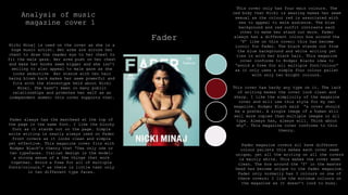
1. Analysis of music
magazine cover 1
Fader
This cover only has four main colours. The
red body that Nicki is wearing makes her seem
sexual as the colour red is associated with
sex to appeal to male audience. The blue
background and red outfit contrasts each
other to make her stand out more. Fader
always has a different colour box around the
‘F’ like on this cover; this has become
iconic for Fader. The black stands out from
the blue background and white writing yet
ties in with her black hair. This magazine
cover conforms to Rodger Blacks idea to
“avoid a free for all multiple font/colour”
as it only uses a simple four colour pallet
with only two bright colours.
This cover has hardy any type on it. The lack
of writing makes the cover look clean and
sharp. I like the simplicity of the magazine
cover and will use this style for my own
magazine. Rodger Black said “a cover should
be a poster. A single image of a human will
sell more copies than multiple images or all
type. Always has, always will. Think about
why”. This magazine cover conforms to this
theory.
Fader always has the masthead at the top of
the page in the same font. I like the blocky
font as it stands out on the page. Simple
write writing is nearly always used on Fader
front covers as it looks clean and simple
yet effective. This magazine cover fits with
Rodger Black’s theory that “Use only one or
two typefaces. Italian design is the model:
a strong sense of a few things that work
together. Avoid a free for all of multiple
fonts/colours.” as there is little text only
in two different type faces.
Nicki Minaj is used on the cover as she is a
huge music artist. Her arms are across her
chest to draw the reader eye to her chest to
fit the male gaze. Her arms push on her chest
and make her boobs seem bigger and she isn’t
smiling to also appeal to male gaze as she
looks seductive Her stance with her hair
being blown back makes her seem powerful and
fits with the stereotype held about Nicki
Minaj. She hasn’t been in many public
relationships and promotes her self as an
independent women; this cover supports that.
Fader magazine covers all have different
colour pallets this makes each cover seem
unique, yet all the writing on all the covers
is mainly white. This makes the cover seem
clean. The box around the ‘f’ in the master
head has become unique to the fader magazine.
Fader only normally has 3 colours on one of
there covers; I like the minimum colours on
the magazine as it doesn’t look to busy.
2. Analysis of
music magazine
cover 2
Billboard
This cover only has four main colours
yet all the colours are bold and bright
colours. These colours make the cover
stand out in shops and fit the theme of
the magazine. Most of billboards covers
are bright like this one. However this
cover doesn’t conform to Rodger Blacks
theory to “Avoid a free for all of
multiple fonts/colours.” by using four
different colours. On the other head
Colin Wheildon said “editors and
designer are the missing link between
the ape world and man” yet this cover
brings in nature by having Katy Perry
covered in flowers.
Chris Frost's idea was to “Emphasise
your entry point, with larger intro
type, bold faces, drop letters, etc.
Choose your entry point with care, and
make it the focal point of the page.”
This Billboard cover conforms to this
idea as Katy Perry's name is in a
large and bold type face in the middle
of the page to entice the reader to buy
and read that magazine.
Katy Perry's head covers part of the
masthead, however because billboard has
been around for 122 years there type face
has become iconic meaning people
recognize the magazine with out having to
see the whole masthead. The masthead and
font face for billboard is always bold
and blocky meaning it is easily seen in
shops and easy to read the masthead with
out seeing the whole title.
Katy Perry is used on the cover as she
is a global music artist and billboard
is a music magazine. She is stood
covered in flowers to make her seem
sweet and innocent yet sexual because
of the for posture. Her arms are in
front of her chest which draws the
readers eye to her chest. Pops of the
colour red also make it seem sexual as
the colour red is associated with sex.
This is to appeal to the male gaze.
Billboards master head is always in a
different colour on each cover, the
master head normally contracts the
background to help the master head stand
pout in shops. I like having a brighter
master head that sticks pout so people
know what magazine it is.
3. Analysis of
music magazine
cover 3
Rolling stones
Rolling stones magazine usually has natural
colours part from the masthead which is
always in red to make it stand out in shops.
The red colour of the masthead has become
iconic to the magazine. Both the background
and the writing is in light colours to
highlight Adele's face. I like this colour
pallet as the readers eye is drawn to the red
first and the masthead. Rodger Black theory
is that designers should use “White for
background, black for text, red for accent
and excitement. These three colours are the
best.”. Although is magazine cover doesn’t
have a white background or black text; red is
used for accent in the masthead to draw
attention to the title of the magazine.
Adele is used on the cover of this
magazine as the main selling point as she
is a global artist. Adele's face and hair
fills most of the cover. She has a
straight face to make her seem powerful
yet sexual as her lips are parted. Her
hair is a little messy which also makes
her seem sexual yet Adele is known for
promoting a realist image of woman as she
has spoken out about her weight and
insecurities. Her imperfect hair shows her
exceptions of not being perfect as well as
promoting that its okay to not be perfect
to other young women. Rolling stones is
traditionally aimed at men, this may be
why they have used a woman on the cover to
appeal to the male gaze. Adele's name is
in a large font size across the bottom of
the page as well as having a close up shot
of her face, this is because she is a
selling point of the magazine. Chris frost
said “emphasise your entry point, with
larger intro type, bold face, drop letters
ect.” This magazine complies to this
theory by using Adele's name.
The layout of the magazine is similar to most
other magazines with the masthead at the top
and writing down the sides. Rolling's stone
magazine always sticks to a layout like this.
The masthead being at the top of the page in
a bright red means its obvious to the reader
and use to see when the magazine is stacked
on a shelf in a shop. The rolling stones
masthead has become iconic because of its
type face and the layout on the page.
Like Kerrang, Rolling Stones have a colour
pallet that they often use on there covers
which is black, white and red. This colour
pallet is used on many magazine covers. I
like these colours as they work well
together and the red stands out.
4. Analysis of
music
magazine
contents page
1
Billboard
This magazine only has four main
colours, most of them being natural
and light colours. There are pops of
colour form her lips and the blue box
in the corner of the page. This
magazine complies to Rodger Black
theory to “avoid a free for all
multiple font/colour” as it only has
a colour pallet of four colours.
The page is very simple with only
one picture and one section of
writing on the left side of the
page. This makes the page easy to
read as its simply laid out with
no distractions. Chris Forest’s
idea was “don’t use too many
typefaces”. This magazine
conforms to this idea as it only
has two typefaces, one for the
heading and one for the main
body.
A mid shot of Ariana Grande takes up most of
the page. Her looking over her shoulder makes
her seem more sexual as well as making her
seem innocent and sweet. The stereotype of
Ariana is that she is young and pure, this is
shown in this picture. Ariana hair is always
style in the same way, this has become a
signage thing to her. Her hair is style in
the same way in the picture so people can
recognize her by her hair. This is used to
appeal to the male gaze. This could mean the
magazine is more aimed at men than women.
‘Contents’ is written down the right side of
the page not across the top like a typical
magazine. I like this as it is different to
other magazines. Rodger Blacks theory was
that “if you want normal people to pay
attention you have to chance pace in your
presentation”. This content page by billboard
changes what is seen as normal by having the
heading down the side.
"Rule of Thirds" or "Golden Ratio“ is used
on this content page as the model takes up
2/3 of the page. Rule of Thirds is a
simplified version of the Golden Mean.
5. Analysis of
music magazine
contents page 2
KERRANG
Kerrang always uses two main colours
yellow and red with in there
magazines, these colours make the
magazine stand out from other
magazines and make it seem more
interesting. The colour catch my eye
yet I don’t like the colours
together. These two colours have
become iconic to Kerrang. A survey by
Colin Wheildon suggest that people
”found coloured text more difficult
to read. It was attractive to look at
but did not make a good reading
environment.” With Kerrang using
coloured text and different coloured
backgrounds the text becomes hard to
read. Kerrang uses a black and white
photo of the band to fit with the
four colour pallet for this content
page.
Kerrang’ s whole magazine is normally very
busy with a lot of text and pictures like
with this content page. “Break up type to
add interest” is Chris Frost’s theory which
is used by Kerrang. Kerrang don’t have
blocks of text with out a image or a heading
to brake it up. The crowed page makes the
content make seem captivating and like you
are getting a lot for your money. The busy
lay out of the magazine fits the genre of
music the magazine promotes, which is
rock/metal. Although the page is busy, the
writing in Kerrang magazine is set out in a
way that is easy to read. All the content of
the magazine is set out down the side of the
page with subheadings and different colours
to split the writing up.
Although Kerrang magazine does only “use one
or two typefaces” which mean it conforms
with Rodger Blacks theory, it also goes
against his theory as Rodger Blacks says to
“avoid a free for all of multiple
fonts/colours”. Kerrang uses many bright and
bold colours through out there magazine
which makes it seem crowed.
6. Analysis of
music magazine
contents page
3
FADER
This magazine content page conforms to
Rodger Blacks theory that you should
“avoid a free for all of multiple fonts
and colours” as the whole of this
content page only has two colours, black
and white. This is unusually for
magazine content pages. The monochrome
colour pallet makes the magazine content
page seem simple. I like this colour
pallet yet in my magazine I would have
had a pop of colour to add excitement as
Rodger Black said “White for background,
black for text, red for accent and
excitement. These three colours are the
best.” without a pop of a colour the
page can seem to simple and the read may
not stop to read it as it doesn’t stand
out.
This magazine content page is very
simplistic with little writing that
is formally laid out and only one
picture. This page is easy to read
as there is no distractions. Colin
Wheildon research suggests that
people “found coloured text more
difficult to read. It was attractive
to look at but did not make a good
reading environment”. All the
content of the magazine is set out
across half of the page with
subheadings to make it easy to read.
The lines brake up the text without
making it look busy.
According to Rodger Black this layout in
this magazine will sell was as “a single
image of a human will see more copies than
multiple images or all type.” The image of
the woman in also in black and white like
the rest of the content page. The woman
has glasses and a fur scarf around her
neck which makes the picture seem less
serious, yet her posture makes her seem
sexual. The fur is cover her chest which
draws the readers eye to that part of her
body to appeal to the male gaze. A mid
shot is used for this picture yet you cant
see the models face much meaning her face
isn’t the focus.
7. Analysis of music
magazine double
page spread 1
VIBE
This magazine double page spread has
a typical colour pallet of black,
white and red. This helps the red to
stand out more for important parts of
the magazine. The white background
makes the page seem simple and easy
to read the black writing. This also
helps the models face to stand out.
Rodger Black theory is that “The
first colour is white. The second
colour is black. The third colour is
red. White for background, black for
text, red for accent and excitement.
These three colours are the best.”
This magazine conforms to his ideas
as the colour pallet those three
colours and has a white background,
black for text and red for accent.
This type of layout is used on many
double page spreads with one page
having a block of text and the other
page with a single image. This
format makes the page easy to read
with clear structure.
A close up shot of Kendrick Lamar
fills the second page with a little
text underneath which conforms to
Colin Wheildon idea as he said
“every picture should have a
caption.” The picture of Kendrick
shows him as a careless man as he is
looking to the side, which fits with
the style of music he produces. It
is unusual to have a close up shot
with a model not looking at the
camera. The headline od the article
is jus Kendrick's name, suggesting
he is the selling point and reading
point of this magazine.
A large body of text is use in most
magazine article as a feature yet
this doesn’t conform to Rodger Blacks
theory that “if you want people to
pay attention you have to change the
pace in your presentation”. A pull
quote would have broke up the text to
change the pace. I would use pull
quotes o my double page spread
article.
8. Analysis of
music
magazine
double page
spread 2
Billboard
Colin Wheildon’s theory is that
“Editors and designers are the
missing link between the ape world
and man.” This double page spread
conforms with his idea as there is
no connection to natural. The main
focus is just Nicki Minaj. Although
she is wearing a animal print body
suit.
A mid shot of Nicki Minaj takes up half
the double page spread. She is used as
she is a global artist and people are
interested in what she thinks and says.
She is wearing a tight fitting body suit
that shows her curves as she is known for
having a curvy body to appear sexual and
addresses the male reader appeal to the
male gaze. Her outfit is unusual yet this
is her style as she is often seen in
unusual outfits. Her name is in a large
font size to highlight who she is as she
is a selling point of the magazine. This
complies to Chris Frost idea that
desingers should “emphasise your entry
point, with larger intro type, bold
faces, drop letters, ect. The main focus
is just Nicki Minaj. The body of the text
is an interview from Nicki Minaj making
her the selling point.
The colour pallet of this magazine
is mainly different shades of pink.
This colour catches the readers eye
and fits the style of the article as
Nicki Minaj is associated with this
colour which she often wears. I
don’t like these colours as I feel
they are too much and look cheap
although they do stand out. The
colours of Nicki's outfit contract
the pink background to make nikci
stand out more on the page.
9. Analysis of
music
magazine
double page
spread 3
Rolling stones
Adele's face and hair takes up more than
half of the double page with little
writing. "Rule of Thirds" or "Golden
Ratio“ is used on this double page spread
as the model takes up 2/3 of the page.
Rule of Thirds is a simplified version of
the Golden Mean. This layout is common to
magazines. I wouldn’t use this layout for
my magazine as it is so common although I
do like it and it works well.
Adele's name takes up a large amount of
space on the page as she is the selling
point of the magazine. Chris Frost idea was
that designers should “emphasise your entry
point, with larger intro type, bold faces,
drop letters, ect.”. This is what this
double page spread does by having Adele's
name on the page. Her face and name would
draw people in to read the article as she
is the selling point. Adele is looking way
from the camera which is unusual to see in
magazine, this look makes her seem sexual
as well as innocent rather than powerful.
Adele is famous for her large back-combed
hair which is styled in the same way in
this picture so people will recognize her.
Her eye liner has also become iconic to her
as a style. Adele is known for being a
larger lady and her face is her best
feature; this is why a close up shot of her
face is used on this page. Adele's is more
about her music than her image and body.
This double page spread colour pallet
only black and white with a grey
background. The dark colours make
Adele's face stand out more as her face
is brighter than the rest of the page.
A monochrome colour pallet makes the
page look clean but can look boring and
not draw the reader in to read the
article. In my magazine I would use a
pop of colour to attract my reader. I
would have used a white of brighter
grey on the background of this page to
make the writing stand out more.