Progress And Why !
•Download as PPT, PDF•
0 likes•69 views
The document describes the process of designing the cover of a student magazine about living with little money. First, the designer found an image of someone looking good without much wealth and chose a scruffy font to set the tone. A barcode and slogan were added, along with cover lines describing the magazine's contents. A pull quote was pulled from the image and additional lines were included. The magazine's title was placed with the word "content" and a paint splash graphic was added, with colors adjusted. Finally, pictures were selected and faded to relate to the contents and make key colors like black and purple stand out.
Report
Share
Report
Share

Recommended
New conents (1)
The document describes the steps taken to design the layout and elements of a magazine, including adding an image, rectangles with text to indicate issue details, lines to structure sections, additional shapes and text, a white box with stroke to highlight the editor's note, a picture of the editor with a red stroke to associate it with the theme, and custom shapes and text to advertise a subscription and entice readers.
Process of mag. cover
The document describes the process of designing a magazine cover. It outlines how the author set guidelines by examining an existing magazine cover to determine text sizing and placement. An image was selected of an artist who would be the main subject. Texts were added to the cover, including the magazine title with shadowing and capitals to make it stand out. Color coding was used to represent different artists in the subtitles. Additional details like a barcode and release date were included to make the cover look realistic.
Magazine design evaluationnn
Music magazines are the most popular among the author's age group. The author compared magazine covers and contents pages from pop and rock magazines. They found pop magazines use bolder colors and fonts while rock magazines use red, black, and white. The author created a logo for their magazine using a bold, simple font to catch the eye. They edited two images for the cover, adjusting brightness, contrast, and orientation to make them vibrant and fit well together. Feedback from classmates on the author's magazine was positive.
Codes and conventions
The document discusses how the media product uses, develops, or challenges conventions of magazines. Key elements like photos, fonts, headlines, and layout are used. Cover lines are put in boxes to stand out, which challenges some music magazine conventions. The main article is given prominence near the main image, developing conventions. Words like "Exclusive" draw readers in, using conventions. Large mastheads and images are used commonly across magazines, developing conventions, though some elements like smaller images are not used. The artist's name is foregrounded to be the first thing seen, developing conventions seen elsewhere. Some conventions like page numbers and websites are used although the comparison magazine does not, presenting a challenge. Large images attract readers, developing conventions
Evaluation of magazine 1
The document describes the process of designing a drum and bass music magazine. The author researched conventions from magazines like MixMag and Raveline to inform their own magazine's style and layout. While not directly copying other magazines, the author took ideas and modified them to create their own publication. The target audience is fans of drum and bass music. To appeal to this group, the magazine features well-known drum and bass DJs and MCs. As an avid drum and bass listener, the author believes they have a good understanding of what content would interest readers.
Question 7 pp progress.docx
The document compares the front covers of two magazines the author created. For the first magazine, the font was not appealing, there was too much text, and the colors were boring. For the second magazine, the author used a font site to choose a better font, improved the layout and color scheme in Photoshop, used headlines to encourage reading inside, and only included one pull quote to generate interest. The second magazine masthead also had an improved font and color that fit the genre better and was placed behind the main image.
Font ideas
The author considered various names for their new magazine. They wanted a short name that worked well with the fonts they liked. They settled on the name "Neon" because it referenced the photographer they admired who used neon lights in their work. The author tested different color and font combinations to see which looked best representing a neon light for the magazine title. They determined a thin, tidy font worked best to portray the clean, sharp message they wanted for their magazine.
Q5.How did you attract/address your audience?
The document discusses font, color, picture, and language choices for a magazine focused on indie music. For fonts, a bold script style was used to fit the genre. The main colors are black, white, and red to match other magazines in the genre. Pictures of two models in a natural setting were used for the double page spread to attract both male and female readers. The language is informal but not slang to appeal to the target 16-25 age range.
Front Cover Production
The document describes the process of designing a magazine cover in 4 steps. The designer started with an A4 canvas and added a front cover image. They then added a masthead with a stroke to make the text stand out, and began adding shapes. Next, all the cover lines including the main title were added, along with shapes, price, barcode, and issue date. Finally, a standfirst and footer with the names of featured bands were included, completing the final front cover design.
Generic conventions of a music magazine
The document discusses the generic conventions used in magazine design. It notes that magazines typically use a masthead at the top to identify the publication. The front cover will feature a central image, usually a medium long shot of an artist, to promote the main feature story inside. Additional conventions include displaying the date and issue number prominently, using clear cover lines to indicate the main story, and structuring information from left to right for ease of reading. Color schemes, fonts, and photographic styles are also designed to stand out and be identifiable with the magazine's brand. Captions and titles utilize techniques like capitalization, rhetorical questions, and descriptive language to draw attention and engage readers.
Source and established mag
The document compares the cover layout and design conventions between an established magazine and a new magazine called Source. It notes several key differences in how information like the magazine name, cover lines, images, and article text are presented on the covers. The document also discusses decisions made in designing the cover for Source, such as including multiple pictures and pull quotes, as well as using different colors and layouts compared to the established magazine.
Contents page analysis
The document discusses design elements and strategies for crafting an effective contents page for a music magazine. It notes that the model's bright costume on one page stands out among darker images and grabs readers' attention. Text sizes must be large enough to read easily while maintaining interest. A variety of images and clear labeling of featured artists provides readers insight into the magazine's content and prevents boredom. Facial expressions need to appear welcoming to engage the audience.
Question 1
The document summarizes how the media product, a music magazine called "Noise", uses and develops conventions from the real music magazine "NME". Some ways it does this include using a similar bright red title, large cover images of musicians, and lists of bands along the bottom like NME. It also develops conventions by adding its own touches like an eroded title design and variations in font between uppercase and lowercase letters. The magazine suggests its indie/rock genre through the bands featured on the cover and contents page. The layout similarly features elements like a large bright title and handwritten text found in NME.
Contents page
This document outlines the stages of development for a magazine contents page layout. It describes changes made to colors, images, and elements at each stage. The final stage includes additional band and story listings to suggest more content beyond the main feature article and uses a consistent color scheme to tie the contents page visually to the rest of the magazine. The creator is pleased with the outcome, finding it was worth the time and effort to finalize.
As media studies evaluation
The document discusses how the student's media product of a music magazine uses and develops conventions of real music magazines. It analyzes the forms and conventions of magazines like Top of the Pops and Vibe to layout the design and style. Key elements like the masthead, cover lines, barcode, images and contents page were researched and implemented following industry standards to make the magazine realistic. The double page spread uses techniques like bold titles, transparent images, and columns to break up the text and draw attention.
Evidence of my work!
- The document discusses the process of creating a magazine in InDesign, including screenshots of selecting images, laying out pages on a grid, and editing photos.
- The author created a contact sheet to choose images for articles, selecting one with powerful facial expressions. Photos were edited and placed on pages.
- Steps are described for creating a feature article on rock music and violence, including writing with fake blood and selecting pull quotes.
- The contents page was made with the magazine title, "CONTENTS," and images and text listing article pages. An interview spread included a large photo and introduction.
Audience feedback
The document contains audience feedback on various elements of a magazine, and conclusions drawn from that feedback.
For the front cover, the feedback was positive about the colors and fonts used, but negative about the cover stories. For the contents page, feedback was positive about the layout and inclusion of song listings, but negative about lack of article details. For the double page spread, feedback was positive about the photo, fonts, and layout, but negative about the lack of a pull quote.
In conclusion, the strengths identified were the colors linking pages and well-chosen fonts, while weaknesses were needing more details on stories and articles, and adding a pull quote to grab attention.
Media Studies Work
The document discusses the process of designing a school magazine cover. It describes comparing past school magazine covers to understand effective designs. It also discusses practicing photo editing skills in Photoshop and receiving peer feedback on draft magazine covers. Based on the feedback, changes were made to fonts, text alignment, and use of drop shadows to improve readability and design flow.
Evaluation
The document describes the design choices made for a school magazine cover and contents page. For the cover, the designer chose a large central image with the masthead at the top and cover lines below with only titles and no additional text. Colors were added to the sides to feature the school colors and break up the image. For the contents page, a "contents" title and table of contents were included because magazines reviewed lacked these elements and instead used walls of unappealing text. Images were also added to the contents page for visual interest and to avoid solely text-based design.
Screen shots of front cover]
The document describes the process of designing a magazine cover in Photoshop. The designer started by converting the cover image to black and white to make it stand out, and increased the vibrancy to look glossy like a magazine. They added a bright yellow masthead above the model's forehead to contrast the black and white. Cover lines were added in white with the masthead and lines placed to blend colors and textures. Additional text for date, price, issue number, and bottom bands were placed following magazine design conventions. Band names were listed to indicate the genre and intrigue readers. A red circle with text was added under the masthead to indicate it as the first issue.
Contents
The document discusses the contents page of a magazine, praising certain design elements and critiquing others. It notes that the contents page is split into groups to make it easier to read and uses simple, unisex colors. However, it criticizes a yellow box that disrupts the color scheme and makes the page look "tacky." Overall, it appreciates the use of bold images and titles to draw the eye while keeping the text concise and readable.
Making of my contents
The document summarizes the process for creating a contents page for a music magazine. The creator began with 3 aligned photos at the top of the page without editing. An additional image was added at the bottom to add more shape, color and texture. Text boxes were then added in columns using different fonts to avoid boredom. A header was also included along with smaller additions like a rotated front cover image, lines from paint for clarity, and numbered cutouts placed with the drag tool.
Contents Page Pictures Analysis
This document summarizes the contents page of a magazine called "KING" focusing on music. It discusses design choices made including keeping the color scheme consistent with the front cover, using a simple masthead, including images of featured artists to draw attention and signify their importance, adding page numbers for referenced interviews, and including typical magazine elements like editorials, page numbering, and details on giveaways to make it look authentic. The creator felt the final contents page achieved these goals and made the magazine look realistic and reliable for its target audience.
Front cover screenshots
The document summarizes the steps taken to design the front cover of a magazine. It describes inserting a main image, adding straplines and logos in colored boxes, and wrapping text around images and boxes. Various elements were then added, such as band names, prices, promotions, and barcodes. The final steps involved adding more information boxes, images, and rotated text banners to complete the front cover design.
Production of my music magazine’s front cover
This document summarizes the steps taken to design the front cover of a music magazine. The designer changed the background color to black to make the coverlines stand out, added various coverlines with different formatting styles to highlight important information, and placed the slogan, barcode, issue date, price, and last coverline to complete the design.
Production of my Music Magazine front cover.
This document summarizes the steps taken to design the front cover of a music magazine. The designer changed the background color to black to make the coverlines stand out more clearly. Coverlines were then added about interviews, the magazine slogan, barcode, date, price, and additional headlines. The main coverline was made larger to connect it visually to the central image of a person addressing the reader.
Evaluation of contents
The document summarizes the design choices made for a magazine contents page. It splits the magazine into three sections (Music, Fashion, Film) with four main pages under each subtitle. Photos of the main story subject were included to introduce her personality. The color scheme incorporates pastel purple to match the front cover and uses pops of color to appeal to younger readers. Additional photos were added, including one of a fashion model, and colored bubbles link the photos to their corresponding pages within the color theme.
Evaluation question 1
The document discusses the conventions and forms used in the magazine cover, contents page, and article created by the author. For the cover, common music magazine conventions like the masthead, cover lines, and central image were used. The contents page was modeled after NME magazine and includes images, page numbers, and continues the house style from the cover. The article uses a question and answer interview format, and includes a headline, main image, and pull quotes, following typical music magazine conventions. Colors, images, text styles, and layout are consistent across elements to maintain the house style.
Log book
Emma Davie created a music magazine called St. Paul's as part of her media studies coursework. She provided step-by-step details of creating the front cover and contents page, including adding lines, images, text, and logos. Emma used Billboard magazine as inspiration and researched its genre, target audience, and publisher. Her goal was to apply proper conventions to attract readers and follow her school's brief of including convergence elements.
Q1. In what ways does your media product use, develop or challenge forms and ...
This document discusses the forms and conventions used in magazine design. It provides examples of common magazine elements like the cover layout, masthead, cover lines, and content page. It then describes how the student applied these conventions in their mock magazine design. Photos from a mock photo shoot are presented along with explanations of design choices for the cover, content page, article page, and use of images, fonts, and colors. The student aimed to follow conventions to make their magazine look realistic while also drawing some inspiration from existing magazines.
More Related Content
What's hot
Front Cover Production
The document describes the process of designing a magazine cover in 4 steps. The designer started with an A4 canvas and added a front cover image. They then added a masthead with a stroke to make the text stand out, and began adding shapes. Next, all the cover lines including the main title were added, along with shapes, price, barcode, and issue date. Finally, a standfirst and footer with the names of featured bands were included, completing the final front cover design.
Generic conventions of a music magazine
The document discusses the generic conventions used in magazine design. It notes that magazines typically use a masthead at the top to identify the publication. The front cover will feature a central image, usually a medium long shot of an artist, to promote the main feature story inside. Additional conventions include displaying the date and issue number prominently, using clear cover lines to indicate the main story, and structuring information from left to right for ease of reading. Color schemes, fonts, and photographic styles are also designed to stand out and be identifiable with the magazine's brand. Captions and titles utilize techniques like capitalization, rhetorical questions, and descriptive language to draw attention and engage readers.
Source and established mag
The document compares the cover layout and design conventions between an established magazine and a new magazine called Source. It notes several key differences in how information like the magazine name, cover lines, images, and article text are presented on the covers. The document also discusses decisions made in designing the cover for Source, such as including multiple pictures and pull quotes, as well as using different colors and layouts compared to the established magazine.
Contents page analysis
The document discusses design elements and strategies for crafting an effective contents page for a music magazine. It notes that the model's bright costume on one page stands out among darker images and grabs readers' attention. Text sizes must be large enough to read easily while maintaining interest. A variety of images and clear labeling of featured artists provides readers insight into the magazine's content and prevents boredom. Facial expressions need to appear welcoming to engage the audience.
Question 1
The document summarizes how the media product, a music magazine called "Noise", uses and develops conventions from the real music magazine "NME". Some ways it does this include using a similar bright red title, large cover images of musicians, and lists of bands along the bottom like NME. It also develops conventions by adding its own touches like an eroded title design and variations in font between uppercase and lowercase letters. The magazine suggests its indie/rock genre through the bands featured on the cover and contents page. The layout similarly features elements like a large bright title and handwritten text found in NME.
Contents page
This document outlines the stages of development for a magazine contents page layout. It describes changes made to colors, images, and elements at each stage. The final stage includes additional band and story listings to suggest more content beyond the main feature article and uses a consistent color scheme to tie the contents page visually to the rest of the magazine. The creator is pleased with the outcome, finding it was worth the time and effort to finalize.
As media studies evaluation
The document discusses how the student's media product of a music magazine uses and develops conventions of real music magazines. It analyzes the forms and conventions of magazines like Top of the Pops and Vibe to layout the design and style. Key elements like the masthead, cover lines, barcode, images and contents page were researched and implemented following industry standards to make the magazine realistic. The double page spread uses techniques like bold titles, transparent images, and columns to break up the text and draw attention.
Evidence of my work!
- The document discusses the process of creating a magazine in InDesign, including screenshots of selecting images, laying out pages on a grid, and editing photos.
- The author created a contact sheet to choose images for articles, selecting one with powerful facial expressions. Photos were edited and placed on pages.
- Steps are described for creating a feature article on rock music and violence, including writing with fake blood and selecting pull quotes.
- The contents page was made with the magazine title, "CONTENTS," and images and text listing article pages. An interview spread included a large photo and introduction.
Audience feedback
The document contains audience feedback on various elements of a magazine, and conclusions drawn from that feedback.
For the front cover, the feedback was positive about the colors and fonts used, but negative about the cover stories. For the contents page, feedback was positive about the layout and inclusion of song listings, but negative about lack of article details. For the double page spread, feedback was positive about the photo, fonts, and layout, but negative about the lack of a pull quote.
In conclusion, the strengths identified were the colors linking pages and well-chosen fonts, while weaknesses were needing more details on stories and articles, and adding a pull quote to grab attention.
Media Studies Work
The document discusses the process of designing a school magazine cover. It describes comparing past school magazine covers to understand effective designs. It also discusses practicing photo editing skills in Photoshop and receiving peer feedback on draft magazine covers. Based on the feedback, changes were made to fonts, text alignment, and use of drop shadows to improve readability and design flow.
Evaluation
The document describes the design choices made for a school magazine cover and contents page. For the cover, the designer chose a large central image with the masthead at the top and cover lines below with only titles and no additional text. Colors were added to the sides to feature the school colors and break up the image. For the contents page, a "contents" title and table of contents were included because magazines reviewed lacked these elements and instead used walls of unappealing text. Images were also added to the contents page for visual interest and to avoid solely text-based design.
Screen shots of front cover]
The document describes the process of designing a magazine cover in Photoshop. The designer started by converting the cover image to black and white to make it stand out, and increased the vibrancy to look glossy like a magazine. They added a bright yellow masthead above the model's forehead to contrast the black and white. Cover lines were added in white with the masthead and lines placed to blend colors and textures. Additional text for date, price, issue number, and bottom bands were placed following magazine design conventions. Band names were listed to indicate the genre and intrigue readers. A red circle with text was added under the masthead to indicate it as the first issue.
Contents
The document discusses the contents page of a magazine, praising certain design elements and critiquing others. It notes that the contents page is split into groups to make it easier to read and uses simple, unisex colors. However, it criticizes a yellow box that disrupts the color scheme and makes the page look "tacky." Overall, it appreciates the use of bold images and titles to draw the eye while keeping the text concise and readable.
Making of my contents
The document summarizes the process for creating a contents page for a music magazine. The creator began with 3 aligned photos at the top of the page without editing. An additional image was added at the bottom to add more shape, color and texture. Text boxes were then added in columns using different fonts to avoid boredom. A header was also included along with smaller additions like a rotated front cover image, lines from paint for clarity, and numbered cutouts placed with the drag tool.
Contents Page Pictures Analysis
This document summarizes the contents page of a magazine called "KING" focusing on music. It discusses design choices made including keeping the color scheme consistent with the front cover, using a simple masthead, including images of featured artists to draw attention and signify their importance, adding page numbers for referenced interviews, and including typical magazine elements like editorials, page numbering, and details on giveaways to make it look authentic. The creator felt the final contents page achieved these goals and made the magazine look realistic and reliable for its target audience.
Front cover screenshots
The document summarizes the steps taken to design the front cover of a magazine. It describes inserting a main image, adding straplines and logos in colored boxes, and wrapping text around images and boxes. Various elements were then added, such as band names, prices, promotions, and barcodes. The final steps involved adding more information boxes, images, and rotated text banners to complete the front cover design.
Production of my music magazine’s front cover
This document summarizes the steps taken to design the front cover of a music magazine. The designer changed the background color to black to make the coverlines stand out, added various coverlines with different formatting styles to highlight important information, and placed the slogan, barcode, issue date, price, and last coverline to complete the design.
Production of my Music Magazine front cover.
This document summarizes the steps taken to design the front cover of a music magazine. The designer changed the background color to black to make the coverlines stand out more clearly. Coverlines were then added about interviews, the magazine slogan, barcode, date, price, and additional headlines. The main coverline was made larger to connect it visually to the central image of a person addressing the reader.
Evaluation of contents
The document summarizes the design choices made for a magazine contents page. It splits the magazine into three sections (Music, Fashion, Film) with four main pages under each subtitle. Photos of the main story subject were included to introduce her personality. The color scheme incorporates pastel purple to match the front cover and uses pops of color to appeal to younger readers. Additional photos were added, including one of a fashion model, and colored bubbles link the photos to their corresponding pages within the color theme.
Evaluation question 1
The document discusses the conventions and forms used in the magazine cover, contents page, and article created by the author. For the cover, common music magazine conventions like the masthead, cover lines, and central image were used. The contents page was modeled after NME magazine and includes images, page numbers, and continues the house style from the cover. The article uses a question and answer interview format, and includes a headline, main image, and pull quotes, following typical music magazine conventions. Colors, images, text styles, and layout are consistent across elements to maintain the house style.
What's hot (20)
Similar to Progress And Why !
Log book
Emma Davie created a music magazine called St. Paul's as part of her media studies coursework. She provided step-by-step details of creating the front cover and contents page, including adding lines, images, text, and logos. Emma used Billboard magazine as inspiration and researched its genre, target audience, and publisher. Her goal was to apply proper conventions to attract readers and follow her school's brief of including convergence elements.
Q1. In what ways does your media product use, develop or challenge forms and ...
This document discusses the forms and conventions used in magazine design. It provides examples of common magazine elements like the cover layout, masthead, cover lines, and content page. It then describes how the student applied these conventions in their mock magazine design. Photos from a mock photo shoot are presented along with explanations of design choices for the cover, content page, article page, and use of images, fonts, and colors. The student aimed to follow conventions to make their magazine look realistic while also drawing some inspiration from existing magazines.
Q1. In what ways does your media product use, develop or challenge forms and ...
This document discusses the forms and conventions used in magazine design. It provides examples of common magazine elements like the cover layout, masthead, headlines, and content pages. It then describes how the student incorporated these conventions into their mock magazine cover, content page, and article page. The student aimed to make their magazine look realistic by following typical magazine conventions but also tried to develop their own ideas, like using dramatic quotes and a unique article format. Overall, the document focuses on how the student both challenged and developed magazine conventions in their class project.
Q1 In what ways does your media product use, develop or challenge forms and c...
The document provides information on the forms and conventions used in magazine design. It discusses key elements of magazine covers like large cover images, mastheads, cover lines, and margins. It then summarizes the design choices made for the cover, content page, and sample article page of a student-created magazine. Elements like eye contact on the cover image, positioning of the masthead, use of house colors, and large engaging quotes are described. The document aims to demonstrate an understanding of real magazine design conventions and their application in an original media product.
Front cover
Manvir created the front cover of a magazine called "UpBeat" in InDesign. He added a full-page photo as the background and placed the magazine title "UpBeat" at the top in a large, black font. Additional details like the date and price barcode were also included. Text boxes were created around the page to contain straplines about the magazine's content. The straplines were edited for size, font, and color to match the magazine's house style and ensure readability while drawing attention with a prominent red hue.
Magazine Evaluation PowerPoint
The student created a fashion magazine as a school project. They conducted research on magazine layouts including front covers, contents pages, and double page spreads. They also created a questionnaire to determine what content would appeal to readers. For their magazine, the student designed a logo, selected photos for the front cover and spreads, and wrote an article for one of the spreads. Their magazine included consistent colors, fonts, and layouts across pages. Overall they were happy with the project but felt they could have done more planning and research on different magazine genres.
Progress for final music magazine product
The document describes the process of designing a magazine cover and contents page. It explains how the designer edited photos, changed fonts and colors on the cover, and added cover lines, logos, issue numbers and other elements to make it visually appealing and informative. It then discusses designing a double page spread with photos and an article about a band. The designer aligned elements, added images and text, and aimed to keep a consistent color theme while making the pages organized and easy to read.
Log book 6596
This document provides a log book and evaluation for a student's media studies coursework on producing a music magazine. The student has researched established music magazines like Q and XXL to inform their own magazine design. For Q magazine, their research found it targets mainly males aged 15-24 from middle-class backgrounds. Their research on XXL, a hip hop magazine, informed their decision to focus their own magazine on that genre. Details are provided on layout elements like mastheads, cover lines, and barcodes based on analyzing existing magazines. The student intends to replicate aspects of XXL's successful formula. The document outlines their progress on preliminary tasks like designing the magazine's front cover and contents page.
Progress of my magazine product
The document describes the process of designing magazine covers and pages for a music magazine called "Rising Stars". It discusses adjusting fonts, colors, and layout on the cover to make it eye-catching. It then explains designing a double page spread with band photos and an article. Details on further refining magazine contents, covers, and adding convergence elements are provided. The goal was to create a simple yet organized and visually appealing design that would interest the target audience.
3. production experiments
The document describes the process of designing a fishing magazine. It explains how the designer first created a yellow masthead using tools in the software. Photos and text were then added, including a main cover photo with a black stroke. Additional photos were placed but later removed to make it look more like conventional fishing magazines. A footer and barcode were finally added. The reflection notes that while some elements like cover lines and mastheads will be used, the final magazine layout will differ since it is for hip-hop music rather than fishing.
Screenshots of my double page spread
The document summarizes the design process for a double-page magazine spread about musician Kirby. Key points:
- A light purple background was used to match conventions of pop magazines and attract teen girl readers.
- Kirby's photo was placed across both pages to be the main visual. Additional colored circles and a quote from Kirby were added.
- The interview with Kirby was displayed in three columns, with questions in purple and larger text and answers in white and smaller text.
- Credits and the magazine website URL were added.
- A title spanning both pages was made with purple and pink circles and different colored text to stand out.
- Additional elements like a directional arrow and
Screenshots of cover image
The document describes the process of designing the cover of a music magazine in Photoshop. Key steps included adding a blurred cover image, shapes, masthead with publication details, an overlapping edited image of a model, a bottom section with contents, cover lines and images, and additional cover lines arranged unconventionally across the page. The goal was to make the feature article and magazine stand out to readers.
Development diary media
The document is a development diary describing the process of creating magazine covers and layouts. It discusses editing photos using tools like levels, curves, and paintbrush to smooth skin and emphasize lips. Cover lines were added using outer glow and drop shadow to make them stand out. The contents page features boxes around text and pictures on the right for easy reading. A double page spread is split down the middle with a black title box and yellow title with red outline. Fact boxes and additional photos were included for more details.
Screenshots of contents page
The document summarizes the steps taken to design the contents page of a magazine. Initially, the background color was set to match the cover page. Then, the magazine name, website, price, and "contents" text were added in the appropriate fonts and styles. Finally, the document lists the articles, page numbers, a brief description over the main image, and a message from the editor to complete the contents page design.
Evaluation of my music magazine ‘volume’
The document evaluates the creator's music magazine called 'Volume' and discusses design choices made based on researching other magazines.
Key design elements taken from other magazines include a black background from Kerrang! magazine for a rock edge, adding a skyline and banner from Kerrang! to make text stand out, and using pinks and purples from Bliss magazine which contrast well with black.
Feedback from surveys informed further changes such as modifying the masthead to stand out more, adding more color to engage readers, and including additional photos as suggested. The final magazine reflects an iterative design process of testing ideas, gathering input, and refining the layout, color scheme, and elements to create an engaging music publication.
Front cover timeline
The document describes the process of designing the cover of a magazine. The author had to crop an image for the cover and select a font and colors for the masthead. Based on researching other music magazines, the author changed the font color to bright to fit the pop music genre. Additional revisions included placing the cover story artist at the top and adjusting colors and layout to make the cover more attractive and entice audiences.
Screenshots of contents page
On this first screenshot I started creating my own pop music magazine contents page. I have added various elements including the magazine title, images and articles about artists, a letter from the editor, and listings of additional contents. Throughout the process, I considered design choices like fonts, colors, layout and imagery to appeal to my target audience of teenage girls. The final contents page includes a border, images, quotes, descriptions of articles, and page numbers to help readers navigate to content within the magazine.
Making of contents page
The document describes the process of creating a contents page for a magazine. Key points:
- The creator used Quark to make a template with 3 columns and changed the background color to grey.
- Red and black were used for borders, titles, and numbers to match the inspiration magazine's style.
- Pictures, regular content, and feature content were added along with page numbers and artist names.
- Final changes included adding more information about subscribing, making page numbers more visible, and changing fonts for clarity.
Evaluation of my music magazine ‘volume’
This document summarizes Jessica Nelson's evaluation of her music magazine titled "Volume". She discusses design elements she incorporated from other magazines such as Kerrang!, Bliss, NME, and Sugar. These elements include color schemes, layouts, mastheads, banners, and skylines. She explains how feedback from surveys influenced changes made between versions of the front cover and contents page to improve readability and style. Overall, the document reflects on the iterative design process and lessons learned about the importance of layout, color, and incorporating feedback.
Q1 evaluation
The document summarizes the student's process for designing various elements of a music magazine, including the front cover, contents page, and a double-page article spread. The student researched conventions across different music magazine genres to inform their design choices. For the cover, they experimented with title styling, image placement, and cover lines. For the contents page, they considered layout, images, and subheadings. The double-page spread included band information, an interview format, and visual elements like pull quotes. The student aimed for an informal style to match their target indie music readers.
Similar to Progress And Why ! (20)
Q1. In what ways does your media product use, develop or challenge forms and ...
Q1. In what ways does your media product use, develop or challenge forms and ...
Q1. In what ways does your media product use, develop or challenge forms and ...
Q1. In what ways does your media product use, develop or challenge forms and ...
Q1 In what ways does your media product use, develop or challenge forms and c...
Q1 In what ways does your media product use, develop or challenge forms and c...
Recently uploaded
2022 Vintage Roman Numerals Men Rings
Discover timeless style with the 2022 Vintage Roman Numerals Men's Ring. Crafted from premium stainless steel, this 6mm wide ring embodies elegance and durability. Perfect as a gift, it seamlessly blends classic Roman numeral detailing with modern sophistication, making it an ideal accessory for any occasion.
https://rb.gy/usj1a2
Top 10 Free Accounting and Bookkeeping Apps for Small Businesses
Maintaining a proper record of your money is important for any business whether it is small or large. It helps you stay one step ahead in the financial race and be aware of your earnings and any tax obligations.
However, managing finances without an entire accounting staff can be challenging for small businesses.
Accounting apps can help with that! They resemble your private money manager.
They organize all of your transactions automatically as soon as you link them to your corporate bank account. Additionally, they are compatible with your phone, allowing you to monitor your finances from anywhere. Cool, right?
Thus, we’ll be looking at several fantastic accounting apps in this blog that will help you develop your business and save time.
3 Simple Steps To Buy Verified Payoneer Account In 2024
Buy Verified Payoneer Account: Quick and Secure Way to Receive Payments
Buy Verified Payoneer Account With 100% secure documents, [ USA, UK, CA ]. Are you looking for a reliable and safe way to receive payments online? Then you need buy verified Payoneer account ! Payoneer is a global payment platform that allows businesses and individuals to send and receive money in over 200 countries.
If You Want To More Information just Contact Now:
Skype: SEOSMMEARTH
Telegram: @seosmmearth
Gmail: seosmmearth@gmail.com
Taurus Zodiac Sign: Unveiling the Traits, Dates, and Horoscope Insights of th...
Dive into the steadfast world of the Taurus Zodiac Sign. Discover the grounded, stable, and logical nature of Taurus individuals, and explore their key personality traits, important dates, and horoscope insights. Learn how the determination and patience of the Taurus sign make them the rock-steady achievers and anchors of the zodiac.
The Heart of Leadership_ How Emotional Intelligence Drives Business Success B...
Leaders who possess self-awareness deeply understand their emotions, strengths, and weaknesses.
Satta Matka Dpboss Matka Guessing Kalyan Chart Indian Matka Kalyan panel Chart
Satta Matka Dpboss Matka Guessing Kalyan Chart Indian Matka Kalyan panel Chart➒➌➎➏➑➐➋➑➐➐Dpboss Matka Guessing Satta Matka Kalyan Chart Indian Matka
SATTA MATKA SATTA FAST RESULT KALYAN TOP MATKA RESULT KALYAN SATTA MATKA FAST RESULT MILAN RATAN RAJDHANI MAIN BAZAR MATKA FAST TIPS RESULT MATKA CHART JODI CHART PANEL CHART FREE FIX GAME SATTAMATKA ! MATKA MOBI SATTA 143 spboss.in TOP NO1 RESULT FULL RATE MATKA ONLINE GAME PLAY BY APP SPBOSSProfiles of Iconic Fashion Personalities.pdf
The fashion industry is dynamic and ever-changing, continuously sculpted by trailblazing visionaries who challenge norms and redefine beauty. This document delves into the profiles of some of the most iconic fashion personalities whose impact has left a lasting impression on the industry. From timeless designers to modern-day influencers, each individual has uniquely woven their thread into the rich fabric of fashion history, contributing to its ongoing evolution.
Dpboss Matka Guessing Satta Matta Matka Kalyan Chart Satta Matka
Dpboss Matka Guessing Satta Matta Matka Kalyan Chart Satta Matka➒➌➎➏➑➐➋➑➐➐Dpboss Matka Guessing Satta Matka Kalyan Chart Indian Matka
Dpboss Matka Guessing Satta Matta Matka Kalyan Chart Indian Matka Indian satta Matka Dpboss Matka Kalyan Chart Matka Boss otg matka Guessing Satta How are Lilac French Bulldogs Beauty Charming the World and Capturing Hearts....
“After being the most listed dog breed in the United States for 31
years in a row, the Labrador Retriever has dropped to second place
in the American Kennel Club's annual survey of the country's most
popular canines. The French Bulldog is the new top dog in the
United States as of 2022. The stylish puppy has ascended the
rankings in rapid time despite having health concerns and limited
color choices.”
❼❷⓿❺❻❷❽❷❼❽ Dpboss Matka Result Satta Matka Guessing Satta Fix jodi Kalyan Fin...
❼❷⓿❺❻❷❽❷❼❽ Dpboss Matka Result Satta Matka Guessing Satta Fix jodi Kalyan Fin...❼❷⓿❺❻❷❽❷❼❽ Dpboss Kalyan Satta Matka Guessing Matka Result Main Bazar chart
❼❷⓿❺❻❷❽❷❼❽ Dpboss Matka Result Satta Matka Guessing Satta Fix jodi Kalyan Final ank Satta Matka Dpbos Final ank Satta Matta Matka 143 Kalyan Matka Guessing Final Matka Final ank Today Matka 420 Satta Batta Satta 143 Kalyan Chart Main Bazar Chart vip Matka Guessing Dpboss 143 Guessing Kalyan night 一比一原版新西兰奥塔哥大学毕业证(otago毕业证)如何办理
一模一样【微信:A575476】【新西兰奥塔哥大学毕业证(otago毕业证)成绩单Offer】【微信:A575476】(留信学历认证永久存档查询)采用学校原版纸张、特殊工艺完全按照原版一比一制作(包括:隐形水印,阴影底纹,钢印LOGO烫金烫银,LOGO烫金烫银复合重叠,文字图案浮雕,激光镭射,紫外荧光,温感,复印防伪)行业标杆!精益求精,诚心合作,真诚制作!多年品质 ,按需精细制作,24小时接单,全套进口原装设备,十五年致力于帮助留学生解决难题,业务范围有加拿大、英国、澳洲、韩国、美国、新加坡,新西兰等学历材料,包您满意。
【业务选择办理准则】
一、工作未确定,回国需先给父母、亲戚朋友看下文凭的情况,办理一份就读学校的毕业证【微信:A575476】文凭即可
二、回国进私企、外企、自己做生意的情况,这些单位是不查询毕业证真伪的,而且国内没有渠道去查询国外文凭的真假,也不需要提供真实教育部认证。鉴于此,办理一份毕业证【微信:A575476】即可
三、进国企,银行,事业单位,考公务员等等,这些单位是必需要提供真实教育部认证的,办理教育部认证所需资料众多且烦琐,所有材料您都必须提供原件,我们凭借丰富的经验,快捷的绿色通道帮您快速整合材料,让您少走弯路。
留信网认证的作用:
1:该专业认证可证明留学生真实身份
2:同时对留学生所学专业登记给予评定
3:国家专业人才认证中心颁发入库证书
4:这个认证书并且可以归档倒地方
5:凡事获得留信网入网的信息将会逐步更新到个人身份内,将在公安局网内查询个人身份证信息后,同步读取人才网入库信息
6:个人职称评审加20分
7:个人信誉贷款加10分
8:在国家人才网主办的国家网络招聘大会中纳入资料,供国家高端企业选择人才
→ 【关于价格问题(保证一手价格)
我们所定的价格是非常合理的,而且我们现在做得单子大多数都是代理和回头客户介绍的所以一般现在有新的单子 我给客户的都是第一手的代理价格,因为我想坦诚对待大家 不想跟大家在价格方面浪费时间
对于老客户或者被老客户介绍过来的朋友,我们都会适当给一些优惠。
选择实体注册公司办理,更放心,更安全!我们的承诺:可来公司面谈,可签订合同,会陪同客户一起到教育部认证窗口递交认证材料,客户在教育部官方认证查询网站查询到认证通过结果后付款,不成功不收费!
Unveiling the Dynamic Personalities, Key Dates, and Horoscope Insights: Gemin...
Explore the fascinating world of the Gemini Zodiac Sign. Discover the unique personality traits, key dates, and horoscope insights of Gemini individuals. Learn how their sociable, communicative nature and boundless curiosity make them the dynamic explorers of the zodiac. Dive into the duality of the Gemini sign and understand their intellectual and adventurous spirit.
The Steadfast and Reliable Bull: Taurus Zodiac Sign
Explore the steadfast and reliable nature of the Taurus Zodiac Sign. Discover the personality traits, key dates, and horoscope insights that define the determined and practical Taurus, and learn how their grounded nature makes them the anchor of the zodiac.
Top mailing list providers in the USA.pptx
Discover the top mailing list providers in the USA, offering targeted lists, segmentation, and analytics to optimize your marketing campaigns and drive engagement.
Business storytelling: key ingredients to a story
Storytelling is an incredibly valuable tool to share data and information. To get the most impact from stories there are a number of key ingredients. These are based on science and human nature. Using these elements in a story you can deliver information impactfully, ensure action and drive change.
Dpboss Matka Guessing Satta Matta Matka Kalyan Chart Indian Matka
Dpboss Matka Guessing Satta Matta Matka Kalyan Chart Indian Matka➒➌➎➏➑➐➋➑➐➐Dpboss Matka Guessing Satta Matka Kalyan Chart Indian Matka
9356872877Sattamatka.satta.matka.satta matka.kalyan weekly chart.kalyan chart.kalyan jodi chart.kalyan penal chart.kalyan today.kalyan open.fix satta.fix fix fix Satta matka nambar.Innovation Management Frameworks: Your Guide to Creativity & Innovation
Innovation Management Frameworks: Your Guide to Creativity & InnovationOperational Excellence Consulting
[To download this presentation, visit:
https://www.oeconsulting.com.sg/training-presentations]
This PowerPoint compilation offers a comprehensive overview of 20 leading innovation management frameworks and methodologies, selected for their broad applicability across various industries and organizational contexts. These frameworks are valuable resources for a wide range of users, including business professionals, educators, and consultants.
Each framework is presented with visually engaging diagrams and templates, ensuring the content is both informative and appealing. While this compilation is thorough, please note that the slides are intended as supplementary resources and may not be sufficient for standalone instructional purposes.
This compilation is ideal for anyone looking to enhance their understanding of innovation management and drive meaningful change within their organization. Whether you aim to improve product development processes, enhance customer experiences, or drive digital transformation, these frameworks offer valuable insights and tools to help you achieve your goals.
INCLUDED FRAMEWORKS/MODELS:
1. Stanford’s Design Thinking
2. IDEO’s Human-Centered Design
3. Strategyzer’s Business Model Innovation
4. Lean Startup Methodology
5. Agile Innovation Framework
6. Doblin’s Ten Types of Innovation
7. McKinsey’s Three Horizons of Growth
8. Customer Journey Map
9. Christensen’s Disruptive Innovation Theory
10. Blue Ocean Strategy
11. Strategyn’s Jobs-To-Be-Done (JTBD) Framework with Job Map
12. Design Sprint Framework
13. The Double Diamond
14. Lean Six Sigma DMAIC
15. TRIZ Problem-Solving Framework
16. Edward de Bono’s Six Thinking Hats
17. Stage-Gate Model
18. Toyota’s Six Steps of Kaizen
19. Microsoft’s Digital Transformation Framework
20. Design for Six Sigma (DFSS)
To download this presentation, visit:
https://www.oeconsulting.com.sg/training-presentationsHamster Kombat' Telegram Game Surpasses 100 Million Players—Token Release Sch...
Hamster Kombat' Telegram Game Surpasses 100 Million Players—Token Release Schedule Unveiled
Anny Serafina Love - Letter of Recommendation by Kellen Harkins, MS.
This letter, written by Kellen Harkins, Course Director at Full Sail University, commends Anny Love's exemplary performance in the Video Sharing Platforms class. It highlights her dedication, willingness to challenge herself, and exceptional skills in production, editing, and marketing across various video platforms like YouTube, TikTok, and Instagram.
一比一原版(QMUE毕业证书)英国爱丁堡玛格丽特女王大学毕业证文凭如何办理
永久可查学历认证【微信:A575476】【(QMUE毕业证书)英国爱丁堡玛格丽特女王大学毕业证成绩单Offer】【微信:A575476】(留信学历认证永久存档查询)采用学校原版纸张、特殊工艺完全按照原版一比一制作(包括:隐形水印,阴影底纹,钢印LOGO烫金烫银,LOGO烫金烫银复合重叠,文字图案浮雕,激光镭射,紫外荧光,温感,复印防伪)行业标杆!精益求精,诚心合作,真诚制作!多年品质 ,按需精细制作,24小时接单,全套进口原装设备,十五年致力于帮助留学生解决难题,业务范围有加拿大、英国、澳洲、韩国、美国、新加坡,新西兰等学历材料,包您满意。
【业务选择办理准则】
一、工作未确定,回国需先给父母、亲戚朋友看下文凭的情况,办理一份就读学校的毕业证【微信:A575476】文凭即可
二、回国进私企、外企、自己做生意的情况,这些单位是不查询毕业证真伪的,而且国内没有渠道去查询国外文凭的真假,也不需要提供真实教育部认证。鉴于此,办理一份毕业证【微信:A575476】即可
三、进国企,银行,事业单位,考公务员等等,这些单位是必需要提供真实教育部认证的,办理教育部认证所需资料众多且烦琐,所有材料您都必须提供原件,我们凭借丰富的经验,快捷的绿色通道帮您快速整合材料,让您少走弯路。
留信网认证的作用:
1:该专业认证可证明留学生真实身份
2:同时对留学生所学专业登记给予评定
3:国家专业人才认证中心颁发入库证书
4:这个认证书并且可以归档倒地方
5:凡事获得留信网入网的信息将会逐步更新到个人身份内,将在公安局网内查询个人身份证信息后,同步读取人才网入库信息
6:个人职称评审加20分
7:个人信誉贷款加10分
8:在国家人才网主办的国家网络招聘大会中纳入资料,供国家高端企业选择人才
→ 【关于价格问题(保证一手价格)
我们所定的价格是非常合理的,而且我们现在做得单子大多数都是代理和回头客户介绍的所以一般现在有新的单子 我给客户的都是第一手的代理价格,因为我想坦诚对待大家 不想跟大家在价格方面浪费时间
对于老客户或者被老客户介绍过来的朋友,我们都会适当给一些优惠。
选择实体注册公司办理,更放心,更安全!我们的承诺:可来公司面谈,可签订合同,会陪同客户一起到教育部认证窗口递交认证材料,客户在教育部官方认证查询网站查询到认证通过结果后付款,不成功不收费!
Recently uploaded (20)
Top 10 Free Accounting and Bookkeeping Apps for Small Businesses
Top 10 Free Accounting and Bookkeeping Apps for Small Businesses
3 Simple Steps To Buy Verified Payoneer Account In 2024
3 Simple Steps To Buy Verified Payoneer Account In 2024
Taurus Zodiac Sign: Unveiling the Traits, Dates, and Horoscope Insights of th...
Taurus Zodiac Sign: Unveiling the Traits, Dates, and Horoscope Insights of th...
The Heart of Leadership_ How Emotional Intelligence Drives Business Success B...
The Heart of Leadership_ How Emotional Intelligence Drives Business Success B...
Satta Matka Dpboss Matka Guessing Kalyan Chart Indian Matka Kalyan panel Chart
Satta Matka Dpboss Matka Guessing Kalyan Chart Indian Matka Kalyan panel Chart
Dpboss Matka Guessing Satta Matta Matka Kalyan Chart Satta Matka
Dpboss Matka Guessing Satta Matta Matka Kalyan Chart Satta Matka
How are Lilac French Bulldogs Beauty Charming the World and Capturing Hearts....
How are Lilac French Bulldogs Beauty Charming the World and Capturing Hearts....
❼❷⓿❺❻❷❽❷❼❽ Dpboss Matka Result Satta Matka Guessing Satta Fix jodi Kalyan Fin...
❼❷⓿❺❻❷❽❷❼❽ Dpboss Matka Result Satta Matka Guessing Satta Fix jodi Kalyan Fin...
Unveiling the Dynamic Personalities, Key Dates, and Horoscope Insights: Gemin...
Unveiling the Dynamic Personalities, Key Dates, and Horoscope Insights: Gemin...
The Steadfast and Reliable Bull: Taurus Zodiac Sign
The Steadfast and Reliable Bull: Taurus Zodiac Sign
Dpboss Matka Guessing Satta Matta Matka Kalyan Chart Indian Matka
Dpboss Matka Guessing Satta Matta Matka Kalyan Chart Indian Matka
Innovation Management Frameworks: Your Guide to Creativity & Innovation
Innovation Management Frameworks: Your Guide to Creativity & Innovation
Hamster Kombat' Telegram Game Surpasses 100 Million Players—Token Release Sch...
Hamster Kombat' Telegram Game Surpasses 100 Million Players—Token Release Sch...
Anny Serafina Love - Letter of Recommendation by Kellen Harkins, MS.
Anny Serafina Love - Letter of Recommendation by Kellen Harkins, MS.
Progress And Why !
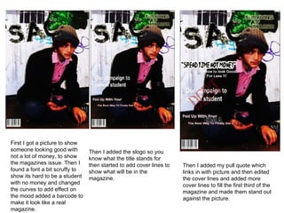
- 1. First I got a picture to show someone looking good with not a lot of money, to show the magazines issue. Then I found a font a bit scruffy to show its hard to be a student with no money and changed the curves to add effect on the mood added a barcode to make it look like a real magazine. Then I added the slogo so you know what the title stands for then started to add cover lines to show what will be in the magazine. Then I added my pull quote which links in with picture and then edited the cover lines and added more cover lines to fill the first third of the magazine and made them stand out against the picture.
- 2. First I added the title of the magazine in with ‘content’ so you no what it is like then added a paint splat which I I was inspired by other magazines and changed the main colour to purple and changed the curves . I added what will be in my magazine and changed the colour so it would stand out and match the title and left room for my pictures. Finally I added my pictures to relate what is in the t magazines and relates to the contents I faded round the edges to blend in and changed most of the picture black and white to make the rest of the colour to stand out and the main colours are the blacks and purple.