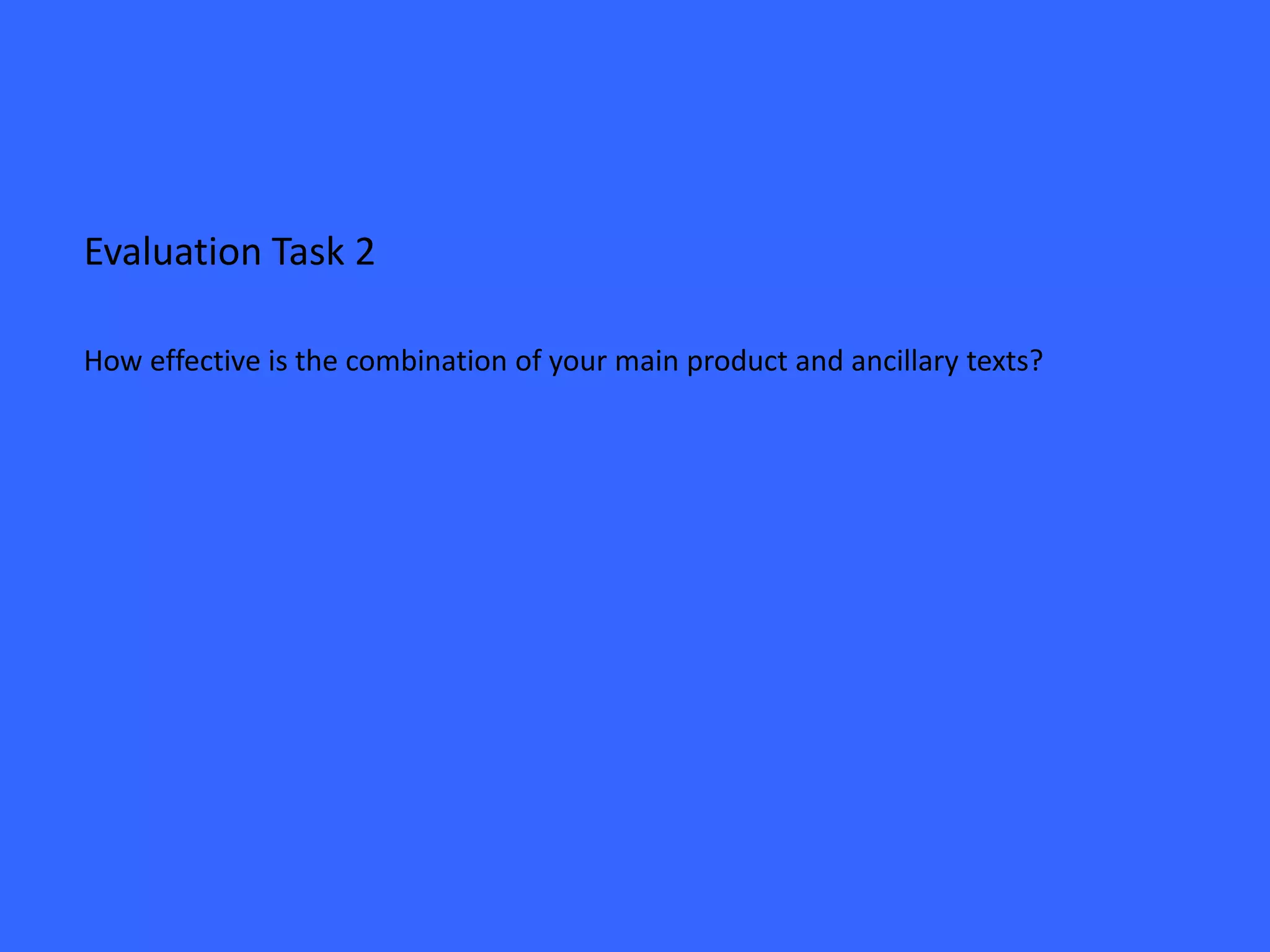
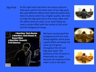
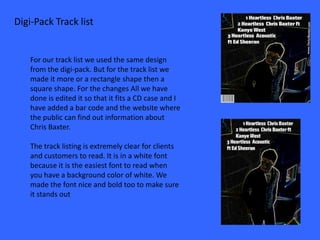
The combination of the main product (album) and ancillary texts (digipack, track listing, advert, album cover) is effective because:
1) The digipack, track listing, and advert covers use similar dark backgrounds and effects to link them visually and tonally to the music and video.
2) Key details like the artist name, song titles, and barcode are prominently displayed in clear, bold fonts across all materials.
3) Multiple drafts were made and feedback was incorporated to refine the designs and ensure the materials complemented each other and represented the genre consistently.

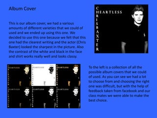


![Cd cover analyse [autosaved]](https://cdn.slidesharecdn.com/ss_thumbnails/cdcoveranalyseautosaved-120411175802-phpapp02-thumbnail.jpg?width=640&height=640&fit=bounds)


