The document describes the design choices for a music magazine called "The Rhythm". It will focus on R&B music. The designer chose bold red or black fonts to match conventions of Vibe magazine. An image of artist Ebonie will be on the cover to represent the main article. Articles will include how to create your own R&B look and top upcoming artists. Multiple fonts in red, black, and navy blue were selected to match the genre while providing visual interest.
Operation “Blue Star” is the only event in the history of Independent India where the state went into war with its own people. Even after about 40 years it is not clear if it was culmination of states anger over people of the region, a political game of power or start of dictatorial chapter in the democratic setup.
The people of Punjab felt alienated from main stream due to denial of their just demands during a long democratic struggle since independence. As it happen all over the word, it led to militant struggle with great loss of lives of military, police and civilian personnel. Killing of Indira Gandhi and massacre of innocent Sikhs in Delhi and other India cities was also associated with this movement.
Honest Reviews of Tim Han LMA Course Program.pptxtimhan337
Personal development courses are widely available today, with each one promising life-changing outcomes. Tim Han’s Life Mastery Achievers (LMA) Course has drawn a lot of interest. In addition to offering my frank assessment of Success Insider’s LMA Course, this piece examines the course’s effects via a variety of Tim Han LMA course reviews and Success Insider comments.
Instructions for Submissions thorugh G- Classroom.pptxJheel Barad
This presentation provides a briefing on how to upload submissions and documents in Google Classroom. It was prepared as part of an orientation for new Sainik School in-service teacher trainees. As a training officer, my goal is to ensure that you are comfortable and proficient with this essential tool for managing assignments and fostering student engagement.
A Strategic Approach: GenAI in EducationPeter Windle
Artificial Intelligence (AI) technologies such as Generative AI, Image Generators and Large Language Models have had a dramatic impact on teaching, learning and assessment over the past 18 months. The most immediate threat AI posed was to Academic Integrity with Higher Education Institutes (HEIs) focusing their efforts on combating the use of GenAI in assessment. Guidelines were developed for staff and students, policies put in place too. Innovative educators have forged paths in the use of Generative AI for teaching, learning and assessments leading to pockets of transformation springing up across HEIs, often with little or no top-down guidance, support or direction.
This Gasta posits a strategic approach to integrating AI into HEIs to prepare staff, students and the curriculum for an evolving world and workplace. We will highlight the advantages of working with these technologies beyond the realm of teaching, learning and assessment by considering prompt engineering skills, industry impact, curriculum changes, and the need for staff upskilling. In contrast, not engaging strategically with Generative AI poses risks, including falling behind peers, missed opportunities and failing to ensure our graduates remain employable. The rapid evolution of AI technologies necessitates a proactive and strategic approach if we are to remain relevant.
2024.06.01 Introducing a competency framework for languag learning materials ...Sandy Millin
http://sandymillin.wordpress.com/iateflwebinar2024
Published classroom materials form the basis of syllabuses, drive teacher professional development, and have a potentially huge influence on learners, teachers and education systems. All teachers also create their own materials, whether a few sentences on a blackboard, a highly-structured fully-realised online course, or anything in between. Despite this, the knowledge and skills needed to create effective language learning materials are rarely part of teacher training, and are mostly learnt by trial and error.
Knowledge and skills frameworks, generally called competency frameworks, for ELT teachers, trainers and managers have existed for a few years now. However, until I created one for my MA dissertation, there wasn’t one drawing together what we need to know and do to be able to effectively produce language learning materials.
This webinar will introduce you to my framework, highlighting the key competencies I identified from my research. It will also show how anybody involved in language teaching (any language, not just English!), teacher training, managing schools or developing language learning materials can benefit from using the framework.
How to Make a Field invisible in Odoo 17Celine George
It is possible to hide or invisible some fields in odoo. Commonly using “invisible” attribute in the field definition to invisible the fields. This slide will show how to make a field invisible in odoo 17.
Francesca Gottschalk - How can education support child empowerment.pptxEduSkills OECD
Francesca Gottschalk from the OECD’s Centre for Educational Research and Innovation presents at the Ask an Expert Webinar: How can education support child empowerment?
Embracing GenAI - A Strategic ImperativePeter Windle
Artificial Intelligence (AI) technologies such as Generative AI, Image Generators and Large Language Models have had a dramatic impact on teaching, learning and assessment over the past 18 months. The most immediate threat AI posed was to Academic Integrity with Higher Education Institutes (HEIs) focusing their efforts on combating the use of GenAI in assessment. Guidelines were developed for staff and students, policies put in place too. Innovative educators have forged paths in the use of Generative AI for teaching, learning and assessments leading to pockets of transformation springing up across HEIs, often with little or no top-down guidance, support or direction.
This Gasta posits a strategic approach to integrating AI into HEIs to prepare staff, students and the curriculum for an evolving world and workplace. We will highlight the advantages of working with these technologies beyond the realm of teaching, learning and assessment by considering prompt engineering skills, industry impact, curriculum changes, and the need for staff upskilling. In contrast, not engaging strategically with Generative AI poses risks, including falling behind peers, missed opportunities and failing to ensure our graduates remain employable. The rapid evolution of AI technologies necessitates a proactive and strategic approach if we are to remain relevant.
Macroeconomics- Movie Location
This will be used as part of your Personal Professional Portfolio once graded.
Objective:
Prepare a presentation or a paper using research, basic comparative analysis, data organization and application of economic information. You will make an informed assessment of an economic climate outside of the United States to accomplish an entertainment industry objective.
The Roman Empire A Historical Colossus.pdfkaushalkr1407
The Roman Empire, a vast and enduring power, stands as one of history's most remarkable civilizations, leaving an indelible imprint on the world. It emerged from the Roman Republic, transitioning into an imperial powerhouse under the leadership of Augustus Caesar in 27 BCE. This transformation marked the beginning of an era defined by unprecedented territorial expansion, architectural marvels, and profound cultural influence.
The empire's roots lie in the city of Rome, founded, according to legend, by Romulus in 753 BCE. Over centuries, Rome evolved from a small settlement to a formidable republic, characterized by a complex political system with elected officials and checks on power. However, internal strife, class conflicts, and military ambitions paved the way for the end of the Republic. Julius Caesar’s dictatorship and subsequent assassination in 44 BCE created a power vacuum, leading to a civil war. Octavian, later Augustus, emerged victorious, heralding the Roman Empire’s birth.
Under Augustus, the empire experienced the Pax Romana, a 200-year period of relative peace and stability. Augustus reformed the military, established efficient administrative systems, and initiated grand construction projects. The empire's borders expanded, encompassing territories from Britain to Egypt and from Spain to the Euphrates. Roman legions, renowned for their discipline and engineering prowess, secured and maintained these vast territories, building roads, fortifications, and cities that facilitated control and integration.
The Roman Empire’s society was hierarchical, with a rigid class system. At the top were the patricians, wealthy elites who held significant political power. Below them were the plebeians, free citizens with limited political influence, and the vast numbers of slaves who formed the backbone of the economy. The family unit was central, governed by the paterfamilias, the male head who held absolute authority.
Culturally, the Romans were eclectic, absorbing and adapting elements from the civilizations they encountered, particularly the Greeks. Roman art, literature, and philosophy reflected this synthesis, creating a rich cultural tapestry. Latin, the Roman language, became the lingua franca of the Western world, influencing numerous modern languages.
Roman architecture and engineering achievements were monumental. They perfected the arch, vault, and dome, constructing enduring structures like the Colosseum, Pantheon, and aqueducts. These engineering marvels not only showcased Roman ingenuity but also served practical purposes, from public entertainment to water supply.
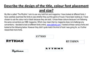
1. Describe the design of the title, colour font placement
and size?
My title is called „The Rhythm‟ I aim to use very bold font and magazine. I have looked at different fonts; I
have carefully examined the fonts to see whether they suit the genre of music I have been looking at. I have
chosen to use the colour red or black because they are bold, I chose these colours because I am following
the same conventions as VIBE magazine. Which may mean that my magazine does not challenge any
conventions. I decided to look at different fonts online, www.dafonts.com. I looked at these various fonts and
looked at the following below. However they didn‟t quite match the kind of look I was going for, so I further
researched more fonts.
2. What is the name of the magazine?
The name of the magazine is ‘The Rhythm’, I have chosen rhythm because I wanted to
incorporate the genre of music within the title and I believe by the way I have done it
exemplifies this.
What is the magazine going to be
about?
The magazine is going to be about an upcoming artist who slowly began to get involved
with drugs; it is going to have an article about what’s in the fashion world. Also it is going
to have an advertisement of all the new albums which have been created by new artists.
The magazine will also aim to teach the wider audience in how to create your own RnB
look from home.
3. How I intend to place the masthead
• I intend to place the masthead, behind the main image. I want the main image to be the
forefront of the magazine. The masthead will still be place
What is the dominant image be and why?
• My main image will be an image of „Ebonie‟ who is the artist who is featured in the main article
of my magazine. I choose this image because I wanted to have a relationship between the
image and the articles, I thought the way I chose to do this will allow this to do so. The images I
have placed below, are what I aspire my front cover to look like however, I will like to
incorporate an instrument in my front cover, to allow my reader to know what kind of music
magazine they are reading. I did this so that the magazine isn‟t too generic.
4. What does the image tell your potential target audience?
• My image will tell my target audience that this magazine is here to promote the upcoming artist. The
image will tell my target audience that women are beautiful in all shapes and sizes.
Would you be including any other image on the
front cover?
• I will include images of „sneak peaks‟ of what will be included inside of the magazine. I have also thought about
adding images of upcoming artist for other issues of the magazine. I have decided to add single images of
musical instruments which are used in this genre of music.
How do these articles relate to the title of the
music magazine?
• These articles will relate to the title of the music magazine because „Rhythm‟ is the pattern of musical
movement through time, this will be found in my
5. Will your target audience find your front page appealing and why? Why not?
• My target audience will find my front page appealing because it will display beautiful woman and an
instrument. The colours I have chosen to use are very bold. They will stand out and will aim to represent
the genre. The colours I have considered in my main image are red, black and yellow. I have chosen red
because this colour is very alarming and will draw attention to the magazine, it represents passion in which
most females posses, I have chosen this as another to target my target audience. I have chosen black, to
aim to neutralise the cover, so it will not be too overpowering. I have also considered yellow, I might use
this colour, I don‟t want the main image to look messy that‟s why I will see what the main image looks like
before I add any more colour to it. I have also considered going for a different colour scheme. I have
considered using gold. I have considered this colour because it will add class to my magazine. I would my
magazine to resemble a porno magazine too much, that‟s why I have considered using other colour
schemes. Such as pink, blue and other pastoral colours. I have looked at the way in which VIBE has used
colours, and through my research I found out that they stick to really simple colours, which are apparent in
my examples below. The colours always compliment the main image which is something I aspire to do for
my front cover.
6. What articles will be found in my magazine?
The articles which will be found in my magazine:
• How to create your own “diva” look. I have chosen this as an article in my magazine because my target audience
will want to create their own RnB star look at home, so this will potentially draw the audience straight away into my
magazine.
• Top 10 upcoming bangers of this year- I will aim to use this as an advert for the upcoming artists, also I will use
this to showcase the genre of music I have chosen.
• Celebrity gossip, I will use this article as a way of connecting the reader to celebrities personal life.
The music behind RnB, here I will aim to give my audience a lesson about where the music they listen to has
generated from. It will act a history lesson for my readers.
Will your target audience find this appealing? Why?
• My target audience will find this appealing because it fits in with the genre of music I am trying to represent. It will
emulate the VIBE magazine which completely showcases the genre of music I am trying to represent.
Will your chosen font, depict the genre of the music magazine?
• The chosen font will depict the genre of the music magazine because I aim at making the magazine very sensual.
I believe that the RnB genre is a sensual, relaxed kind of genre; I hope to make my font very relaxed and informal.
I want the font to be bold, but not bold in the sense that it will resemble heavy metal genre. I have chosen Vibe
which I have analysed, I like the way the magazine has been designed, the bold colours something that I will be
aiming to follow.
7. • How many different fonts am I going to
use, what colour and what size and style?
• Initially when I was thinking of fonts to use, I decided with Viner Hand ITC in gold; I have chose this
font because I believe that it will represent my genre very well. However when I looked at VIBE
magazine and aim to use this as a guideline for my own magazine. I liked the way in which the colour is
bold, but still subtle. I would like my own magazine to have this same type of effect. The font will be
very large, so it can stand out against my background. It also uses a strapline and a
masthead, whereby the strapline is placed above the masthead, I like the way in which this looks, and
aim to use this for my own magazine. through research I went onto the website dafont.com and looked
at fonts. I liked the northern territory and decided to use this for my magazine. I decided to only use
three fonts with three colours. I decided to use red, black and navy blue. Also like the vibe magazine I
have also decided to use the colour red because I like the contrast in the colours. The colour red paired
with another font from dafont.com in black will make the magazine stand out but not too overbearing.
Finally I have again chosen another font from the same website and decided to use it in navy blue, to
allow there to be a range of colours.