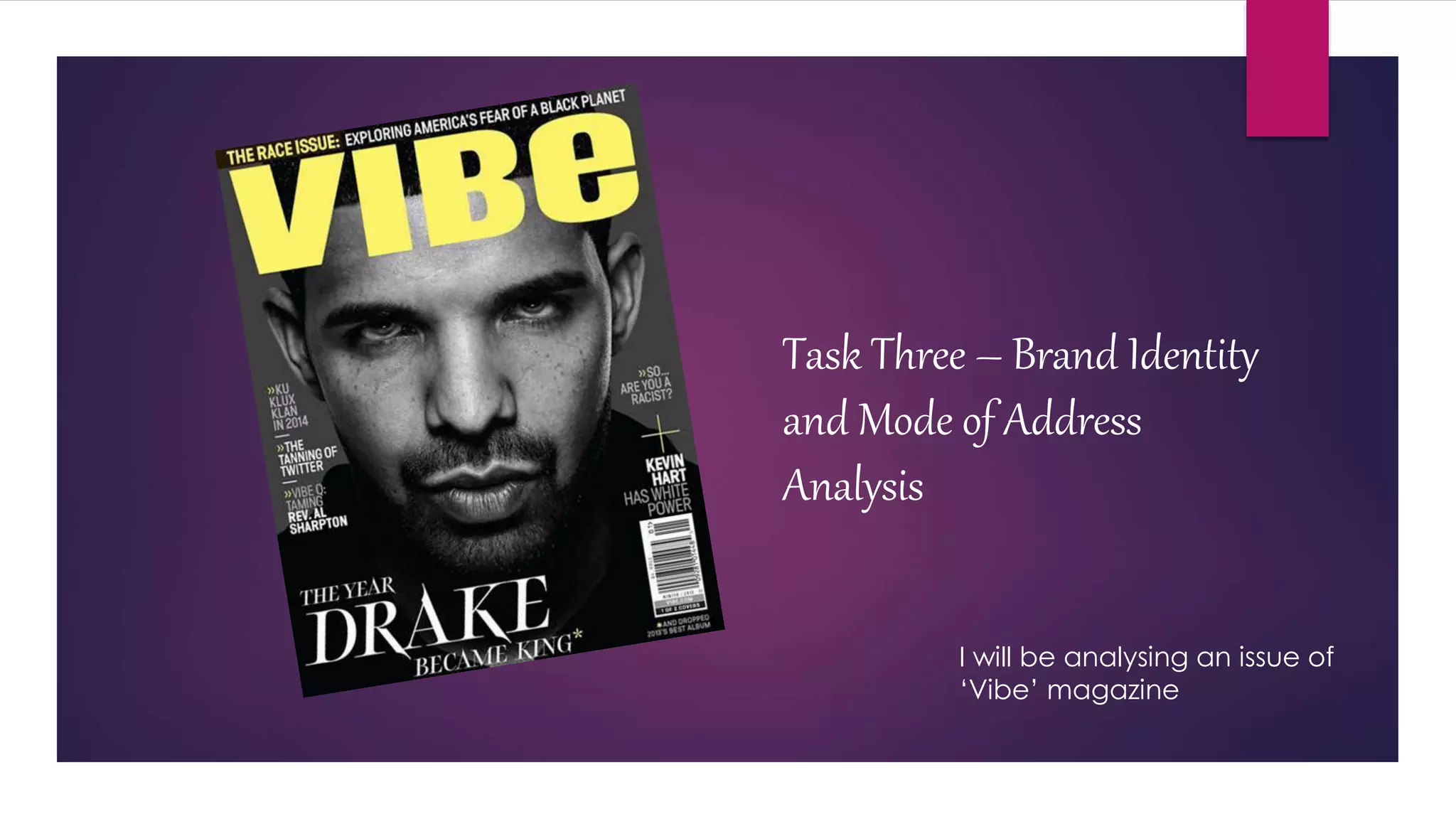
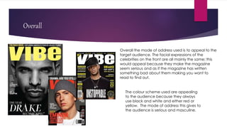
The document analyzes the brand identity and mode of address of an issue of "Vibe" magazine. It summarizes that the magazine establishes its brand through consistent use of colors like black, white, and red in titles and images. The large bold fonts and prominent placement of celebrity photos aims to attract readers' attention. Overall, the magazine's style and serious facial expressions portrayed are meant to appeal to its target teenage audience.