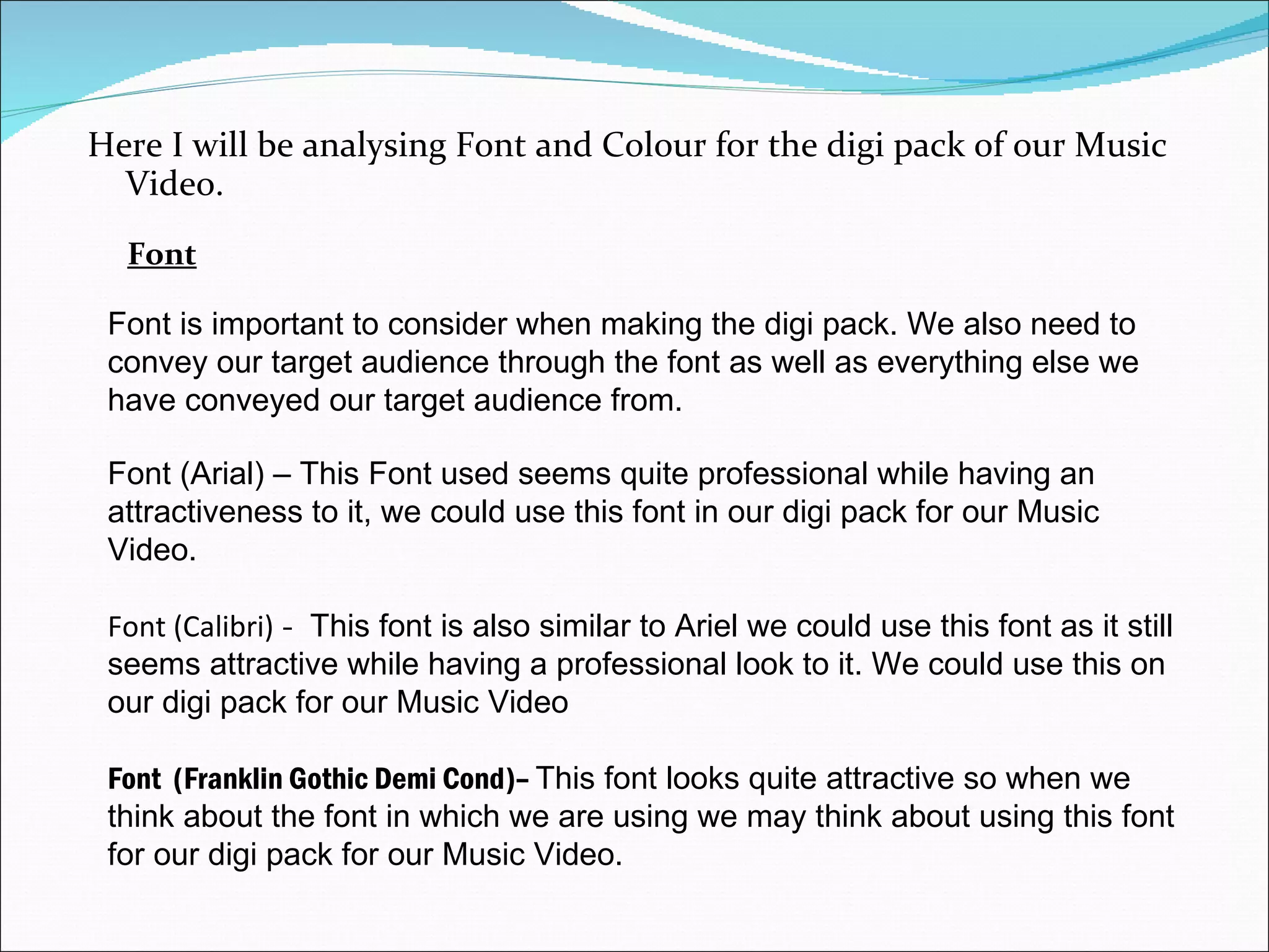
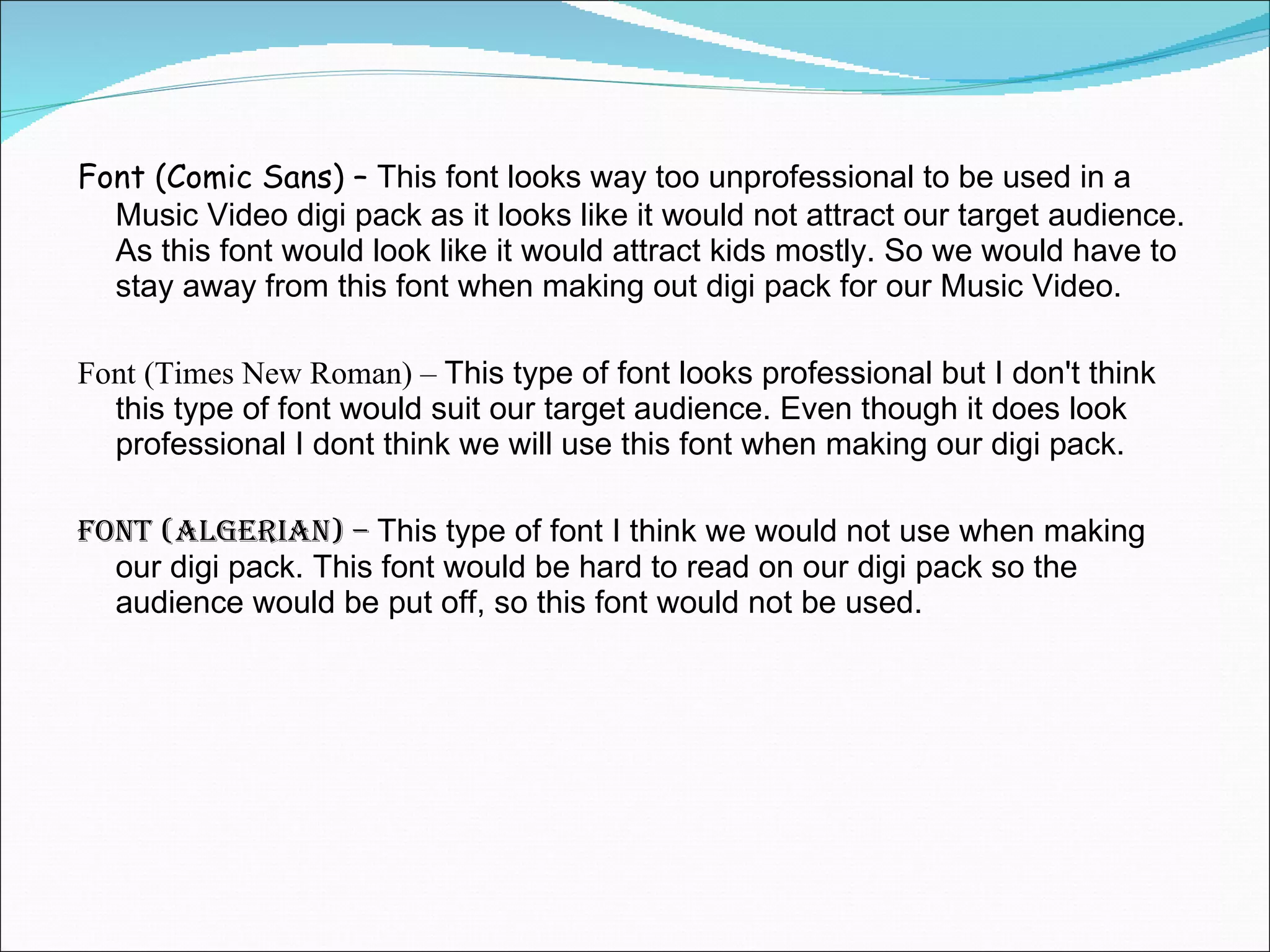
Here I will be analysing Font and Colour for the digi pack of our Music Video. Font Font (Arial) – This Font used seems quite professional while having an attractiveness to it, we could use this font in our digi pack for our Music Video. Font (Calibri)  -  This font is also similar to Ariel we could use this font as it still seems attractive while having a professional look to it. We could use this on our digi pack for our Music Video Font  (Franklin Gothic Demi Cond)–  This font looks quite attractive so when we think about the font in which we are using we may think about using this font for our digi pack for our Music Video.  Font is important to consider when making the digi pack. We also need to convey our target audience through the font as well as everything else we have conveyed our target audience from.
Font (Comic Sans) –  This font looks way too unprofessional to be used in a Music Video digi pack as it looks like it would not attract our target audience. As this font would look like it would attract kids mostly. So we would have to stay away from this font when making out digi pack for our Music Video. Font (Times New Roman) –  This type of font looks professional but I don't think this type of font would suit our target audience. Even though it does look professional I dont think we will use this font when making our digi pack.  Font (Algerian) –  This type of font I think we would not use when making our digi pack. This font would be hard to read on our digi pack so the audience would be put off, so this font would not be used.
Colour is another thing to think about when making our digi pack. We need to convey what emotion our song shows through this as different colours can convey different emotions and feelings. Red -  This colour can convey the feeling of danger so using this colour when having an upbeat song may be a wrong choice to do. It is something to think about when making the digi pack. Black – This colour can convey the emotion of being depressed. So with this , if we were making a song which was quite depressing and the lyrics showed that we could use this colour.  Blue –  This colour actually conveys an emotion of being sad but not overly sad. We could use this colour if we were making a Music Video with a sad song. Colour
Yellow –  This colour conveys the emotion of being happy. This is something to think about when making the digi pack for the Music Video if we are doing an up beat song. Pink –  This colour would convey a more of a girly sort of theme, so if we were to make a music video with a target audience of girls this may be used. Also pink could still be used with an upbeat song.

Font and colour

  • 1.
  • 2.
    Here I willbe analysing Font and Colour for the digi pack of our Music Video. Font Font (Arial) – This Font used seems quite professional while having an attractiveness to it, we could use this font in our digi pack for our Music Video. Font (Calibri) - This font is also similar to Ariel we could use this font as it still seems attractive while having a professional look to it. We could use this on our digi pack for our Music Video Font (Franklin Gothic Demi Cond)– This font looks quite attractive so when we think about the font in which we are using we may think about using this font for our digi pack for our Music Video. Font is important to consider when making the digi pack. We also need to convey our target audience through the font as well as everything else we have conveyed our target audience from.
  • 3.
    Font (Comic Sans)– This font looks way too unprofessional to be used in a Music Video digi pack as it looks like it would not attract our target audience. As this font would look like it would attract kids mostly. So we would have to stay away from this font when making out digi pack for our Music Video. Font (Times New Roman) – This type of font looks professional but I don't think this type of font would suit our target audience. Even though it does look professional I dont think we will use this font when making our digi pack. Font (Algerian) – This type of font I think we would not use when making our digi pack. This font would be hard to read on our digi pack so the audience would be put off, so this font would not be used.
  • 4.
    Colour is anotherthing to think about when making our digi pack. We need to convey what emotion our song shows through this as different colours can convey different emotions and feelings. Red - This colour can convey the feeling of danger so using this colour when having an upbeat song may be a wrong choice to do. It is something to think about when making the digi pack. Black – This colour can convey the emotion of being depressed. So with this , if we were making a song which was quite depressing and the lyrics showed that we could use this colour. Blue – This colour actually conveys an emotion of being sad but not overly sad. We could use this colour if we were making a Music Video with a sad song. Colour
  • 5.
    Yellow – This colour conveys the emotion of being happy. This is something to think about when making the digi pack for the Music Video if we are doing an up beat song. Pink – This colour would convey a more of a girly sort of theme, so if we were to make a music video with a target audience of girls this may be used. Also pink could still be used with an upbeat song.