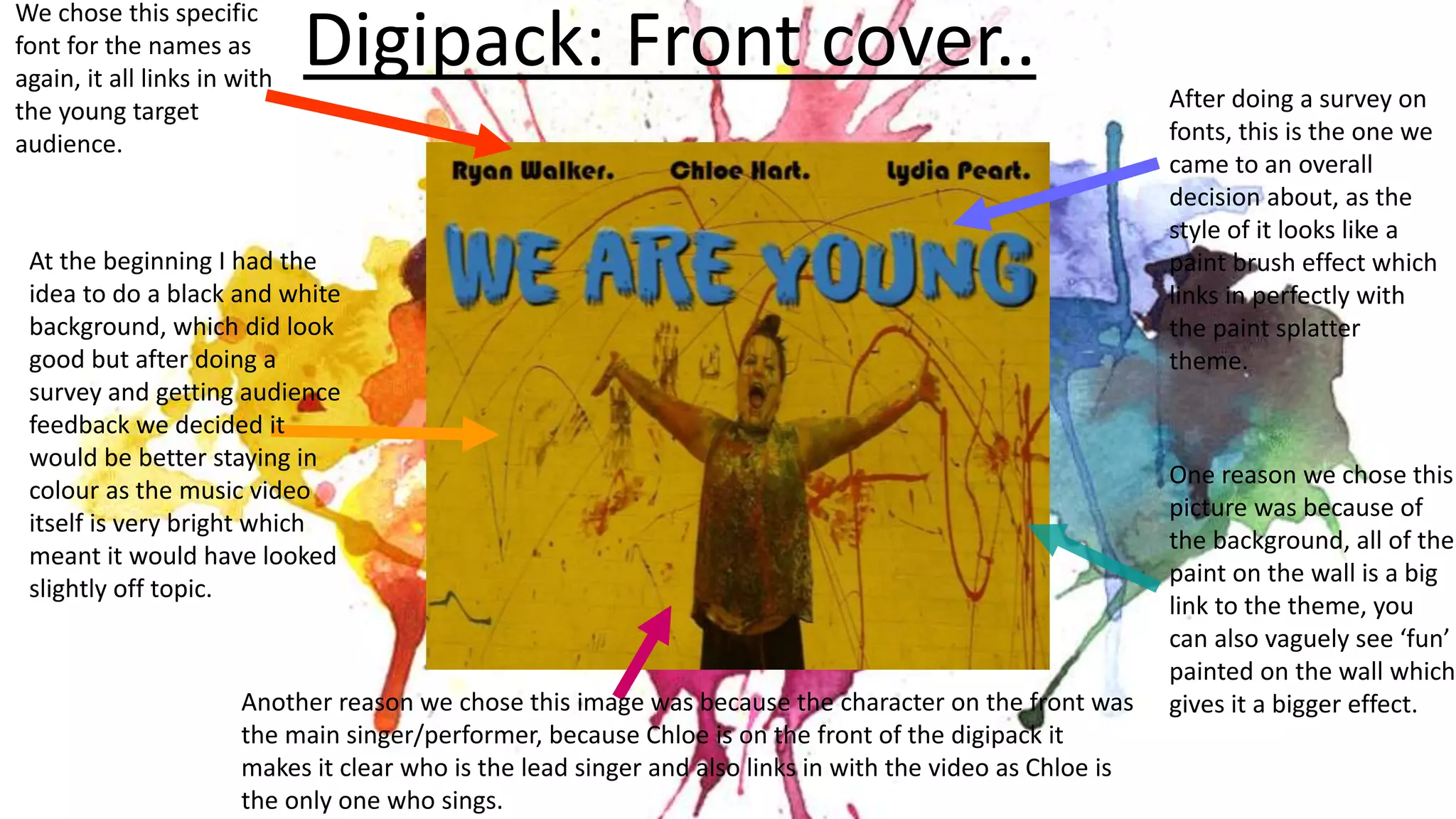
This document discusses the design choices made for packaging and promotional materials for a band's music. For the digipack front cover, a font resembling a paint brush effect was chosen to match the paint splatter theme. An image of the lead singer was used to identify her as the main performer. Feedback from surveys informed keeping the design in color.
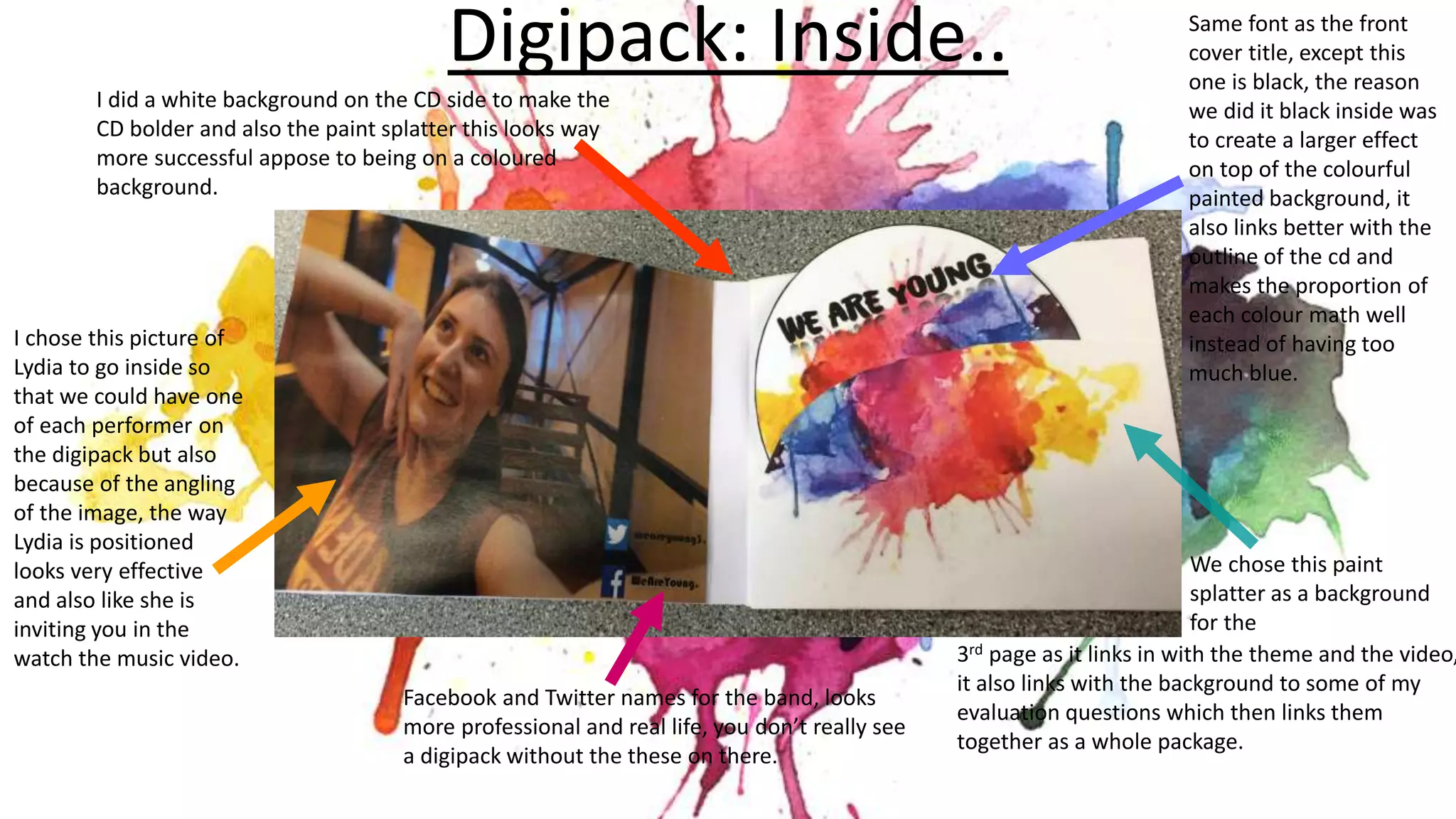
Inside pages feature social media handles, band member photos, and a paint splatter background tying elements together visually. Fonts and colors are consistent across pages to create a cohesive brand identity.
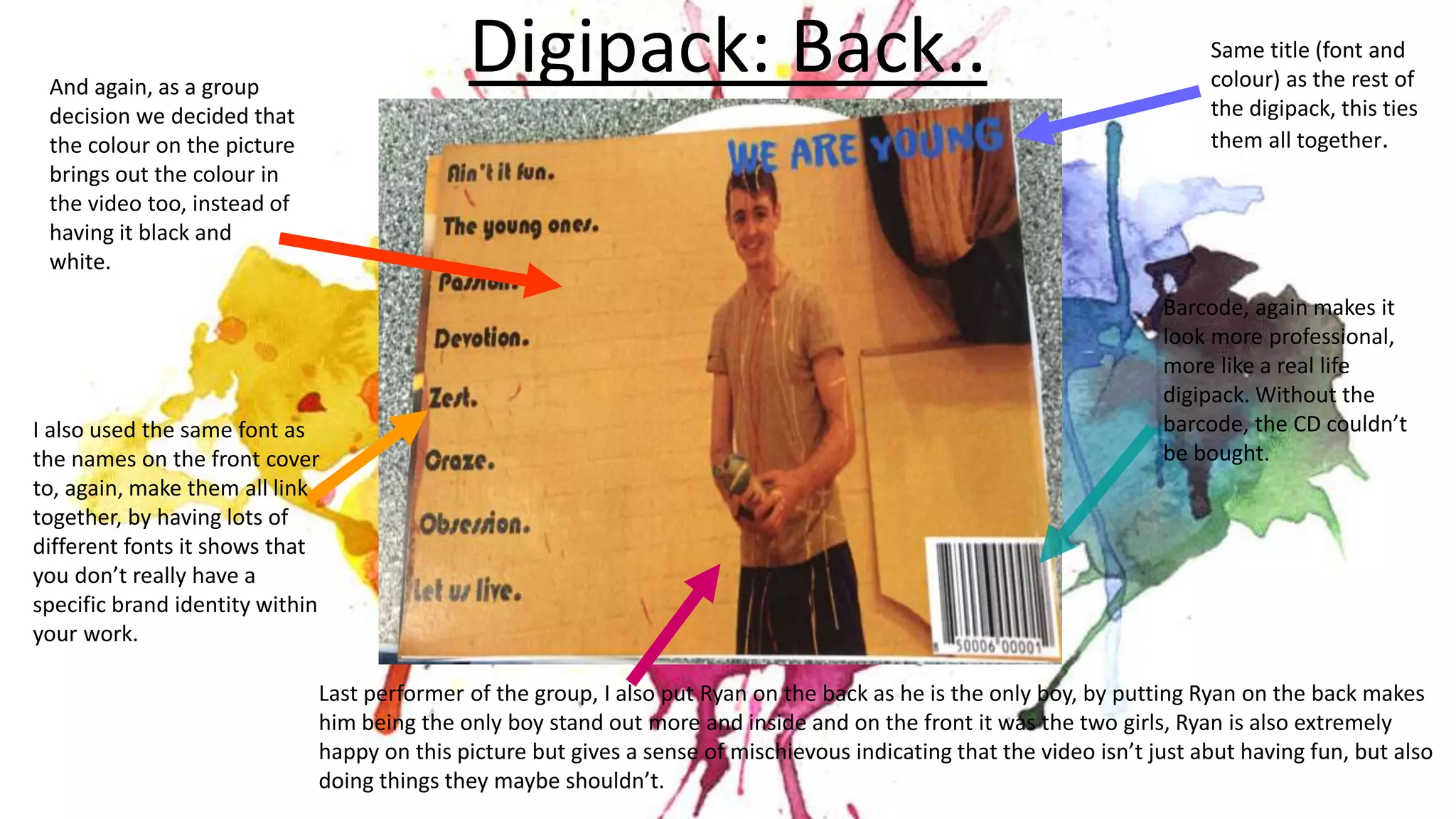
The back cover features the only male band member to make him stand out. Consistent fonts and colors link all elements of the packaging.
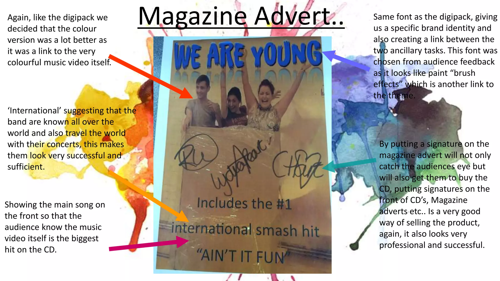
The magazine ad design mirrors the