The CMO Survey - Highlights and Insights Report - Spring 2024
stuff
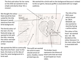
1. The font and colour for her name We wanted the a brick wall on the background because it related
on the DVD we wanted it to be to the our genre, because graffiti is associated with our target
simple and clearly show ‘On a audience.
mission’.
We thought the colour The title of the
black would be best DVD cover
suited for the title which should
because it would be ‘ON A
stand out from the MISSION’, we
brick background. also wanted to
stand by having
The font & colour of a white outline.
the text s for the The colour of the
featured songs, we heart we wanted
wanted to link with was red. We
the title, meaning decided on this
the colour and type colour because it is
of font should be the main colour that
similar is associated with
love.
We wanted the DVD to continually The outfit we wanted
flow from the front cover to the the artist to wear The broken heart,
back, this lead us to the idea of should consist of represents the theme of
have the same background of a jeans, hoodies, trainer heart ache that we tried
brick wall. printed tops etc. to portrayed our music
video.